flex Layout Foundation
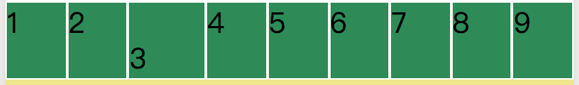
flex containers and elements
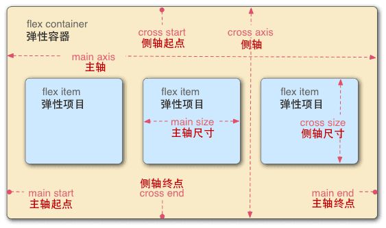
The default axis from left to right is called the main axis, and the axis from top to bottom is called the cross axis, or the cross axis. The yellow background part is the container.
Detailed description of container attributes of flex
- flex-direction determines the orientation of elements
- flex-wrap determines how elements wrap (when they are not aligned)
- flex-flow is short for flex-direction and flex-wrap
- justify-content determines the alignment of elements on the main axis
- align-items determine the alignment of elements on the cross-axis
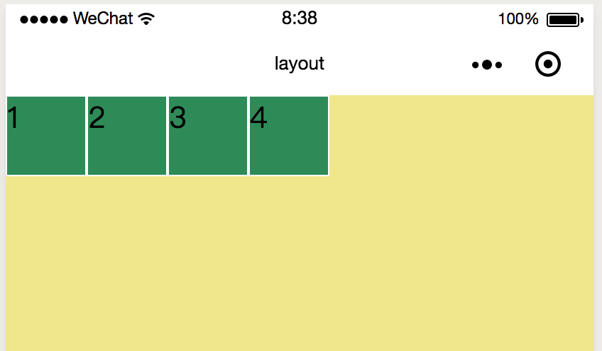
<view class="container" >
  <view class="item">1</view>
  <view class="item">2</view>
  <view class="item">3</view>
  <view class="item">4</view>
</view>
.container {
height : 100%;
width:100%;
background-color: khaki;
display: flex;
flex-direction: row;
}
.item {
width:100rpx;
height:100rpx;
background-color: seagreen;
border: 1px solid #fff;
}
flex-direction
/* flex-direction There are two directions, row by default and column by default. */
flex-direction: column;
When set to column, we actually treat the container from top to bottom as the main axis and from left to right as the cross axis. 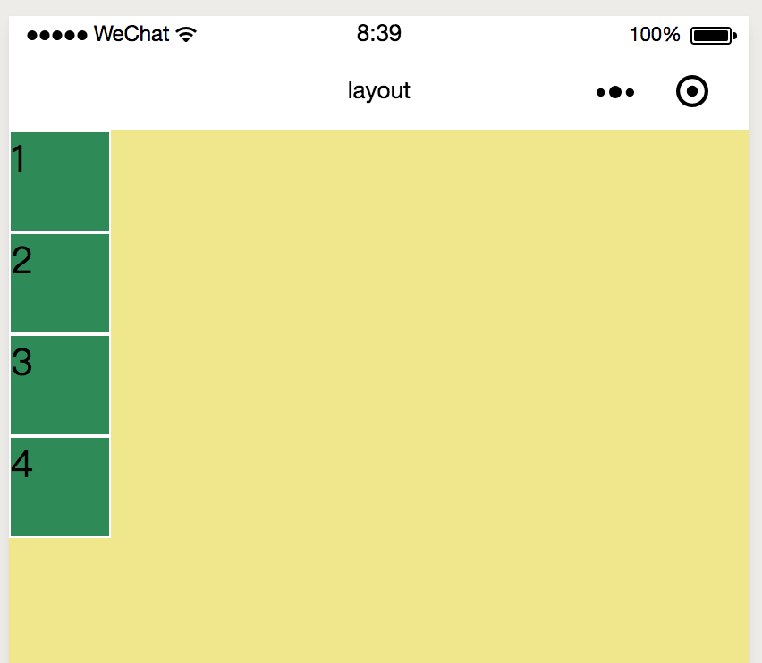
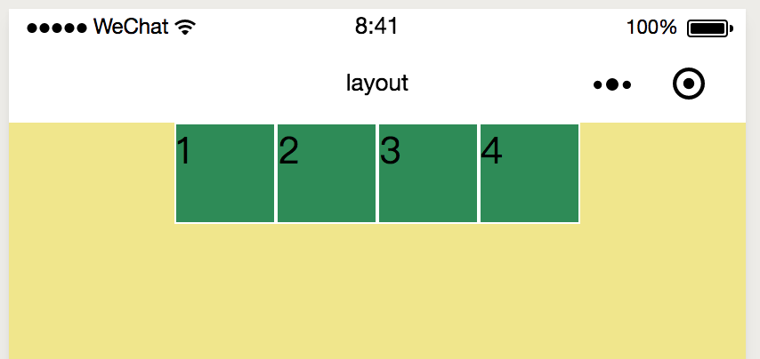
flex-wrap
When multiple view s are added to the home page, if flex-wrap is not set and the default direction is row, each item will be placed in one line, and if it cannot be placed, it will lead to deformation. 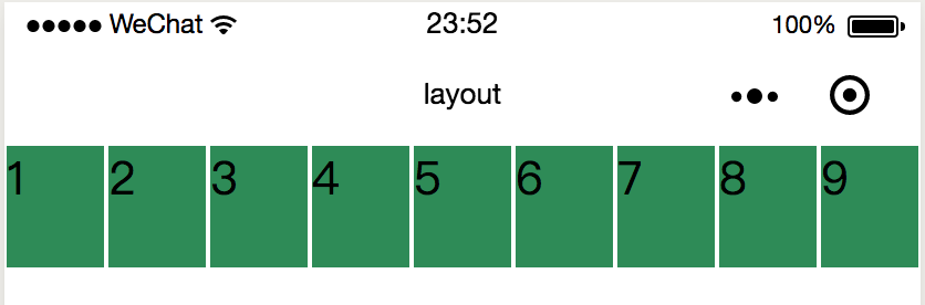
flex-wrap : wrap;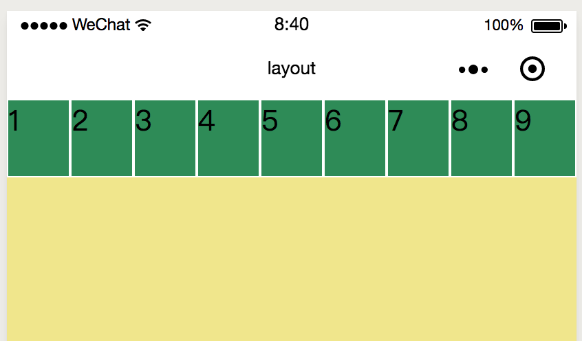
* flex-wrap: nowrap; no line change
* flex-wrap: wrap; line change
* flex-wrap: wrap-reverse; inversion
flex-flow
flex-flow: row wrap; justify-content
.container {
  height : 100%;
  width:100%;
  background-color: khaki;
  display: flex;
  flex-flow: row wrap;
  justify-content: center;
}
  display: flex;
  flex-direction: column;   /* Change the spindle to top-down */
  justify-content: center;  /* Alignment of spindle */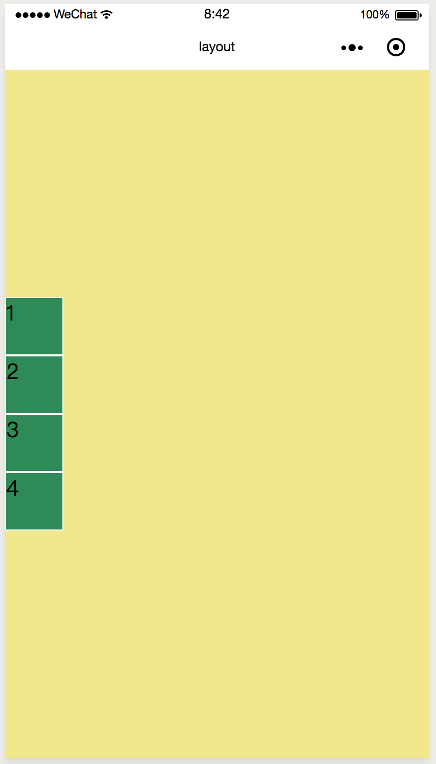
When the axis from left to right is the main axis:
Left alignment of flex-start spindle 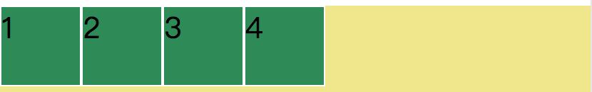
Right alignment of flex-end spindle 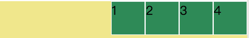
Centralization 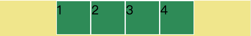
space-around equals the left and right sides of each item 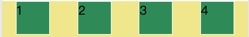
space-between left-most and right-most without spacing 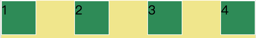
align-items
The alignment of elements on the cross axis.
  justify-content: flex-start;  /* Default spindle alignment */
  align-items: flex-start;
When the axis from top to bottom is a cross axis:
flex-start alignment
Alignment under flex-end 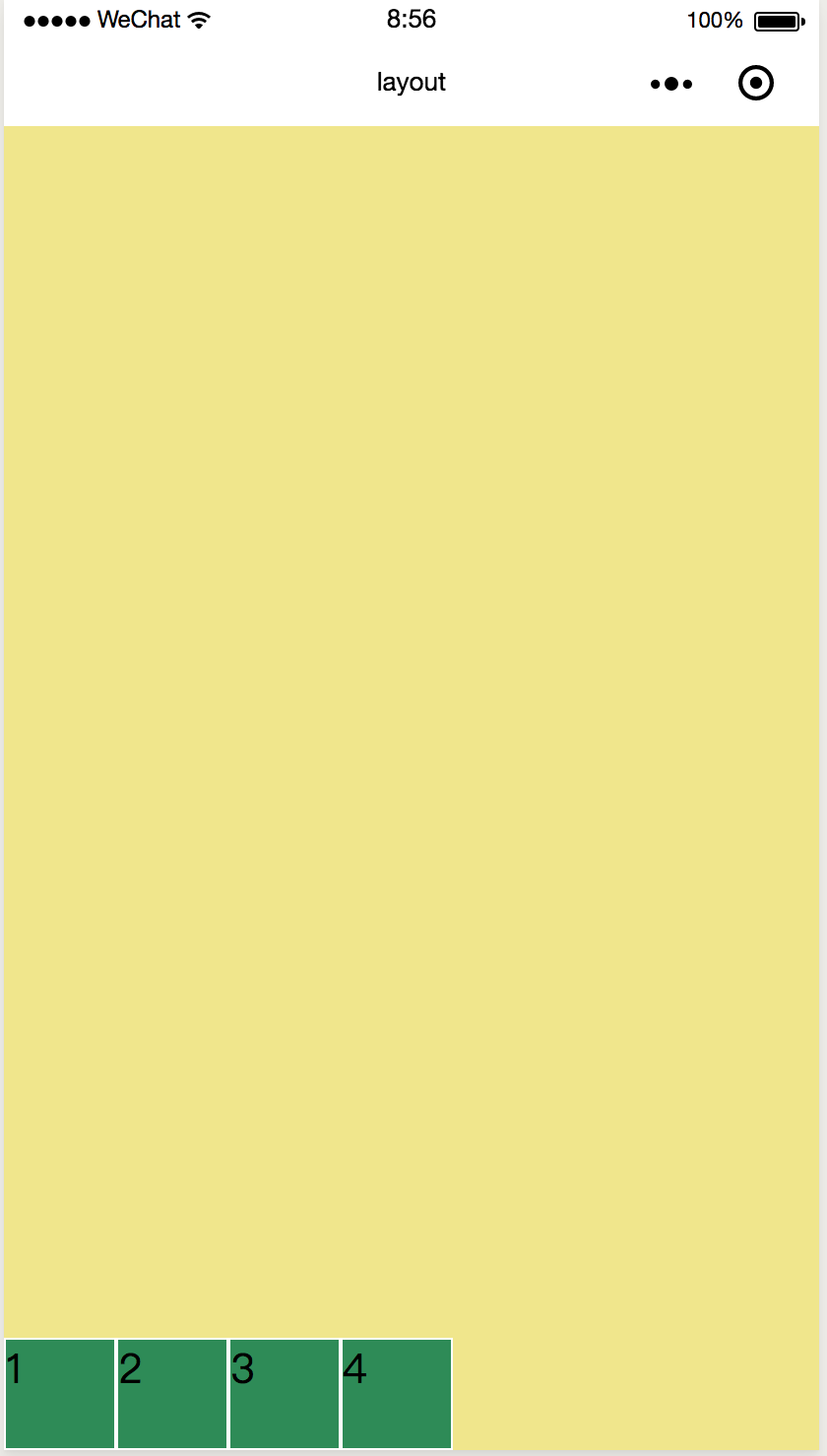
Centralization 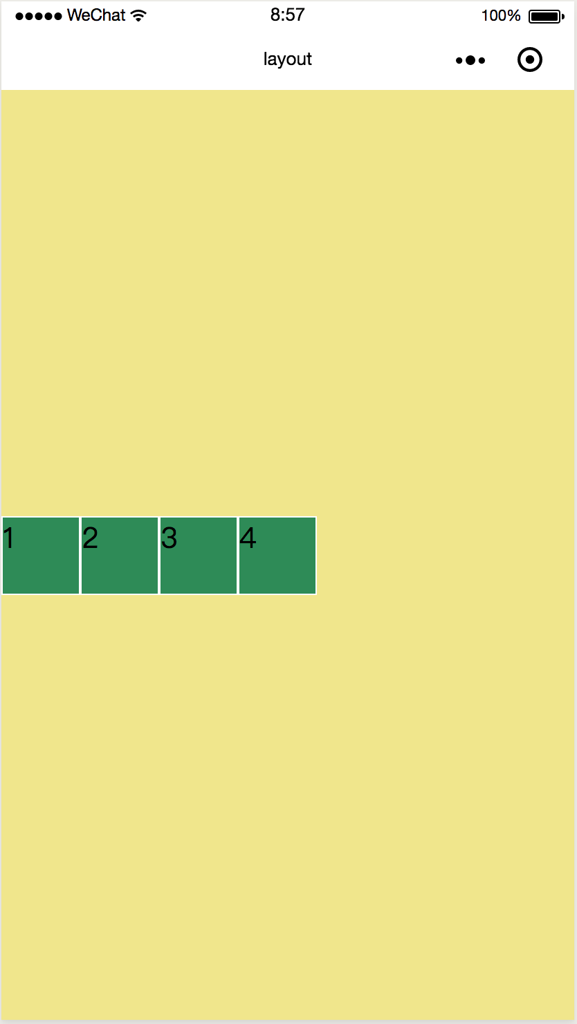
stretch automatically fills the entire container height when the element is not set to a fixed height
If no fixed height is set for each item, the effect is as follows: 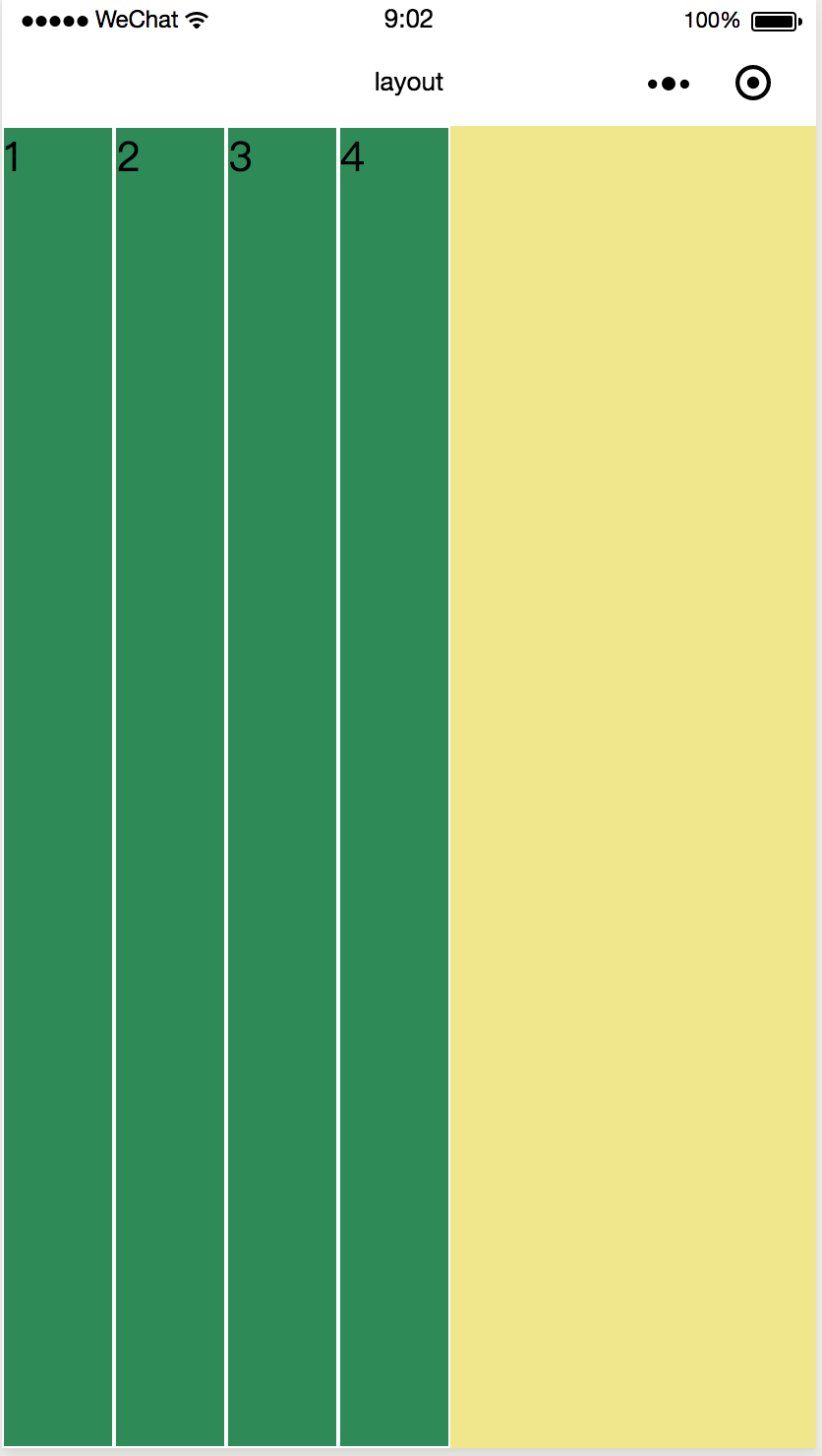
Baseline aligns with the baseline of the text
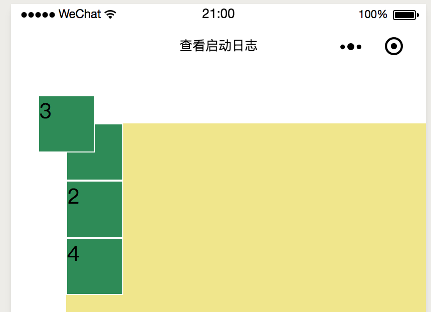
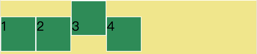
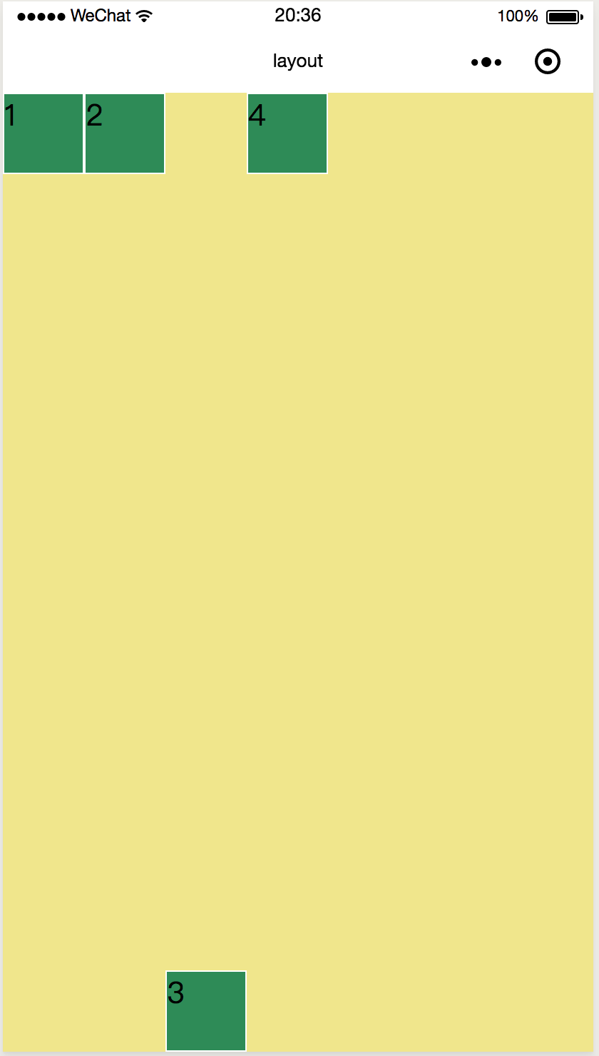
Set a separate style for the third view
<view class="item i3">3</view>.i3 {
display: flex;
align-items: flex-end;
}
Detailed description of flex element attributes
The attributes of flex elements can only be used in each flex item, not in container.
* Flexible-group When there is extra space, the magnification of elements
* flex-shrink When space is insufficient, the reduction ratio of elements
* The space occupied by flex-base elements on the spindle
* flex is short for grow shrink base
* Order defines the order of elements
* align-self defines the alignment of elements themselves
.item {
  width:100rpx;
  height:100rpx;
  background-color: seagreen;
  border: 1px solid #fff;
  flex-grow: 1;
}
The default value of flex-group is 0 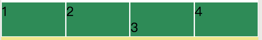
.item {
width:100rpx;
height:100rpx;
background-color: seagreen;
border: 1px solid #fff;
flex-grow: 1;
}
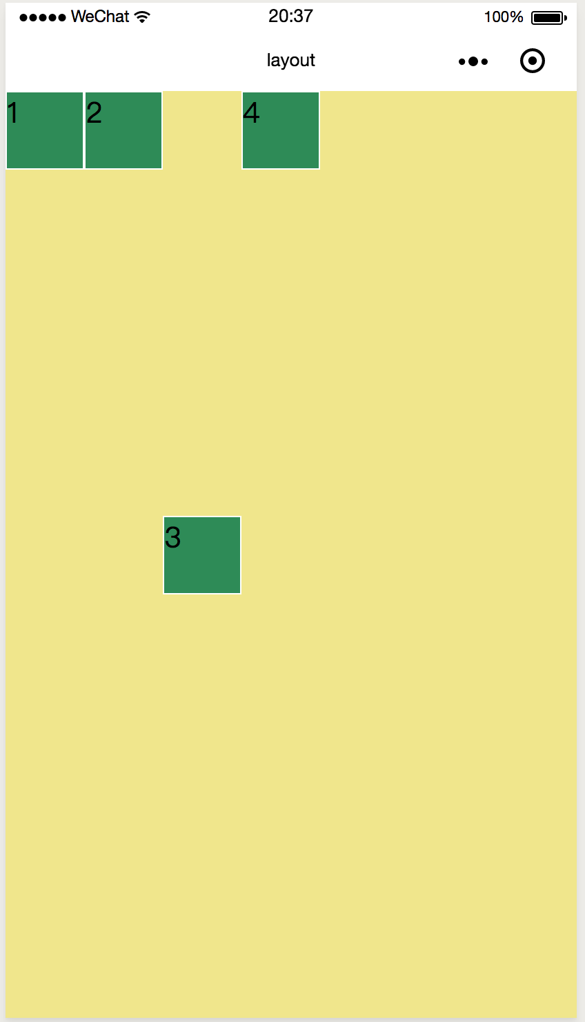
.i3 {
display: flex;
align-items: flex-end;
flex-grow: 2;
}item1, 2, 4 occupy one part of the redundant space, item3 occupies two parts of the redundant space. 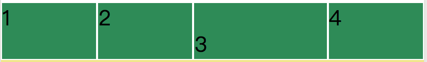
The default flex-shrink value is 1. When space is insufficient, the ratio of item s is reduced. 
If the third element is styled flex-shrink: 0 separately, the element does not shrink:
.i3 {
  display: flex;
  align-items: flex-end;
  /* flex-grow: 2;  */
  flex-shrink: 0;
}
.i3 {
  display: flex;
  align-items: flex-end;
  /* flex-grow: 2;  */
  flex-shrink: 5;
}
flex-basis
.i3 {
  display: flex;
  align-items: flex-end;
  flex-basis: 150px;
}
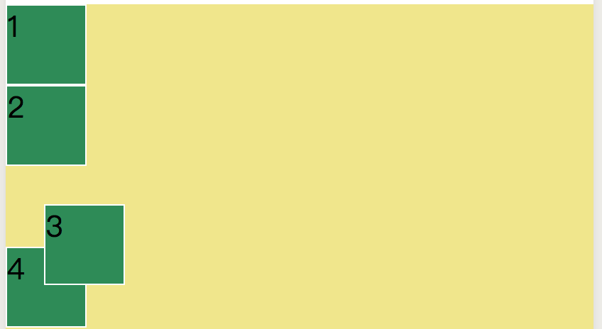
order
.item {
  width:100rpx;
  height:100rpx;
  background-color: seagreen;
  border: 1px solid #fff;
  order: 3;
}
.i3 {
  display: flex;
  order: 1;
}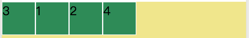
<view class="container" >
  <view class="item" style="order:4">1</view>
  <view class="item" style="order:3">2</view>
  <view class="item i3" style="order:2">3</view>
  <view class="item" style="order:1">4</view>
</view>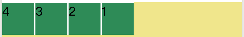
align-self
.container {
  min-height : 100%;
  width:100%;
  background-color: khaki;
  display: flex;
  flex-direction: row;
  justify-content: flex-start;
  align-items: flex-start;
}

.i3 {
  display: flex;
  align-self: flex-end;   /* item3 Set to different alignment */
}
.i3 {
  display: flex;
  align-self: center;
}
Relative and absolute positioning
Understanding relative positioning and absolute positioning
The element of relative positioning is positioning itself, and the reference object is itself.
An absolutely positioned element is positioned relative to its nearest parent element.
Coding of Relative and Absolute Location
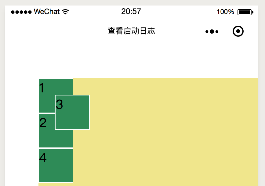
<view class="item3" >3</view>.item3 {
width:100rpx;
height:100rpx;
background-color: seagreen;
border: 1px solid #fff;
position: relative;
left: 50rpx; /* Migrate from the original self */
top: 50rpx;
}
.container {
  min-height : 100%;
  width: 100%;
  background-color: khaki;
  position: absolute;
  left: 100rpx;
  top: 100rpx;
}
.item3 {
  width:100rpx;
  height:100rpx;
  background-color: seagreen;
  border: 1px solid #fff;
  position: absolute;   /* The nearest positioned parent element to it is container */
  left: 50rpx;
  top:50rpx;
}
.container {
  min-height : 100%;
  width:100%;
  background-color: khaki;
  margin-left: 100rpx;
  margin-top:100rpx;
}
.item3 {
  width:100rpx;
  height:100rpx;
  background-color: seagreen;
  border: 1px solid #fff;
  position: absolute;  /* The nearest positioned parent element to it is the entire page, because the container is not positioned */
  left: 50rpx;
  top:50rpx;
}