primary coverage
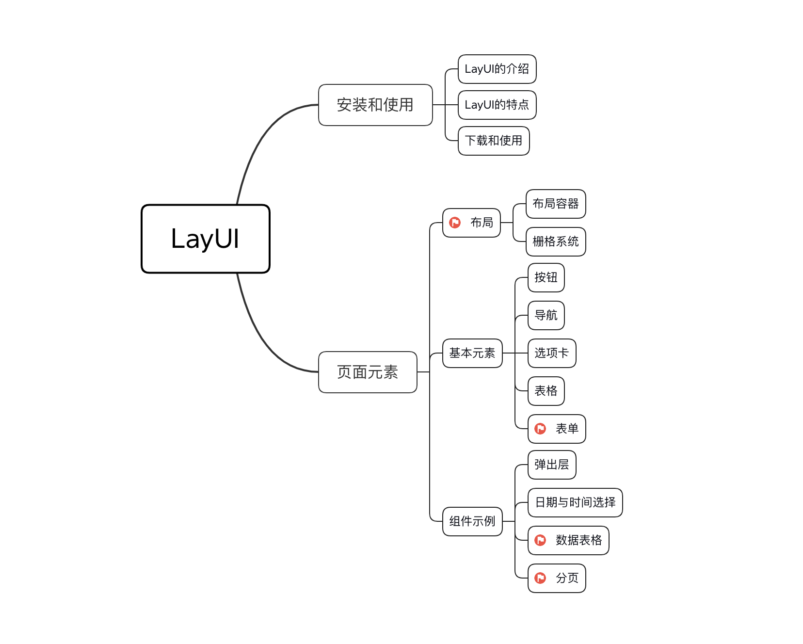
Introduction to LayUI
Laui (homophonic: class UI) is a front-end UI framework written with its own module specifications, which follows the native HTML/CSS/JS writing and organization form, with very low threshold and ready to use.
(Developed by people and factory for 16 years, this framework provides a lot of nice and convenient styles, and is basically ready to use. It is similar to Bootstrap, but it has a great advantage that it defines a number of style interfaces for front-end and back-end interaction, such as paging tables, simply configure the interface on the front-end, and the back-end returns data according to the defined interface rules.Page-by-page display greatly reduces back-end development costs.
Official website: https://www.layui.com
Official Documentation: < https://www.layui.com/doc/>
Features of LayUI
(1) Layerui is a lightweight framework, simple and beautiful.Suitable for developing back-end modes, which work well on service-side pages.
(2) layui is a ui framework for back-end developers, based on DOM drivers.
Download and use
-
stay Official Home Page Download to the latest version of layui.The directory structure is as follows:
├─css // css directory
 │  │─modules // Module css directory (generally if the module is relatively large, we extract it separately, such as the following three:)
 │  │  ├─laydate
 │  │  ├─layer
 │  │  └─layim
 │  └─layui.css // Core Style File
 ├─font  // Font icon directory
 ├─images // Picture Resource Catalog (currently only layim and editor-used GIF emoticons)
 │─lay // Module Core Directory
 │  └─modules // Each module component
 │─layui.js // Base Core Library
 └─layui.all.js // ContainLayui.jsMerge file with all modules
- Once you have the layui and fully deploy it (copy it into the project) to your project directory, you only need to introduce the following two files:
./layui/css/layui.css
./layui/layui.js // Tip: If you are using a non-modular approach, you can replace it here:. /layui/layui.all.js
- Basic Getting Started Page
<!DOCTYPE html>
<html>
<head>
  <meta charset="utf-8">
  <meta name="viewport" content="width=device-width, initial-scale=1, maximum-scale=1">
  <title>Start using layui</title>
  <link rel="stylesheet" href="layui/css/layui.css">
</head>
<body>

<!-- Your HTML Code -->

<script src="layui/layui.js"></script>
<script>
    // Modules and callback functions
    // Typically written directly in a js file
    layui.use(['layer', 'form'], function(){
      var layer = layui.layer
      ,form = layui.form;

      layer.msg('Hello World');
    });
</script>
</body>
</html>-
You also need to declare the modules and callback functions you need to use.Refer to the official documents and choose the effect you want.
For example:
<script>
   // Note: Navigation depends on the element module, otherwise functional operations cannot be performed
   layui.use('element', function(){
        var element = layui.element;

        //...
   });
</script>
Page Elements
layout
Layout Container
Fixed Width
Place the raster in a specific container with class="layui-container" to fix the width and control the columns in devices above the small screen.
<div class="layui-container">
  <div class="layui-row">
    ......
  </div>
</div>
Full width
The container width may not be fixed.Placing a raster or other element in a container with class="layui-fluid" will not fix the width but will fit 100%
<div class="layui-fluid">
  ......
</div>
grid system
To enrich the layout of web pages, simplify the coupling of HTML/CSS code, and enhance the adaptability of multiple terminals, layui introduced a responsive raster system.Containers are divided into 12 equal sections, preset with 4*12 CSS permutation classes that play their respective roles on four different screens: mobile devices, tablets, desktops/large sizes.
Raster Layout Rules
-
Use layui-row to define rows, such as:
<div class="layui-row"></div>
-
Define a set of column s with preset classes like layui-col-md* and place them in row s.Where:
- Variable md represents markup under different screens
- The variable ***** represents the 12-part fraction (for example, 6/12) used by the column, with an optional value of 1 - 12
- If the sum of the "equal value" of multiple columns equals 12, the row is just full.If it is greater than 12, the extra column will automatically start a new row.
-
Columns can appear in up to four different combinations simultaneously: xs (ultra-small screen, such as mobile phone), sm (small screen, such as tablet), md (medium screen on desktop), lg (large screen on desktop).
-
Preset classes such as layui-col-space5, layui-col-md-offset3 can be appended to columns to define the spacing and offset of columns.
- You can fill a column element with any of your own elements
Example:
<h3>General layout (for example, medium screen desktop): </h3>
<div class="layui-row">
    <div class="layui-col-md9" style="background-color: #00F7DE;">
      Your Content 9/12
    </div>
    <div class="layui-col-md3" style="background-color: rosybrown;">
      Your Content 3/12
    </div>
</div>
Responsive Rules
The responsiveness of the raster is enhanced by the strong support of CSS3 Media Queries, which adapts to four different sizes of screens.
| Ultra small screen (mobile phone < 768px) | Small screen (flat Panel > 768px) | Medium screen (desktop > 992px) | Large screen (desktop < 1200px) | |
|---|---|---|---|---|
| Value of.layui-container | auto | 750px | 970px | 1170px |
| sign | xs | sm | md | lg |
| Column Correspondence Class* Equivalent of 1-12 | layui-col-xs* | layui-col-sm* | layui-col-md* | layui-col-lg* |
| Total Columns | 12 | 12 | 12 | 12 |
| Response Behavior | Always arrange horizontally at a set scale | Arrange horizontally under the current screen and stack if the screen size is below the threshold | Arrange horizontally under the current screen and stack if the screen size is below the threshold | Arrange horizontally under the current screen and stack if the screen size is below the threshold |
<h3>Different performance of tablet and desktop:</h3>
<div class="layui-row">
    <div class="layui-col-sm6 layui-col-md4"
         style="background-color: thistle">
        //Flat < 768px:6/12 | Desktop < 992px:4/12
    </div>
</div>

<div class="layui-row">
    <div class="layui-col-sm4 layui-col-md6"
         style="background-color: mediumaquamarine;">
        //Flat < 768px:4/12 | Desktop < 992px:6/12
    </div>
</div>

<div class="layui-row">
    <div class="layui-col-sm12 layui-col-md8"
         style="background-color: coral">
        //Flat < 768px:12/12 | Desktop < 992px:8/12
    </div>
</div>
Column Margins
Set the spacing between columns using the preset class of Column Spacing.The leftmost column in a row does not have a left margin, and the rightmost column does not have a right margin.Column spacing guarantees beautiful layout and further ensures the fineness of the width of the columns.Combining the margins commonly used on Web pages, we preset 12 different sizes of margins:
/* Supports all double-digit intervals between columns of 1px-30px, and single-digit intervals of 1px, 5px, 15px, 25px */
layui-col-space1
layui-col-space2
layui-col-space4
layui-col-space5
layui-col-space6
layui-col-space8
layui-col-space10
layui-col-space12
layui-col-space14
layui-col-space15
layui-col-space16
layui-col-space18
layui-col-space20
layui-col-space22
layui-col-space24
layui-col-space25
layui-col-space26
layui-col-space28
layui-col-space30
Example:
<h3>Column spacing</h3>
<div class="layui-row layui-col-space10">
    <div class="layui-col-md4" >
        <!-- Need to layui-col-md4 One more layer inside div -->
        <div style="background-color: #009688;">
            1/3
        </div>
    </div>
    <div class="layui-col-md4">
        <div style="background-color: burlywood;">
            1/3
        </div>
    </div>
    <div class="layui-col-md4">
        <div style="background-color: silver;">
            1/3
        </div>
    </div>
</div>
Note:
- layui-col-space: Setting the background color padding will also add color as if there were no gaps, mainly because it is padding, which means it will shrink inward.You can do this by adding a div to it.
- Spacing is generally not higher than 30px, and column offsets are recommended if greater than 30.
Column Offset
Append a preset class like layui-col-md-offset* to the column to offset it to the right.The sign represents the number of columns occupied by the offset, optionally 1 - 12.
For example: layui-col-md-offset3*, which means that under Medium Desktop Screen, offset the column three columns to the right
<h3>Column Offset</h3>
<div class="layui-row">
    <div class="layui-col-md4" style="background-color: rosybrown;">
        4/12
    </div>
    <div class="layui-col-md4 layui-col-md-offset4"
         style="background-color: cornflowerblue;">
        //Offset 4 columns to the right
    </div>
</div>
Note: Column offsets can be set to different screen standards, which are valid under the currently set screen. When they are below the required threshold for desktop screens, they are stacked.
Column Nesting
The raster can be nested at an infinite level.Nesting is accomplished by inserting a row element (layui-row) into a column element (layui-col-md*).
<h3>Column Nesting</h3>
<div class="layui-row layui-col-space5">
    <div class="layui-col-md5" style="background-color: thistle;">
        <div class="layui-row">
            <div class="layui-col-md3" style="background-color: burlywood;" >
                //Internal Column
            </div>
            <div class="layui-col-md5" style="background-color: indianred;">
                //Internal Column
            </div>
            <div class="layui-col-md4" style="background-color: mediumaquamarine;">
                //Internal Column
            </div>
        </div>
    </div>
</div>