The main references of this paper are as follows:
- Silverman B.W. Density Estimation. Chapman and Hall, London, 1986
- Standard ISO 13528
Example data introduction
The sample data used in this blog are tables 2.1 and 2.2 in reference 1 of this blog, as follows:
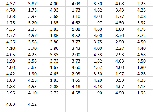
Mental illness treatment duration data sheet
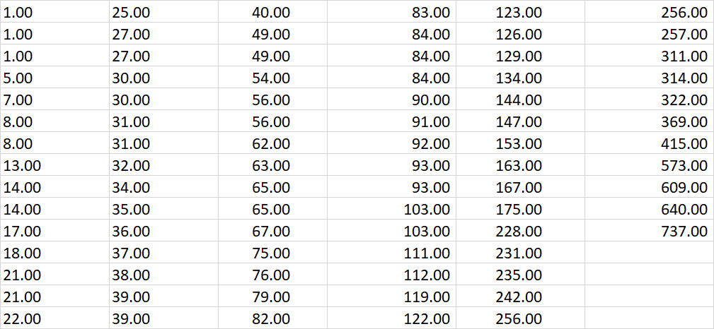
Geyser burst duration data sheet
Introduction to file placement
We put the above data table in another folder named "data" in the code folder:
code:
------->Xxx.py (code)
Data:
------->Geyser outbreak duration schedule
------->Suicidal tendency treatment time
Frequency distribution histogram method
Principle discussion and analysis
Set dataset as X = ( X 1 , X 2 , ⋯ , X n ) X=(X_1, X_2, \cdots, X_n) X=(X1,X2,⋯,Xn):
The frequency distribution histogram requires us to provide the drawing origin
x
0
x_0
x0 and a bandwidth
h
h
h. Will fall on
[
x
0
+
(
m
−
1
)
⋅
h
,
x
0
+
m
⋅
h
]
[x_0 + (m-1)\cdot h, x_0 + m \cdot h]
Count the number of points on [x0 + (m − 1) ⋅ h,x0 + m ⋅ H] and divide it by the bandwidth length:
f
^
(
x
)
=
1
n
h
(
Fall on and
x
On the same bandwidth
X
i
Number of
)
\hat{f}(x) = \frac{1}{nh} (\text {number of} X_i \text {falling on the same bandwidth as} x \text})
f ^ (x)=nh1 (number of Xi falling on the same bandwidth as x)
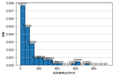
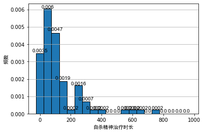
Generally, when analyzing the data, we often use the frequency distribution histogram to preliminarily visualize the data. We draw the frequency distribution histogram between the mental illness treatment duration data table and the geyser outbreak duration data table, as shown below:
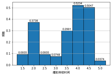
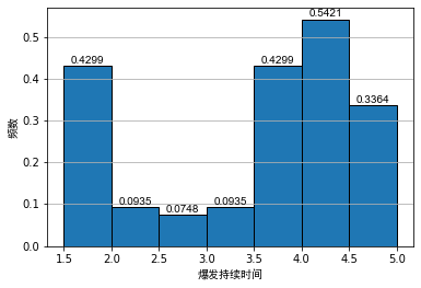
As can be seen from the above figure, even if the bandwidth is the same, different origins of histograms will lead to different visual effects of histograms. For the histogram of outbreak duration of indirect spring, although the first and second diagrams show obvious bimodal distribution, it is difficult to see the interval of bimodal for Figure 2.
For the histogram of psychiatric treatment duration, the second figure is in the area [ 150 , 250 ] [150, 250] At [150250], a secondary peak can be seen. For non statisticians, it is likely to cause the misunderstanding that the data show bimodal distribution. After all, from Figure 1, this is likely to be caused by randomness.
Python code implementation
# -*- coding: utf-8 -*-
"""
Created on Sun Sep 19 10:11:15 2021

@author: zhuozb

This code mainly shows the relevant information in Section II of 13528 reference 30 histogram Use case discussion.

This code mainly discusses the duration of geyser explosion and the frequency distribution of suicide psychotherapy time.
"""

import matplotlib.pyplot as plt
import numpy as np
import pandas as pd

def extract_data(path):
    # Reading Excel datasheets into Python
    table = pd.read_excel(path, header=None)
    # Convert data table to 2D sequence
    data = table.values
    # Eliminate non digital data and convert one-dimensional sequence to two-dimensional sequence
    data = data[~np.isnan(data)]
    return data


def plot_histogram(data, bins='auto', title=''):

    #
    fig, ax = plt.subplots()

    # Draw directly with plt.hist
    freq, bins, patches = plt.hist(data,
                                   bins=bins,
                                   density=True,
                                   edgecolor='black')
    # Label position of frequency distribution histogram
    bin_centers = np.diff(bins)*0.5 + bins[:-1]


    for fr, x, patch in zip(freq, bin_centers, patches):
      height = round(fr, 4)
      plt.annotate("{}".format(height),
                   xy = (x, height),             # top left corner of the histogram bar
                   xytext = (0,0.2),             # offsetting label position above its bar
                   textcoords = "offset points", # Offset (in points) from the *xy* value
                   ha = 'center', va = 'bottom',
                   fontfamily='arial')  # The label is also displayed in a font

    # Automatically adjust the display range of X-axis and Y-axis, although it is of no use
    ax.set_xlim(auto=True)
    ax.set_ylim(auto=True)

    # Label the X and Y axes
    if title != '':
        # If no title is given, the X-axis label is not displayed
        plt.xlabel(title, fontfamily='simhei')
    plt.ylabel('frequency', fontfamily='simhei')


    plt.grid(axis='y')

if __name__ == '__main__':
    eruption_lenght_path = r'../data/Geyser outbreak duration schedule.xlsx'
    treatment_spell_path = r'../data/Suicidal tendency treatment time.xlsx'
    # Read dataset
    # Read data table 2.1
    treatment_spell_data = extract_data(treatment_spell_path)
    # Draw table 2.2
    eruption_lenght_data = extract_data(eruption_lenght_path)

    # Draw figure 2.1
    plot_histogram(eruption_lenght_data, bins=np.arange(1.25, 5.5, 0.5), title='Burst duration')
    plot_histogram(eruption_lenght_data, bins=np.arange(1.5, 5.5, 0.5), title='Burst duration')

    # Draw Figure 2.2
    plot_histogram(treatment_spell_data, bins=np.arange(0, 1000, 50), title='Duration of suicide psychotherapy')
    plot_histogram(treatment_spell_data, bins=np.arange(-25, 1000, 50), title='Duration of suicide psychotherapy')
Simple kernel density estimation
Principle discussion and analysis
The principle of the simple kernel density estimation method is to set the bandwidth of the frequency distribution histogram close to 0. For a probability density function:
f
(
x
)
=
lim
h
→
0
1
2
h
P
(
x
−
h
<
X
<
x
+
h
)
f(x) = \lim_{h\to0} \frac{1}{2h} P(x-h < X < x+h)
f(x)=h→0lim2h1P(x−h<X<x+h)
Therefore, we can use the frequency distribution map with infinitesimal bandwidth to estimate the probability density:
f
^
(
x
)
=
1
2
n
h
(
Fall in bandwidth
(
x
−
h
,
x
+
h
)
Upper
X
i
Number of
)
\hat{f}(x) = \frac{1}{2nh} (\text {number of} X_i \text {falling on bandwidth} (x-h, x+h) \text {)
f ^ (x)=2nh1 (the number of Xi falling on the bandwidth (x − h,x+h))
For convenience of expression, we define a kernel density function as follows:
w
(
x
)
=
{
1
2
if
∣
x
∣
<
1
0
otherwise.
w(x)= \begin{cases}\frac{1}{2} & \text { if }|x|<1 \\ 0 & \text { otherwise. }\end{cases}
w(x)={210 if ∣x∣<1 otherwise.
therefore,
f
^
(
x
)
\hat{f}(x)
f ^ (x) can be expressed as:
f
^
(
x
)
=
1
h
n
∑
i
=
1
n
w
(
x
−
X
i
h
)
\hat{f}(x) = \frac{1}{hn} \sum_{i=1}^{n} w ( \frac{x-X_i}{h} )
f^(x)=hn1i=1∑nw(hx−Xi)
In practical application, of course, the bandwidth does not need to be infinitely close to 0. Taking the duration of geyser outbreak as an example, we can set the bandwidth to 0.25, and the simple kernel density diagram is as follows:
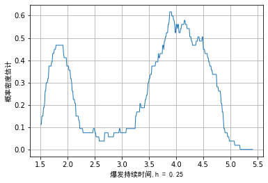
Due to our empirical density function f ^ ( x ) \hat{f}(x) f ^ (x) is not a continuous function and is non differentiable at the break point. It can also be seen intuitively from the above figure that the step part of the image may be confusing to scholars without learning.
Python code implementation
# -*- coding: utf-8 -*-
"""
Created on Sun Sep 19 11:37:22 2021

@author: zhuozb

This is ISO13528 References in, 2 in 30.3 Case drawing of section
"""


import numpy as np
import pandas as pd
import matplotlib.pyplot as plt
from histogram_example_showing import extract_data


def digits_after_decimal(num):
    '''
    Return variable num Number of decimal places
    '''
    num = str(num)
    # Position of decimal point
    digit_loc = num.find('.')

    # Number of digits after decimal point
    digits_decimal = len(num) - digit_loc - 1

    return digits_decimal

def plot_naive_estimator(data, bandwidth=0.25, title=''):
    '''
     data : Data to be counted
     bandwidth: Drawing bandwidth
     title: Draw the title of the image. If not, the title will not be written by default
    '''
    fig, ax = plt.subplots()

    # n is the sample size
    n = len(data)

    # Returns the smallest number in the sequence and generates (limit) interval ranges based on this number
    min_num = min(data)
    # Find the number of digits after the decimal point
    digits_decimal = digits_after_decimal(min_num)

    # Drawing point interval
    data_interval = 0.1**(digits_decimal)

    # Find the maximum number in the sequence to generate the drawing range
    max_num = max(data)

    # Generate drawing points of X axis
    xtick_array = np.arange(0.9*min_num if (min_num>0) else 1.1*min_num,
                            1.1*max_num, data_interval)

    # Generate drawing points of Y axis
    ytick_array = []

    def calculate_y(x, x_data, bandwidth):
        # Solve according to formula 2.1, X corresponds to Y
        y_sum = 0
        for x_i in data:
            # Generate a weight sequence from the data sequence according to (x-X)/h
            weight_array = np.abs((x - x_i)/bandwidth)
            # According to formula 2.1, sum the weight sequence according to conditions
            sum_weight = len(weight_array[(weight_array < 1)])/2
            y_sum = y_sum + sum_weight
        #
        y = y_sum/(n*bandwidth)
        return y

    ytick_array = [calculate_y(x, data, bandwidth) for x in xtick_array]

    # Label the X and Y axes
    if title != '':
        # If no title is given, the X-axis label is not displayed
        plt.xlabel(title, fontfamily='simhei')
    plt.ylabel('Probability density estimation', fontfamily='simhei')
    plt.plot(xtick_array, ytick_array, linewidth=1)
    # Set gridlines
    plt.grid(axis='both')

if __name__ == '__main__':
    eruption_lenght_path = r'../data/Geyser outbreak duration schedule.xlsx'
    treatment_spell_path = r'../data/Suicidal tendency treatment time.xlsx'
    # Read dataset
    # Read data table 2.1
    treatment_spell_data = extract_data(treatment_spell_path)
    # Draw table 2.2
    eruption_lenght_data = extract_data(eruption_lenght_path)
    plot_naive_estimator(eruption_lenght_data, title=f'Burst duration,h = 0.25')
Kernel density estimation
Principle discussion and analysis
As simple as the above, when kernel density estimation is generally used, a kernel density function needs to be defined first
K
(
x
)
K(x)
K(x), the kernel density function is a probability density, which requires that the integral area on the coordinate axis is the unit area. Generally, the standard normal distribution can be taken as the kernel density function:
K
(
x
)
=
1
2
π
exp
(
−
x
2
2
)
K(x) = \frac{1}{\sqrt{2\pi}} \exp(-\frac{x^2}{2})
K(x)=2π
1exp(−2x2)
The empirical density function is defined
f
^
(
x
)
\hat{f}(x)
f ^ (x) is as follows:
f
^
(
x
)
=
1
n
h
∑
i
=
1
n
K
(
x
−
X
i
h
)
\hat{f}(x) = \frac{1}{nh} \sum_{i=1}^{n} K ( \frac{x-X_i}{h} )
f^(x)=nh1i=1∑nK(hx−Xi)
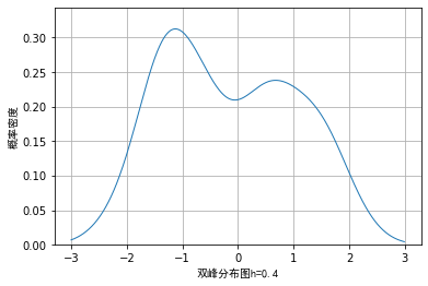
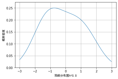
In kernel density estimation, parameter h is generally called window width, and the selection of window width will affect the visualization effect of data. We take 7 data as examples, although a small amount of data is not suitable for visualization by kernel density method in practical application:
The example data is: example_data = [-1.95, -1.5, -0.7, -0.65, -0.62, 0.1, 0.9], the effect when the window width is 0.2, 0.4 and 0.8 respectively can be drawn as follows:
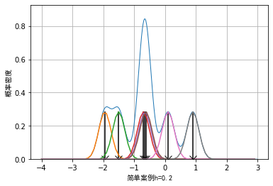
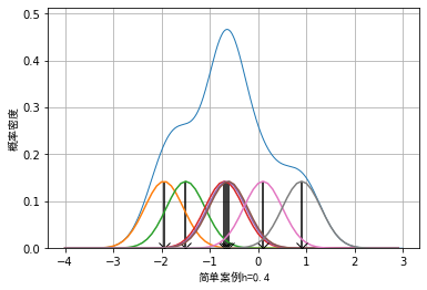
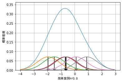
It can be seen that when the selection of window length is small, some details of the data will be enlarged. For example, when the window length is 0.2, the whole data presents an effect similar to Dirac distribution. When the window length is wider, some details of the data will be smoothed. For example, when the window length is 0.8, some sub peak distributions of the data will be covered.
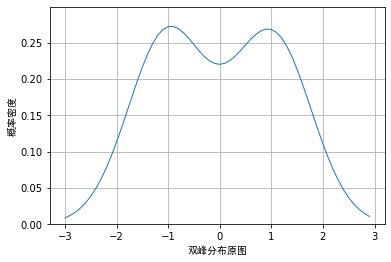
Let's use two distributions as
N
(
−
1
,
0.65
)
N(-1, 0.65)
N(− 1,0.65) and
N
(
1
,
0.65
)
N(1, 0.65)
The cumulative distribution of N(1,0.65) produces 200 random data. Obviously, the cumulative distribution of the two normal distributions is a bimodal distribution, as shown below:
However, when we use random data and draw nuclear density according to different window lengths, the visualization effects are as follows:
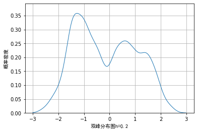
From the above images, we also verified the previous conclusion and that if the window length is too small, some details may be enlarged, while if the window length is too large, some details may be covered and cannot be seen.
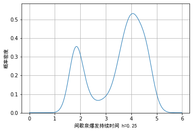
Next, we will use the data of geyser burst duration and the method of nuclear density to draw the picture. The visual effect is as follows:
One disadvantage of drawing with kernel density method is that in addition to the above selection of window length, some unidirectional trailing data may also cause errors in the expression of some details due to the selection of kernel density.
For example, in our data of psychiatric treatment duration, the value of the data must be greater than 0, while the kernel density function stipulates that the value range of the data is
[
−
∞
,
∞
]
[-\infty, \infty]
[−∞,∞]. Taking the example data as an example, we draw the visualization effect when the window length is 20 and 60:
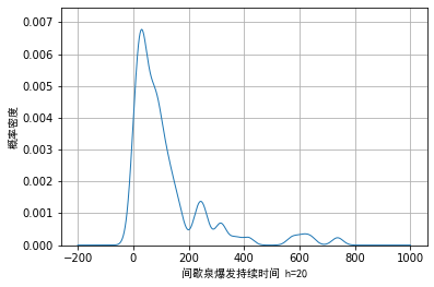
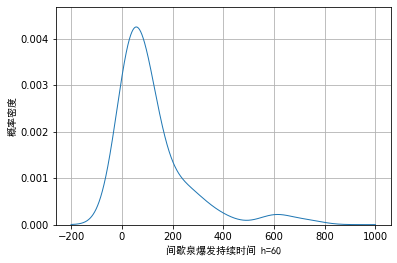
We can see from Figure 1 that when the window length is selected to be small, certain noise will appear in the trailing part on the right. When the wound length is selected to be large, although these noises can be smoothly transited, the details of the main part cannot be fully displayed.
Python code implementation
# -*- coding: utf-8 -*-
"""
Created on Sun Sep 19 22:05:00 2021

@author: zhuozb

according to ISO13528 References, 2 of 30.4 Section and density estimation drawing
"""

import numpy as np
import pandas as pd
import matplotlib.pyplot as plt
from scipy.stats import norm
from histogram_example_showing import extract_data
from naive_estimator_example_showing import digits_after_decimal
from scipy.stats import binom
import random

def kernel_function(x):
    '''
    Density function
    '''
    return norm.pdf(x)


def plot_kernel_estimate(data, fn, window_width=0.4, size=None,
                         title='', interval=None):

    # sample size
    n = len(data)
    # Returns the smallest number in the sequence,
    min_num = min(data)

    # Find the maximum number in the sequence to generate the drawing range
    max_num = max(data)

    if interval == None:
        # If the drawing interval is not given, it is automatically generated according to the digits after the decimal point of the minimum value in the data
        # Find the number of digits after the decimal point of the minimum value
        digits_decimal = digits_after_decimal(min_num)
        # Generate drawing range
        interval = 0.1**(digits_decimal)

    if size == None:
        # Generate drawing and drawing range
        xtick_array = np.arange(0.9*min_num if (min_num>0) else 1.1*min_num,
                                1.1*max_num, interval)
    else:
        xtick_array = np.arange(size[0], size[1], interval)

    ytick_array = []
    for x in xtick_array:
        x_trans = (x - data)/window_width
        y_norm = fn(x_trans)
        y = np.sum(y_norm)/(n*window_width)
        ytick_array.append(y)

    plt.plot(xtick_array, ytick_array, linewidth=1)
    plt.ylim((0, 1.1*max(ytick_array)))
    # Label the X and Y axes

    plt.xlabel(title+f'h={window_width}', fontfamily='simhei')
    plt.ylabel('probability density', fontfamily='simhei')
    # Set gridlines
    plt.grid(axis='both')

def example_showing(window_width=0.4, title=''):
    '''
    This function is mainly used to draw an example diagram
    '''
    example_data = [-1.95, -1.5, -0.7, -0.65, -0.62, 0.1, 0.9]
    plot_kernel_estimate(example_data, kernel_function, title=title,
                         window_width=window_width, size=(-4, 3))

    # sample size
    n = len(example_data)

    # Returns the smallest number in the sequence,
    min_num = min(example_data)

    # Find the maximum number in the sequence to generate the drawing range
    max_num = max(example_data)

    size = (-4, 3)

    if size == None:
        # Generate drawing and drawing range
        xtick_array = np.arange(0.9*min_num if (min_num>0) else 1.1*min_num,
                                1.1*max_num, 0.1)
    else:
        xtick_array = np.arange(size[0], size[1], 0.1)

    def plot_individual(x):
        # Draw the normal distribution of each point of the original data
        # Find the Y corresponding to the X axis, which has been used for drawing
        ytick_array = (xtick_array - x)/window_width
        ytick_array = norm.pdf(ytick_array)/(n*window_width)
        # Draw the normal distribution of the original data
        plt.plot(xtick_array, ytick_array)
        # Mark the original data points and draw a straight line parallel to the Y axis
        plt.plot(x, 0, marker='x', color='black', markersize=10)
        plt.vlines(x, 0, norm.pdf(0)/(n*window_width), color='black')

    for x in example_data:
        # Draw the normal distribution of each original data
        plot_individual(x)

def bimodal_example_showing(data, kernel_function,
                            window_width, interval=0.01, title=''):
    plot_kernel_estimate(data, kernel_function, window_width,
                         size=(-3, 3), title=title, interval=0.01)


if __name__ == '__main__':
    # Draw the figure in the reference, 2.42.5
    for window_width in (0.2, 0.4, 0.8):
        fig = plt.figure()
        example_showing(window_width, title='Simple case')
        plt.show()

    # A bimodal distribution of data is generated and the amount of data is 200
    # The peak values of the data are - 1 and 1 respectively. The data uses normal distribution, and the variance of the normal distribution is 0.65
    np.random.seed(seed=3)
    def generate_bimodal(low1=-2.5, high1=0.5, mode1=-1,
                          low2=-0.5, high2=2.5, mode2=1):
        data = [norm.rvs(-1, 0.65)  if random.choice((0,1))
                else norm.rvs(1, 0.65) for i in range(200)]

        return data

    data = generate_bimodal()

    # Draw figure 2.6 in the references
    for window_width in (0.2, 0.4, 0.8):
        fig = plt.figure()
        bimodal_example_showing(data, kernel_function,
                                window_width, title='Bimodal distribution')

    # Draw the original probability density distribution of bimodal distribution
    def plot_bimodal_kernal():
        data = [norm.rvs(-1, 0.65)  if random.choice((0,1))
                else norm.rvs(1, 0.65) for x in range(20000)]

        fig = plt.figure()
        plot_kernel_estimate(data, kernel_function, window_width=0.4, size=(-3,3),
                              interval=0.1)
        plt.ylabel('probability density', fontfamily='simhei')
        plt.xlabel('Original bimodal distribution', fontfamily='simhei')
        plt.show()

    plot_bimodal_kernal()

    # Read the sample data of the two tables and draw their and density diagrams

    # Read the geyser burst duration data sheet
    eruption_lenght_path = r'../data/Geyser outbreak duration schedule.xlsx'
    eruption_lenght_data = extract_data(eruption_lenght_path)
    # Draw figure 2.8
    fig = plt.figure()
    plot_kernel_estimate(eruption_lenght_data, kernel_function, window_width=0.25,
                         size=(0,6), title='Geyser burst duration ')
    plt.show()

    # Read suicide treatment duration data
    treatment_spell_path = r'../data/Suicidal tendency treatment time.xlsx'
    treatment_spell_data = extract_data(treatment_spell_path)
    # Draw figures 2.9a and 2.9b
    for h in (20, 60):
        fig = plt.figure()
        plot_kernel_estimate(treatment_spell_data, kernel_function, window_width=h,
                             size=(-200, 1000), title='Geyser burst duration ')
        plt.show()
Kernel density estimation of minimum nearest neighbor method
Principle discussion and analysis
From the discussion and analysis of the above methods, it can be seen that a fixed window width or bandwidth width will lead to either noise or covering the details of the main part. Therefore, can we dynamically determine the window length according to the distance between data? The minimum nearest neighbor method solves this problem:
Define current data
x
x
x and raw data set
X
i
,
i
∈
(
1
,
2
,
⋯
,
n
)
X_i, i\in(1,2,\cdots, n)
The distance of Xi, i ∈ (1,2,..., n) is
d
i
=
∣
x
−
X
i
∣
d_i = |x- X_i|
di = ∣ x − Xi ∣, sort the data in ascending order and find the k-th minimum distance
d
k
d_k
dk. Where K is the number of nearest neighbors and is an integer greater than 0, so the empirical density function can be obtained as follows:
f
^
(
x
)
=
k
2
n
d
k
\hat{f}(x) = \frac{k}{2n d_k}
f^(x)=2ndkk
This formula is actually very easy to understand, assuming that the probability density of data points is
f
(
x
)
f(x)
f(x), then when the bandwidth
r
r
When r is small, we expect to have
2
r
n
f
(
x
)
2 r n f(x)
2rnf(x) data falling in bandwidth
[
x
−
r
,
x
+
r
]
[x-r, x+r]
[x−r,x+r]. Let's say, if there are k data falling in the interval
[
x
−
d
k
,
x
+
d
k
]
[x-d_k, x+d_k]
In [x − dk, x+dk], i.e
k
=
2
d
k
n
f
(
x
)
k = 2d_k n f(x)
k=2dk nf(x), then the probability density function can be estimated as:
f
^
(
x
)
=
k
2
n
d
k
\hat{f}(x) = \frac{k}{2n d_k}
f^(x)=2ndkk.
about x < X m i n x < X_{min} For the point x < xmin , we need to ensure that our window width is not too large, so we need to d k = X ( k ) − x d_k = X_{(k)} - x dk=X(k)−x; Similarly, for x > X m a x x > X_{max} x> Xmax, you need to d k = x − X ( n − k + 1 ) d_k = x - X_{(n-k+1)} dk = x − X(n − k+1), where X ( i ) , i ∈ ( 1 , 2 , ⋯ , n ) X_{(i)}, i\in(1,2,\cdots,n) X(i), i ∈ (1,2,..., n) is the original data X i , i ∈ ( 1 , 2 , ⋯ , n ) X_i, i\in(1,2,\cdots,n) Xi, i ∈ (1,2,..., n).
One disadvantage of using the minimum nearest neighbor method for density estimation is that the kernel density function of the minimum nearest neighbor method is not a probability density function, and it is not a unit area for the integral area on the X-axis. Therefore, when using this method for visualization, the data tailing will be very serious.
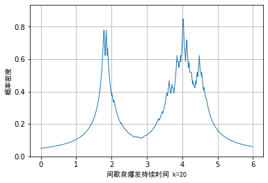
In addition, when using this method for density estimation, the kernel density
d
k
d_k
At the break point of dk , the kernel density is non differentiable, which will lead to more burrs in the visualization effect. We have seen the example data of star weight burst duration as an example. The minimum nearest neighbor method is used for density estimation, and the visualization effect is as follows:
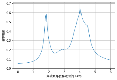
In order to alleviate this problem, we can combine the kernel density function of normal distribution with the minimum nearest neighbor method. The estimation formula of the empirical density function is as follows:
f ^ ( x ) = 1 n d k ∑ i = 1 n K ( x − X i d k ) \hat{f}(x)=\frac{1}{n d_{k}} \sum_{i=1}^{n} K\left(\frac{x-X_{i}}{d_{k}}\right) f^(x)=ndk1i=1∑nK(dkx−Xi)
The visualization effect of the example data is as follows. It can be seen that although the problem is alleviated, the essential problem is still not solved, that is:
- The kernel density function is not a probability density function
- Non differentiable at some points
Python code implementation
# -*- coding: utf-8 -*-
"""
Created on Mon Sep 20 09:12:34 2021

@author: zhuozb

This code mainly shows the standards, ISO13528 References, 30 of 2.5 The minimum adjacent value method in the section draws the composite density diagram
"""

import numpy as np
import pandas as pd
import matplotlib.pyplot as plt
from histogram_example_showing import extract_data
from naive_estimator_example_showing import digits_after_decimal
from kernel_estimate_example_showing import kernel_function


def nearest_neighbour_method(data, k=20, fn='uniform', title='', size=None,
                             interval=None):

    # sample size
    n = len(data)
    # Returns the smallest number in the sequence,
    min_num = min(data)

    # Find the maximum number in the sequence to generate the drawing range
    max_num = max(data)

    if interval == None:
        # If the drawing interval is not given, it is automatically generated according to the digits after the decimal point of the minimum value in the data
        # Find the number of digits after the decimal point of the minimum value
        digits_decimal = digits_after_decimal(min_num)
        # Generate drawing range
        interval = 0.1**(digits_decimal)

    if size == None:
        # Generate drawing and drawing range
        xtick_array = np.arange(0.9*min_num if (min_num>0) else 1.1*min_num,
                                1.1*max_num, interval)
    else:
        xtick_array = np.arange(size[0], size[1], interval)

    ytick_array = []
    # Sort raw data
    data_sort = np.sort(data)
    data_k = data_sort[0]
    data_n = data_sort[-1]

    for x in xtick_array:
        # If the current X point is less than a K minimum value of the original data or greater than the maximum value of the original data, d use another method to solve it
        if x < data_k:
            diff_k = data_sort[k-1] - x
        elif x > data_n:
            diff_k = x - data_sort[n-k]
        else:
            # Find the distance between the current X and the data point
            diff = np.abs(x - data)
            # Find the K-th minimum distance
            diff_sort = np.sort(diff)
            diff_k = diff_sort[k-1]

        if fn == 'uniform':
            # Tool 2.3, find F
            y = k/(2*n*diff_k)
        else:
            y_fn = fn((x-data)/diff_k)
            y = np.sum(y_fn)/(n*diff_k)

        ytick_array.append(y)

    plt.plot(xtick_array, ytick_array, linewidth=1)
    plt.ylim((0, 1.1*max(ytick_array)))
    # Label the X and Y axes

    plt.xlabel(title+f'k={k}', fontfamily='simhei')
    plt.ylabel('probability density', fontfamily='simhei')
    # Set gridlines
    plt.grid(axis='both')


if __name__ == '__main__':
    # Read the geyser burst duration data sheet
    eruption_lenght_path = r'../data/Geyser outbreak duration schedule.xlsx'
    eruption_lenght_data = extract_data(eruption_lenght_path)
    # Draw figure 2.10

    nearest_neighbour_method(eruption_lenght_data, k=20,
                          size=(0,6), title='Geyser burst duration ')

    # Combining kernel density method and minimum nearest neighbor method
    nearest_neighbour_method(eruption_lenght_data, k=20, fn=kernel_function,
                          size=(0,6), title='Geyser burst duration ')
Dynamic kernel density method
Principle discussion and analysis
Inspired by the minimum nearest neighbor method, we can dynamically adjust the width of the window in combination with the spacing between the data in the original data
d
j
k
d_jk
dj k is the data set
X
i
X_i
Xi # and remaining data
X
j
X_j
Xj
[
k
/
2
]
[k/2]
[k/2] minimum distances so that there is an empirical density function as follows:
f
^
(
t
)
=
1
n
∑
j
=
1
n
1
h
d
j
,
k
K
(
t
−
X
j
h
d
j
,
k
)
\hat{f}(t)=\frac{1}{n} \sum_{j=1}^{n} \frac{1}{h d_{j, k}} K\left(\frac{t-X_{j}}{h d_{j, k}}\right)
f^(t)=n1j=1∑nhdj,k1K(hdj,kt−Xj)
Using this method, we need to select the minimum number of nearest neighbors k and window length (I really think it solves one problem and another problem). Taking the data of psychotherapy duration as an example, we use dynamic and density methods
k
=
8
,
h
=
5
k=8, h=5
k=8,h=5, the visualization effect is as follows:
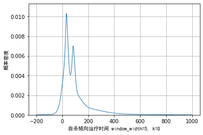
It can be seen from the above figure that the dynamic kernel density method can smoothly transition the noise of the trailing part on the right and reflect the specific details of the main part. Compared with the kernel density of the minimum net spirit method, it also solves the problem that the kernel density is probability density and differentiable, so it is a good method. But one disadvantage is that two parameters need to be selected, which is more subjective.
Python code implementation
# -*- coding: utf-8 -*-
"""
Created on Mon Sep 20 10:02:00 2021

@author: zhuozb

This code implements the standard ISO13528 The publicity in reference 30, 2.6 Variable kernel density estimation
"""

import numpy as np
import pandas as pd
import matplotlib.pyplot as plt
from histogram_example_showing import extract_data
from naive_estimator_example_showing import digits_after_decimal
from kernel_estimate_example_showing import kernel_function

def variable_kernel_estimate(data, fn=kernel_function, window_width=5, k=8, title='',
                             size=None, interval=None):

    # sample size
    n = len(data)
    # Returns the smallest number in the sequence,
    min_num = min(data)

    # Find the maximum number in the sequence to generate the drawing range
    max_num = max(data)

    if interval == None:
        # If the drawing interval is not given, it is automatically generated according to the digits after the decimal point of the minimum value in the data
        # Find the number of digits after the decimal point of the minimum value
        digits_decimal = digits_after_decimal(min_num)
        # Generate drawing range
        interval = 0.1**(digits_decimal)

    if size == None:
        # Generate drawing and drawing range
        xtick_array = np.arange(0.9*min_num if (min_num>0) else 1.1*min_num,
                                1.1*max_num, interval)
    else:
        xtick_array = np.arange(size[0], size[1], interval)

    ytick_array = []
    for x in xtick_array:
        # For the data on the most beautiful coordinate axis X, calculate the data on the Y axis according to formula 2.6
        y_sum = 0
        for x_data in data:
            # For each point of the original data, find out the k-th minimum nearest neighbor distance between it and other N-1 points
            diff = np.abs(data-x_data)
            diff_sort = np.sort(diff)
            diff_jk = diff_sort[round(k/2)]

            # Calculate the density estimate according to formula 2.6
            x_trans = (x-x_data)/(window_width*diff_jk)
            y_fn = fn(x_trans)/(window_width*diff_jk)
            y_sum = y_sum + y_fn

        y = y_sum/n
        ytick_array.append(y)

    plt.plot(xtick_array, ytick_array, linewidth=1)
    plt.ylim((0, 1.1*max(ytick_array)))
    # Label the X and Y axes

    plt.xlabel(title+f'window_width={window_width}, k={k}', fontfamily='simhei')
    plt.ylabel('probability density', fontfamily='simhei')
    # Set gridlines
    plt.grid(axis='both')

if __name__ == '__main__':
    # Read suicide treatment duration data
    treatment_spell_path = r'../data/Suicidal tendency treatment time.xlsx'
    treatment_spell_data = extract_data(treatment_spell_path)
    # Draw figure 2.11
    variable_kernel_estimate(treatment_spell_data, window_width=5,
                             k=8, fn=kernel_function,
                             size=(-200,1000), title='Suicidal tendency treatment time ',
                             interval=1)