
preface
HarmonyOS ArkUI 3.0 framework trial first experience 2 comes |゙ ( ̄▽  ̄) ノミ| Ю, This time compared with the last time Synthetic development practice , some contents are added: display animation, page Jump and data transfer, Grid container Grid, custom window, etc. Originally, I wanted to make distributed HarmonyOS ArkUI 3.0 kapok mine sweeping, but because there is no corresponding API version of distributed simulator or multiple real machines for debugging and operation, I can only end up with a single embarrassing actual battle  ̄ □  ̄ |
design sketch
::: hljs-center
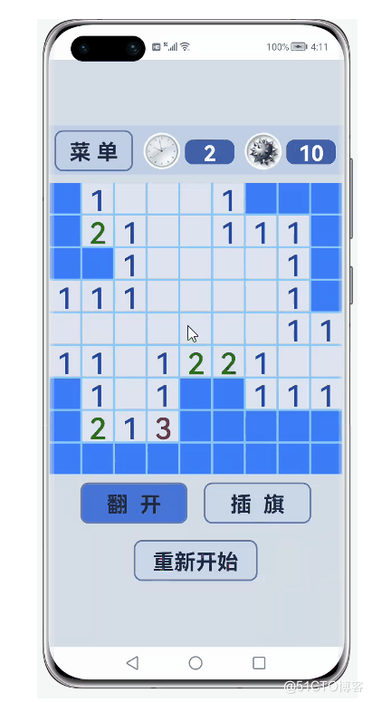
:::
Code file structure
::: hljs-center
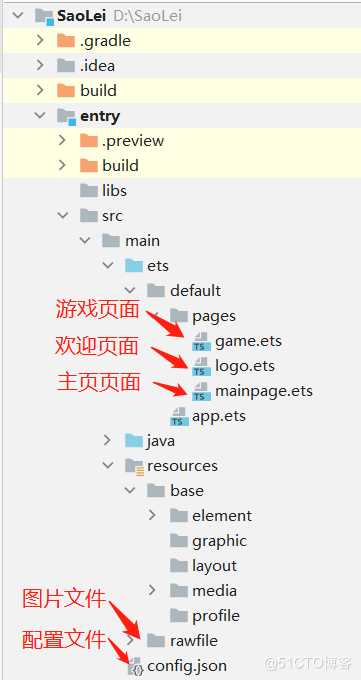
:::
text
1, Create a blank project
1. Install and configure DevEco Studio 3.0
DevEco Studio 3.0 download
DevEco Studio 3.0 installation
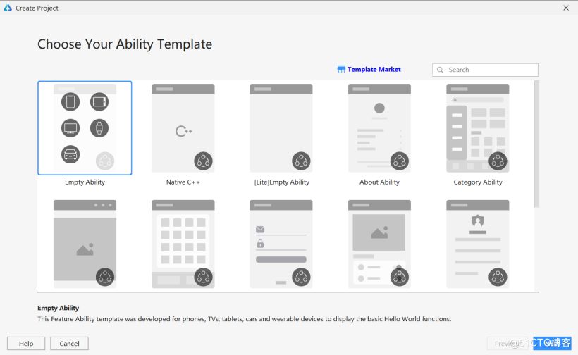
2. Create an empty ETS Capability Application
After the DevEco Studio is downloaded and installed successfully, open DevEco Studio, click File in the upper left corner, click New, select New Project, select Empty Ability, and click Next.
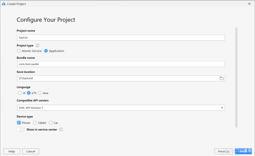
Name the file SaoLei (the file name cannot appear Chinese or special characters, otherwise the project file cannot be successfully created), check Application for Project Type, select the save path, check eTS for Language, select API7, check Phone for device, and finally click Finish.
3. Preparation
Add the following code after "launchType": "standard" at the bottom of the entry > SRC > main > config.json file, so that the label bar above the application can be removed.
config.json bottom part code:
"metaData": {
      "customizeData": [
        {
          "name": "hwc-theme",
          "value": "androidhwext:style/Theme.Emui.Light.NoTitleBar",
          "extra": ""
        }
      ]
    }
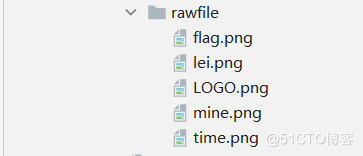
4. Save the picture
Save the picture to the entry > SRC > main > Resources > rawfile file.
2, Welcome page
1. Change the file name
Right click the entry > SRC > ETS > Default > pages > index.ets file, select Refactor in the pop-up menu bar, and then select Rename in the pop-up submenu bar, or press Shift+F6 to name the file logo.ets.
Change the "pages/index" in the "pages" item in the "js" item in the entry > SRC > main > config.json file to "pages/logo".
config.json bottom part code:
    "js": [
      {
        "mode": {
          "syntax": "ets",
          "type": "pageAbility"
        },
        "pages": [
          "pages/logo"
        ],
        "name": "default",
        "window": {
          "designWidth": 720,
          "autoDesignWidth": false
        }
      }
    ]
2. Add background
In the logo.ets file, the Logo image can be placed through Image($rawfile('LOGO.png '), and the text content can be placed through Text('kapok minesweeping').
The property linearGradient sets the gradient color, the angle in linearGradient is the gradient angle, which is set to 180, that is, the gradient from top to bottom, and colors is the gradient color.
logo.ets:
@Entry
@Component
struct Logo {
  build() {
    Flex({ justifyContent: FlexAlign.Center, alignItems: ItemAlign.Center, direction: FlexDirection.Column }) {
      Image($rawfile('LOGO.png'))
        .objectFit(ImageFit.Contain)
        .height(300)
      Text('Kapok minesweeping')
        .fontSize(30)
        .fontColor(Color.White)
        .margin({ top: 200 })
    }
    .width('100%')
    .height('100%')
    .linearGradient(
      {
        angle: 180,
        colors: [['#D3D7DC', 0.1], ["#B4BED2", 0.6],  ["#A0AAC8", 1]]
      })
  }
}
3. Add animation effect
The animation effect used here is realized through animateTo explicit animation. animateTo explicit animation can set the animation effect of the change of components from state A to state B, including the addition and deletion of styles, location information and nodes. Developers do not need to pay attention to the change process, but only need to specify the state of the starting point and end point. animateTo also provides A callback interface for playback status, which is an enhancement and encapsulation of attribute animation.
Add the state variables opacityValue and scaleValue and initialize them to 0, which are respectively used to represent the times of transparency and zoom in and out. The gradual out and zoom in effect of the Logo can be realized by realizing these two values from 0 to 1 in the animation effect.
Define a Bezier curve cubicBezier, Curves.cubicBezier(0.1, 0.2, 1, 1). Since the interpolation calculation in the animation capability interface needs to be used, the curves module needs to be imported@ ohos.curves module provides initialization functions for linear Curve. Linear, step, cubic Bezier and spring interpolation curves. You can create an interpolation curve object according to the input parameters.
In animateTo explicit animation, set the animation duration to 2s, delay to 0.1s, and set the closure function (curve) to display dynamic effect event s, that is, the transparency opacityValue and size scaleValue from 0 to 1 from the start state to the end state.
logo.ets:
// @ts-nocheck
import Curves from '@ohos.curves'

@Entry
@Component
struct Logo {
  @State private opacityValue: number = 0
  @State private scaleValue: number = 0
  private curve1 = Curves.cubicBezier(0.1, 0.2, 1, 1)

  build() {
    Flex({ justifyContent: FlexAlign.Center, alignItems: ItemAlign.Center, direction: FlexDirection.Column }) {
      Image($rawfile('LOGO.png'))
        .objectFit(ImageFit.Contain)
        .height(300)
        .scale({ x: this.scaleValue, y: this.scaleValue })
        .opacity(this.opacityValue)
        .onAppear(() => {
          animateTo({
            duration: 2000,
            curve: this.curve1,
            delay: 100,
          }, () => {
            this.opacityValue = 1
            this.scaleValue = 1
          })
        })
      Text('Kapok minesweeping')
        .fontSize(30)
        .fontColor(Color.White)
        .margin({ top: 200 })
    }
    .width('100%')
    .height('100%')
    .linearGradient(
      {
        angle: 180,
        colors: [['#D3D7DC', 0.1], ["#B4BED2", 0.6],  ["#A0AAC8", 1]]
      })
  }
}
4. Add jump effect
First create a mainpage.ets file.
In the onFinish callback interface that animateTo shows the end of animation play, calling the setTimeout interface of timer Timer to delay 1s, calling router.replace to display mainpage.ets page. The router module also needs to be imported.
logo.ets:
// @ts-nocheck
import router from '@system.router'
import Curves from '@ohos.curves'

@Entry
@Component
struct Logo {
  @State private opacityValue: number = 0
  @State private scaleValue: number = 0
  private curve1 = Curves.cubicBezier(0.1, 0.2, 1, 1)

  build() {
    Flex({ justifyContent: FlexAlign.Center, alignItems: ItemAlign.Center, direction: FlexDirection.Column }) {
      Image($rawfile('LOGO.png'))
        .objectFit(ImageFit.Contain)
        .height(300)
        .scale({ x: this.scaleValue, y: this.scaleValue })
        .opacity(this.opacityValue)
        .onAppear(() => {
          animateTo({
            duration: 2000,
            curve: this.curve1,
            delay: 100,
            onFinish: () => {
              setTimeout(() => {
                router.replace({ uri: "pages/mainpage" })
              }, 1000);
            }
          }, () => {
            this.opacityValue = 1
            this.scaleValue = 1
          })
        })
      Text('Kapok minesweeping')
        .fontSize(30)
        .fontColor(Color.White)
        .margin({ top: 200 })
    }
    .width('100%')
    .height('100%')
    .linearGradient(
      {
        angle: 180,
        colors: [['#D3D7DC', 0.1], ["#B4BED2", 0.6],  ["#A0AAC8", 1]]
      })
  }
}
3, Home page
1. Add background
The background of the game page is almost the same as that of the welcome page. I won't repeat it here.
mainpage.ets:
@Entry
@Component
struct Mainpage {
  build() {
    Column() {
      Image($rawfile('mine.png'))
        .objectFit(ImageFit.Contain)
        .height(300)
        .scale({ x: 0.5, y: 0.5 })
        .opacity(0.8)
    }
    .width('100%')
    .height('100%')
    .linearGradient(
      {
        angle: 180,
        colors: [['#D3D7DC', 0.1], ["#B4BED2", 0.6],  ["#A0AAC8", 1]]
      })
  }
}
2. Add button
It can be seen from the effect drawing that the Button styles are consistent, so we can use the decorator @ Component to customize the Button. Add four variables: String, difficulty and Number_row and Number_column, which is used to record the difficulty text, the number of mines, the number of rows and columns of the grid respectively. Set the style of picture and text in the Button Component. Br / > in the component decorated by decorator @ Entry, draw three buttons in the form of calling custom components.
mainpage.ets:
@Entry
@Component
struct Mainpage {
  build() {
    Column() {
      Image($rawfile('mine.png'))
        .objectFit(ImageFit.Contain)
        .height(300)
        .scale({ x: 0.5, y: 0.5 })
        .opacity(0.8)

      setButton({ String: 'primary', difficulty: 10, Number_row: 9, Number_column: 9 });
      setButton({ String: 'intermediate', difficulty: 30, Number_row: 12, Number_column: 12 });
      setButton({ String: 'senior', difficulty: 50, Number_row: 16, Number_column: 16 });
    }
    .width('100%')
    .height('100%')
    .linearGradient(
      {
        angle: 180,
        colors: [['#D3D7DC', 0.1], ["#B4BED2", 0.6],  ["#A0AAC8", 1]]
      })
  }
}

@Component
struct setButton {
  private String: string
  private difficulty: number
  private Number_row: number
  private Number_column: number

  build() {
    Button({ type: ButtonType.Capsule, stateEffect: true }){
      Column(){
        Text(this.String)
          .textAlign(TextAlign.Center)
          .fontSize(30)
          .fontWeight(600)
          .fontColor('#0000FF')
          .margin({ top: -5 })
        Flex({ justifyContent: FlexAlign.Center, alignItems: ItemAlign.Center, direction: FlexDirection.Row }) {
          Text('( ' + this.difficulty.toString() + 'individual')
            .textAlign(TextAlign.Center)
            .fontSize(22)
            .fontWeight(600)
            .fontColor('#416EBE')
            .margin({ top: -2, right: 5 })
          Image($rawfile('mine.png'))
            .height(26)
            .width(26)
          Text(this.Number_row.toString() + '*' + this.Number_column.toString() + ' )')
            .textAlign(TextAlign.Center)
            .fontSize(22)
            .fontWeight(600)
            .fontColor('#416EBE')
            .margin({ left: 5, top: -2})
        }.margin({ top: 5 })
      }
    }
    .width(220)
    .height(90)
    .backgroundColor('#F3F7FF')
    .margin({ top: 10 })
  }
}
3. Respond to click jump events
First create a game.ets file.
Add the click event onClick() in the user-defined button component and call the router.push interface, where uri is the page to jump and params is the data carried, in the form of params: {key: values}. Call router.getParams().key on the new page to obtain the data corresponding to the key carried when the page jumps, which also needs to be imported into the router module.
mainpage.ets:
import router from '@system.router'

@Entry
@Component
struct Mainpage {
  build() {
    Column() {
      Image($rawfile('mine.png'))
        .objectFit(ImageFit.Contain)
        .height(300)
        .scale({ x: 0.5, y: 0.5 })
        .opacity(0.8)

      setButton({ String: 'primary', difficulty: 10, Number_row: 9, Number_column: 9 });
      setButton({ String: 'intermediate', difficulty: 30, Number_row: 12, Number_column: 12 });
      setButton({ String: 'senior', difficulty: 50, Number_row: 16, Number_column: 16 });
    }
    .width('100%')
    .height('100%')
    .linearGradient(
      {
        angle: 180,
        colors: [['#D3D7DC', 0.1], ["#B4BED2", 0.6],  ["#A0AAC8", 1]]
      })
  }
}

@Component
struct setButton {
  private String: string
  private difficulty: number
  private Number_row: number
  private Number_column: number

  build() {
    Button({ type: ButtonType.Capsule, stateEffect: true }){
      Column(){
        Text(this.String)
          .textAlign(TextAlign.Center)
          .fontSize(30)
          .fontWeight(600)
          .fontColor('#0000FF')
          .margin({ top: -5 })
        Flex({ justifyContent: FlexAlign.Center, alignItems: ItemAlign.Center, direction: FlexDirection.Row }) {
          Text('( ' + this.difficulty.toString() + 'individual')
            .textAlign(TextAlign.Center)
            .fontSize(22)
            .fontWeight(600)
            .fontColor('#416EBE')
            .margin({ top: -2, right: 5 })
          Image($rawfile('mine.png'))
            .height(26)
            .width(26)
          Text(this.Number_row.toString() + '*' + this.Number_column.toString() + ' )')
            .textAlign(TextAlign.Center)
            .fontSize(22)
            .fontWeight(600)
            .fontColor('#416EBE')
            .margin({ left: 5, top: -2})
        }.margin({ top: 5 })
      }
    }
    .width(220)
    .height(90)
    .backgroundColor('#F3F7FF')
    .margin({ top: 10 })
    .onClick(() => {
      router.push({
        uri: 'pages/game',
        params: { difficulty: this.difficulty, Number_row: this.Number_row ,Number_column: this.Number_column }
      })
    })
  }
}
So far, both the welcome page and the main page have been completed. In Kapok mine clearance based on HarmonyOS ArkUI 3.0 framework (Part 2) We will continue to share the implementation of the game page (~  ̄▽  ̄) ~
Pay attention to me and share knowledge every day~