Example background:
My friend Helen has been using online dating sites to find suitable dates. Although dating websites recommend different people, she doesn't like everyone. After summing up, she found that she had met three types of people:
(1) dislikes the person;
(2) Charming people;
(3) Charming people;
Despite these findings, Helen still can't categorize the matches recommended by dating websites properly. She feels that she can date attractive people from Monday to Friday, while she prefers to be with attractive people on weekends. Helen hopes that our classification software can better help her classify matched objects into exact categories. In addition, Helen has collected some data information that has not been recorded on dating websites, which she believes is more conducive to categorizing matches.
Preparing data: parsing data from text files
Helen has been collecting dating data for some time. She keeps these data in the text file datingTestSet.txt. Each sample takes up one row, totaling 1000 rows. Helen's samples mainly include the following three characteristics:
1. The number of frequent flyer miles obtained annually;
2. Percentage of time spent playing video games;
3. The number of ice-cream liters consumed per week;
Before input the feature data to the classifier, the format of the data to be processed must be changed to a format acceptable to the classifier. Create a function called file2matrix in kNN.py to handle the input format problem. The input of the function is a text file name string, and the output is a training sample matrix and class label vector.
Analytical data: Create scatter plots using Matplotlib
import matplotlib as mpl
import matplotlib.pyplot as plt
import operator


def file2matrix(filename):  #get data
    f = open(filename)
    arrayOLines = f.readlines()
    numberOfLines = len(arrayOLines)
    returnMat = zeros((numberOfLines,3),dtype=float)
    #zeros(shape, dtype, order), create a shape size matrix of all 0, dtype is the data type, the default is float,
       #order denotes the arrangement in memory (in C or Fortran) and defaults to C.
    classLabelVector = []
    rowIndex = 0
    for line in arrayOLines:
        line = line.strip()
        listFormLine = line.split('\t')
        returnMat[rowIndex,:] = listFormLine[0:3]
        classLabelVector.append(int(listFormLine[-1]))
        rowIndex += 1
    return returnMat, classLabelVector


if __name__ == "__main__":
    datingDataMat, datingLabels = file2matrix('datingTestSet2.txt')
    fig = plt.figure()  #chart
    mpl.rcParams['font.sans-serif'] = ['KaiTi']
    mpl.rcParams['font.serif'] = ['KaiTi']
    plt.xlabel('Percentage of time spent playing video games')
    plt.ylabel('Ice-cream litres consumed per week')
    '''
    matplotlib.pyplot.ylabel(s, *args, **kwargs)

    override = {
       'fontsize'            : 'small',
       'verticalalignment'   : 'center',
       'horizontalalignment' : 'right',
       'rotation'='vertical' : }
    '''
    ax = fig.add_subplot(111) #Divide the graph into one row and one column. The current coordinate system is located at block 1 (there is only one block in all).
    ax.scatter(datingDataMat[: ,1], datingDataMat[: ,2],15.0*array(datingLabels), 15.0*array(datingLabels))
    #Scatter is used to draw scatter plots
    # scatter(x,y,s=1,c="g",marker="s",linewidths=0)
    # s: size of hash points, c: color of hash points, marker: shape, linewidths: border width
    plt.show()
This is a simple way to create a scatter plot. You can see that there are no legends in the above chart. So the following code creates a scatter plot with legends using two other columns of data as an example. The code is roughly the same:
from numpy import *
import matplotlib as mpl
import matplotlib.pyplot as plt
import operator
def file2matrix(filename): #get data
f = open(filename)
arrayOLines = f.readlines()
numberOfLines = len(arrayOLines)
returnMat = zeros((numberOfLines,3),dtype=float)
#zeros(shape, dtype, order), create a shape size of all 0 matrix, dtype is the data type, default float, order represents the way in memory (arranged in C or Fortran language), default C language arrangement.
classLabelVector = []
rowIndex = 0
for line in arrayOLines:
line = line.strip()
listFormLine = line.split('\t')
returnMat[rowIndex,:] = listFormLine[0:3]
classLabelVector.append(int(listFormLine[-1]))
rowIndex += 1
return returnMat, classLabelVector
if __name__ == "__main__":
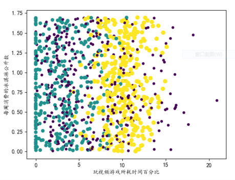
datingDataMat, datingLabels = file2matrix('datingTestSet2.txt')
fig = plt.figure() #chart
plt.title('Scatter analysis chart')
mpl.rcParams['font.sans-serif'] = ['KaiTi']
mpl.rcParams['font.serif'] = ['KaiTi']
plt.xlabel('Frequent Flight Miles Obtained Annually')
plt.ylabel('Percentage of time spent playing video games')
'''
matplotlib.pyplot.ylabel(s, *args, **kwargs)
override = {
'fontsize' : 'small',
'verticalalignment' : 'center',
'horizontalalignment' : 'right',
'rotation'='vertical' : }
'''
type1_x = []
type1_y = []
type2_x = []
type2_y = []
type3_x = []
type3_y = []
ax = fig.add_subplot(111) #Divide the graph into one row and one column. The current coordinate system is located at block 1 (there is only one block in all).
index = 0
for label in datingLabels:
if label == 1:
type1_x.append(datingDataMat[index][0])
type1_y.append(datingDataMat[index][1])
elif label == 2:
type2_x.append(datingDataMat[index][0])
type2_y.append(datingDataMat[index][1])
elif label == 3:
type3_x.append(datingDataMat[index][0])
type3_y.append(datingDataMat[index][1])
index += 1
type1 = ax.scatter(type1_x, type1_y, s=30, c='b')
type2 = ax.scatter(type2_x, type2_y, s=40, c='r')
type3 = ax.scatter(type3_x, type3_y, s=50, c='y', marker=(3,1))
'''
scatter It's used to draw scatter plots.
matplotlib.pyplot.scatter(x, y, s=20, c='b', marker='o', cmap=None, norm=None, vmin=None, vmax=None, alpha=None, linewidths=None, verts=None, hold=None,**kwargs)
//Where xy is the coordinate of a point and the size of s point
maker Shape is OK maker=(5,1)5 Represents shape as 5-sided, 1 as star (0 as polygon, 2 as radiation, 3 as circle)
alpha Express transparency; facecolor='none'Represents no filling.
'''
ax.legend((type1, type2, type3), ('Dislike', 'General Charm', 'Charming'), loc=0)
'''
loc(Set the location of the legend display)
'best' : 0, (only implemented for axes legends)(Adaptive mode)
'upper right' : 1,
'upper left' : 2,
'lower left' : 3,
'lower right' : 4,
'right' : 5,
'center left' : 6,
'center right' : 7,
'lower center' : 8,
'upper center' : 9,
'center' : 10,
'''
plt.show()

Prepare data: normalized values
When we calculate the Euclidean distance between samples, because some values are larger, the larger the impact on the overall results, the smaller the data may have no impact. In this case, frequent flyer mileage is very large, but the remaining two columns are very small. In order to solve this problem, we need to convert the data into the values between [0,1], that is, the normalized values we need to do here.
The formula is:
New Value= (old Value_min)/(max_min) new Value= (old Value_min)/(max_min). (min and maxmax are the minimum and maximum eigenvalues of data set, respectively)
def autoNorm(dataSet): #Normalized value
    minVals = dataSet.min(0)  #0 represents the minimum value of each column, 1 represents the minimum value of each row, returned in one-dimensional matrix form
    maxVals = dataSet.max(0)
    ranges = maxVals - minVals
    normDataSet = zeros(shape(dataSet))
    m = dataSet.shape[0]
    normDataSet = dataSet - tile(minVals, (m,1))
    normDataSet = normDataSet/tile(ranges, (m,1))
    return normDataSet, ranges, minVals
Testing and Constructing Complete Algorithms
According to these 1000 data, 100 of them are used as test data, and 900 are used as training set to see the accuracy of 100 data sets.
Finally, according to the test data input by oneself, judge what the result should be.
from numpy import *
import matplotlib as mpl
import matplotlib.pyplot as plt
import operator
def classify0(inX, dataSet, labels, k):
dataSetSize = dataSet.shape[0]
diffMat = tile(inX, (dataSetSize,1)) - dataSet #Unifying Matrix to Achieve Addition and Subtraction
sqDiffMat = diffMat**2
sqDistances = sqDiffMat.sum(axis=1) #For accumulation, axis=0 is by column and axis=1 is by row
distances = sqDistances**0.5 #Open Root Number
sortedDistIndicies = distances.argsort() #Sort in ascending order and return the original subscript
classCount = {}
for i in range(k):
voteIlabel = labels[sortedDistIndicies[i]]
classCount[voteIlabel] = classCount.get(voteIlabel, 0) + 1 #get is the method in the dictionary. The first is the value to be obtained, and the second is the default value if the value does not exist.
sortedClassCount = sorted(classCount.items(), key=operator.itemgetter(1), reverse=True)
return sortedClassCount[0][0]
def file2matrix(filename): #get data
f = open(filename)
arrayOLines = f.readlines()
numberOfLines = len(arrayOLines)
returnMat = zeros((numberOfLines,3),dtype=float)
#zeros(shape, dtype, order), create a shape size of all 0 matrix, dtype is the data type, default float, order represents the way in memory (arranged in C or Fortran language), default C language arrangement.
classLabelVector = []
rowIndex = 0
for line in arrayOLines:
line = line.strip()
listFormLine = line.split('\t')
returnMat[rowIndex,:] = listFormLine[0:3]
classLabelVector.append(int(listFormLine[-1]))
rowIndex += 1
return returnMat, classLabelVector
def autoNorm(dataSet): #Normalized value
minVals = dataSet.min(0) #0 represents the minimum value of each column, 1 represents the minimum value of each row, returned in one-dimensional matrix form
maxVals = dataSet.max(0)
ranges = maxVals - minVals
normDataSet = zeros(shape(dataSet))
m = dataSet.shape[0]
normDataSet = dataSet - tile(minVals, (m,1))
normDataSet = normDataSet/tile(ranges, (m,1))
return normDataSet, ranges, minVals
def datingClassTest(datingDataMat, datingLabels): #Test Correctness Rate
hoRatio = 0.1
m = datingDataMat.shape[0]
numTestVecs = int(hoRatio*m)
numError = 0.0
for i in range(numTestVecs):
classifierResult = classify0(datingDataMat[i,:], datingDataMat[numTestVecs:m, :], datingLabels[numTestVecs:m], 3)
print('The classifier came back with: %d, the real answer is: %d.' %(classifierResult, datingLabels[i]))
if (classifierResult != datingLabels[i]):
numError += 1
print('Error rate %f' %(numError/float(numTestVecs)))
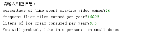
def classifyPerson(datingDataMat, datingLabels, ranges, minVals):
result = ['not at all', 'in small doses', 'in large doses']
print('Please enter the appropriate information:')
percentTats = float(input('percentage of time spent playing video games?'))
ffMiles = float(input('frequent flier miles earned per year?'))
iceCream = float(input('liters of ice cream consumed per year?'))
inArr = array([ffMiles, percentTats, iceCream])
classifyResult = classify0((inArr-minVals)/ranges, datingDataMat, datingLabels, 3)
print('You will probably like this person: ', result[classifyResult-1])
if __name__ == "__main__":
datingDataMat, datingLabels = file2matrix('datingTestSet2.txt')
datingDataMat, ranges, minVals = autoNorm(datingDataMat) #Normalized value
datingClassTest(datingDataMat, datingLabels)
classifyPerson(datingDataMat, datingLabels, ranges, minVals)
fig = plt.figure() #chart
plt.title('Scatter analysis chart')
mpl.rcParams['font.sans-serif'] = ['KaiTi']
mpl.rcParams['font.serif'] = ['KaiTi']
plt.xlabel('Frequent Flight Miles Obtained Annually')
plt.ylabel('Percentage of time spent playing video games')
'''
matplotlib.pyplot.ylabel(s, *args, **kwargs)
override = {
'fontsize' : 'small',
'verticalalignment' : 'center',
'horizontalalignment' : 'right',
'rotation'='vertical' : }
'''
type1_x = []
type1_y = []
type2_x = []
type2_y = []
type3_x = []
type3_y = []
ax = fig.add_subplot(111) #Divide the graph into one row and one column. The current coordinate system is located at block 1 (there is only one block in all).
index = 0
for label in datingLabels:
if label == 1:
type1_x.append(datingDataMat[index][0])
type1_y.append(datingDataMat[index][1])
elif label == 2:
type2_x.append(datingDataMat[index][0])
type2_y.append(datingDataMat[index][1])
elif label == 3:
type3_x.append(datingDataMat[index][0])
type3_y.append(datingDataMat[index][1])
index += 1
type1 = ax.scatter(type1_x, type1_y, s=30, c='b')
type2 = ax.scatter(type2_x, type2_y, s=40, c='r')
type3 = ax.scatter(type3_x, type3_y, s=50, c='y', marker=(3,1))
'''
scatter It's used to draw scatter plots.
matplotlib.pyplot.scatter(x, y, s=20, c='b', marker='o', cmap=None, norm=None, vmin=None, vmax=None, alpha=None, linewidths=None, verts=None, hold=None,**kwargs)
//Where xy is the coordinate of a point and the size of s point
maker Shape is OK maker=(5,1)5 Represents shape as 5-sided, 1 as star (0 as polygon, 2 as radiation, 3 as circle)
alpha Express transparency; facecolor='none'Represents no filling.
'''
ax.legend((type1, type2, type3), ('Dislike', 'General Charm', 'Charming'), loc=0)
'''
loc(Set the location of the legend display)
'best' : 0, (only implemented for axes legends)(Adaptive mode)
'upper right' : 1,
'upper left' : 2,
'lower left' : 3,
'lower right' : 4,
'right' : 5,
'center left' : 6,
'center right' : 7,
'lower center' : 8,
'upper center' : 9,
'center' : 10,
'''
plt.show()You can see that the error rate is 5%: