Absrtact: there are many kinds of computer screens, plus the system's own zoom settings, making the screen resolution different, so we will encounter the trouble of different sizes when using px units. Although there are percentage, em, rem, vh, vw and other css units, they are not friendly to animation, and they are not direct enough, so I realized the general js adaptive px unit. Directly a function to do, convenient and convenient, the effect is the same.
The main principle is to use css attribute transform to scale the page.
It should be noted that if the target width is inconsistent with your screen resolution or viewport size, the real-time box size displayed by the browser when hover ing the mouse is calculated after zooming, and the data of the box model of the console is not zoomed, so only the console (small problem) can be referred to.
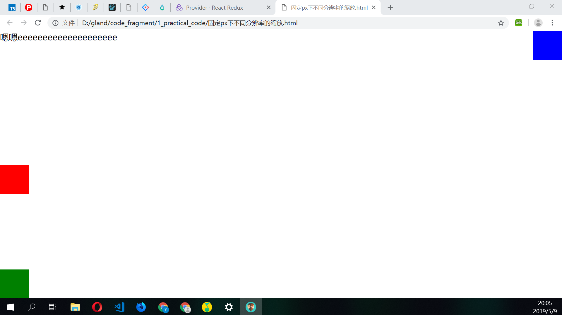
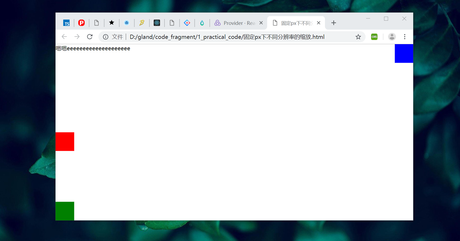
Effect
The code is as follows
<!DOCTYPE html>
<html>
  <head>
    <meta charset="utf-8" />
    <script>
      (function(targetWidth = 1920) {
        let style = document.createElement('style');
        style.innerHTML = `
        html {
          width:${targetWidth + 'px'};
          transform-origin: top left;
          overflow: hidden;
        }
        body {
          width: 100%;
          height: 100%;
          margin: 0;
          overflow: auto;
        }
        `;
        document.head.appendChild(style);
        let myStyle = document.createElement('style');
        document.head.appendChild(myStyle);

        let adjustWindow = () => {
          let scale = window.innerWidth / targetWidth;
          let height = window.innerHeight / scale + 'px';
          myStyle.innerHTML = `html{height:${height};transform:scale(${scale});}`;
        };
        adjustWindow();
        window.addEventListener('resize', () => {
          adjustWindow();
        });
      })();
    </script>
  </head>
  <body>
    <div style="font-size: 30px;width:100%">
      //Yeah, eeeeeeeeeeeeeeeeeeee
    </div>
    <div
      style="width: 100px;height:100px;background: red;position: absolute;left:0;top:50%;"
    ></div>
    <div
      style="width: 100px;height:100px;background: blue;position: absolute;right:0;top:0;"
    ></div>
    <div
      style="width: 100px;height:100px;background: green;position: absolute;left:0;bottom:0;"
    ></div>
  </body>
</html>