The common control usage of JavaFX was introduced earlier. Although JavaFX control is better than AWT and Swing, it does not improve the development efficiency by coding the control interface. If you want to browse the display effect of the interface, you have to run the test program to see it. Even if it is only the size of the micro-controller, you have to run the program again to see the effect, which is obviously time-consuming and laborious. For this reason, JavaFX provides another way to layout the interface. Instead of using Java code to build controls, it uses FXML files to layout the interface. With the help of idea's preview function, it can directly observe the layout effect of FXML without running programs. The so-called "FXML" means the special XML format of JavaFX. It is based on the XML standard and extended. Each JavaFX control has corresponding XML tags. By assembling the tags of these contained controls, a layout file with exclusive window interface is formed.
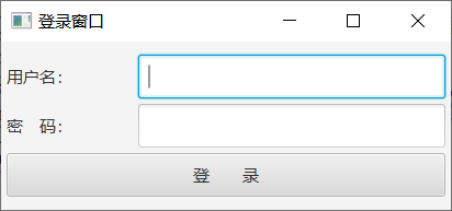
For a simple example, now we are going to draw the login interface, which includes user name input box, password input box, and login button. These controls are arranged in three rows from top to bottom. The expected display effect of this interface is shown in the following figure.
If the above login interface is fully implemented by using code, it is undoubtedly necessary to adjust the code repeatedly and execute the program many times in order to achieve a satisfactory layout effect. If FXML is adopted, the control elements related to the interface can be stripped out and the XML tag structure can be written in the FXML file instead. For example, the FXML file corresponding to the above login page is called login.fxml, and its contents are as follows:
<?import javafx.scene.layout.FlowPane?>
<?import javafx.scene.layout.HBox?>
<?import javafx.scene.control.Button?>
<?import javafx.scene.control.Label?>
<?import javafx.scene.control.TextField?>
<?import javafx.scene.control.PasswordField?>

<FlowPane xmlns:fx="http://javafx.com/fxml" alignment="center" hgap="5" vgap="5">
	<HBox fx:id="hbUser" prefWidth="400" prefHeight="40">
		<Label fx:id="labelUser" prefWidth="120" prefHeight="40" text="User name:" />
		<TextField fx:id="fieldUser" prefWidth="280" prefHeight="40" />
	</HBox>
	<HBox fx:id="hbPassword" prefWidth="400" prefHeight="40">
		<Label fx:id="labelPassword" prefWidth="120" prefHeight="40" text="dense Code:" />
		<PasswordField fx:id="fieldPassword" prefWidth="280" prefHeight="40" />
	</HBox>
	<Button fx:id="btnLogin" prefWidth="400" prefHeight="40" text="Deng  record" />
</FlowPane>
Open login.fxml in idea and notice that there are two tabs in the lower left corner of the file interface, one is called "Text" and the other is called "Scene Builder". The current open login.fxml is displayed as text content, which corresponds to the "Text" option. Click the "Scene Builder" option on the right, and the original text content quickly turns into a set of visual pages. The preview effect of login.fxml is presented in the center of the page, as shown in the following figure.
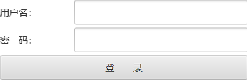
The original fxml file is similar to the html file, although the html file is full of text labels, but using the browser to open the html file can always see the well-typed web page; and idea's own Scene Builder assumes the role of fxml browser, as long as the programmer changes the format and content of the fxml file, switch to "Scene Builder" The "r" option allows you to see the modified interface immediately. Scene Builder renders much faster than the traditional way of running programs.
Looking back at the login.fxml mentioned above, its file content is divided into two parts, the first one is like <? Import ***?>, whose function is to import the control with the specified package name path, similar to the import statement of Java code; the latter one contains the nested structure of all levels of control, whose label format is <list of control name attributes> </control. If the current control does not have a subordinate control, its label format can be simplified to "<Control Name Property List/>". According to the label content of login.fxml, the interface adopts FlowPane flow pane, and the flow pane has the following three types of controls:
1. Horizontal box HBox containing user name components, its number is hbUser. Inside the box, there are user name labels numbered labelUser and user name input boxes numbered fieldUser.
2. Horizontal box HBox containing cryptographic components, identified as hbPassword. Inside the box, there are label Password's password label and field Password's password input box.
3. Login button numbered btnLogin;
After introducing the FXML layout, the Java code will be changed to load the interface from the specified fxml file, that is, the scene creation process will be changed to the following two lines of code:
		// Initial interface of loader from FXML resource file
		Parent root = FXMLLoader.load(getClass().getResource("login.fxml"));
		Scene scene = new Scene(root, 410, 240); // Create a scenario
So the JavaFX code that draws the interface narrows down to a few lines below:
//Program Entry of Logon Window (FXML Layout Control)
public class LoginMain extends Application {

	@Override
	public void start(Stage stage) throws Exception { // The application starts running
		stage.setTitle("Login window"); // Setting the title of the stage
		// Initial interface of loader from FXML resource file
		Parent root = FXMLLoader.load(getClass().getResource("login.fxml"));
		Scene scene = new Scene(root, 410, 240); // Create a scenario
		stage.setScene(scene); // Stage setting
		stage.setResizable(true); // Is the size of the stage allowed to change?
		stage.show(); // Display Stage
	}

	public static void main(String[] args) {
		launch(args); // Start the JavaFX application, and then jump to the start method
	}
}
Then run the LoginMain program above, and the login interface pops up as expected.
Most static controls of JavaFX can be added to fxml in the form of a single tag. In addition to the flow pane, horizontal box HBox, button Button, label Label, text input field, password input field mentioned in the previous example, it also includes grid pane, border pane BorderPane. Vertical box VBox, multi-line input box TextArea, check box CheckBox, drop-down box ComboBox, etc. However, radio button RadioButton is added in a unique way, because several radio buttons need to form a button group, so that the same group of radio buttons can be linked. So fxml first declares a Toggle Group tag and assigns it a tag number, then adds the toggle Group attribute after the RadioButton tag, specifying the Toggle Group number of the previous step. Examples of specific fxml fragments that operate radio buttons are as follows:
	<HBox fx:id="hbType" prefWidth="400" prefHeight="40">
		<Label fx:id="labelType" prefWidth="120" prefHeight="40" text="Login type:" />
		<fx:define>
			<ToggleGroup fx:id="tgType" />
		</fx:define>
		<RadioButton fx:id="rbPassword" prefWidth="140" prefHeight="40" toggleGroup="$tgType"
			text="Password login" selected="true" />
		<RadioButton fx:id="rbVerifycode" prefWidth="140" prefHeight="40" toggleGroup="$tgType"
			text="Authentication Code Logon" />
	</HBox>
Of course, the new RadioButton and Toggle Group will also add the following import statements to the fxml header:
<?import javafx.scene.control.RadioButton?>
<?import javafx.scene.control.ToggleGroup?>
Add the xml tag related to radio button to login.fxml and save it as a new fxml file named login_with_flow.fxml. The complete file contents are as follows:
<?import javafx.scene.layout.FlowPane?>
<?import javafx.scene.layout.HBox?>
<?import javafx.scene.control.Button?>
<?import javafx.scene.control.Label?>
<?import javafx.scene.control.TextField?>
<?import javafx.scene.control.PasswordField?>
<?import javafx.scene.control.RadioButton?>
<?import javafx.scene.control.ToggleGroup?>

<FlowPane xmlns:fx="http://javafx.com/fxml" alignment="center" hgap="5" vgap="5">
	<HBox fx:id="hbType" prefWidth="400" prefHeight="40">
		<Label fx:id="labelType" prefWidth="120" prefHeight="40" text="Login type:" />
		<fx:define>
			<ToggleGroup fx:id="tgType" />
		</fx:define>
		<RadioButton fx:id="rbPassword" prefWidth="140" prefHeight="40" toggleGroup="$tgType"
			text="Password login" selected="true" />
		<RadioButton fx:id="rbVerifycode" prefWidth="140" prefHeight="40" toggleGroup="$tgType"
			text="Authentication Code Logon" />
	</HBox>
	<HBox fx:id="hbUser" prefWidth="400" prefHeight="40">
		<Label fx:id="labelUser" prefWidth="120" prefHeight="40" text="User name:" />
		<TextField fx:id="fieldUser" prefWidth="280" prefHeight="40" />
	</HBox>
	<HBox fx:id="hbPassword" prefWidth="400" prefHeight="40">
		<Label fx:id="labelPassword" prefWidth="120" prefHeight="40" text="dense Code:" />
		<PasswordField fx:id="fieldPassword" prefWidth="280" prefHeight="40" />
	</HBox>
	<Button fx:id="btnLogin" prefWidth="400" prefHeight="40" text="Deng  record" />
	<Label fx:id="labelLoginResult" prefWidth="400" prefHeight="40" text="The login results are displayed here." />
</FlowPane>
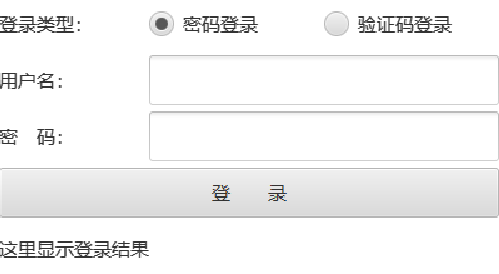
Scene Builder is then used to observe the preview interface of login_with_flow.fxml. The following figure shows that the radio button combination has been added to the top of the login window.
Then modify LoginMain.java, change the name of the resource file loaded when creating the scene to login_with_flow.fxml, and run the test program again. The login interface pops up as shown in the following figure:
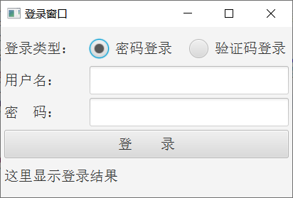
Comparing the preview interface of Scene Builder with the actual window interface, they are similar in general, and the basic layout is consistent.
See more Java technology articles< Java Development Notes (Preface) Chapter Program Directory>