
Note: without special instructions, the versions of Flutter and Dart are as follows:
- Flutter version: 1.12.13+hotfix.5
- Dart version: 2.7.0
DataTable
DataTable control displays table data. DataTable needs to set rows and columns. The usage is as follows:
DataTable(
  columns: [
    DataColumn(label: Text('Full name')),
    DataColumn(label: Text('Age')),
  ],
  rows: [
    DataRow(cells: [
      DataCell(Text('Lao Meng')),
      DataCell(Text('18')),
    ]),

  ],
)
The columns parameter is the column of the DataTable, and the rows parameter is the data of each row of the DataTable. The effect is as follows:

To add a row of data, just add a DataRow. The usage is as follows:
DataTable(
      ...
      rows: [
        DataRow(cells: [
          DataCell(Text('Lao Meng')),
          DataCell(Text('18')),
        ]),
        DataRow(cells: [
          DataCell(Text('Chinese rhubarb')),
          DataCell(Text('20')),
        ]),
      ],
    )
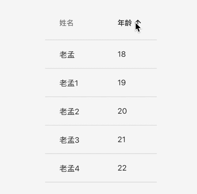
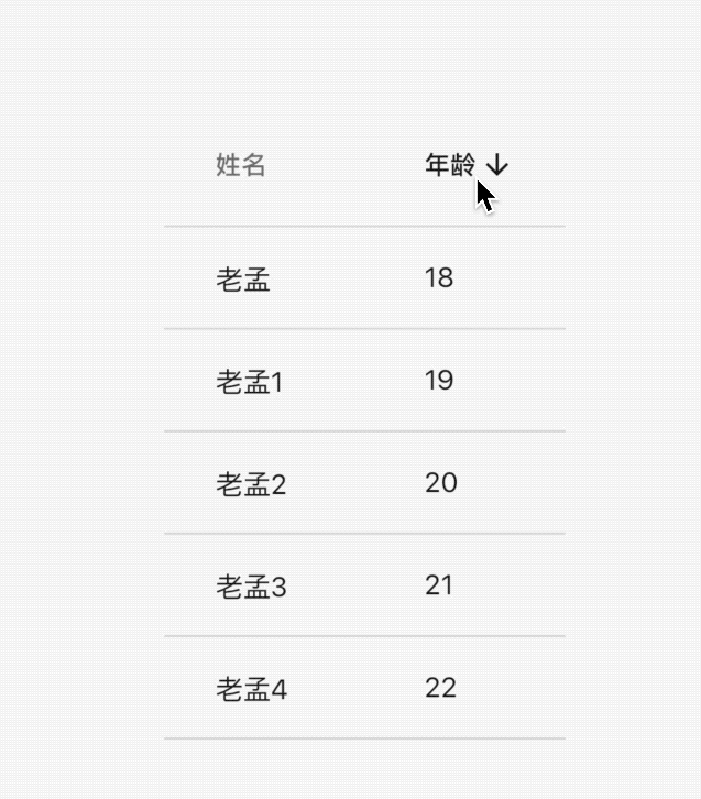
Show sort icon in header:
DataTable(
  sortColumnIndex: 1,
  sortAscending: true,
  ...
  )
The sortColumnIndex parameter indicates the index of the table display sorting icon, and the sortAscending parameter indicates ascending or descending order. The effect is as follows:
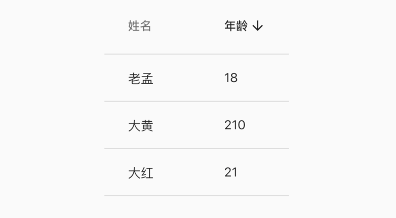
Note that DataTable itself can't sort data. These parameters are only visual controls.
DataColumn
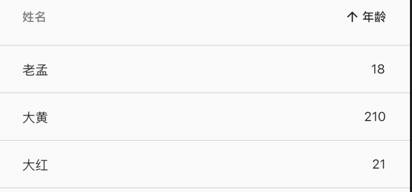
By default, the data is left aligned. To make a column right aligned, you only need to set the numeric parameter true in the DataColumn as follows:
 DataTable(
  columns: [
    DataColumn(label: Text('Full name')),
    DataColumn(label: Text('Age'),numeric: true),
  ],
  ...
  )
Effect:
Setting the toolip parameter in the DataColumn indicates that a prompt will be displayed when this header is installed in Chang'an. The usage is as follows:
DataColumn(label: Text('Full name'),tooltip: 'Long press prompt')
Long press the prompt:

The onSort callback is the callback when the user clicks the header (DataColumn). The first parameter in the onSort, columnIndex, represents the index, and the ascending parameter, ascending or descending, is used as follows:
DataColumn(label: Text('Age'), onSort: (int columnIndex, bool ascending){
	//Sorting algorithm
}),
DataRow
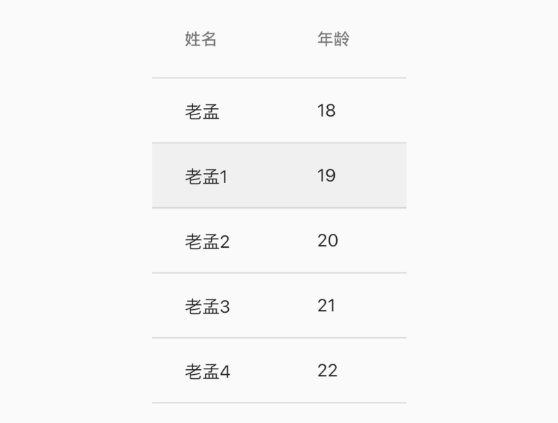
It can be displayed that one of the rows is selected. Set the selected parameter in DataRow to true. The usage is as follows:
DataRow(
  selected: true,
  ...
)
The effect is as follows:
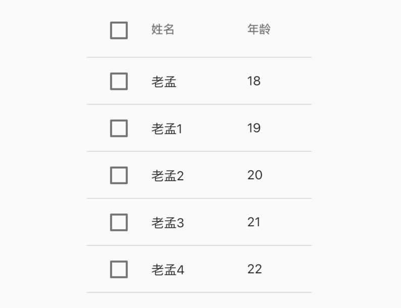
The onSelectChanged parameter is a callback when clicking each row of data. The usage is as follows:
DataRow(
	onSelectChanged: (selected){
	}
	...
)
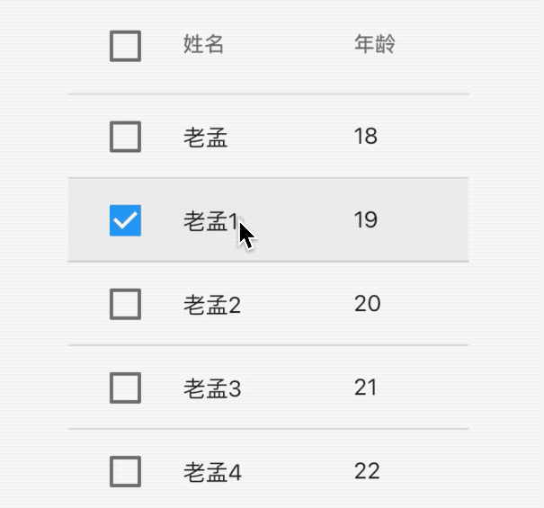
The onSelectChanged parameter is set to display a check box in front of each row and header of the data. The effect is as follows:
Of course, clicking now can't display the selected effect. Add the selected effect, modify the User model class, and add the selected attribute to indicate whether the current line is selected or not
class User {
  User(this.name, this.age, {this.selected = false});

  String name;
  int age;
  bool selected;
}
Modify data:
List<User> data = [
  User('Lao Meng', 18),
  User('Lao Meng 1', 19,selected: true),
  User('Lao Meng 2', 20),
  User('Lao Meng 3', 21),
  User('Lao Meng 4', 22),
];
To build a DataTable:
List<DataRow> dateRows = [];
    for (int i = 0; i < data.length; i++) {
      dateRows.add(DataRow(
        selected: data[i].selected,
        onSelectChanged: (selected){
          setState(() {
            data[i].selected = selected;
          });
        },
        cells: [
          DataCell(Text('${data[i].name}')),
          DataCell(Text('${data[i].age}')),
        ],
      ));
    }
    return DataTable(columns: [
      DataColumn(label: Text('Full name')),
      DataColumn(
        label: Text('Age'),
      ),
    ], rows: dateRows);
The effect is as follows:
We don't control the check box of "select all / uncheck all" in the header. There is a big question: click the check box of "select all / uncheck all". If it is checked, whether the real data has changed. The corresponding example is whether all the selected parameters in the User are true. It can definitely tell you that all the selected parameters in the User have changed to true. How is that true What is it now? Very simply, the onSelectChanged of each line is called back once.
DataCell
DataCell is every sub control in DataRow. The sub control of DataCell is not necessarily text, but also any component such as icon. We can set edit icon for DataCell:
DataCell(Text('name'),showEditIcon: true)
The effect is as follows:

Of course, it's just an icon, and the placeholder parameter is the same. If it's set to true, it's just that the style of the text has changed. onTap is the click callback. The usage is as follows:
DataCell(Text('name'),showEditIcon: true,onTap: (){
  print('DataCell onTap');
},placeholder: true)
The effect is as follows:

sort
DateTable itself has no sorting function. When the user clicks the header, the data will be sorted according to the data in this column. The usage is as follows:,
Data model class:
class User {
  User(this.name, this.age);

  final String name;
  final int age;
}
Initialization data and default sorting:
List<User> data = [
  User('Lao Meng', 18),
  User('Lao Meng 1', 19),
  User('Lao Meng 2', 20),
  User('Lao Meng 3', 21),
  User('Lao Meng 4', 22),
];

var _sortAscending = true;
To build a DataTable:
DataTable(
    sortColumnIndex: 1,
    sortAscending: _sortAscending,
    columns: [
      DataColumn(label: Text('Full name')),
      DataColumn(label: Text('Age'), onSort: (int columnIndex, bool ascending){
        setState(() {
          _sortAscending = ascending;
          if(ascending){
            data.sort((a, b) => a.age.compareTo(b.age));
          }else {
            data.sort((a, b) => b.age.compareTo(a.age));
          }
        });
      }),
    ],
    rows: data.map((user) {
      return DataRow(cells: [
        DataCell(Text('${user.name}')),
        DataCell(Text('${user.age}')),
      ]);
    }).toList())
The effect is as follows:
If you want to add sorting to the name column, modify it as follows:
var _sortAscending = true;
var _sortColumnIndex =0;
DataTable(
        sortColumnIndex: _sortColumnIndex,
        sortAscending: _sortAscending,
        columns: [
          DataColumn(label: Text('Full name'),onSort: (int columnIndex, bool ascending){
            setState(() {
              _sortColumnIndex = columnIndex;
              _sortAscending = ascending;
              if(ascending){
                data.sort((a, b) => a.name.compareTo(b.name));
              }else {
                data.sort((a, b) => b.name.compareTo(a.name));
              }
            });
          }),
          DataColumn(label: Text('Age'), onSort: (int columnIndex, bool ascending){
            setState(() {
              _sortColumnIndex = columnIndex;
              _sortAscending = ascending;
              if(ascending){
                data.sort((a, b) => a.age.compareTo(b.age));
              }else {
                data.sort((a, b) => b.age.compareTo(a.age));
              }
            });
          }),
        ],
        ...
)
The effect is as follows:
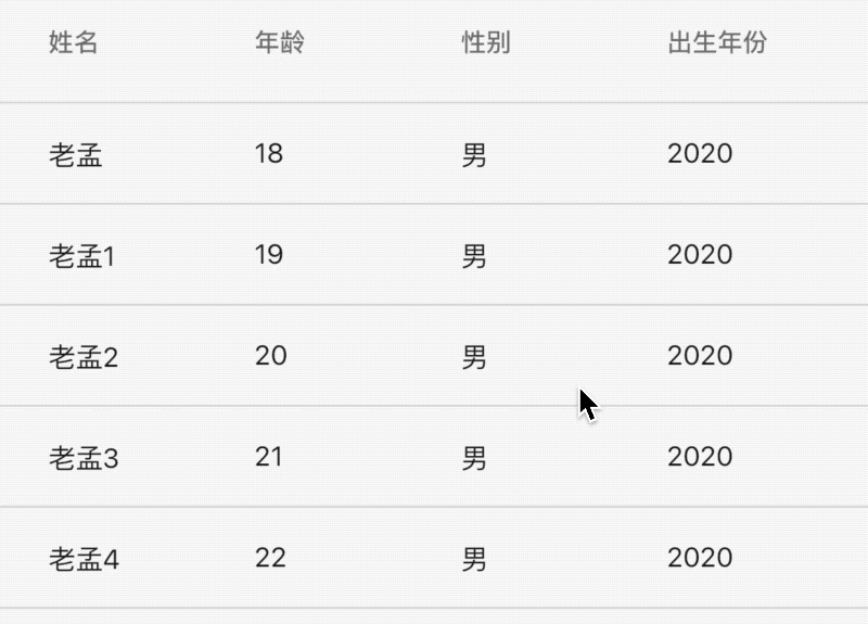
Dealing with incomplete data display
When there are many table columns, you can use SingleChildScrollView to wrap the DataTable and scroll it when the display is incomplete. The usage is as follows:
List<DataRow> dateRows = [];
for (int i = 0; i < data.length; i++) {
  dateRows.add(DataRow(
    cells: [
      DataCell(Text('${data[i].name}')),
      DataCell(Text('${data[i].age}')),
      DataCell(Text('male')),
      DataCell(Text('2020')),
      DataCell(Text('10')),
    ],
  ));
}
return SingleChildScrollView(
  scrollDirection: Axis.horizontal,
  child: DataTable(columns: [
    DataColumn(label: Text('Full name')),
    DataColumn(
      label: Text('Age'),
    ),
    DataColumn(
      label: Text('Gender'),
    ),
    DataColumn(
      label: Text('Year of birth'),
    ),
    DataColumn(
      label: Text('Birth month'),
    ),
  ], rows: dateRows),
);
The effect is as follows:
Is today's article helpful to you? If yes, please leave a message and click "like" at the bottom of the article to show your support for me. Your message, comment and forwarding are my driving force for continuous updating!