Brief introduction
matplotlib library is one of the libraries in Python data mining, which is mainly used for 2D drawing, simple 3D drawing and data visualization.
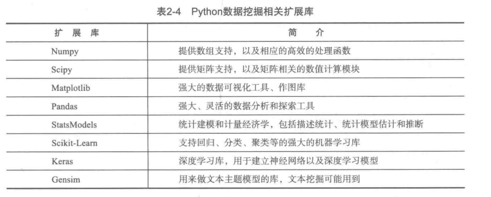
Python data mining related extension library
Simple use
(1) Draw a straight line
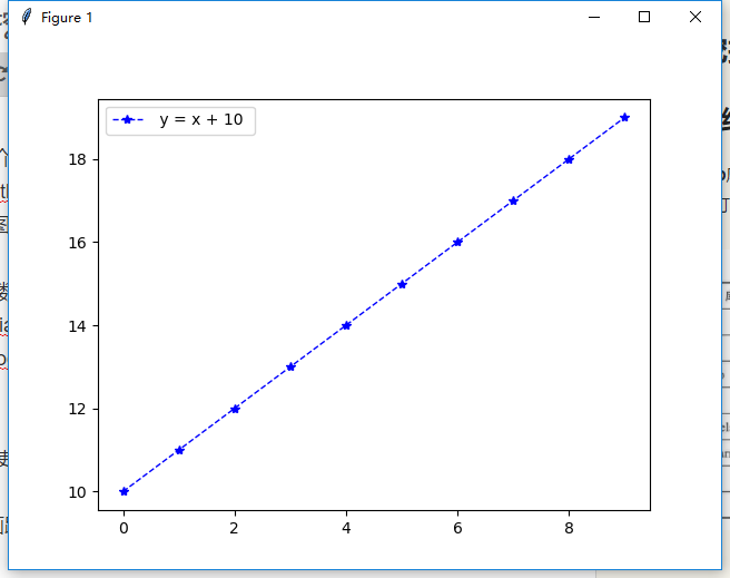
Line y=x+10
Code:
def print_line_draw():
    """
    //Draw straight lines
    :return:
    """
    # Create a numpy array with a 1 interval between 0-10
    x = np.arange(0, 10, 1)
    y = x + 10

    # Drawing graphics
    plt.plot(x, y, color='blue', linestyle='--', marker='*', linewidth=1, label=' y = x + 10 ')

    # Save picture, dpi
    plt.savefig('first.png', dpi=50)
    # Show Legend
    plt.legend()
    # display graphics
    plt.show()
(2) Draw a pie chart
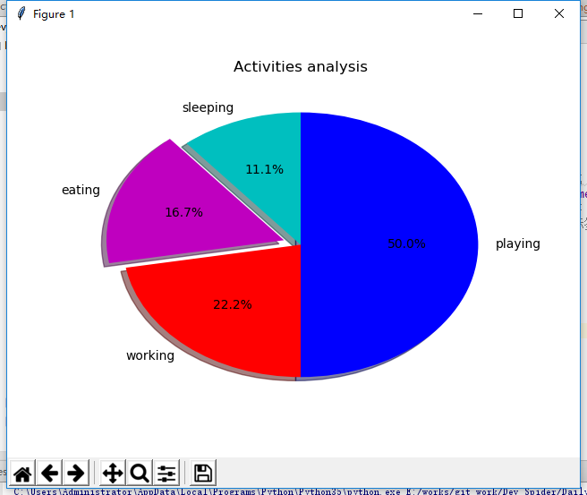
Pie chart
Code:
def print_pie_draw():
    """
    //Pie chart
    :return:
    """
    # Specify the size (scale) of each slice
    slice = [2,3,4,9]
    # Specified tag
    activities =['sleeping','eating','working','playing']
    # colour
    cols = ['c','m','r','b']

    plt.pie(slice,
            labels=activities,
            colors=cols,
            startangle=90, #Start angle, default is 0 degrees, starting from the x-axis, 90 degrees starting from the y-axis
            shadow=True,
            explode=(0,0.1,0,0), # Pull out the second slice. If it's all 0, it doesn't pull out. The distance between the number here and the center of the circle
            autopct='%1.1f%%')   # Show percentage
    plt.title('Activities analysis')
    # The first 0 of the parameter in expand represents the first slice, and the distance from the origin is 0
    plt.show()
(3) Draw a scatter
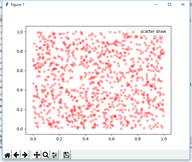
Scatter plot
Code:
def print_scatter_draw():
    """
    //Scatter plot
    :return:
    """
    x = np.random.rand(1000)
    y = np.random.rand(len(x))

    # Mapping
    plt.scatter(x,y,color='r',alpha=0.3,label='scatter draw ',marker='p')
    plt.legend()

    #plt.axis([0,2,0,2])# Set the range of coordinates
    plt.show()
(4) Draw a histogram
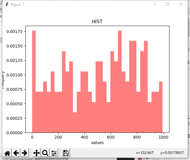
Ugly histogram
Code:
def print_hist_draw():
    """
    //Draw histogram
    :return:
    """
    x = np.random.randint(1,1000,200)

    axit = plt.gca()  # Get the current drawing object
    #The number of bins histogram, the style of histtype histogram normalized histogram, display probability density (default false)
    axit.hist(x,bins=35,facecolor='r',normed=True,histtype='bar',alpha=0.5)
    axit.set_xlabel('values') # Label x
    axit.set_ylabel('Frequery') # Label y
    axit.set_title('HIST')
    plt.show()
(5) Simple trigonometric function
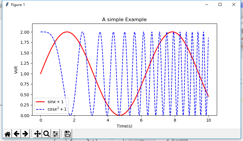
Trigonometric function diagram
Code:
def print_sinandcos_line():

    x = np.linspace(0,10,1000)
    y = np.sin(x) +1
    z = np.cos(x**2) +1

    # Set image size
    plt.figure(figsize=(8,4))
    # Drawing, setting label, line color, line size
    plt.plot(x,y,label='$\sin x +1$',color='red',linewidth=2)
    # Drawing, labeling, line type
    plt.plot(x,z,'b--',label='$\cos x^2+1$')
    # Set x-axis name
    plt.xlabel('Time(s)')
    # Set y-axis name
    plt.ylabel('Volt')
    # Set title
    plt.title('A simple Example')
    # Displayed y-axis range
    plt.ylim(0,2.2)
    # Show Legend
    plt.legend()
    # Display drawing results
    plt.show()
The above is a simple use of today's matplotlib function
All code
# -*- coding: utf-8 -*-
# @Time    : 2018/3/26 15:09
# @Author: snake cub
# @Email   : 643435675@QQ.com
# @File    : test_matplotlib.py

import matplotlib.pyplot as plt
import numpy as np


def print_line_draw():
    """
    //Draw straight lines
    :return:
    """
    # Create a numpy array with a 1 interval between 0-10
    x = np.arange(0, 10, 1)
    y = x + 10

    # Drawing graphics
    plt.plot(x, y, color='blue', linestyle='--', marker='*', linewidth=1, label=' y = x + 10 ')

    # Save picture, dpi
    plt.savefig('first.png', dpi=50)
    # Show Legend
    plt.legend()
    # display graphics
    plt.show()


def print_pie_draw():
    """
    //Pie chart
    :return:
    """
    # Specify the size (scale) of each slice
    slice = [2,3,4,9]
    # Specified tag
    activities =['sleeping','eating','working','playing']
    # colour
    cols = ['c','m','r','b']

    plt.pie(slice,
            labels=activities,
            colors=cols,
            startangle=90, #Start angle, default is 0 degrees, starting from the x-axis, 90 degrees starting from the y-axis
            shadow=True,
            explode=(0,0.1,0,0), # Pull out the second slice. If it's all 0, it doesn't pull out. The distance between the number here and the center of the circle
            autopct='%1.1f%%')   # Show percentage
    plt.title('Activities analysis')
    # The first 0 of the parameter in expand represents the first slice, and the distance from the origin is 0
    plt.show()


def print_scatter_draw():
    """
    //Scatter plot
    :return:
    """
    x = np.random.rand(1000)
    y = np.random.rand(len(x))

    # Mapping
    plt.scatter(x,y,color='r',alpha=0.3,label='scatter draw ',marker='p')
    plt.legend()

    #plt.axis([0,2,0,2])# Set the range of coordinates
    plt.show()
    pass


def print_hist_draw():
    """
    //Draw histogram
    :return:
    """
    x = np.random.randint(1,1000,200)

    axit = plt.gca()  # Get the current drawing object
    #The number of bins histogram, the style of histtype histogram normalized histogram, display probability density (default false)
    axit.hist(x,bins=35,facecolor='r',normed=True,histtype='bar',alpha=0.5)
    axit.set_xlabel('values') # Label x
    axit.set_ylabel('Frequery') # Label y
    axit.set_title('HIST')
    plt.show()
    pass


def print_sinandcos_line():

    x = np.linspace(0,10,1000)
    y = np.sin(x) +1
    z = np.cos(x**2) +1

    # Set image size
    plt.figure(figsize=(8,4))
    # Drawing, setting label, line color, line size
    plt.plot(x,y,label='$\sin x +1$',color='red',linewidth=2)
    # Drawing, labeling, line type
    plt.plot(x,z,'b--',label='$\cos x^2+1$')
    # Set x-axis name
    plt.xlabel('Time(s)')
    # Set y-axis name
    plt.ylabel('Volt')
    # Set title
    plt.title('A simple Example')
    # Displayed y-axis range
    plt.ylim(0,2.2)
    # Show Legend
    plt.legend()
    # Display drawing results
    plt.show()
    pass


if __name__ == '__main__':
    # print_line_draw()
    # print_pie_draw()
    # print_scatter_draw()
    # print_hist_draw()
    print_sinandcos_line()