In the last article, I did a simple analysis of Flutter's own demo in a simple way, but that's not enough. Originally intended to bring you infinite drop-down refresh cases on the official website, but found that some things here are too advanced, as an introduction to Flutter, of course, can not be so casual, in order to enable everyone to learn something, so today to bring you a login of their own hands.
Simple Analysis of Layout
As we all know, a simple login requires at least three steps:
- Enter account number
- Input password
- Click login
So we need at least three widgets for our layout. Why at least? Because widgets used in layout are often larger than operation steps. Here I share with you about my layout.
- The whole outer frame, the pale red gradient background, is a container widget that can wrap all the contents inside.
- Here is a vertical layout widget that allows all content to be arranged vertically.
- In it, you enter your cell phone number and password. There are = containers, which can wrap the input box. Why use this container? Is it not good to use input widget s directly? Let me buy a pass first.~~
- Next comes a button.
- Finally, the layout of the display text.
Scaffold
Why explain this? This is because it implements a simple "scaffolding" of Mataril Design, some of which are also called "scaffolding". This translation shows that, in fact, it provides us with a simple framework, and we can use it directly. So the question is, can we not use it? Certainly, but it is not recommended, because many widget s (such as TextField) we need to use later must be supported by it to run, otherwise we will report a mistake.
class Scaffold extends StatefulWidget {
  /// Creates a visual scaffold for material design widgets.
  const Scaffold({
    Key key,
    this.appBar, //Horizontal layout, usually displayed at the top (*)
    this.body, // Content (*)
    this.floatingActionButton, //The suspension button is the button (*) in the lower right corner of the picture above.
    this.floatingActionButtonLocation, //Suspension button position
    //Suspension button appears / disappears animation in [floating action Button Location]
    this.floatingActionButtonAnimator,
    //Presents a set of button s at the bottom, above [body Navigation Bar], and below [body].
    this.persistentFooterButtons,
    //A vertical panel, displayed on the left, is initially hidden (*)
    this.drawer,
    this.endDrawer,
    //A series of horizontal buttons (*) appearing at the bottom
    this.bottomNavigationBar,
    //Bottom persistence prompt box
    this.bottomSheet,
    //Content background color
    this.backgroundColor,
    //Abandon, use [resizeToAvoid Bottom Inset]
    this.resizeToAvoidBottomPadding,
    //Recalculate layout space size
    this.resizeToAvoidBottomInset,
    //Whether to display the bottom, default true will be displayed to the top status bar
    this.primary = true,
    //
    this.drawerDragStartBehavior = DragStartBehavior.down,
  }) : assert(primary != null),
       assert(drawerDragStartBehavior != null),
       super(key: key);
From this, we can see that Scaffold provides many ways and means to implement the layout of Mataril Design:
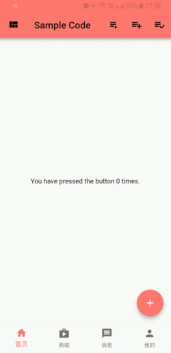
AppBar
Usually for Scaffold.appBar, it's a horizontal layout at the top of the screen. Why is it horizontal? It can be seen as follows:
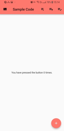
I set up several widget s in its anctions attribute, and then arranged them in the order of the three following ones.
 AppBar(
    title: Text('Sample Code'),
    leading: IconButton(
        icon: Icon(Icons.view_quilt),
        tooltip: 'Air it',
        onPressed: () {},
    ),
    bottom: TabBar(tabs: tabs.map((e) => Tab(text: e)).toList(),controller: _tabController),
    actions: <Widget>[
        IconButton(
        icon: Icon(Icons.playlist_play),
        tooltip: 'Air it',
        onPressed: () {},
        ),
        IconButton(
        icon: Icon(Icons.playlist_add),
        tooltip: 'Restitch it',
        onPressed: () {},
        ),
        IconButton(
        icon: Icon(Icons.playlist_add_check),
        tooltip: 'Repair it',
        onPressed: () {},
        )
    ],
)
For the above leading needs to be explained, we usually use it to display a button to close the current page or open a drawer. If you are interested, you can try it.~~
Among the many attributes of AppBar, there's another one that we use more often. That's bottom, which is displayed below the toolbar. Note that it's not the bottom of the screen. TabBar is usually used to switch between different pages in a page.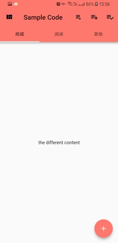
Of course, there are some other ways and means, so we won't take up much space here. Let's talk briefly.
- Title is the title.
- Drawer drawer, usually open on the left, default initial hiding
-
Are centerTitle s in the middle of the title?
If you want to see the complete implementation, then Come with me.!
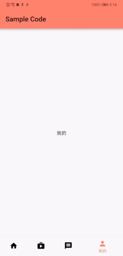
BottomNavigationBar
This property is also very important, if we want to achieve multiple, different page switching, you can use this. Why? Isn't that what I said?
Bottom Navigation Bar is different from TabBar in AppBar. One is used to display at the top and the other is used to display at the bottom.
There are few floating options in our domestic applications, so if you want your App not to float, you can use one of the type attributes.
type: BottomNavigationBarType.fixed,
Bottom Navigation BarType has two values, fixed and shifting by default. After this setting, there is still a problem: the font of the selected button will still be a little bigger than that of the unchecked button, and you can verify it by yourself if you are interested.
So what about this problem? Unfortunately, there is no way to deal with this problem in the latest stable version (Flutter Stable 1.2.1) SDK. If you want to solve this problem, change the Flutter SDK to the latest development version (Flutter Dev 1.3.8), you can use its properties to solve this problem.
selectedItemColor: colorRegular, //Choose the color
unselectedItemColor: colorBlack,//No color selected
selectedFontSize: 12,//Select font size
unselectedFontSize: 12,//Unselected font size
FloatingActionButton
Personally, I think this Floating Action Button still needs to be explained. After all, it is used more often. Floating Action Button is a floating button, that is, the button with "+" above, which can be used to add, share, or navigate. It can be used in conjunction with two attributes in Scaffold
- FloatingActionButtonLocation
- FloatingActionButtonAnimator
The Floating Action ButtonLocation property can move the position of the floating button. There are several positions that can be moved as follows:
FloatingActionButtonLocation.endDocked //Right Bottom NagivationBar Cover
FloatingActionButtonLocation.centerDocked //Cover the middle bottom NagivationBar
FloatingActionButtonLocation.endFloat //The top right of the bottomNagivationBar is displayed
FloatingActionButtonLocation.centerFloat //Center display above bottomNagivationBar
I can try it on my own. I won't show you all here. I'll just show you the center Docked.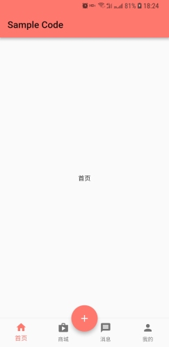
Floating Action Button Animator is the animation effect of Floating Action Button in the location where Floating Action Button Location appears.~~
The following points should be noted:
- If there are multiple Floating Action Button Locations on a page, you need to have each floating button have its own and unique hero Tag.
- If onPressed returns null, it will not respond to your touch. It is not recommended to display a floating button without any response.
SnackBar
Information prompts are often used in our applications, so we can use showSnackBar to display a short prompt, which defaults to 4s.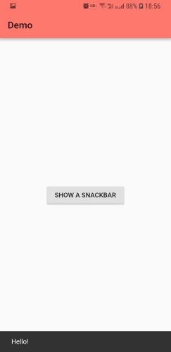
class SnackTest extends StatelessWidget{
  @override
  Widget build(BuildContext context) {
    return Scaffold(
      appBar: AppBar(
          title: Text('Demo')
      ),
      body: Center(
        child: RaisedButton(
          child: Text('SHOW A SNACKBAR'),
          onPressed: () {
            Scaffold.of(context).showSnackBar(SnackBar(
              content: Text('Hello!'),
            ));
          },
        ),
      )
    );
  }
}
Normally we will handle it as above, but we may throw an exception called with a context that does not contain a Scaffold. It will not show snackBar.
This is because the context required for Scaffold.of() is Scaffold, not built context above Scaffold, but not one of the two.
The right way is to create your own context:
class SnackTest extends StatelessWidget{
  @override
  Widget build(BuildContext context) {
    return Scaffold(
      appBar: AppBar(
          title: Text('Demo')
      ),
      body: Builder(
        // Create an inner BuildContext so that the onPressed methods
        // can refer to the Scaffold with Scaffold.of().
        builder: (BuildContext context) {
          return Center(
            child: RaisedButton(
              child: Text('SHOW A SNACKBAR'),
              onPressed: () {
                Scaffold.of(context).showSnackBar(SnackBar(
                  content: Text('Hello!'),
                ));
              },
            ),
          );
        },
      ),
    );
  }
}
Of course, you can also use the GlobalKey approach:
class ScaffoldTestState extends State<ScaffoldTest> {
  final _scaffoldKey = GlobalKey<ScaffoldState>();

  void showSnackBar() {
    _scaffoldKey.currentState
        .showSnackBar(new SnackBar(content: Text("SnackBar is Showing!")));
  }

  return new Scaffold(
        key: _scaffoldKey,
        body: Center(
        child: RaisedButton(
          child: Text('SHOW A SNACKBAR'),
          onPressed: () {
            showSnackBar(),
            ));
          },
        ),
      )
    }
}
Another hint is bottomSheet: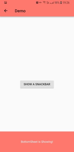
The difference between snackBar and snackBar is that although the prompt pops up, it will not disappear automatically, and it will need to be manually pulled down to disappear.
class SnackTest extends StatelessWidget{

  void showBottomSheet(BuildContext context) {
    Scaffold.of(context).showBottomSheet((BuildContext context) {
      return new Container(
        constraints: BoxConstraints.expand(height: 100),
        color: Color(0xFFFF786E),
        alignment: Alignment.center,
        child: new Text(
          "BottomSheet is Showing!",
          style: TextStyle(color: Color(0xFFFFFFFF)),
        ),
      );
    });
  }

  @override
  Widget build(BuildContext context) {
    return Scaffold(
      appBar: AppBar(
          title: Text('Demo')
      ),
      body: Builder(
        // Create an inner BuildContext so that the onPressed methods
        // can refer to the Scaffold with Scaffold.of().
        builder: (BuildContext context) {
          return Center(
            child: RaisedButton(
              child: Text('SHOW A SNACKBAR'),
              onPressed: () {
                showBottomSheet(context);
              },
            ),
          );
        },
      ),
    );
  }
}
Implementing login
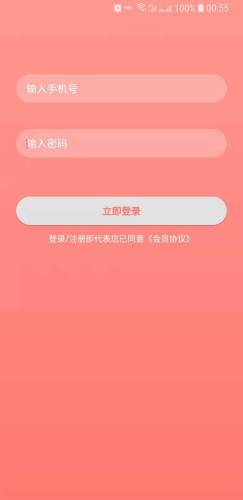
So much has been said before in preparation for our next presentation. Let's look at the login code first.
class LoginPageState extends State<LoginPage> {
  Color colorRegular = Color(0xFFFF786E);
  Color colorLight = Color(0xFFFF978F);
  Color colorInput = Color(0x40FFFFFF);
  Color colorWhite = Colors.white;

  TextStyle defaultTextStyle =
  TextStyle(color: Colors.white, fontWeight: FontWeight.bold, fontSize: 16);

  BorderRadius radius = BorderRadius.all(Radius.circular(21));

  void login() {

  }

  @override
  Widget build(BuildContext context) {
    // TODO: implement build
    return new Scaffold(
      body: Container(
        constraints: BoxConstraints.expand(),
        decoration: BoxDecoration(
            gradient: LinearGradient(
                colors: [colorLight, colorRegular],
                begin: Alignment.topCenter,
                end: Alignment.bottomCenter)),
        child: Column(
          children: <Widget>[
            Container (
              margin: EdgeInsets.only(top: 110, bottom: 39, left: 24, right: 24),
              decoration: BoxDecoration(
                  borderRadius: BorderRadius.all(Radius.circular(21)), color: colorInput),
              child: TextField(
                decoration: InputDecoration(
                    contentPadding: EdgeInsets.symmetric(horizontal: 15,vertical: 9),
                    border: InputBorder.none,
                    hintText: "Enter mobile phone number",
                    hintStyle: TextStyle(color: Colors.white, fontSize: 16),
                    labelStyle: TextStyle(color: Colors.black, fontSize: 16)),
                maxLines: 1,
                cursorColor: colorRegular,
                keyboardType: TextInputType.phone,
              ),
            ),
            Container(
              margin: EdgeInsets.only(bottom: 58, left: 24, right: 24),
              decoration: BoxDecoration(
                  borderRadius: radius,
                  color: colorInput),
              child: TextField(
                decoration: InputDecoration(
                    contentPadding: EdgeInsets.symmetric(horizontal: 15,vertical: 9),
                    border: InputBorder.none,
                    hintText: "Input password",
                    hintStyle: TextStyle(color: Colors.white, fontSize: 16),
                    labelStyle: TextStyle(color: Colors.black, fontSize: 16)),
                maxLines: 1,
                cursorColor: colorRegular,
                keyboardType: TextInputType.number,
                obscureText: true,
              ),
            ),
            Container(
              height: 42, width: 312,
              margin: EdgeInsets.only(left: 24, right: 24),
              decoration: BoxDecoration (
                  borderRadius: radius,
                  color: colorWhite),
              child: RaisedButton(onPressed: login,
                  elevation: 1,
                  highlightElevation: 1,
                  textColor: colorRegular,
                  shape: RoundedRectangleBorder(
                      borderRadius: radius
                  ),
                  child: new Text("Log in immediately", style: TextStyle(
                      fontSize: 15,
                      fontWeight: FontWeight.bold),
                  )),
            ),
            Padding(
              padding: EdgeInsets.only(top: 10),
              child: Text(
                "Sign in/Registration means that you have agreed to the Membership Agreement.",
                style: TextStyle(color: Colors.white, fontSize: 13),
              ),
            ),
          ],
        ),
      ),
    );
  }
}
As mentioned in the previous chapter, if the State changes throughout the life cycle, then we use StatefulWidget to present it, and the implementation of StatefulWidget requires two steps: one is to create a class inheriting StatefulWidget; the other is to create a class inheriting StatefulWidget, which generally controls the whole State in StatefulWidget. So here it is:
class LoginPage extends StatefulWidget {
  @override
  State<StatefulWidget> createState() => LoginPageState();
}

class LoginPageState extends State<LoginPage> {

  @override
  Widget build(BuildContext context) {
    // TODO: implement build
    return new Scaffold(
      body: Container(
      //Eliminate code
      ...
      )
    );
  }
}
And the current login interface does not have a toolbar, so the AppBar is removed. Write everything directly in the body. You can see that the background of the whole login interface is a gradient, shallow above and deeper below, so you need a container to wrap the whole content, and this container can achieve the gradient of the background color, so I chose Container, because it is the most comprehensive attribute in all container layout.
 Container({
    Key key,
    this.alignment,//Arrangement of sub-layouts
    this.padding,//Internal filling
    Color color,//background color
    Decoration decoration,  //Decorative containers
    this.foregroundDecoration,//Prospect Decoration
    double width, //Vessel width
    double height, //Container height
    BoxConstraints constraints, //constraint
    this.margin, //External Filling
    this.transform, //Transform containers
    this.child,
  })
Tip: If the container is under body, regardless of width or height, it will be full-screen.
So the outermost gradient is using Box Decoration:
const BoxDecoration({
    this.color,
    this.image, picture
    this.border, //Frame
    this.borderRadius, //fillet
    this.boxShadow, //shadow
    this.gradient, //Gradual change
    this.backgroundBlendMode, //Background mode, default BlendMode.srcOver
    this.shape = BoxShape.rectangle, //shape
  }) : assert(shape != null),
       assert(
         backgroundBlendMode == null || color != null || gradient != null,
         'backgroundBlendMode applies to BoxDecoration\'s background color or '
         'gradient, but no color or gradient was provided.'
       );
Tip: In shape processing, the following are interchangeable:
- CircleBorder === BoxShape.circle
- RoundedRectangleBorder == BoxShape.rectangle
So we can accomplish our gradient from the top:
 decoration: BoxDecoration(
            gradient: LinearGradient(
                colors: [colorLight, colorRegular],
                begin: Alignment.topCenter,
                end: Alignment.bottomCenter)
        )
Implementing the process of gradient, then is the input box, from the design point of view, these contents are arranged vertically, so the content uses layout Column for vertical layout, of course, the relative horizontal layout Row.
 Column({
    Key key,
    //The arrangement of the principal axis, where the principal axis is vertical, is actually vertical layout.
    MainAxisAlignment mainAxisAlignment = MainAxisAlignment.start,
    //Column controls that occupy the spindle (vertically) by default as large as possible
    MainAxisSize mainAxisSize = MainAxisSize.max,
    //Cross-axis arrangement, then it's horizontal.
    CrossAxisAlignment crossAxisAlignment = CrossAxisAlignment.center,
    //Layout order of horizontal sub-widget s
    TextDirection textDirection,
    //Alignment Direction of Crossing Axis
    VerticalDirection verticalDirection = VerticalDirection.down,
    TextBaseline textBaseline,
    List<Widget> children = const <Widget>[],
  })
There are three Containers in Column, the first two being the input layout TextField, and the last one being RaisedButton. Here's the answer to the question raised at the beginning of the article: Why wrap TextField with Container?
- The need for decoration
- To achieve spacing (marin and padding)
All need to use Container to complete this style decoration.
TextField should be the widget we use more often:
TextField(
    decoration: InputDecoration(
        contentPadding: EdgeInsets.symmetric(horizontal: 15,vertical: 9),
        border: InputBorder.none,
        hintText: "Enter mobile phone number",
        hintStyle: TextStyle(color: Colors.white, fontSize: 16),
        labelStyle: TextStyle(color: Colors.black, fontSize: 16)
    ),
    maxLines: 1,
    cursorColor: colorRegular,
    keyboardType: TextInputType.phone,
),
Here we just use decoration to decorate TextField, such as content Padding, to fill in the blanks.
cursorColor cursor color, input type keyboard type, here is the mobile phone number type. In addition, there are a lot of attributes, here do not go into detail, you can go to the official website to see.
The last one wrapped by container is AisedButton:
RaisedButton(
    onPressed: login,
    elevation: 1,
    highlightElevation: 1,
    textColor: colorRegular,
    shape: RoundedRectangleBorder(
        borderRadius: radius
    ),
    child: new Text("Log in immediately", style: TextStyle(
        fontSize: 15,
        fontWeight: FontWeight.bold),
))
I'll decorate it, too.
-
The layout of the login interface everywhere is finished, and then it will appear at the beginning of the article after running, but when we click on TextField for input, we will find that the entire layout will be on top. Why?
Answer: This is because Scaffold fills up the whole available space. When a soft keyboard appears from the Scaffold layout, Scaffold will recalculate the size when the available space is less. This is the fundamental reason why Scaffold will move all our layout up. To avoid this, we can use res. IzeToAvoid Bottom Inset and
Just set it to false. - How do I remove the debug tag in the upper right corner of the screen?
Answer: Set debugShow Checked Mode Banner in Material App to false
class MyApp extends StatelessWidget {
  // This widget is the root of your application.
  @override
  Widget build(BuildContext context) {
    return MaterialApp(
      title: 'Flutter Demo',
      theme: ThemeData(
        primaryColor: Color(0xFFFF786E),
        primaryColorLight: Color(0xFFFF978F),
        accentColor: Color(0xFFFFFFFF)
      ),
      home: LoginPage(),
      debugShowCheckedModeBanner: false,
    );
  }
}- How to let the status bar show immersion without gray catching up?
 runApp(new MyApp());
  if (Platform.isAndroid) {
    // The following two lines set the android status bar to transparent immersion.
    //Written after component rendering, it is for set assignment after rendering.
    //Override the status bar, which is overwritten by the MaterialApp component before rendering.
    SystemUiOverlayStyle systemUiOverlayStyle =
    SystemUiOverlayStyle(statusBarColor: Colors.transparent);
    SystemChrome.setSystemUIOverlayStyle(systemUiOverlayStyle);
  }
Finally, I recommend a Flutter book to you. It introduces the use of Flutter in detail and provides demonstration cases. Flutter Actual Warfare: