It's been more than a year since Constraint Layout was released at Google I/O last year, but it hasn't been popularized. People who know about Constraint Layout layout know that its performance has improved a lot. Not long ago, the Google developer blog published an article. Understanding the performance benefits of ConstraintLayout(Chinese address ) Detailed analysis of the advantages of ConstraintLayout performance, interested friends can see.
Of course, I didn't realize the performance advantages of Constraint Layout layout before, so I started this article by introducing the attributes and use of Constraint Layout in detail, and I also have a more comprehensive understanding of Constraint Layout. Today's article mainly introduces some attributes of layout, learning address is Google Documents.
To configure
Before using ConstraintLayout, we need to add ConstraintLayout dependencies to the gradle file under our app. Up to now, the latest version of ConstraintLayout is 1.0.2.
dependencies {
    compile 'com.android.support.constraint:constraint-layout:1.0.2'
}
Relative positioning
The effect of relative positioning is similar to that of Relative Layout, but stronger than that of Relative Layout. Constraints allow us to specify the position of one control relative to another, and through some properties we can arrange components horizontally or vertically. For example, when we use keyword attributes containing Left, Right, Start or End to locate components, we arrange them horizontally. Similarly, top, bottom and text baseline (baseline position of text) are arranged vertically. Some attributes of specific relative positioning are grouped as follows
- layout_constraintLeft_toLeftOf
The left of the current component is aligned to the left of a component. - layout_constraintLeft_toRightOf
The left side of the current component is on the right side of a component. - layout_constraintRight_toLeftOf
The right side of the current component is on the left side of a component. - layout_constraintRight_toRightOf
The right side of the current component is on the right side of a component. - layout_constraintTop_toTopOf
The top edge of the current component and the top edge of a component are opposite to each other. - layout_constraintTop_toBottomOf
The top of the current component is below a component. - layout_constraintBottom_toTopOf
The bottom of the current component is on top of a component. - layout_constraintBottom_toBottomOf
The bottom of the current component is below a component. - layout_constraintBaseline_toBaselineOf
Baseline position of current component and baseline position of a component to it (rarely used) - layout_constraintStart_toEndOf
- layout_constraintStart_toStartOf
- layout_constraintEnd_toStartOf
- layout_constraintEnd_toEndOf
There are two values for these attributes, one is the component ID at the same level, and the other is the parent, which is positioned relative to the parent layout when the value is parent.
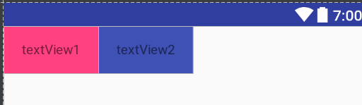
<?xml version="1.0" encoding="utf-8"?>
<android.support.constraint.ConstraintLayout xmlns:android="http://schemas.android.com/apk/res/android"
    xmlns:app="http://schemas.android.com/apk/res-auto"
    android:layout_width="match_parent"
    android:layout_height="match_parent">

    <TextView
        android:id="@+id/textView1"
        android:layout_width="100dp"
        android:layout_height="50dp"
        android:background="@color/colorAccent"
        android:gravity="center"
        android:text="textView1" />

    <TextView
        android:id="@+id/textView2"
        android:layout_width="100dp"
        android:layout_height="50dp"
        android:background="@color/colorPrimary"
        android:gravity="center"
        android:text="textView2"
        app:layout_constraintLeft_toRightOf="@+id/textView1" />
</android.support.constraint.ConstraintLayout>
For example, in the above layout, we use app: layout_constraintLeft_to RightOf="@+id/textView1" to align the left side of textView2 with the right side of textView1. The rendering
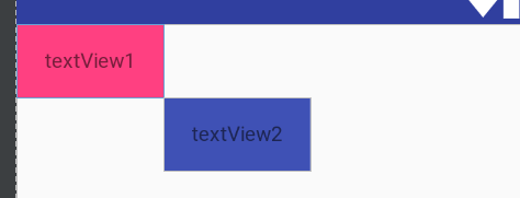
Then when the textView2 property is set to
    app:layout_constraintTop_toBottomOf="@+id/textView1"
    app:layout_constraintLeft_toRightOf="@+id/textView1"
Design sketch:
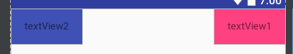
When textView1 sets the property app:layout_constraintRight_toLeftOf="parent"
When textView2 sets app:layout_constraintLeft_toLeftOf="parent",
Design sketch:
Margins
We are not unfamiliar with margin values, because we often use them. There are several kinds of margin values
- android:layout_marginStart
- android:layout_marginEnd
- android:layout_marginLeft
- android:layout_marginTop
- android:layout_marginRight
- android:layout_marginBottom
Note that this margin only works where constraints are set, as follows
<?xml version="1.0" encoding="utf-8"?>
<android.support.constraint.ConstraintLayout xmlns:android="http://schemas.android.com/apk/res/android"
    xmlns:app="http://schemas.android.com/apk/res-auto"
    android:layout_width="match_parent"
    android:layout_height="match_parent">

    <TextView
        android:id="@+id/textView1"
        android:layout_width="100dp"
        android:layout_height="50dp"
        android:background="@color/colorAccent"
        android:gravity="center"
        android:layout_marginLeft="10dp"
        android:layout_marginTop="10dp"
        app:layout_constraintLeft_toLeftOf="parent"
        android:text="textView1" />
</android.support.constraint.ConstraintLayout>
We only set the left constraints of TextView and the left constraints of parent layout. When we set the margin values of both left and upper margins to 10, we found that only the left margin took effect, and the change of the upper margin did not work. This also verified that the margin only played a role in the constrained areas.
In addition to our commonly used margin settings properties, ConstraintLayout also provides some unique margin settings. Look at the following layout first
<?xml version="1.0" encoding="utf-8"?>
<android.support.constraint.ConstraintLayout xmlns:android="http://schemas.android.com/apk/res/android"
    xmlns:app="http://schemas.android.com/apk/res-auto"
    android:layout_width="match_parent"
    android:layout_height="match_parent">

    <TextView
        android:id="@+id/textView1"
        android:layout_width="100dp"
        android:layout_height="50dp"
        android:background="@color/colorAccent"
        android:gravity="center"
        android:text="textView1"
        app:layout_constraintLeft_toLeftOf="parent" />

    <TextView
        android:id="@+id/textView2"
        android:layout_width="100dp"
        android:layout_height="50dp"
        android:background="@color/colorPrimary"
        android:gravity="center"
        android:text="textView2"
        app:layout_constraintLeft_toRightOf="@+id/textView1" />
</android.support.constraint.ConstraintLayout>
Textview2 above is on the right side of textview1, so when we set View.GONE to hide the control for textview1 due to some need, textview2 will run to the upper left corner, and if we hide textview, we will keep textview2 unchanged. Previous applications can be a little more cumbersome, but ConstraintLayout provides us with the layout_goneMargin** class attribute, which represents the margin value when constraints are hidden. For example, in textView2 above, we add the app:layout_goneMarginLeft="100dp" attribute to keep the textView2 position unchanged when the constraint textView1 is hidden.
One thing to note is that if a constraint sets View.GONE, which is equal to 0 width and height of the component and one point in the constraint layout, the other constraints are still valid.
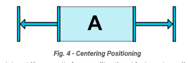
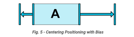
Centering positioning and bias
    <TextView
        android:id="@+id/textView1"
        android:layout_width="100dp"
        android:layout_height="50dp"
        android:background="@color/colorAccent"
        android:gravity="center"
        android:text="textView1"
        app:layout_constraintLeft_toLeftOf="parent"
        app:layout_constraintRight_toRightOf="parent" />
If we add textview in the constrained layout and set the left side and the left side of the parent layout, the right side aligned with the right side of the parent layout, and set the width of 100dp, then what is the effect at this time? We find that textview is centered, which is the centering of constraint layout.
In fact, we can understand that the parent layout has a pull on the left and right sides of the textview, because by default, the force is the same size and is displayed in the middle position.
Above, because of two opposite constraints, the component is centered, and bias is also provided in the collaborative layout. By default, the value is 0.5 (50%). For example, we set the textview attribute by setting the component's bias to a horizontal or vertical position through the attribute layout_constraintHorizontal_bias or layout_constraintVertical_bias.
app:layout_constraintHorizontal_bias="0.3"
At this point, the component leans to the left.
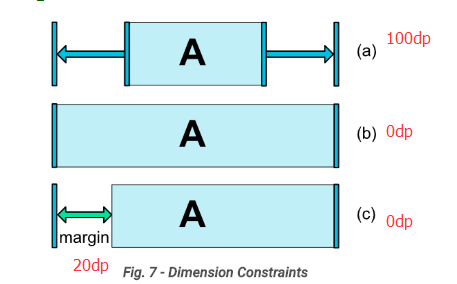
Dimensions constraints
When we set wrap_content for the sub-components of our coordinated layout, we can set the minimum width or height constraints through the android:minWidth or android:minHeight properties. minWidth/minHeight works only if the width or height is wrap_content.
For the android: layout_height/android: layout_width attribute, its value has only three cases
- Use a reference of the specified size or size, such as 100dp
- WRAP_CONTENT, which calculates its own size based on the content
- 0dp, which is equivalent to MATCH_CONSTRAINT.
It should be noted that the value of the MATCH_PARENT attribute is not supported in the constraint layout. For example, in the TextView above, we set layout_width to 100dp, 0dp and 0dp (margin Left: 20dp), respectively. The general effect is shown in Figures a,b,c.
Ratio
Scale constraints can constrain the aspect ratio of our control, such as the following example
    <TextView
        android:id="@+id/textView1"
        android:layout_width="100dp"
        android:layout_height="0dp"
        android:background="@color/colorAccent"
        android:gravity="center"
        android:text="textView1"
        app:layout_constraintDimensionRatio="2:1"
        app:layout_constraintLeft_toLeftOf="parent"
        app:layout_constraintRight_toRightOf="parent" />
If the width is 100 DP and the height is 0 dp, and the aspect ratio is 2:1, the width will be automatically adjusted to 50 dp.
If we change the width and height above, the width is 0 DP and the height is 100 dp, then the final width is 200 and the height is 100 (width: height = 2:1).
The width-to-height ratio constraint described above is one-dimensional, so if we have both width and height constraints, it is set to 0dp. In this case, the system will use the maximum size that satisfies all the constraints and ratios. Of course, we can also add W or H before the scale value to restrict width or height, such as H,2:1.
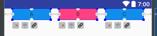
Chains
Chain is a special constraint that allows multiple Views connected by the chain to equalize the remaining space position.
Here we create a horizontal chain
<?xml version="1.0" encoding="utf-8"?>
<android.support.constraint.ConstraintLayout xmlns:android="http://schemas.android.com/apk/res/android"
    xmlns:app="http://schemas.android.com/apk/res-auto"
    android:layout_width="match_parent"
    android:layout_height="match_parent">

    <TextView
        android:id="@+id/A"
        android:layout_width="100dp"
        android:layout_height="30dp"
        android:background="@color/btnnormal"
        android:gravity="center"
        android:text="A"
        app:layout_constraintLeft_toLeftOf="parent"
        app:layout_constraintRight_toLeftOf="@+id/B" />

    <TextView
        android:id="@+id/B"
        android:layout_width="100dp"
        android:layout_height="30dp"
        android:background="@color/colorAccent"
        android:gravity="center"
        android:text="B"
        app:layout_constraintLeft_toRightOf="@+id/A"
        app:layout_constraintRight_toLeftOf="@+id/C" />

    <TextView
        android:id="@+id/C"
        android:layout_width="100dp"
        android:layout_height="30dp"
        android:background="@color/btnnormal"
        android:gravity="center"
        android:text="C"
        app:layout_constraintLeft_toRightOf="@+id/B"
        app:layout_constraintRight_toRightOf="parent" />
</android.support.constraint.ConstraintLayout>
The effect diagram of the above code is as follows. A and C have a constraint relative to the left and right side of the parent component. A and B, B and C restrict each other. What we need to know is that the first element component of the chain is the chain head. Figure A below is the chain head of the chain.
Chain mode
For the chain head, we can set it by the attribute layout_constraintHorizontal_chainStyle (layout_constraintVertical_chainStyle), which has three values: spread, spread_inside, packed.
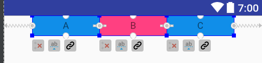
- CHAIN_SPREAD
By default, the default value of this property is spread. Its clearance divides the remaining space equally, as shown in the figure above. - CHAIN_SPREAD_INSIDE
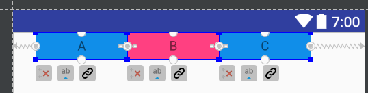
The spread_inside value will display the two most edged Views on both sides by the side, and then let the remaining View s divide the gap in the remaining space. When spread_inside is set face to face, the effect diagram is as follows
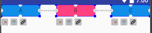
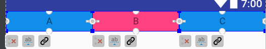
- CHAIN_PACKED
Another value is packed, which means that the view s are displayed next to each other, and all of them are displayed in the center. After setting this mode, the effect is as follows
In addition, we can adjust the overall position by setting the layout_constraintHorizontal_bias attribute. The default is in the middle, that is, the value is 0.5. For example, if we set the value to 0.3, the effect is as follows.
- Weighted chain
In CHAIN_SPREAD mode, if we set the width or height of the control to 0 dp, they will equally divide the width or height of the parent control according to the weight. The setting of the weight is the same as setting the weight of the attribute in our linear layout. For example, in the three TextView s above, we set the weight. The width is 0dp and the chain style is spread (or spread_inside). The effect is as follows
If we set the following properties for A and C
app:layout_constraintHorizontal_weight="1"
Set properties for B
app:layout_constraintHorizontal_weight="2"
At this time, the width of A, B and C is 1:2:1, which accounts for the full width of the parent component. Chain style cannot be set to packed when weight is set (width will shrink to 0 after setting)
Reference Line Guideline
Guideline is used to assist us in locating View s and setting constraints. It will no longer really display, but it will play a supporting role. Common attributes are as follows
- android:orientation
This property can specify whether the auxiliary line is vertical or horizontal. It has two values, vertical and horizontal. - layout_constraintGuide_begin/layout_constraintGuide_end
Used to set the distance between the start or end edges of aligned parent components. - layout_constraintGuide_percent
This value is between 0.0 and 1.0, which is used to set the position of the auxiliary line in the parent layout, such as 0.5, which is equivalent to 50% of the width of the parent view.
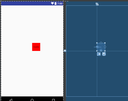
    <android.support.constraint.Guideline
        android:id="@+id/guideline_h"
        android:layout_width="wrap_content"
        android:layout_height="wrap_content"
        android:orientation="horizontal"
        app:layout_constraintGuide_percent="0.5" />

    <android.support.constraint.Guideline
        android:id="@+id/guideline_v"
        android:layout_width="wrap_content"
        android:layout_height="wrap_content"
        android:orientation="vertical"
        app:layout_constraintGuide_percent="0.5" />

    <TextView
        android:id="@+id/tvguide"
        android:layout_width="50dp"
        android:layout_height="50dp"
        android:background="@color/red"
        android:gravity="center"
        android:text="Guide"
        app:layout_constraintBottom_toTopOf="@+id/guideline_h"
        app:layout_constraintLeft_toLeftOf="@+id/guideline_v" />
On the top, we create two auxiliary lines in the constraint layout, which are vertical and horizontal auxiliary lines, and align the bottom of textView with the top of horizontal auxiliary lines, and align the left side of TextView with the left side of vertical auxiliary lines. In this way, we can use auxiliary lines to arbitrarily control the constrained position of View.
Well, the basic knowledge of Constraint Layout is introduced here today. The next article will introduce the knowledge of Behavior in Constraint Layout layout. If there are errors in this article, you are welcome to point out. Hava a wonderful day.