This article is reproduced from Introduction to the Basic Use of Layer-list-layer-list
1. What is layer-list? What's the effect?
1.1 What is layer-list?
Simply understand, layer is a layer, list is a list, then layer-list is the meaning of layer list. But what level list is it? In fact, layer-list is used to create Layer Drawable, Layer Drawable is one of Drawable Resources, so layer-list creates a layer list, that is, a drawable graph.
1.2 layer-list uses
As mentioned above, layer-list is used to create a list of layers by which special drawable s can be created, such as:
In the Alert Dialog below, we just need to set the top edge of the button and the right edge of the left button (or the left edge of the right button), so we can't use shapes directly, because shapes are used to draw four borders directly; if you have an artist cut it, it's a lot less flexible, and it adds app s. Volume; in this case, layer-list is the best choice. Of course, there are many uses of layer-list. Here's just one example. Please continue to look at the specific use. 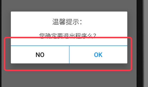
2. General Principle of Layer-list
The general principle of layer-list is similar to that of Relative Layout (or FrameLayout), but it is also a layer-by-layer overlay, which is added first. In layer-list, different display effects can be obtained by adding four attributes, such as the top left margin, the bottom right margin and so on, to the bottom layer after controlling.
In the example diagram above, the background of the ok button at the bottom of the Alert Dialog is implemented with layer-list. In this layer-list, the bottom layer uses a shape with a filling color of blue, the upper layer uses a shape with filling color of white, and then controls the top edge distance of the upper layer to the bottom layer of 1dp, thus visually forming a white background with a blue top edge. The specific code continues to look down.
3. Basic use examples of layer-list:
Because layer-list creates drawable resources, like shape selector, it is defined in the drawable folder in res and is also an xml file. When you use it, you use the @drawable/xxx reference in the layout file and the R.drawable.xxx x reference in the code with the shape selector.
Different layers in layer-list are defined using item nodes.
3.1 Effect 1: Single Side Line
Design sketch:
In the figure, TextView has only one top edge. 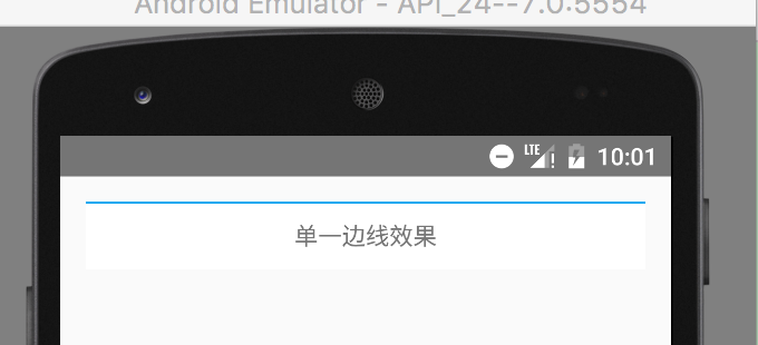
Specific code:
- Create a layer-list graph with a blue top border
Under the drawable directory in the res directory, create an XML file named singleline.xml, and then edit the layer-list details as follows:
<?xml version="1.0" encoding="utf-8"?>
<layer-list xmlns:android="http://schemas.android.com/apk/res/android">

    <! - The bottom uses blue filler colour - >.
    <item>
        <shape>
            <solid android:color="#02a0ef"/>
        </shape>
    </item>

    <! - The top layer is DP away from the top of the bottom layer, similar to marginTop, and the filling color is white, thus forming a white background with a blue top edge - >
    <item android:top="1dp">
        <shape>
            <solid android:color="#fff"/>
        </shape>
    </item>
</layer-list>- Using the layer-list diagram, set the background to textView
 <TextView
        android:layout_width="match_parent"
        android:layout_height="40dp"
        android:background="@drawable/singleline"
        android:gravity="center"
        android:text="Single sideline effect"/>
3.2 Effect 2: Bilateral Line
Design sketch:
In the figure, TextView has upper and lower edges 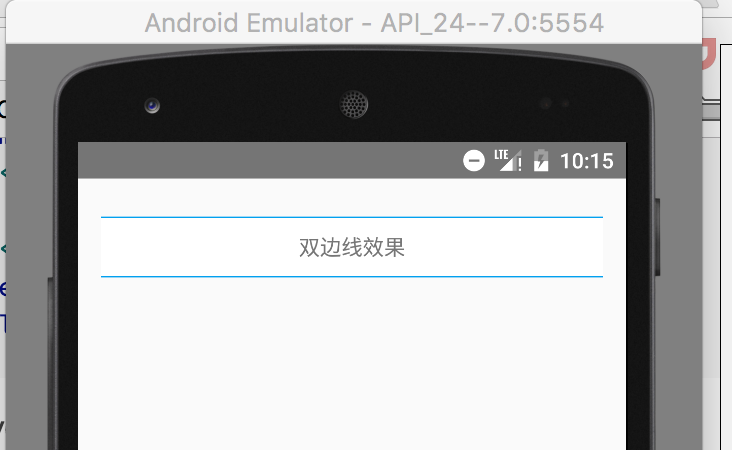
Specific code:
- Create a layer-list graph with blue top and bottom edges
<?xml version="1.0" encoding="utf-8"?>
<layer-list xmlns:android="http://schemas.android.com/apk/res/android">

    <!--The bottom is filled with blue.-->
    <item>
        <shape>
            <solid android:color="#02a0ef"/>
        </shape>
    </item>

    <!--The upper layer is 1 from the top of the bottom layer. dp,Distance from bottom 1 dp,Similar marginTop,The fill color is white, thus forming a white background with blue top and bottom edges.-->
    <item android:bottom="1dp"
          android:top="1dp">
        <shape>
            <solid android:color="#fff"/>
        </shape>
    </item>
</layer-list>- Using the layer-list diagram, set the background to textView
<TextView
        android:layout_width="match_parent"
        android:layout_height="40dp"
        android:layout_marginTop="10dp"
        android:background="@drawable/doubleline"
        android:gravity="center"
        android:text="Bilateral line effect"/>
3.3 Effect 3: Shadows
Design sketch: 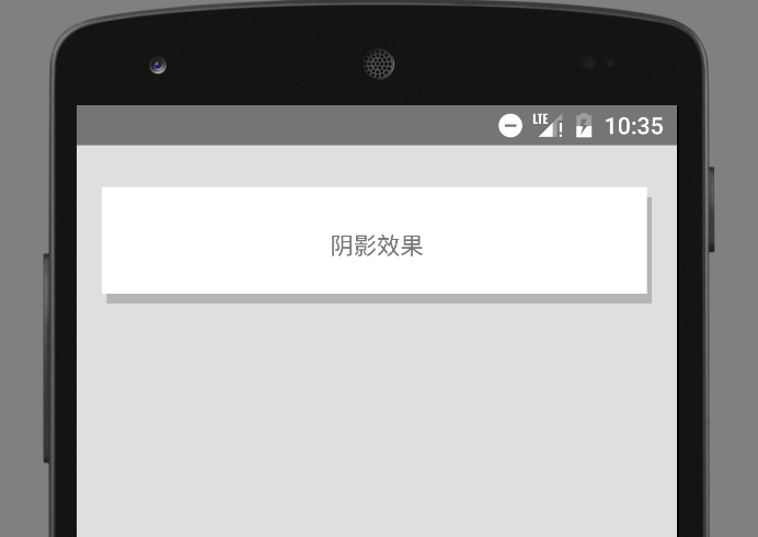
Specific code:
- Create layer-list
<?xml version="1.0" encoding="utf-8"?>
<layer-list xmlns:android="http://schemas.android.com/apk/res/android">

    <!--The left side of the bottom is 3 from the left side of the upper layer. dp, The top of the bottom, 6 from the top of the top. dp,If this control is not done, the left and upper sides of the bottom and upper layers will overlap.-->
    <item android:left="3dp"
          android:top="6dp">
        <shape>
            <solid android:color="#b4b5b6"/>
        </shape>
    </item>

    <!--The right side of the upper layer is 3 from the right side of the lower layer. dp, The bottom of the upper layer is 6 from the bottom of the lower layer. dp-->
    <item android:bottom="6dp"
          android:right="3dp">
        <shape>
            <solid android:color="#fff"/>
        </shape>
    </item>
</layer-list>- Using layer-list graphs
 <TextView
        android:layout_width="match_parent"
        android:layout_height="70dp"
        android:layout_marginTop="10dp"
        android:background="@drawable/shadow"
        android:gravity="center"
        android:text="Shadow effect"/>
3.4 Effect 4: Picture Cascade
There are two kinds of effects when the images are stacked. One is the stacking after scaling, the other is the stacking without scaling. The default is the zoom effect. The specific effect and implementation code are as follows:
Figure 1: Scaling effect 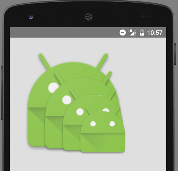
Specific code 1:
- Create layer-list
<?xml version="1.0" encoding="utf-8"?>
<layer-list xmlns:android="http://schemas.android.com/apk/res/android">
    <!--Default scaling-->
    <item>
        <bitmap
            android:src="@drawable/ic_launcher"/>
    </item>

    <item android:left="35dp"
          android:top="35dp">
        <bitmap
            android:src="@drawable/ic_launcher"/>
    </item>

    <item android:left="70dp"
          android:top="70dp">
        <bitmap
            android:src="@drawable/ic_launcher"/>
    </item>
</layer-list>
Or you can use the following code to implement the scaled overlay graph:
<?xml version="1.0" encoding="utf-8"?>
<layer-list xmlns:android="http://schemas.android.com/apk/res/android">
    <!--This way you get a scaling effect, even if you give it item Set up gravity And the effect seen from the simulator is not scalable, but it is still scalable on the real machine.-->
    <item android:drawable="@drawable/ic_launcher">
    </item>
    <item android:drawable="@drawable/ic_launcher"
          android:left="45dp"
          android:top="45dp">
    </item>
    <item android:drawable="@drawable/ic_launcher"
          android:left="90dp"
          android:top="90dp">
    </item>
</layer-list>- Using layer-list graphs
  <ImageView
        android:layout_width="wrap_content"
        android:layout_height="wrap_content"
        android:background="@drawable/overlay"
    />
Figure 2: No zoom effect
Be careful:
A. Without scaling, bitmap nodes must be used in item nodes and gravity=center must be set for bitmap.
B. Although drawable attributes in item can be used directly when scaling effect is achieved, if drawable attributes are used when achieving non-scaling effect, even if gravity =center is set to item, the effect on the real machine will still be scaled. (But the simulator is not scalable)

Specific code 2:
- Create layer-list
<?xml version="1.0" encoding="utf-8"?>
<layer-list xmlns:android="http://schemas.android.com/apk/res/android">
    <!--No scaling-->
    <item>
        <bitmap
            android:gravity="center"
            android:src="@drawable/ic_launcher"/>
    </item>

    <item android:left="35dp"
          android:top="35dp">
        <bitmap android:gravity="center"
                android:src="@drawable/ic_launcher"/>
    </item>

    <item android:left="70dp"
          android:top="70dp">
        <bitmap android:gravity="center"
                android:src="@drawable/ic_launcher"/>
    </item>

</layer-list>- Using layer-list graphs
 <ImageView
        android:layout_width="wrap_content"
        android:layout_height="wrap_content"
        android:background="@drawable/overlay"
    />
3.5 Effect 5: Overlay Rotation
Design sketch: 
Specific code:
- Create layer-list
<?xml version="1.0" encoding="utf-8"?>
<layer-list xmlns:android="http://schemas.android.com/apk/res/android">

    <item>
        <rotate android:fromDegrees="-10" android:pivotX="0"
                android:pivotY="0">
            <bitmap android:src="@drawable/decibel_blue_background"/>
        </rotate>
    </item>
    <item>
        <rotate android:fromDegrees="10" android:pivotX="0"
                android:pivotY="0">
            <bitmap android:src="@drawable/decibel_orange_background"/>
        </rotate>
    </item>
    <item>
        <rotate android:fromDegrees="30" android:pivotX="0"
                android:pivotY="0">
            <bitmap android:src="@drawable/decibel_red_background"/>
        </rotate>
    </item>


</layer-list>
When rotating, only the starting angle (from degress) is needed.
- Using layer-list graphs
    <!--Picture Overlay with Rotation Effect-->
    <ImageView
        android:layout_width="wrap_content"
        android:layout_height="wrap_content"
        android:background="@drawable/rotate"/>
4. Extended use of layer-list
4.1. Implementing the effect of selector
Major use components: RadioGroup Selector layer-list
1). Effect map: 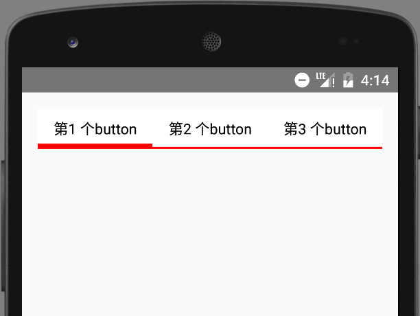
2. Specific code
Define selector selector selector
In the item node of selector, nest layer-list directly
Of course, you can also write layer-list first, and then quote it.
<?xml version="1.0" encoding="utf-8"?>
<selector xmlns:android="http://schemas.android.com/apk/res/android">
    <!--When selected, it was 4. dp The bottom edge-->
    <item android:state_checked="true">
        <layer-list>
            <item>
                <shape>
                    <solid android:color="#f00"/>
                </shape>
            </item>
            <item android:bottom="4dp">
                <shape>
                    <solid android:color="#fff"/>
                </shape>
            </item>
        </layer-list>
    </item>

    <!--Unselected 2 dp The bottom edge-->
    <item>
        <layer-list>
            <item>
                <shape>
                    <solid android:color="#f00"/>
                </shape>
            </item>
            <item android:bottom="2dp">
                <shape>
                    <solid android:color="#fff"/>
                </shape>
            </item>
        </layer-list>
    </item>
</selector>
Be careful:
In the above code, because there is no specific shape, we can omit shape and use color directly. The simplified code is as follows:
<?xml version="1.0" encoding="utf-8"?>
<selector xmlns:android="http://schemas.android.com/apk/res/android">

    <!--When selected, it was 4. dp The bottom edge-->
    <item android:state_checked="true">
        <layer-list>
            <item>
                <color android:color="#f00"/>
            </item>
            <item android:bottom="5dp">
                <color android:color="#fff"/>
            </item>
        </layer-list>
    </item>

    <!--Unselected 2 dp The bottom edge-->
    <item>
        <layer-list>
            <item>
                <color android:color="#f00"/>
            </item>
            <item android:bottom="2dp">
                <color android:color="#fff"/>
            </item>
        </layer-list>
    </item>
</selector>- Using selector
<LinearLayout xmlns:android="http://schemas.android.com/apk/res/android"
              android:layout_width="match_parent"
              android:layout_height="match_parent"
              android:orientation="vertical"
              android:padding="15dp">
    <RadioGroup
        android:id="@+id/rg"
        android:layout_width="match_parent"
        android:layout_height="wrap_content"
        android:orientation="horizontal">
        <RadioButton
            android:id="@+id/rb1"
            android:layout_width="0dp"
            android:layout_height="wrap_content"
            android:layout_weight="1"
            android:background="@drawable/selector_bk_rb"
            android:button="@null"
            android:checked="true"
            android:gravity="center"
            android:padding="10dp"
            android:text="First button"/>
        <RadioButton
            android:layout_width="0dp"
            android:layout_height="wrap_content"
            android:layout_weight="1"
            android:background="@drawable/selector_bk_rb"
            android:button="@null"
            android:gravity="center"
            android:padding="10dp"
            android:text="Second button"/>
        <RadioButton
            android:layout_width="0dp"
            android:layout_height="wrap_content"
            android:layout_weight="1"
            android:background="@drawable/selector_bk_rb"
            android:button="@null"
            android:gravity="center"
            android:padding="10dp"
            android:text="Third button"/>

    </RadioGroup>
</LinearLayout>
Be careful:
In RadioGroup, the id of RadioButton is used to control the selection.
Therefore, if you need to set a RadioButton as the default selection, you must set the RadioButton id.
If the id is not set, the result is that the RadioButton will always be selected!!!