Introduction to applet Progress component
progress bar. The length unit of component attribute is px by default, 2.4.0 Incoming units (rpx/px) are supported.
attribute
All visible components of the applet can bind the tap event bindmap, even if it is not indicated in the attribute.
If the Boolean attribute in the applet is true, you only need to write the attribute name. If you want to set it to false, you need to write the attribute name = "false".
| attribute | type | Default value | Required | explain |
|---|---|---|---|---|
| percent | number | no | Percentage 0 ~ 100 | |
| show-info | boolean | false | no | Displays the percentage to the right of the progress bar |
| border-radius | number/string | 0 | no | Fillet size |
| font-size | number/string | 16 | no | Right percentage font size |
| stroke-width | number/string | 6 | no | Width of the progress bar (viewed from the forward direction of the progress bar, it is actually the height of the component from the appearance) |
| color | string | #09BB07 | no | Progress bar color (use activeColor) |
| activeColor | string | #09BB07 | no | The color of the selected progress bar |
| backgroundColor | string | #EBEBEB | no | Color of unselected progress bar |
| active | boolean | false | no | Progress bar animation from left to right |
| active-mode | string | backwards | no | backwards: the animation is played from scratch; Forwards: the animation is played from the last ending point (forwards is generally used in practice) |
| duration | number | 30 | no | Milliseconds required to increase progress by 1% |
| bindactiveend | eventhandle | no | Animation completion event |
Applet color design specification
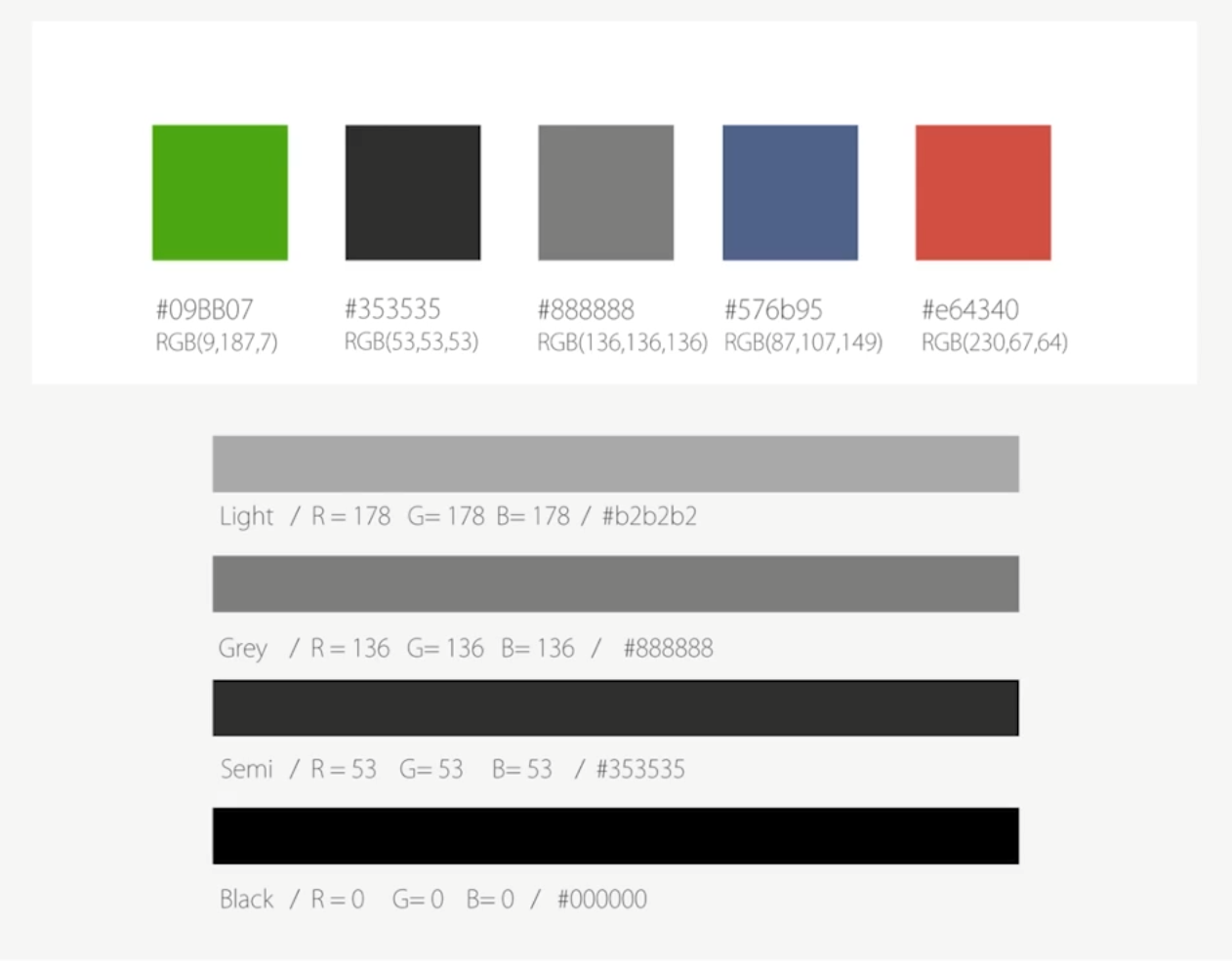
- #09BB07 is the default activeColor color and the finish color.
- #3535, also known as Semi, is a large descriptive text and belongs to the main content, such as the text.
- #888888, also known as Grey, is used for secondary content.
- #576b95 link color.
- #e64340 warning color.
- Pure Black is generally used for main content.
- Light black is generally used for timestamps and form defaults.
- backgroundColor is the default color value #eb.
- In the Weui code base, the default button background color is #F2F2F2.
common problem
How to realize the function of downloading files and displaying dynamic progress bar?
- Enable the Progress properties active and active mode = "forwards".
- The percentage value can be calculated in real time through the total file size and download completion size. It should be noted that the percentage attribute is dynamically bound. Every time this value changes, we need to display the view update triggered by setData.
How to set the fillet for the Progress bar generated by Progress?
<progress border-radius="5" percent="20" show-info />
The border radius property of the Progress component sets the fillet size outside the component. It cannot set the Progress bar fillet that has advanced inside.
Directly change the internal style of the applet Progress component and overwrite it.
Of course, this method is a wild way. If one day the wechat team modifies such a name, it will not be used.
.wx-progress-inner-bar {
    width:0;
    height: 100%;
}
.wx-progress-inner-bar {
    border-radius:5px;
}
How to click a button to reload the Progress bar that has been loaded?
There are two implementation methods, but the principle is to delay some operations until the next time slice (rendering cycle).
Method 1: use nextTick function , or use the setTimeout function in versions that do not support nextTick.
The setTimeout time here is set to 17ms because the refresh rate of the general mobile phone screen is greater than or equal to 60Hz, so 60 frames per second can ensure a smooth visual effect, 1000/60 = 16.6666 ms.
Method 2: call setData twice, because each time setData needs to call the underlying function evaluateJavascript, which is used for the communication between the logic layer and the view layer of the applet. His execution itself takes time.
The specific codes are as follows:
<view class="gap">Loaded progress bar Progress,How to click a button to reload it?</view>
<button bindtap="resetProgress">Reset</button>
<button bindtap="resetProgressYet">Reset YET</button>
<progress border-radius="5" active-mode="forwards" active  show-info percent="{{percentValue}}"></progress>
Page({

    /**
     * Initial data of the page
     */
    data: {
        percentValue: 20,
    },
    resetProgress() {
        this.setData({
            percentValue: 0
        });
        if (wx.canIUse('nextTick')) {
            wx.nextTick(() => {
                this.setData({
                    percentValue: 100
                });
            });
        } else {
            setTimeout(() => {
                this.setData({
                    percentValue: 0
                });
            }, 17)
        }
    },
    resetProgressYet(){
        this.setData({
            percentValue: 0
        });
        this.setData({
            percentValue: 100
        });
    },
})
Can you design a circular progress bar?
use Canvas Create a custom component: the principle is as follows: use css to design two circles, a large gray outer circle and a small white inner circle, and then control canvas to draw the completed progress according to the change of percent age value.
- When using wx.createCanvasContent in the custom component to create the context drawing object of the canvas, you need to pass this object at the second parameter. This is how to find the canvas in the component. Otherwise, it will become looking in the page that references it.
- When using the select method of wx.createSelectorQuery to create an object and find a component object by ID, if it is in a custom component, you must call its in method before finding and pass in the this object, otherwise the component cannot be found. The default component query is only on the main page, and does not query the sub components in the referenced components.
The specific codes are as follows:
- Component code
// progress/circle-progress/index.js
Component({
    runTimeid: 0,
    behaviors: [],
    /**
     * List of properties for the component
     */
    properties: {
        percent: {
            type: Number,
            value: 50,
            observer: function (newVal, oldVal) {
                this.draw(newVal);
            }
        }
    },

    /**
     * The initial data of the component is private data and can be used for template rendering
     */
    data: {
        //percentage
        percentage: '',
        //Animation execution time
        animTime: ''
    },
    ready() {
        if (this.data.percent) this.draw(this.data.percent);
    },
    /**
     * Component method list
     */
    methods: {
        // Method of drawing circular progress bar
        run(c,w,h){
            let that = this;
            var num = (2 * Math.PI / 100 * c) - 0.5 * Math.PI;
            that.ctx2.arc(w, h, w - 8, -0.5 * Math.PI, num);
            that.ctx2.setStrokeStyle('#09bb07');// green
            that.ctx2.setLineWidth('16');
            that.ctx2.setLineCap('butt');
            that.ctx2.stroke();

            that.ctx2.beginPath();
            that.ctx2.setFontSize(40);//Set the font size without quotation marks
            that.ctx2.setFillStyle('#b2b2b2');// Gray font
            that.ctx2.setTextAlign('center');
            that.ctx2.setTextBaseline('middle');
            that.ctx2.fillText(c+' %',w,h);
            that.ctx2.draw();
        },
        // Achieve animation effect
        canvasTap(start,end,time,w,h){
            let that = this;
            start++;
            if(start>end){
                return false;
            }
            that.run(start,w,h);
            that.runTimerid=setTimeout(function(){
                that.canvasTap(start,end,time,w,h);
            },time);
        },
        draw(percent) {
           const id = 'runCanvas';
           const animTime = 500;
           if(percent>100)return
           if(!this.ctx2){
               const ctx2=wx.createCanvasContext(id, this)
               this.ctx2 = ctx2
           }
           let oldPercentValue = this.data.percentage;
           this.setData({
               percentage:percent,
               animTime:animTime
           });
           var time = this.data.animTime/(this.data.percentage-oldPercentValue);
           const query = wx.createSelectorQuery().in(this)
           query.select('#'+id).boundingClientRect((res)=>{
               var w = parseInt(res.width/2);
               var h = parseInt(res.height/2);
               if(this.runTimeid) clearTimeout(this.runTimeid)
               this.canvasTap(oldPercentValue,percent,time,w,h)
           }).exec()
        }
    }
})
<!--  progress/circle-progress/index.wxml -->
<view class="canvasBox">
    <!-- Outer gray circle  -->
    <view class="bigCircle"></view>
    <!-- White circle inside -->
    <view class="littleCircle"></view>
    <canvas canvas-id="runCanvas" id="runCanvas" class="canvas"></canvas>
</view>
/* progress/circle-progress/index.wxss */
.canvasBox {
    height: 500rpx;
    position: relative;
    background-color: white;
}

.bigCircle {
    width: 420rpx;
    height: 420rpx;
    border-radius: 50%;
    position: absolute;
    top: 0;
    bottom: 0;
    left: 0;
    right: 0;
    margin: auto auto;
    background-color: #f2f2f2;
}

.littleCircle {
    width: 350rpx;
    height: 350rpx;
    border-radius: 50%;
    position: absolute;
    top: 0;
    bottom: 0;
    left: 0;
    right: 0;
    margin: auto auto;
    background-color: white;
}

.canvas {
    width: 420rpx;
    height: 420rpx;
    border-radius: 50%;
    position: absolute;
    top: 0;
    bottom: 0;
    left: 0;
    right: 0;
    margin: auto auto;
    z-index: 99;
}
- Page usage code
Reference component declaration
{
  "usingComponents": {
    "circle-progress": "./circle-progres/index"
  }
}
Specific use
<view class="gap">Can you design a circular progress bar?</view>
<circle-progress id="progress1" percent="{{percentValue}}" />
<button bindtap="drawProgress">draw</button>
// progress/progress.js
Page({

    /**
     * Initial data of the page
     */
    data: {
        percentValue: 20,
    },
    drawProgress(){
        if(this.data.percentValue>=100){
            this.setData({percentValue:0})
        }
        this.setData({percentValue:this.data.percentValue+10})
    }
})
How to set the percentage of Progress of the Progress component?
There are two methods:
The first is to directly override the style inside the component, which is a global change.
<view class="gap">Progress How to set the percentage of component progress?</view>
<progress percent="40" stroke-width="5" show-info />
.wx-progress-info{
    color:red;
}
Second, use inline style.
<view class="gap">Progress How to set the percentage of component progress?</view>
<progress percent="40" stroke-width="5" show-info style="color:red"/>
The percentage text on the right side of the Progress component is too close to the left. Can you add a margin?
Directly override the style inside the component.
<view class="gap">Progress The percentage text on the right side of the component is too close to the left. Can you add a margin?</view>
<progress percent="40" stroke-width="5" show-info />
.wx-progress-info{
    margin-left: 5px;
}