Prerequisite:
SpringBoot + Vue + ElementUI Implement Background Management System Template--Front End Chapter (1): Set up the basic environment:https://www.cnblogs.com/l-y-h/p/12930895.html
1. Define common component pages
The effect of a simple page is as follows: (Do it roughly and understand the page roughly)
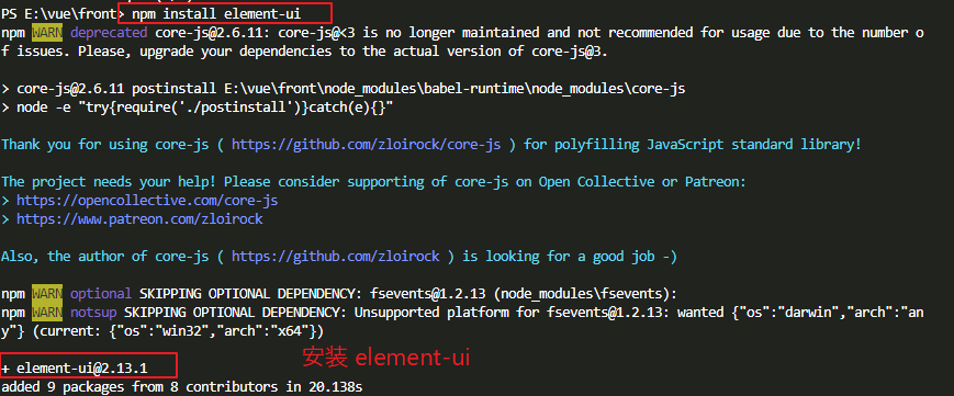
1. Install element-ui
(1) Introduction
A UI framework.Use element-ui for page drawing.
[Official website:]
    https://element.eleme.cn/#/zh-CN

[Documentation:]
    https://element.eleme.cn/#/zh-CN/component/installation
(2) Installation
You can use either NPM or cdn, and install it here using npm.
[Installation method 1: ( npm Installation)]
    npm install element-ui

[Installation method 2: ( CDN Mode of introduction)]
    <!-- Introducing Styles -->
    <link rel="stylesheet" href="https://unpkg.com/element-ui/lib/theme-chalk/index.css">
    <!-- Introducing component libraries -->
    <script src="https://unpkg.com/element-ui/lib/index.js"></script>
(3) introducing element-ui
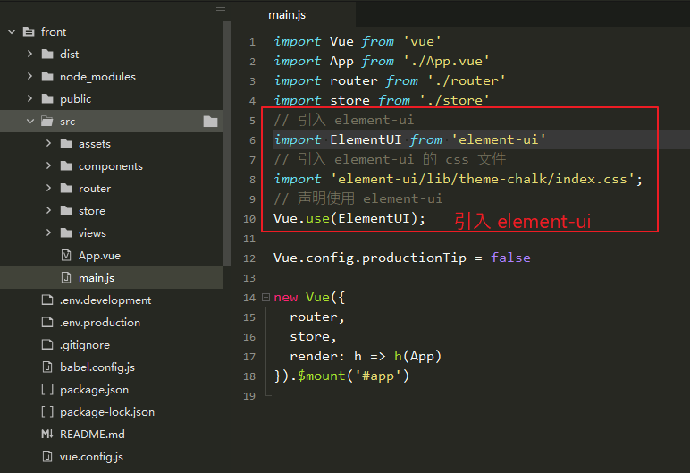
InMain.jsImport (or customize a js, and thenMain.jsIntroduces custom js).
// Introduce element-ui
import ElementUI from 'element-ui'
// Introduce element-ui Of css file
import 'element-ui/lib/theme-chalk/index.css';
// Declare Use element-ui
Vue.use(ElementUI);
2. ModificationApp.vue
(1) Introduction
The main entrance to the page.
Router displays components on the router-view tag.(You can see the basic routing rules at the end of this article)
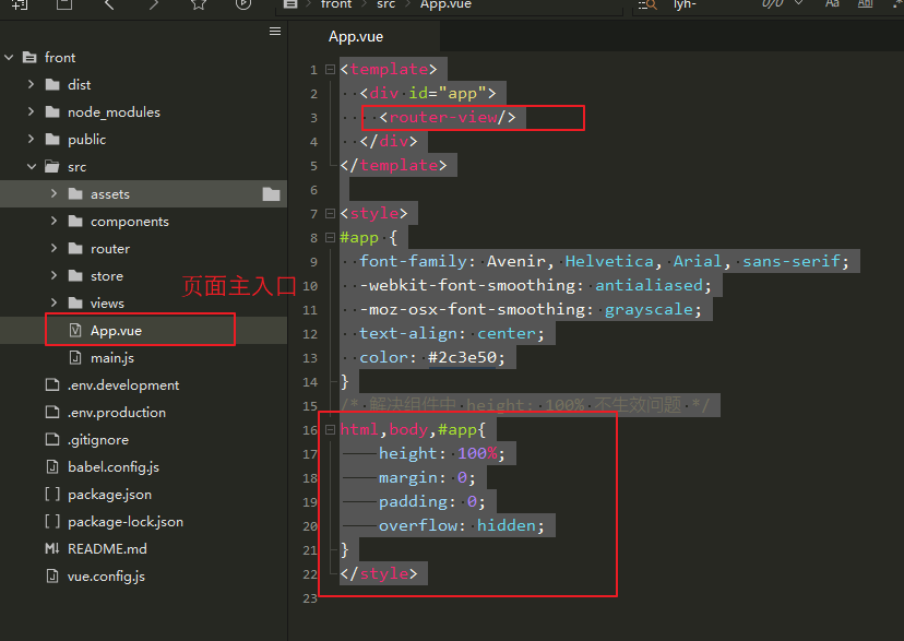
(2) Modify page content
<template>
  <div id="app">
    <router-view/>
  </div>
</template>

<style>
#app {
  font-family: Avenir, Helvetica, Arial, sans-serif;
  -webkit-font-smoothing: antialiased;
  -moz-osx-font-smoothing: grayscale;
  text-align: center;
  color: #2c3e50;
}
/* Resolve height: 100% ineffective in subcomponents */
html,body,#app{
    height: 100%;
    margin: 0;
    padding: 0;
    overflow: hidden;
}
</style>
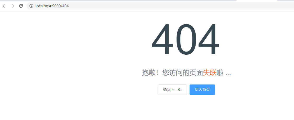
3,404.vue
(1) Introduction
Define the error page.
Used to jump to page 404 when an error occurs.
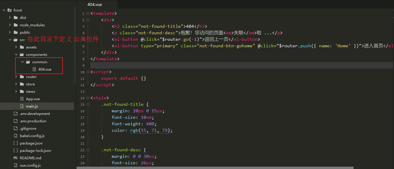
(2) Define page content
<template>
    <div class="error-wrapper">
        <h2 class="not-found-title">404</h2>
        <p class="not-found-desc">I'm sorry!Pages you visit<em>Out of contact</em>La ...</p>
        <el-button @click="$router.go(-1)">Return to the previous page</el-button>
        <el-button type="primary" class="not-found-btn-gohome" @click="$router.push({ name: 'Home' })">Go to Home Page</el-button>
    </div>
</template>

<script>
    export default {}
</script>

<style>
    .error-wrapper {
        position: absolute;
        top: 0;
        right: 0;
        bottom: 0;
        left: 0;
        overflow: hidden;
    }

    .not-found-title {
        margin: 20px 0 15px;
        font-size: 10em;
        font-weight: 400;
        color: rgb(55, 71, 79);
    }

    .not-found-desc {
        margin: 0 0 30px;
        font-size: 26px;
        color: rgb(118, 131, 143);
    }

    .not-found-desc>em {
        font-style: normal;
        color: #ee8145;
    }

    .not-found-btn-gohome {
        margin-left: 30px;
    }
</style>
(3) The page is displayed as follows:
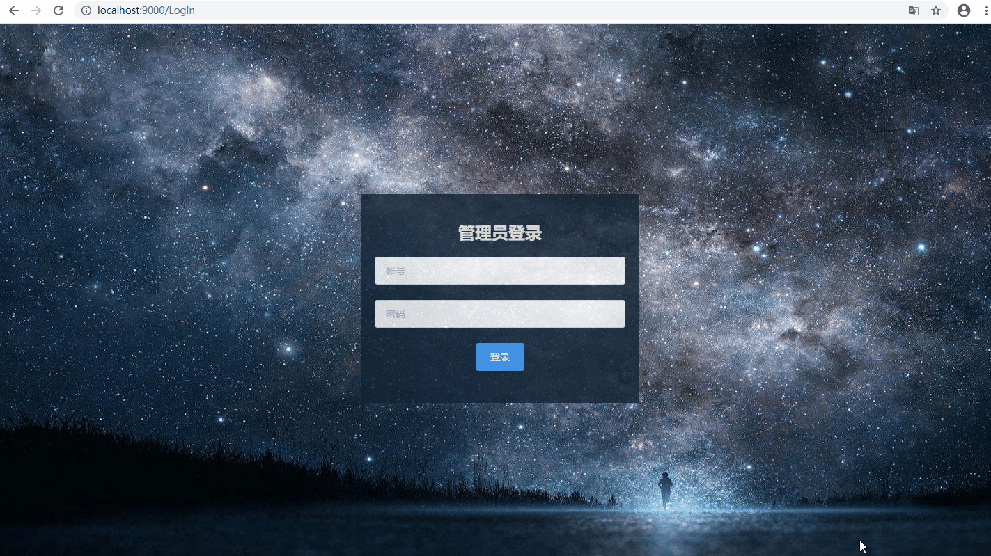
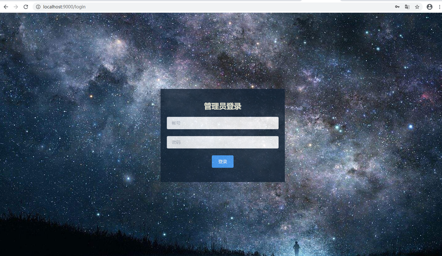
4,Login.vue
(1) Introduction
Define the landing page.
Used to jump to the login interface when accessing the system.
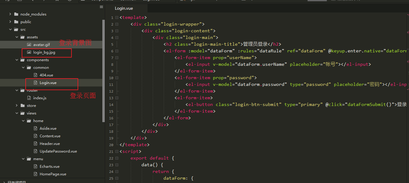
Background image (from network):

(2) Define the content of the page:
<template>
    <div class="login-wrapper">
        <div class="login-content">
            <div class="login-main">
                <h2 class="login-main-title">Administrator login</h2>
                <el-form :model="dataForm" :rules="dataRule" ref="dataForm" @keyup.enter.native="dataFormSubmit()" status-icon>
                    <el-form-item prop="userName">
                        <el-input v-model="dataForm.userName" placeholder="accounts"></el-input>
                    </el-form-item>
                    <el-form-item prop="password">
                        <el-input v-model="dataForm.password" type="password" placeholder="Password"></el-input>
                    </el-form-item>
                    <el-form-item>
                        <el-button class="login-btn-submit" type="primary" @click="dataFormSubmit()">Sign in</el-button>
                    </el-form-item>
                </el-form>
            </div>
        </div>
    </div>
</template>
<script>
    export default {
        data() {
            return {
                dataForm: {
                    userName: '',
                    password: ''
                },
                dataRule: {
                    userName: [{
                        required: true,
                        message: 'Account number cannot be empty',
                        trigger: 'blur'
                    }],
                    password: [{
                        required: true,
                        message: 'Password cannot be empty',
                        trigger: 'blur'
                    }]
                }
            }
        },
        methods: {
            // Submit Form
            dataFormSubmit() {
                // TODO: Logic of login code needs to be improved
                alert("Logic of login code is not perfect")
                this.$router.replace({name: 'Home'})
            }
        }
    }
</script>
<style>
    .login-wrapper {
        position: absolute;
        top: 0;
        right: 0;
        bottom: 0;
        left: 0;
        overflow: hidden;
        background-color: rgba(38, 50, 56, .6);
        background: url(~@/assets/login_bg.jpg) no-repeat;
        background-size: 100% 100%;
    }

    .login-content {
        position: absolute;
        top: 0;
        right: 0;
        bottom: 0;
        left: 0;
        margin: auto;
        height: 300px;
        width: 400px;
        background-color: #112234;
        opacity: .8;
    }

    .login-main {
        color: beige;
        padding: 20px 20px 10px 20px;
    }
</style>
(3) The page is displayed as follows:
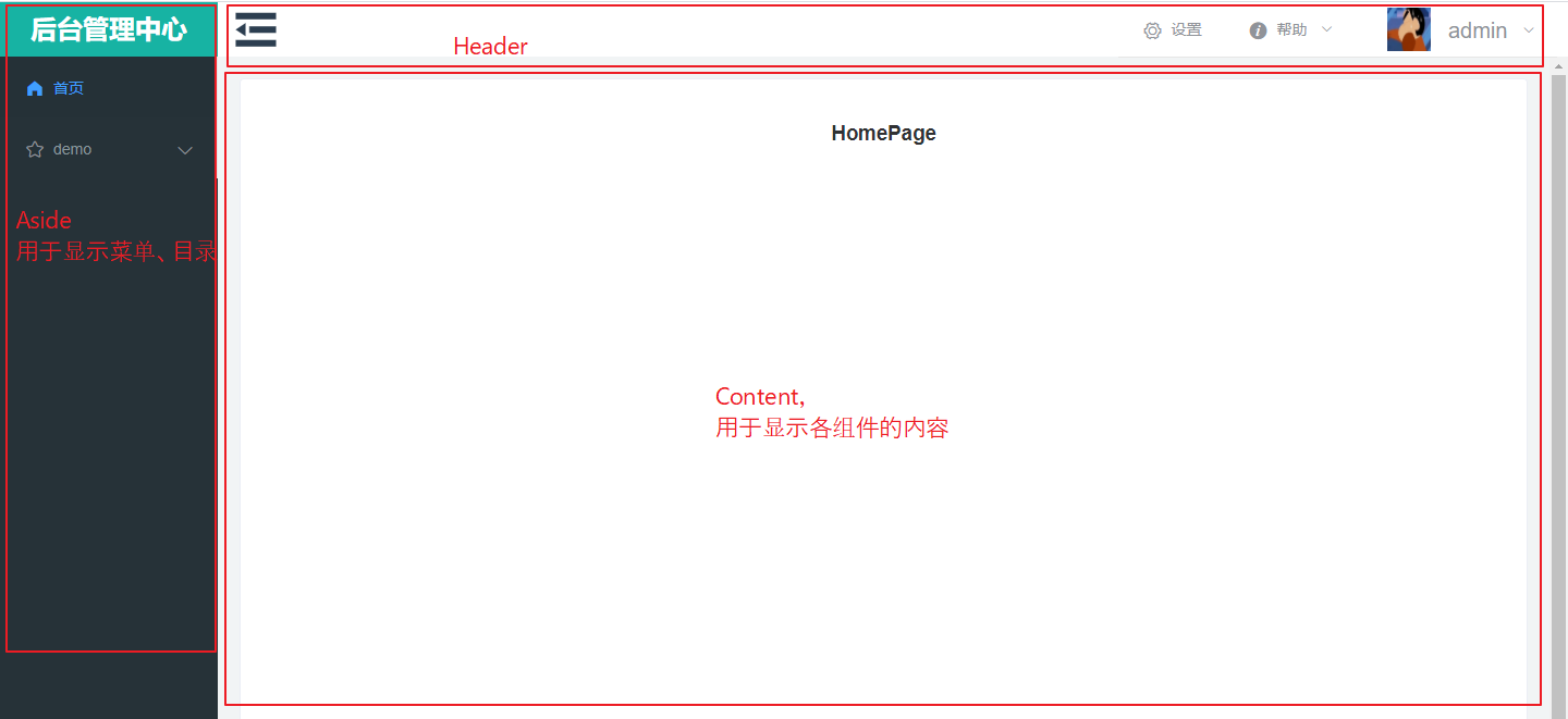
2. Define Home Page
The main page can be split into several components, each of which is responsible for the display of a portion of the page.
Split into three pages: Header, Aside, Content.
Where:
Header is used to define navigation bar information
Aside is used to define menu bar information
Content: Pages for displaying menu options
1,Home.vue
(1) Introduction
Define the main interface.
After Login, you need to jump to the main page.
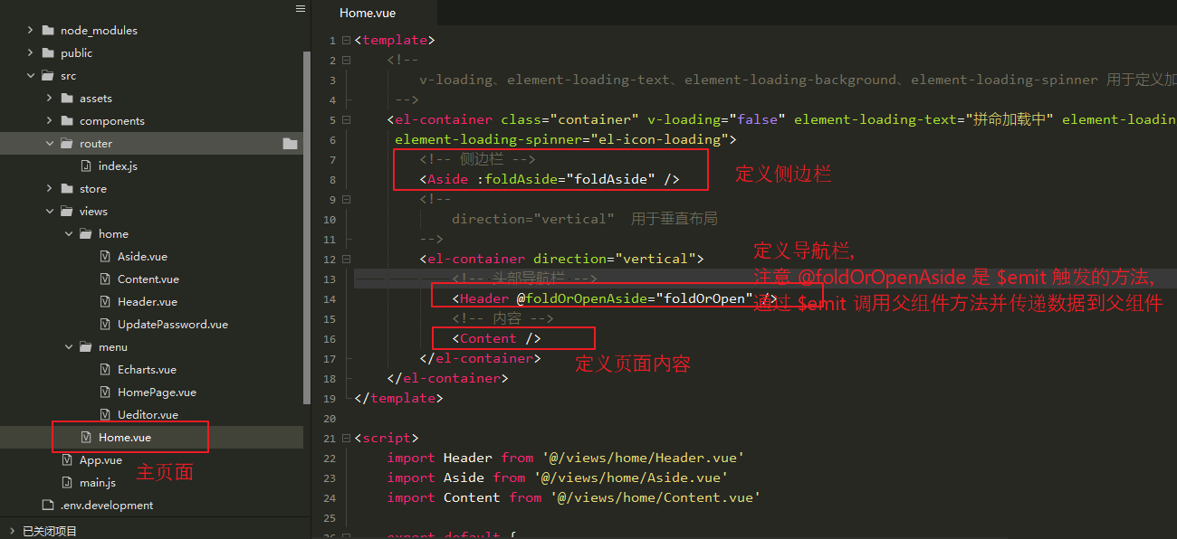
(2) Define page content
<template>
<!--
v-loading,element-loading-text,element-loading-background,element-loading-spinner Style used to define loading
-->
<el-container class="container" v-loading="false" element-loading-text="Desperate Loading" element-loading-background="rgba(0, 0, 0, 0.8)"
element-loading-spinner="el-icon-loading">
<!-- sidebar -->
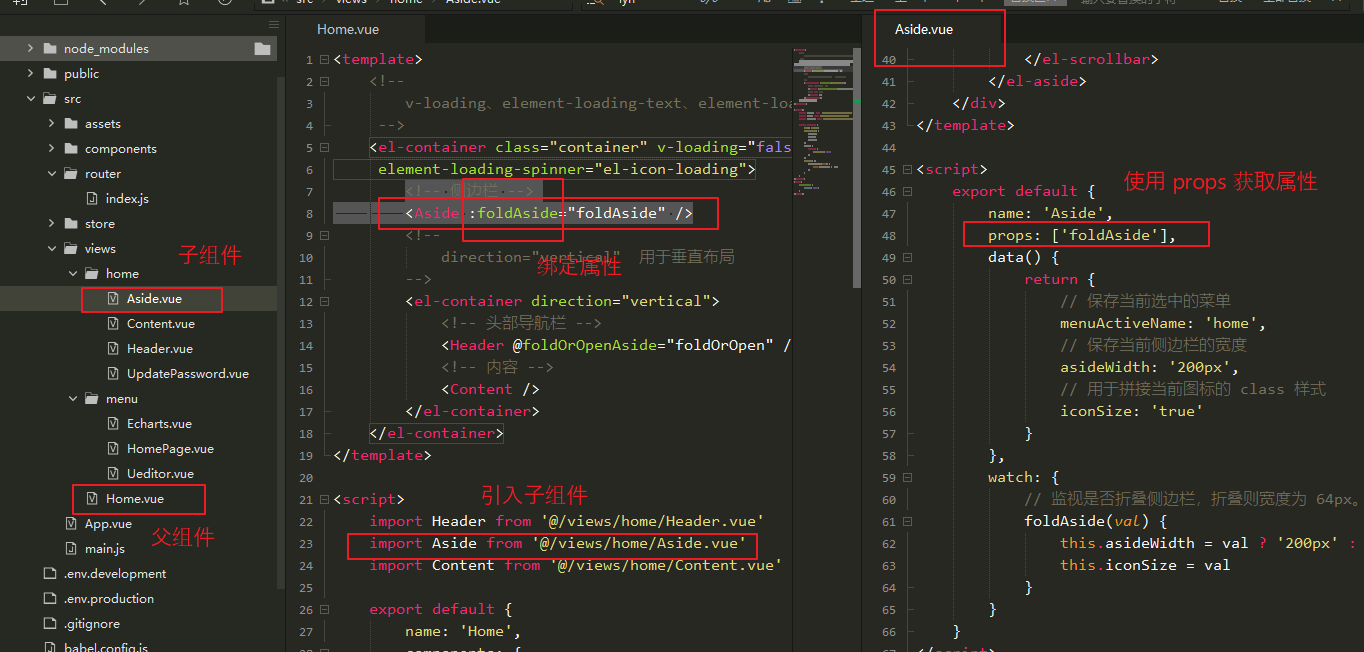
<Aside :foldAside="foldAside" />
<!--
direction="vertical" For Vertical Layout
-->
<el-container direction="vertical">
<!-- Header Navigation Bar -->
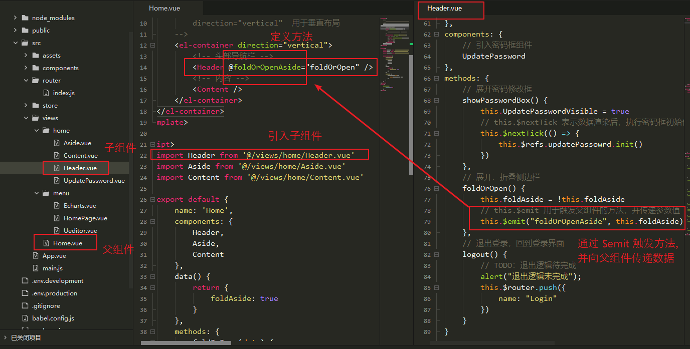
<Header @foldOrOpenAside="foldOrOpen" />
<!-- content -->
<Content />
</el-container>
</el-container>
</template>
<script>
import Header from '@/views/home/Header.vue'
import Aside from '@/views/home/Aside.vue'
import Content from '@/views/home/Content.vue'
export default {
name: 'Home',
components: {
Header,
Aside,
Content
},
data() {
return {
foldAside: true
}
},
methods: {
foldOrOpen(data) {
this.foldAside = data
}
}
}
</script>
<style>
.container {
height: 100%;
}
</style>
(3) The page is displayed as follows:
2,Header.vue
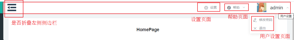
(1) Introduction
The navigation bar used to define the home page.
You can do some things with the navigation bar.For example, fold the sidebar, change your password, sign out, and so on.
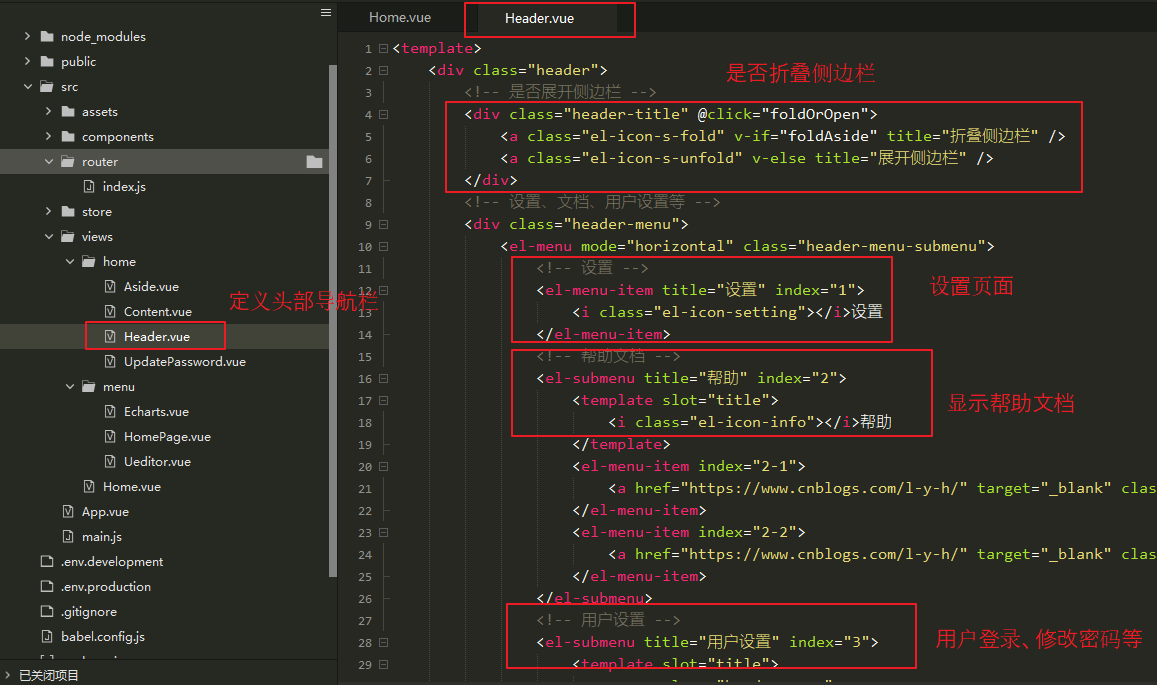
(2) Define page content
<template>
    <div class="header">
        <!-- Whether to expand the sidebar -->
        <div class="header-title" @click="foldOrOpen">
            <a class="el-icon-s-fold" v-if="foldAside" title="Collapse Sidebar" />
            <a class="el-icon-s-unfold" v-else title="Expand Sidebar" />
        </div>
        <!-- Settings, Documents, User Settings, etc. -->
        <div class="header-menu">
            <el-menu mode="horizontal" class="header-menu-submenu">
                <!-- Set up -->
                <el-menu-item title="Set up" index="1">
                    <i class="el-icon-setting"></i>Set up
                </el-menu-item>
                <!-- Help Documentation -->
                <el-submenu title="Help" index="2">
                    <template slot="title">
                        <i class="el-icon-info"></i>Help
                    </template>
                    <el-menu-item index="2-1">
                        <a href="https://Www.cnblogs.com/l-y-h/"Target="_Blank "class=" header-submenu-a ">blog address</a>
                    </el-menu-item>
                    <el-menu-item index="2-2">
                        <a href="https://Www.cnblogs.com/l-y-h/"Target="_Blank "class=" header-submenu-a ">code address</a>
                    </el-menu-item>
                </el-submenu>
                <!-- User Settings -->
                <el-submenu title="User Settings" index="3">
                    <template slot="title">
                        <span class="header-span">
                            <img src="~@/assets/avatar.gif" :alt="userName"> {{ userName }}
                        </span>
                    </template>
                    <el-menu-item index="3-1" @click="showPasswordBox">
                        <i class="el-icon-edit"></i>Change Password
                    </el-menu-item>
                    <el-menu-item index="3-2" @click="logout">
                        <i class="el-icon-close"></i>Sign out
                    </el-menu-item>
                </el-submenu>
            </el-menu>
        </div>
        <!-- Password Change Box -->
        <UpdatePassword v-if="UpdatePasswordVisible" ref="updatePassowrd"></UpdatePassword>
    </div>
</template>

<script>
    import UpdatePassword from '@/views/home/UpdatePassword.vue'
    export default {
        name: 'Header',
        data() {
            return {
                // Whether to expand the sidebar
                foldAside: true,
                // Default User Name
                userName: 'admin',
                // Whether to expand the password box
                UpdatePasswordVisible: false
            }
        },
        components: {
            // Introducing the password box component
            UpdatePassword
        },
        methods: {
            // Expand Password Modification Box
            showPasswordBox() {
                this.UpdatePasswordVisible = true
                // this.$nextTick Indicates that password box initialization is performed after data is rendered
                this.$nextTick(() => {
                    this.$refs.updatePassowrd.init()
                })
            },
            // Expand and and collapse sidebar
            foldOrOpen() {
                this.foldAside = !this.foldAside
                // this.$emit Method used to trigger parent components and pass parameter values
                this.$emit("foldOrOpenAside", this.foldAside)
            },
            // Exit login and return to login interface
            logout() {
                // TODO: Exit logic to be completed
                alert("Exit logic incomplete");
                this.$router.push({
                    name: "Login"
                })
            }
        }
    }
</script>

<style>
    .header {
        padding: 0 10px;
        display: flex;
        height: 50px;
        line-height: 50px;
    }

    .header-title {
        height: 50px;
        width: 50px;
        float: left;
        font-size: 50px;
        cursor: pointer;
    }

    .header-menu {
        height: 50px;
        width: 100%;
        flex: 1;
        line-height: 50px;
        font-size: 30px;
    }
    .header-menu-submenu {
        float: right;
    }
    .header-submenu-a {
        text-decoration: none;
        color: #4CC4B8;
        font-weight: bold;
        font-size: 16px;
    }
    .header-submenu-a:hover {
        background-color: #2C3E50;
    }
    .el-menu--horizontal>.el-menu-item,
    .el-menu--horizontal>.el-submenu .el-submenu__title {
        height: 50px !important;
        line-height: 50px !important;
    }
    .el-menu--collapse .el-menu .el-submenu, .el-menu--popup {
        min-width: auto !important;
    }
    .header-span img {
        width: 40px;
        height: 40px;
        line-height: 40px;
        margin: 5px 10px 10px 10px;
    }
    .header-span {
        font-size: 20px;
    }
</style>
(3) The page is displayed as follows
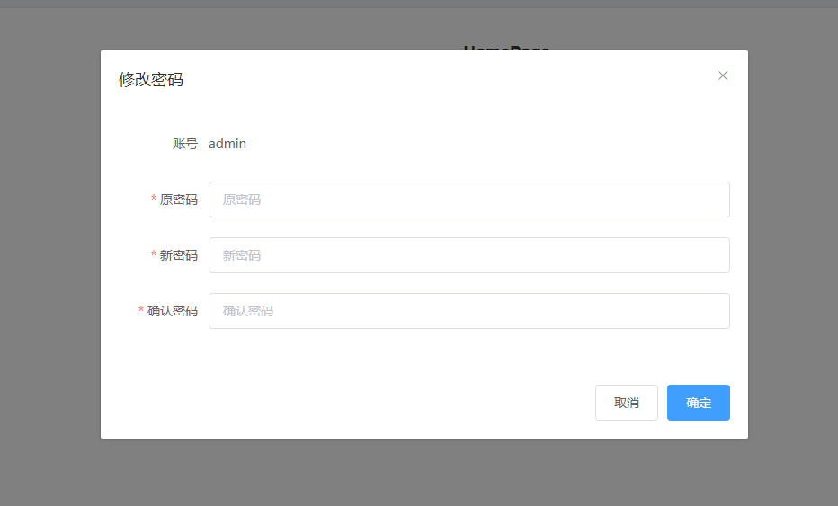
3,UpdatePassword.vue
(1) Introduction
Defines a password modification box for modifying user passwords.
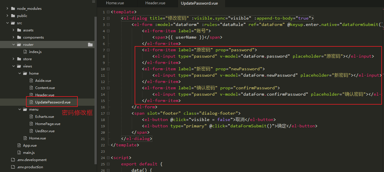
(2) Define page content
<template>
    <el-dialog title="Change Password" :visible.sync="visible" :append-to-body="true">
        <el-form :model="dataForm" :rules="dataRule" ref="dataForm" @keyup.enter.native="dataFormSubmit()" label-width="100px">
            <el-form-item label="Account number">
                <span>{{ userName }}</span>
            </el-form-item>
            <el-form-item label="Original Password" prop="password">
                <el-input type="password" v-model="dataForm.password" placeholder="Original Password"></el-input>
            </el-form-item>
            <el-form-item label="New password" prop="newPassword">
                <el-input type="password" v-model="dataForm.newPassword" placeholder="New password"></el-input>
            </el-form-item>
            <el-form-item label="Confirm Password" prop="confirmPassword">
                <el-input type="password" v-model="dataForm.confirmPassword" placeholder="Confirm Password"></el-input>
            </el-form-item>
        </el-form>
        <span slot="footer" class="dialog-footer">
            <el-button @click="visible = false">cancel</el-button>
            <el-button type="primary" @click="dataFormSubmit()">Determine</el-button>
        </span>
    </el-dialog>
</template>

<script>
    export default {
        data() {
            return {
                userName: 'admin',
                visible: false,
                dataForm: {
                    password: '',
                    newPassword: '',
                    confirmPassword: ''
                },
                dataRule: {
                    password: [{
                        required: true,
                        message: 'The original password cannot be empty',
                        trigger: 'blur'
                    }],
                    newPassword: [{
                        required: true,
                        message: 'New password cannot be empty',
                        trigger: 'blur'
                    }],
                    confirmPassword: [{
                        required: true,
                        message: 'Confirmation password cannot be empty',
                        trigger: 'blur'
                    }]
                }
            }
        },
        methods: {
            // Initialization
            init() {
                this.visible = true
                // Initialize emptying form content
                this.$nextTick(() => {
                    this.$refs['dataForm'].resetFields()
                })
            },
            // Form submission, back to login
            dataFormSubmit() {
                // TODO: Expression submission logic to be completed
                alert("Expression submission logic not completed")
                this.visible = false;
                this.$nextTick(() => {
                    this.$router.push({
                        name: "Login"
                    })
                })
            }
        }
    }
</script>
(3) The page is displayed as follows
4. Introduction to this.$nextTick and this.$emit
(1)this.$nextTick
It is used after data rendering.
For example:
You can use this.$nextTick when you modify a data that will not be displayed until the dom is updated.It passes a callback function and executes after the data is rendered.
In Header.vue In, this is used.As follows:
The password change box controls whether or not to display through UpdatePasswordVisible.
When the showPasswordBox() method is executed, the UpdatePassword component begins to load and triggers this.$nextTick's callback function to initialize the password box when data rendering is complete.
<!-- Password Change Box -->
<UpdatePassword v-if="UpdatePasswordVisible" ref="updatePassowrd"></UpdatePassword>


// Expand Password Modification Box
showPasswordBox() {
    this.UpdatePasswordVisible = true
    // this.$nextTick Indicates that password box initialization is performed after data is rendered
    this.$nextTick(() => {
        this.$refs.updatePassowrd.init()
    })
},
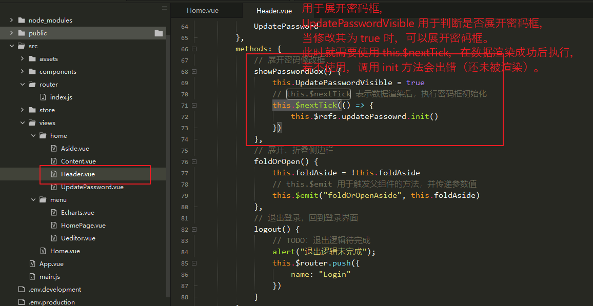
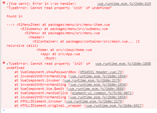
If you use this.$refs.updatePassowrd.init() Calling UpdatePassword's init method will result in an error because the UpdatePassword data is not rendered at this time. To execute successfully, you need to use this.$nextTick, which means execute after the data has been rendered successfully.
// Expand Password Modification Box
showPasswordBox() {
    this.UpdatePasswordVisible = true
    this.$refs.updatePassowrd.init()
},
(2)this.$emit
A method used by a child component to pass data to a parent component and trigger the parent component.
In Home.vue and Header.vue In, this is used.As follows:
The Header component is introduced into the Home component and the @foldOrOpenAside method is defined.
Call the foldOrOpenAside method in the Header component through this.$emit and pass the data (optional).
[Home.vue]
<Header @foldOrOpenAside="foldOrOpen" />

foldOrOpen(data) {
    this.foldAside = data
}

[Header.vue]
<div class="header-title" @click="foldOrOpen"></div>
// Expand and and collapse sidebar
foldOrOpen() {
    this.foldAside = !this.foldAside
    // this.$emit Method used to trigger parent components and pass parameter values
    this.$emit("foldOrOpenAside", this.foldAside)
},
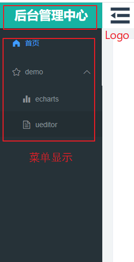
5,Aside.vue
(1) Introduction
Used to define sidebars and display menus.
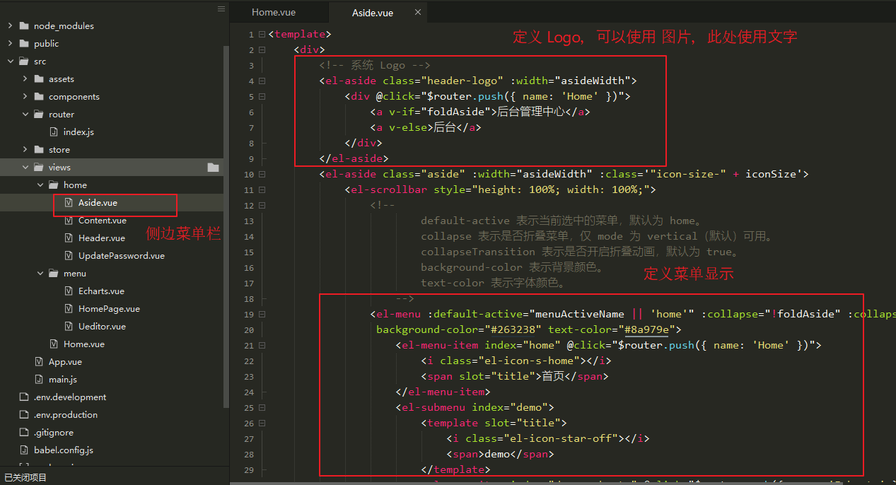
(2) Define page content
<template>
    <div>
        <!-- system Logo -->
        <el-aside class="header-logo" :width="asideWidth">
            <div @click="$router.push({ name: 'Home' })">
                <a v-if="foldAside">Background Management Center</a>
                <a v-else>Backstage</a>
            </div>
        </el-aside>
        <el-aside class="aside" :width="asideWidth" :class='"icon-size-" + iconSize'>
            <el-scrollbar style="height: 100%; width: 100%;">
                <!--
                        default-active Represents the currently selected menu, defaulting to home.
                        collapse Indicates whether the menu is collapsed, only mode by vertical(Default) Available.
                        collapseTransition Indicates whether the collapse animation is turned on or not, defaulting to true.
                        background-color Represents the background color.
                        text-color Represents the font color.
                    -->
                <el-menu :default-active="menuActiveName || 'home'" :collapse="!foldAside" :collapseTransition="false"
                 background-color="#263238" text-color="#8a979e">
                    <el-menu-item index="home" @click="$router.push({ name: 'Home' })">
                        <i class="el-icon-s-home"></i>
                        <span slot="title">home page</span>
                    </el-menu-item>
                    <el-submenu index="demo">
                        <template slot="title">
                            <i class="el-icon-star-off"></i>
                            <span>demo</span>
                        </template>
                        <el-menu-item index="demo-echarts" @click="$router.push({ name: 'Echarts' })">
                            <i class="el-icon-s-data"></i>
                            <span slot="title">echarts</span>
                        </el-menu-item>
                        <el-menu-item index="demo-ueditor" @click="$router.push({ name: 'Ueditor' })">
                            <i class="el-icon-document"></i>
                            <span slot="title">ueditor</span>
                        </el-menu-item>
                    </el-submenu>
                </el-menu>
            </el-scrollbar>
        </el-aside>
    </div>
</template>

<script>
    export default {
        name: 'Aside',
        props: ['foldAside'],
        data() {
            return {
                // Save the currently selected menu
                menuActiveName: 'home',
                // Save current sidebar width
                asideWidth: '200px',
                // Used to stitch the current icon class style
                iconSize: 'true'
            }
        },
        watch: {
            // Monitors whether the sidebar is collapsed or not, with a width of 64 px.
            foldAside(val) {
                this.asideWidth = val ? '200px' : '64px'
                this.iconSize = val
            }
        }
    }
</script>

<style>
    .aside {
        margin-bottom: 0;
        height: 100%;
        max-height: calc(100% - 50px);
        width: 100%;
        max-width: 200px;
        background-color: #263238;
        text-align: left;
        right: 0;
    }

    .header-logo {
        background-color: #17b3a3;
        text-align: center;
        height: 50px;
        line-height: 50px;
        width: 200px;
        font-size: 24px;
        color: #fff;
        font-weight: bold;
        margin-bottom: 0;
        cursor: pointer;
    }
    .el-submenu .el-menu-item {
        max-width: 200px !important;
    }
    .el-scrollbar__wrap {
        overflow-x: hidden !important;
    }
    .icon-size-false i {
        font-size: 30px !important;
    }
    .icon-size-true i {
        font-size: 18px !important;
    }
</style>
(3) The page is displayed as follows
6. Introduction of props
It is used by parent components to transfer data to child components.
In Home.vue and Aside.vue In, this is used.As follows:
In Home.vue Introduction Aside.vue Component, and defined: foldAside property.
In Aside.vue In the component, this property can be obtained using props.
[Home.vue]
<!-- sidebar -->
<Aside :foldAside="foldAside" />

[Aside.vue]
props: ['foldAside'],
7,Content.vue
(1) Introduction
Defines the page display after each menu click.
The basic routing rules are described at the end of this article.
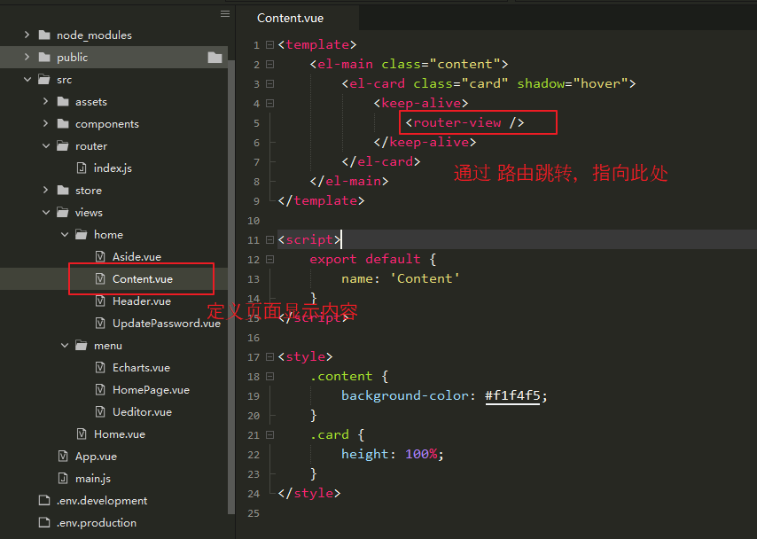
(2) Define page content
<template>
    <el-main class="content">
        <el-card class="card" shadow="hover">
            <keep-alive>
                <router-view />
            </keep-alive>
        </el-card>
    </el-main>
</template>

<script>
    export default {
        name: 'Content'
    }
</script>

<style>
    .content {
        background-color: #f1f4f5;
    }
    .card {
        height: 100%;
    }
</style>
(3) The page is displayed as follows
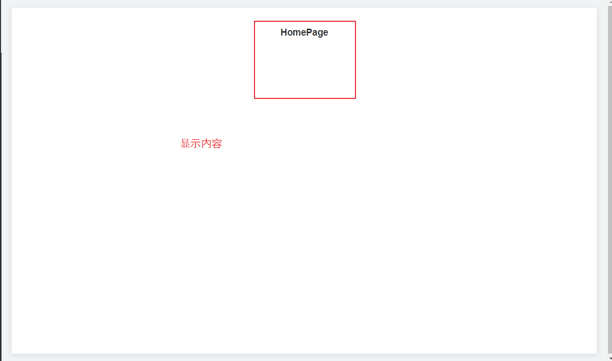
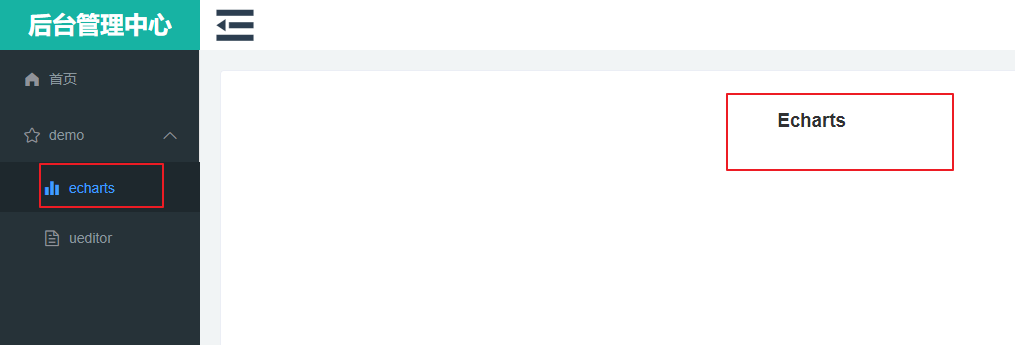
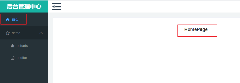
8. Define the content display page (for testing only)
[Ueditor.vue]
<template>
    <div>
        <h1>Ueditor</h1>
    </div>
</template>

<script>
</script>

<style>
</style>

[HomePage.vue]
<template>
    <div style="height: 800px;">
        <h1>HomePage</h1>
    </div>
</template>

<script>
</script>

<style>
</style>

[Echarts.vue]
<template>
    <div>
        <h1>Echarts</h1>
    </div>
</template>

<script>
</script>

<style>
</style>
Click on each menu in the Aside to display a different page in Content.
9. Basic Routing Issues
(1) Introduction
router is required to successfully jump between component pages.
Routing jump rules are briefly written here and will be modified later.
(2) Define routing jump rules
Path refers to a path.
A redirect is a path that needs to be jumped.
Name refers to the name of the route (in this project, name is used for routing jumps).
A component is a routing component that displays a page (<router-view /> loads the component).
children refers to a subroute (where another route is displayed).
import Vue from 'vue'
import VueRouter from 'vue-router'
import Home from '../views/Home.vue'

Vue.use(VueRouter)

const routes = [{
        path: '/',
        redirect: {
            name: "Login"
        }
    },
    {
        path: '/404',
        name: '404',
        component: () => import('@/components/common/404.vue')
    },
    {
        path: '/Login',
        name: 'Login',
        component: () => import('@/components/common/Login.vue')
    },
    {
        path: '/Home',
        name: 'Home',
        component: () => import('@/views/Home.vue'),
        redirect: {
            name: 'HomePage'
        },
        children: [{
                path: '/Home/Page',
                name: 'HomePage',
                component: () => import('@/views/menu/HomePage.vue')
            },
            {
                path: '/Home/Demo/Echarts',
                name: 'Echarts',
                component: () => import('@/views/menu/Echarts.vue')
            },
            {
                path: '/Home/Demo/Ueditor',
                name: 'Ueditor',
                component: () => import('@/views/menu/Ueditor.vue')
            }
        ]
    },
]

const router = new VueRouter({
    // routes Used to define routing jump rules
    routes,
    // mode Used to remove from addresses #
    mode: 'history',
    // scrollBehavior Page scrolls when used to define routing switches.
    scrollBehavior: () => ({
        y: 0
    })
})

// Resolve same path jump error
const routerPush = VueRouter.prototype.push;
VueRouter.prototype.push = function push(location, onResolve, onReject) {
    if (onResolve || onReject)
        return routerPush.call(this, location, onResolve, onReject)
    return routerPush.call(this, location).catch(error => error)
};

export default router