Interpretation of matplotlib in vernacular - line chart
previously on
Interpretation of matplotlib in vernacular - general function and histogram,Interpretation of matplotlib in vernacular - histogram,Colloquial interpretation of matplotlib usage - adding data to columns
Hello, this is W
In the first three articles, we have seen histogram and histogram, and then we will see line chart.
Broken line diagram
Introduction and use of line chart
As the name implies, a line chart is drawn by connecting points in the coordinate axis to form a line. It reflects the change of quantity and quality of the same thing in different time periods, and the change trend of the same object in different situations when comparing objects. So when we look at the line chart, we mainly look at the change, and we should also reflect the trend of change when we draw it.
Usage scenarios
- Temperature changes at different times of a day in a city
- Change of water level in a river basin in recent 30 years
- Change of gold price in 30 years
- The change of average house price in a city in 10 years
...
Example explanation (code copy available)
It's very simple to draw a line graph. Just like a histogram, you need to call plt.plot() to display the x-axis and y-axis data.
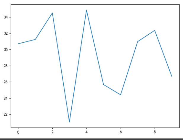
import random
import matplotlib.pyplot as plt

plt.rcParams['font.sans-serif'] = ['SimHei']  # Display Chinese
plt.rcParams['axes.unicode_minus'] = False  # Display minus sign

# Random number of y-axis 10
y = [random.uniform(20, 35) for i in range(10)]
x = range(10)

plt.plot(x, y)
plt.show()
Effect:
Just add some label s and title s to make a good line chart.
So what are the parameters in the plot method? Click [axes.py] to see the plot method. The document is long, so I won't copy one by one. I'll pick up some common parameters to explain.
>>> plot(x, y)        # plot x and y using default line style and color
 This method uses x, y to display data, and the lines and colors are default

>>> plot(x, y, 'bo')  # plot x and y using blue circle markers
 plot uses the data of x and y, and displays the data as a blue circle without a line connection point
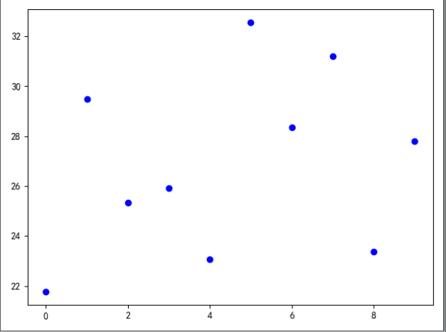
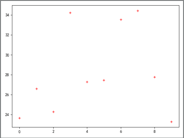
>>> plot(y)           # plot y using x as index array 0..N-1
 The data of y-axis is lost directly, while the data of x-axis is from 0 to n-1
>>> plot(y, 'r+')     # ditto, but with red plusses
 plot displays data from 0 to n-1, and data points are indicated by red + sign, corresponding to the blue circle above

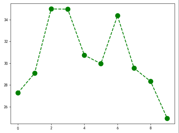
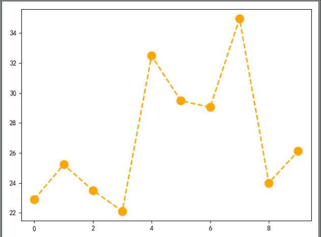
plt.plot(x, y, 'go--', linewidth=2, markersize=12)
# The third position parameter represents the display mode of the line, 'go --' represents a dot to mark the coordinates, and the lines between the coordinates are represented by dotted lines
# linewdith =: indicates the width of the line
# Marker size =: indicates the marking size of coordinate points
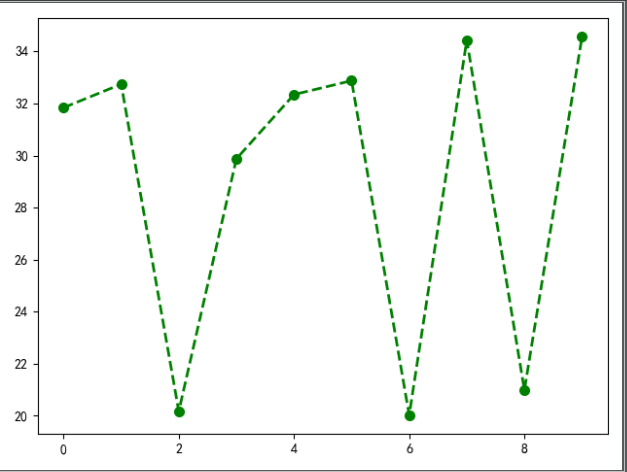
plt.plot(x, y, color='orange', marker='o', linestyle='dashed', linewidth=2, markersize=12)
# x. y for position parameter
# Color =: indicates the color of the line and point in the line chart
# marker =: the way to mark points in a line chart
**Markers**Introduction to the whole document

    =============    ===============================
    character        description
    =============    ===============================
    ``'.'``          point marker spot
    ``','``          pixel marker Pixel points
    ``'o'``          circle marker Dot
    ``'v'``          triangle_down marker Solid inverted triangle
    ``'^'``          triangle_up marker Solid upper triangle
    ``'<'``          triangle_left marker Realize left triangle
    ``'>'``          triangle_right marker Black right triangle
    ``'1'``          tri_down marker down arrow
    ``'2'``          tri_up marker up arrow
    ``'3'``          tri_left marker slightly
    ``'4'``          tri_right marker slightly
    ``'s'``          square marker Black Square
    ``'p'``          pentagon marker Solid Pentagon
    ``'*'``          star marker Asterisk
    ``'h'``          hexagon1 marker Solid hexagon
    ``'H'``          hexagon2 marker Solid hexagon
    ``'+'``          plus marker +Number
    ``'x'``          x marker x Number
    ``'D'``          diamond marker A solid square that turns 45 degrees
    ``'d'``          thin_diamond marker diamond◇
    ``'|'``          vline marker vertical|
    ``'_'``          hline marker Lower line replacement_


# linestyle =: indicates the style of the line
**Line Styles**

    =============    ===============================
    character        description
    =============    ===============================
    ``'-'``          solid line style Solid line
    ``'--'``         dashed line style Long dashed line
    ``'-.'``         dash-dot line style Long deficiency+Point line
    ``':'``          dotted line style Dotted line
    =============    ===============================
It is worth mentioning that the above marker and linestyle can be used together, but they can not be used together with fmt, because the position parameter fmt is a fixed combination of line and point. If you use marker and linestyle, it means you have set the point line, do not use fmt.
plt.plot(y, 'r+')
ok, I've learned all the parameters of the line chart here, and I've also talked about other common methods used with pyplot in the previous article.
Because I don't have the right demand for making line chart on hand, I don't need to make a complete chart. Generally speaking, the use of line chart is very simple, as long as I know the parameters.

