1. Import dependency module
from kivy.app import App
from kivy.lang import Builder
from kivy.uix.boxlayout import BoxLayout
from kivy.uix.behaviors import ToggleButtonBehavior
from kivy.core.window import Window
from kivy.utils import get_color_from_hex
# Still full screen display
Window.fullscreen = False
# Set the form background color to white
Window.clearcolor = get_color_from_hex('#ffffff')
Some basic running modules appear in other modules, some configuration of forms, and layout containers
2. Customize RadioButton class
main.py The purpose of the class definition in the file is that when the mouse clicks the entire RadioButton container, the checkbox in it will be selected.
class RadioButton(ToggleButtonBehavior, BoxLayout):
    def on_change_checkbox(self):
        ToggleButtonBehavior._do_press(self.children[1])

class ToomaxWindow(BoxLayout):
    pass
main.kv Layout definition in file
#:import C kivy.utils.get_color_from_hex
<RadioButton>:
    id: radiobtn
    orientation: 'horizontal'
    group: 'btn'
    size_hint: 1, None
    height: 50
    on_touch_down: self.on_change_checkbox()
    CheckBox: # It's used here kivy Self contained checkbox Control, just add group Attribute value can play the function of radio button
        group: "checkbox"
        size_hint: None, None
        size: lab.height, lab.height
    Label:
        id: lab
        text: "RadioButton"
        color: 0, 0, 0, 1
        size_hint: None, None
        size: self.texture_size
<ToomaxWindow>:
    orientation: 'vertical'
    spacing: 2
    RadioButton:
    RadioButton:
3. Effect after running the program
How to run it, I posted code here, that is, to define a App class and rewrite the build() method, then call run() of the App class instance.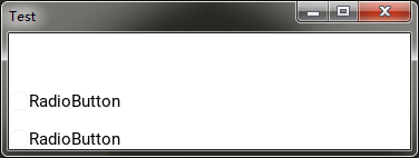
From the running results, we can see that both radio buttons are not selected. We hope that after the program runs, one of them is selected by default. So how to solve this problem?
Here you need to use the custom property of the control to configure. In RadioButton, you need to customize a selected property to set the status of the radio button.
class RadioButton(ToggleButtonBehavior, BoxLayout):
    selected = BooleanProperty(False)
    def on_change_checkbox(self):
        ToggleButtonBehavior._do_press(self.children[1])
        self.selected = True
The RadioButton in the kv file also needs to be changed accordingly.
<RadioButton>:
    id: radiobtn
    orientation: 'horizontal'
    group: 'btn'
    size_hint: 1, None
    height: 32
    valign: 'middle'
    on_touch_down: self.on_change_checkbox()
    CheckBox:
        group: "checkbox"
        # use selected Attribute to judge checkbox Status of
        state: 'down' if self.parent.selected else 'normal'
        size_hint: None, None
        size: lab.height, lab.height
    Label:
        id: lab
        text: "RadioButton"
        color: 0, 0, 0, 1
        size_hint: None, None
        size: self.texture_size
<ToomaxWindow>:
    orientation: 'vertical'
    spacing: 2
    RadioButton:
        # Set the first radio button to selected
        selected: True
    RadioButton:
The first radio button is selected when you run it again.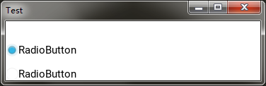
4. Do not use the checkbox control to customize the status icon
Sometimes, when we develop radio button like functions, the previous icons will be replaced by other font icons, so how to achieve this requirement?
For example, if we change the checkbox to a label control, we only need to set the text property of the label as a font icon to realize customization.
py content:
class ToomaxWindow(BoxLayout):
    pass

class RadioButton(ToggleButtonBehavior, BoxLayout):
    selected = BooleanProperty(False)
    text = StringProperty('')
    # rewrite on_state Event handling method, when state Execute after value changes
    def on_state(self, widget, value):
        if value == 'down':
            self.selected = True
        else:
            self.selected = False
    # rewrite_do_press Method, when the radio container is clicked, it is executed to solve the problem togglebutton Click again after being selected to cancel the selected question
    def _do_press(self):
        if self.state == 'normal':
            ToggleButtonBehavior._do_press(self)
            self.selected = True
    pass

class TestApp(App):
    def __init__(self, **kwargs):
        super(TestApp, self).__init__(**kwargs)
        # Register Font Icon, need to import kivy.core.text.LabelBase modular
        LabelBase.register(name='font_mp', fn_regular='./fonts/modernpics.otf')
    def build(self):
        Builder.load_string(kv)
        return ToomaxWindow()

TestApp().run()
kv file content:
#:import C kivy.utils.get_color_from_hex
<RadioButton>:
    id: radiobtn
    orientation: 'horizontal'
    group: 'btn'
    size_hint: 1, None
    height: 32
    # according to selected Property to determine the selected state
    state: 'down' if self.selected else 'normal'
    Label:
        # Use font icons
        text: '[font=font_mp][size=32]>[/size][/font]'
        # Based on the selected Property to set the color of the Font Icon
        color: C('#ff0000') if self.parent.selected else C('#000000')
        size_hint: None, None
        size: lab.height, lab.height
        markup: True
    Label:
        id: lab
        # Added in parent control text Property is used to define the text content of radio buttons. If not, the default value is used
        text: self.parent.text if self.parent.text else 'RadioButton'
        color: 0, 0, 0, 1
        size_hint: None, None
        size: self.texture_size

<ToomaxWindow>:
    orientation: 'vertical'
    spacing: 2
    RadioButton:
        selected: True
        text: 'good'
    RadioButton:
Operation effect: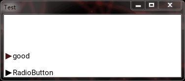
5. Summary
-
When developing components, it's best to use simple original controls as the cornerstone
-
Make good use of various behavior classes in behaviors module
-
Fully grasp the custom attributes, which can achieve many unexpected effects