First, problem description
When the mouse moves to the picture, there will be transparent shadows and text animation effect below the picture. When the picture is moved out, there will also be animation effect of exit. When the animation moves in and out, the action is slow.
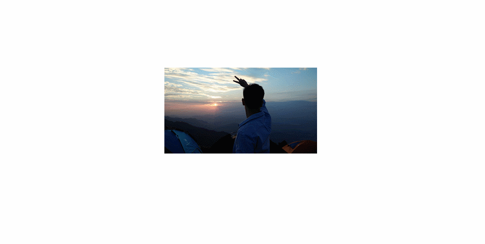
Second, effect preview

3. Major Events Used
- onmourseover: When the mouse moves into the picture, it skips the picture trigger.
- onmourseout: Triggered when the mouse moves out of the picture.
- window.setInterval (): Timer, how often to call the specified method, mainly for the excessive effect of animation.
Fourth, detailed code
- Code structure
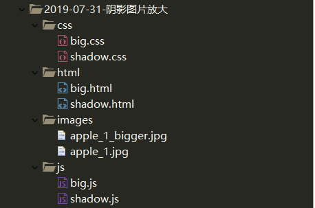
- Html code
<!DOCTYPE html>
<html>
	<head>
		<meta charset="UTF-8">
		<title></title>
	</head>
	<link rel="stylesheet" type="text/css" href="../css/shadow.css"/>
	<script type="text/javascript" src="../js/shadow.js" ></script>
	<body>
		<ul id="nav">
			<li><img src="../../2019-07-30-Advertisement/images/me_background.jpg"/></li>
			<li>shadow</li>
			<li>Boys must work hard.</li>
		</ul>
	</body>
</html>
- Css code
*{
	padding: 0px;
	margin: 0px;
}
body{
	margin: 0 auto;
	/*text-align: center;*/
}
#nav{
	width: 400px;
	margin: 0 auto;
	text-align: center;
	position: relative;
	overflow: hidden;
}
#nav img{
	width: 400px;
}
#nav li{
	list-style: none;
	width: 100%;
}
#nav li:nth-child(2){
	opacity: .4;
	text-indent: -9999px;
	background-color: gray;
}
#nav li:nth-child(2),#nav li:nth-child(3)
{
	height: 40px;
	line-height: 40px;
	font-size: 26px;
	color: darkorange;
	position: absolute;
	left: 0px;
	bottom: -40px;
}
- JS code
*{
	padding: 0px;
	margin: 0px;
}
body{
	margin: 0 auto;
	/*text-align: center;*/
}
#nav{
	width: 400px;
	margin: 0 auto;
	text-align: center;
	position: relative;
	overflow: hidden;
}
#nav img{
	width: 400px;
}
#nav li{
	list-style: none;
	width: 100%;
}
#nav li:nth-child(2){
	opacity: .4;
	text-indent: -9999px;
	background-color: gray;
}
#nav li:nth-child(2),#nav li:nth-child(3)
{
	height: 40px;
	line-height: 40px;
	font-size: 26px;
	color: darkorange;
	position: absolute;
	left: 0px;
	bottom: -40px;
}
V. effect demonstration