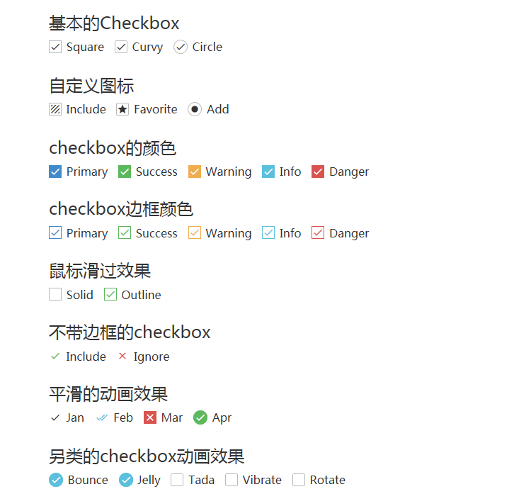
1. Style modification using css3 pseudo elements
Ideas:
1. You can add generative content (pseudo elements) to <label>elements and style them based on the state of the check box;
2. Then hide the real check boxes;
3. Finally, beautify the generated content.
Solution:
Beautify checkbox
1. A simple structure code:
<input type="checkbox" id="awesome" />
<label for="awesome">Awesome!</label>
2. Generate a pseudo element as a check box for the beautification version, first add some styles to the pseudo element:
input[type="checkbox"] + label::before {
    content: "\a0";  /*Non-breaking space*/
    display: inline-block;
    vertical-align: .2em;
    width: .8em;
    height: .8em;
    margin-right: .2em;
    border-radius: .2em;
    background-color: silver;
    text-indent: .15em;
    line-height: .65;  /*Without a unit for row height, the child element multiplies the inherited number by its font size instead of the parent element's row height*/
}
3. Add different styles to the check box's check state:
input[type="checkbox"]:checked + label::before {
    content: "\2713";
    background-color: yellowgreen;
}
4. Now hide the original check box:
input[type="checkbox"] {
    position: absolute;
    clip: rect(0, 0, 0, 0);
}
When hiding the original check box, using display: none will remove it completely from the queue where the keyboard tab key switches focus.
This allows you to cut the size to zero, hiding the original multiple check box.
5. Extension
Change its style when focusing and disabling:
input[type="checkbox"]:focus + label::before {
    box-shadow: 0 0 .1em .1em #58a;
}
input[type="checkbox"]:disabled + label::before {
    background-color: gray;
    box-shadow: none;
    color: #555;
}
Effect: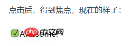
Beautify radio
html code:
 <p>Your gender:</p>
    <div class="radio-sex">
        <input type="radio" id="sex1" name="sex">
        <label for="sex1"></label>
        <span>male</span>
    </div>
    <div class="radio-sex">
        <input type="radio" id="sex2" name="sex">
        <label for="sex2"></label> female
    </div>
css style:
.radio-sex {
    position: relative;
    display: inline-block;
    margin-right: 12px;
}

.radio-sex input {
    vertical-align: middle;
    margin-top: -2px;
    margin-bottom: 1px;
    /* The first three lines of code are to align the radio radio buttons with the text */
    width: 20px;
    height: 20px;
    appearance: none;/*Clear default style*/
    -webkit-appearance: none;
    opacity: 0;
    outline: none;
    /* Note that cannot be set to display:none*/
}

.radio-sex label {
    position: absolute;
    left: 0;
    top: 0;
    z-index: -1;
    /*Note the hierarchical relationship, if you do not set the label hierarchy to the lowest, the input will be obscured and the radio will not be selected*/
    width: 20px;
    height: 20px;
    border: 1px solid #3582E9;
    border-radius: 100%;
}

.radio-sex input:checked+label {
    background: #3582E9;
}

.radio-sex input:checked+label::after {
    content: "";
    position: absolute;
    left: 8px;
    top: 2px;
    width: 5px;
    height: 12px;
    border-right: 1px solid #fff;
    border-bottom: 1px solid #fff;
    transform: rotate(45deg);
}
Effect: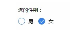
Summary:
Advantages: Take full advantage of CSS3, no js and pictures are needed, just pure CSS3 will do it
Disadvantages: poor compatibility, support IE9+only
2. Style modification using pictures (radio)
radio Style Two:
thinking
1. Set the input property hidden to hide the input
<input type="radio" name="type" id="adviceRadio1" value="1" checked hidden/>
2. Bind input by id with label for tag, so when you click label, you actually click input
<input type="radio" name="type" id="adviceRadio1" value="1" checked hidden/>
                        <label for="adviceRadio1" class="advice"></label>
3. Define the style of the label and set the background image of the unchecked state
.advice{
    height: 12px;
    width: 12px;
    display: inline-block;
    background-image: url('https://caiyunupload.b0.upaiyun.com/newweb/imgs/icon-unchecked.png');
    background-repeat: no-repeat;
    background-position: center;
    vertical-align: middle;
    margin-top: -4px;
}
4. Style the label of the selected state using the adjacent selector
input[type="radio"]:checked + .advice{
                    background-image: url('https://caiyunupload.b0.upaiyun.com/newweb/imgs/icon-checked.png');
                }
3. Implement by Plug-in
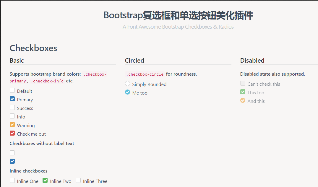
awesome-bootstrap-checkbox plugin
awesome-bootstrap-checkbox is a plug-in that beautifies the Bootstrap check boxes and radio buttons.It is written in pure CSS without any javascript files.It beautifies beautifully by making small changes to the native Bootstrap components.
Demo address: http://awesome-bootstrap-chec...
Plug-in download: https://www.bootcdn.cn/awesom...
Note: awesome-bootstrap-checkbox.css, font-awesome.css and font awesome font files need to be introduced
pretty.css
pretty.css is a beautiful checkbox and radio beautification of pure css3.pretty.css can be used in conjunction with several font icons to beautify native checkboxes and radios, and to animate button clicks.
Demo address: http://www.htmleaf.com/Demo/2...
Plug-in download: https://www.bootcdn.cn/pretty...