The new crown epidemic has lasted for several months. At present, the epidemic situation in our country has been basically controlled, while the European and American countries are in the period of outbreak. We will see that many websites have provided a variety of epidemic statistics maps. Today, we use Python's pyecharts framework to draw some more common statistical maps.
Rose Chart
First, let's draw a Nightingale Rose Map of the previous period of fire. The data comes from the interface `https://lab.isaaclin.cn/nCoV/zh'. We take data from countries with more than 2,000 deaths in the epidemic and implement the code as follows:url = 'https://lab.isaaclin.cn/nCoV/api/area'
data_json = requests.get(url).json()
country_list = []
count_list = []
ds = {}
for item in data_json['results']:
if item['countryEnglishName']:
if item['deadCount'] is not None and item['countryName'] is not None:
if int(item['deadCount']) > 2000:
d = {item['countryName']:item['deadCount']}
ds.update(d)
ds = dict(sorted(ds.items(), key = lambda k: k[1]))
# Duplicate name, use country name as key
country_list = ds.keys()
count_list = ds.values()
# Random color generation
def randomcolor(kind):
colors = []
for i in range(kind):
colArr = ['1', '2', '3', '4', '5', '6', '7', '8', '9', 'A', 'B', 'C', 'D', 'E', 'F']
color = ""
for i in range(6):
color += colArr[random.randint(0, 14)]
colors.append("#" + color)
return colors
color_series = randomcolor(len(count_list))
# Create pie chart
pie = Pie(init_opts=opts.InitOpts(width='800px', height='900px'))
# Add data
pie.add("", [list(z) for z in zip(country_list, count_list)],
radius=['20%', '100%'],
center=['60%', '65%'],
rosetype='area')
# Set Global Configuration
# pie.set_global_opts(title_opts=opts.TitleOpts(title='Nightingale Rose'),
# legend_opts=opts.LegendOpts(is_show=False))
# Set Global Configuration Items
pie.set_global_opts(title_opts=opts.TitleOpts(title='Global New Crown Epidemic',subtitle='More deaths than\n2000 Countries',
title_textstyle_opts=opts.TextStyleOpts(font_size=15,color= '#0085c3'),
subtitle_textstyle_opts= opts.TextStyleOpts(font_size=15,color= '#003399'),
pos_right= 'center',pos_left= '53%',pos_top= '62%',pos_bottom='center'
),
legend_opts=opts.LegendOpts(is_show=False))
# Set series configuration and color
pie.set_series_opts(label_opts=opts.LabelOpts(is_show=True, position='inside', font_size=12,
formatter='{b}: {c}', font_style='italic',
font_family='Microsoft YaHei'))
pie.set_colors(color_series)
pie.render('Nightingale Rose.html')
Take a look at the picture: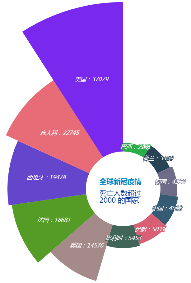
Global epidemic map
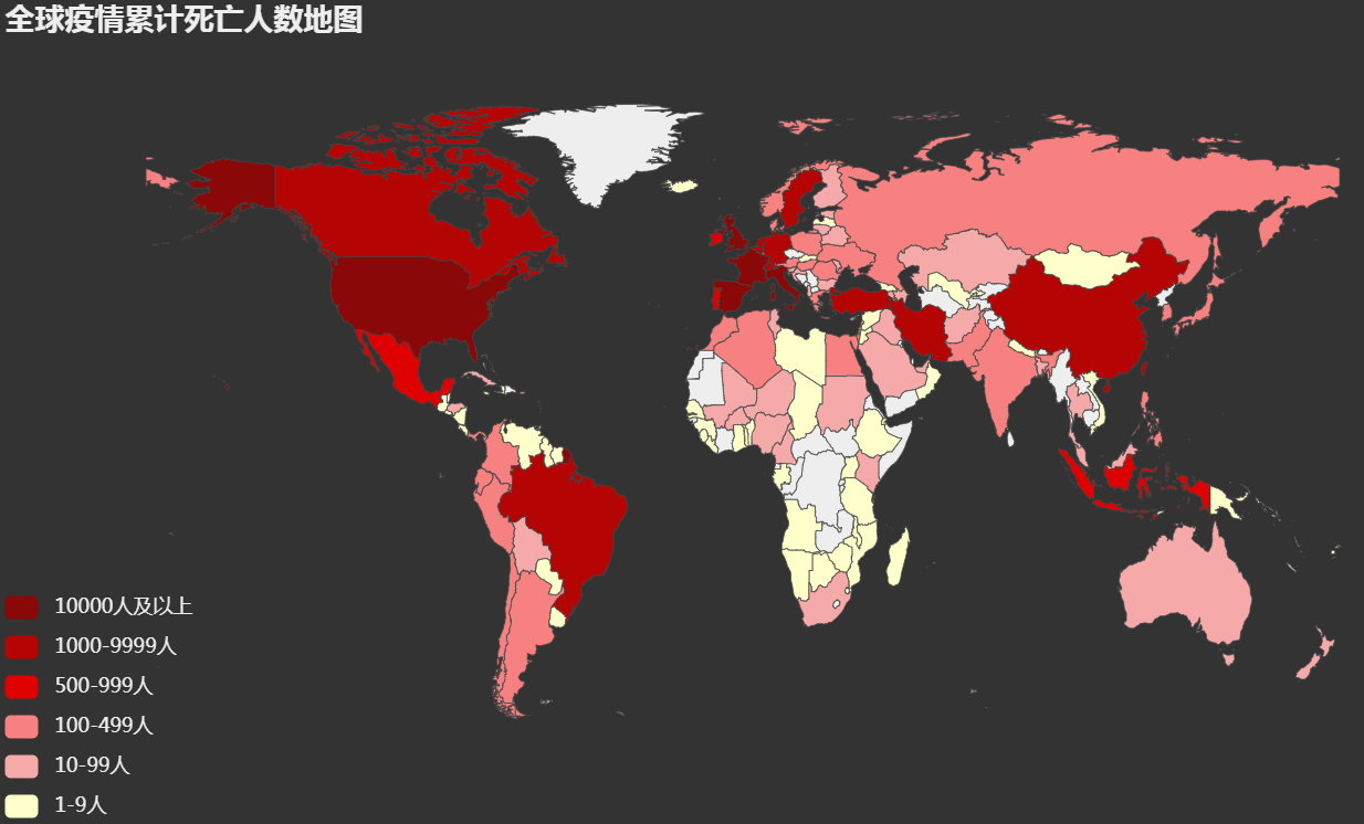
Next, we'll map the global epidemic, and we'll take the cumulative number of deaths from each country, coded as follows:url = 'https://lab.isaaclin.cn/nCoV/api/area'
data = requests.get(url).json()
oversea_confirm = []
for item in data['results']:
if item['countryEnglishName']:
oversea_confirm.append((item['countryEnglishName']
.replace('United States of America', 'United States')
.replace('United Kiongdom', 'United Kingdom'),
item['deadCount']))
world_map = (
Map(init_opts=opts.InitOpts(theme='dark'))
.add('Cumulative number of deaths', oversea_confirm, 'world',is_map_symbol_show=False, is_roam=False)
.set_series_opts(label_opts=opts.LabelOpts(is_show=False, color='#fff'))
.set_global_opts(
title_opts=opts.TitleOpts(title='Global map of cumulative deaths from epidemics'),
legend_opts=opts.LegendOpts(is_show=False),
visualmap_opts=opts.VisualMapOpts(max_=2700,
is_piecewise=True,
pieces=[
{"max": 99999, "min": 10000, "label": "10000 People and above", "color": "#8A0808"},
{"max": 9999, "min": 1000, "label": "1000-9999 people", "color": "#B40404"},
{"max": 999, "min": 500, "label": "500-999 people", "color": "#DF0101"},
{"max": 499, "min": 100, "label": "100-499 people", "color": "#F78181"},
{"max": 99, "min": 10, "label": "10-99 people", "color": "#F5A9A9"},
{"max": 9, "min": 0, "label": "1-9 people", "color": "#FFFFCC"},
])
)
)
world_map.render(path='Global epidemic map.html')
Take a look at the picture:
Epidemic map of China
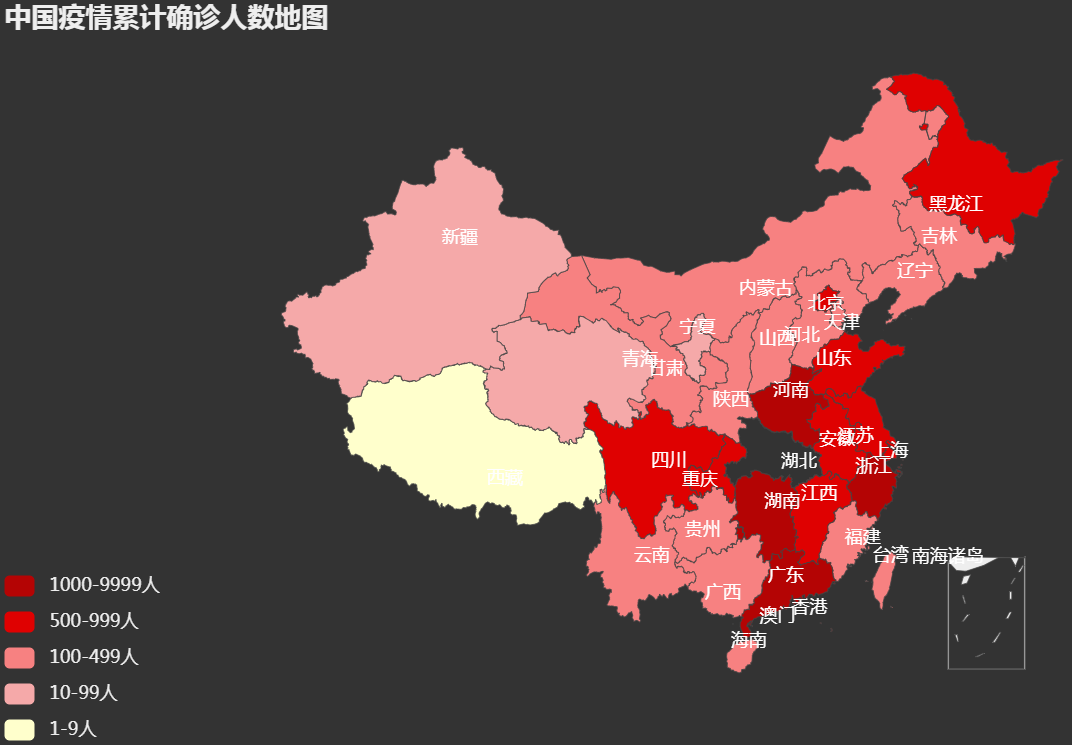
We then mapped the epidemic situation in our country, taking the cumulative number of confirmed cases from each province as follows:url = 'https://lab.isaaclin.cn/nCoV/api/area'
data = requests.get(url).json()
province_data = []
for item in data['results']:
if item['countryName'] == 'China':
province_data.append((item['provinceShortName'], item['confirmedCount']))
china_map = (
Map(init_opts=opts.InitOpts(theme='dark'))
.add('Number of confirmed cases', province_data, 'china',is_map_symbol_show=False, is_roam=False)
.set_series_opts(label_opts=opts.LabelOpts(is_show=True, color='#ffffff'))
.set_global_opts(
title_opts=opts.TitleOpts(title="Map of cumulative number of confirmed cases in China"),
legend_opts=opts.LegendOpts(is_show=False),
visualmap_opts=opts.VisualMapOpts(max_=2000,
is_piecewise=True,
pieces=[
{"max": 9999, "min": 1000, "label": "1000-9999 people", "color": "#B40404"},
{"max": 999, "min": 500, "label": "500-999 people", "color": "#DF0101"},
{"max": 499, "min": 100, "label": "100-499 people", "color": "#F78181"},
{"max": 99, "min": 10, "label": "10-99 people", "color": "#F5A9A9"},
{"max": 9, "min": 0, "label": "1-9 people", "color": "#FFFFCC"},
])
)
)
china_map.render(path='Epidemic map of China.html')
Take a look at the picture:
Thermogram
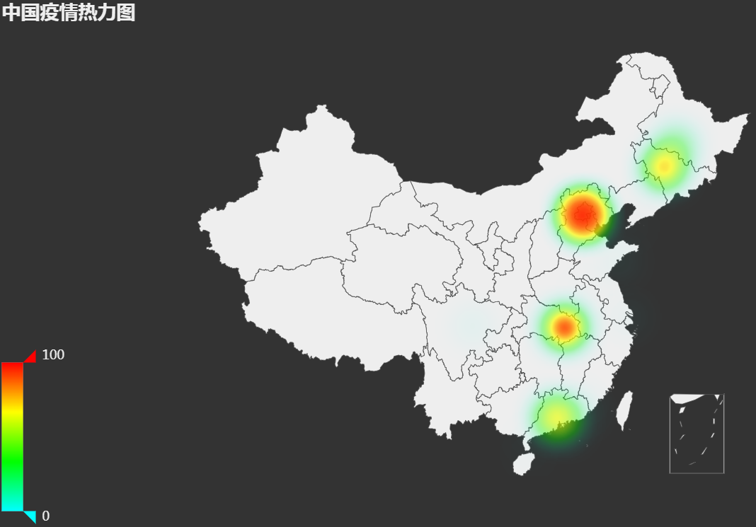
Next we draw the thermogram, but we also take the data from the provinces of our country, and the implementation code is as follows:url = 'https://lab.isaaclin.cn/nCoV/api/area'
data = requests.get(url).json()
cities_data = []
for item in data['results']:
if item['countryName'] == 'China':
if item['cities'] is not None:
cities_data.extend(item['cities'])
hot_geo = (
Geo(init_opts=opts.InitOpts(theme='dark'))
.add_schema(maptype='china')
.add('Cumulative number of confirmed cases',
[(i['cityName'], i['currentConfirmedCount']) for i in cities_data
if i['cityName'] in pyecharts.datasets.COORDINATES.keys()],
type_='heatmap')
.set_global_opts(
title_opts=opts.TitleOpts(title='Epidemic thermogram in China',
pos_left='left'),
legend_opts=opts.LegendOpts(is_show=False),
visualmap_opts=opts.VisualMapOpts(is_show=True,
is_piecewise=False,
range_color=['#0ff', '#0f0', '#ff0', '#f00'])
)
)
hot_geo.render(path='Epidemic thermogram in China.html')
Take a look at the picture:
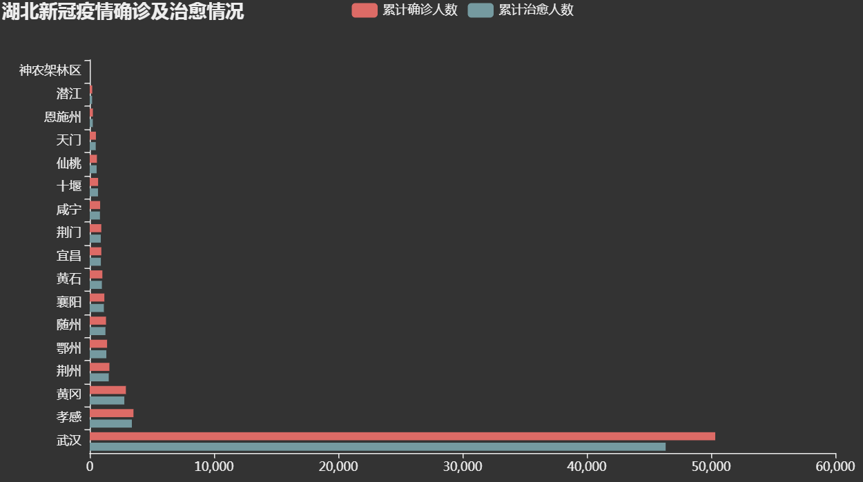
Column Chart
Let's go on to draw a column chart. This time we'll take data from a province. Since Hubei has the largest number of confirmed cases, let's use that province's data, and the implementation code is as follows:url = 'https://lab.isaaclin.cn/nCoV/api/area'
data = requests.get(url).json()
for item in data['results']:
if item['provinceShortName'] == 'Hubei':
hb_data = item['cities']
hb_bar = (
Bar(init_opts=opts.InitOpts(theme='dark'))
.add_xaxis([hd['cityName'] for hd in hb_data])
.add_yaxis('Cumulative number of confirmed cases', [hd['confirmedCount'] for hd in hb_data])
.add_yaxis('Cumulative number of cured', [hd['curedCount'] for hd in hb_data])
.reversal_axis()
.set_series_opts(label_opts=opts.LabelOpts(is_show=False))
.set_global_opts(
title_opts=opts.TitleOpts(title="Diagnosis and Cure of Xinguan Epidemic in Hubei Province"),
legend_opts=opts.LegendOpts(is_show=True)
)
)
hb_bar.render(path='Epidemic Map of New Crown in Hubei Province.html')
Take a look at the picture:
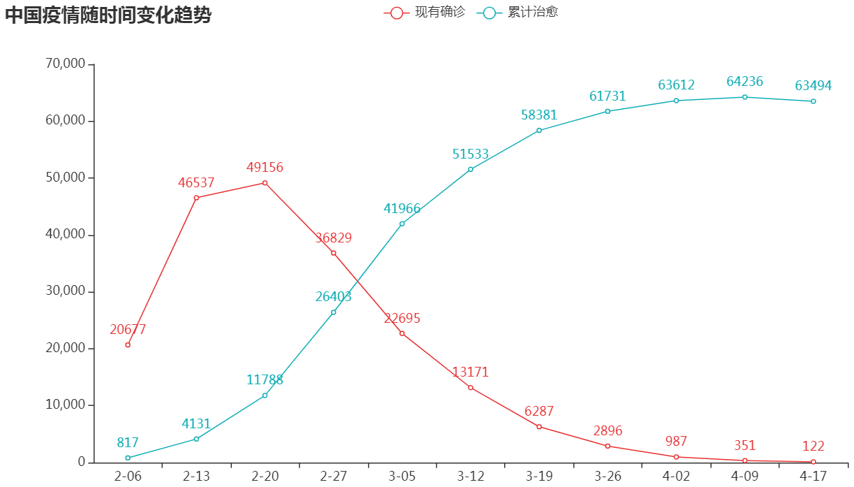
Line chart
At present, the above interface no longer provides data to return time series, but a data warehouse is available on GitHub in both JSON and CSV formats. Because GitHub has a poor network speed, I have tried several times and failed to download the data, so let's use the data shown on WeChat directly. The code is as follows:x_data = ['2-06', '2-13', '2-20', '2-27', '3-05', '3-12', '3-19', '3-26', '4-02', '4-09', '4-17']
# Existing diagnosis
y1_data = [20677, 46537, 49156, 36829, 22695, 13171, 6287, 2896, 987, 351, 122]
# Cumulative cure
y2_data = [817, 4131, 11788, 26403, 41966, 51533, 58381, 61731, 63612, 64236, 63494]
line = (Line()
.add_xaxis(x_data)
.add_yaxis('Existing diagnosis', y1_data, color='#10aeb5')
.add_yaxis('Cumulative cure', y2_data, color='#e83132')
.set_series_opts(label_opts=opts.LabelOpts(is_show=True))
.set_global_opts(
title_opts=opts.TitleOpts(title='Trend of Epidemic Situation over Time in China')
))
line.render(path='Epidemic Line Map of China.html')
Take a look at the picture:
If you need the source code, you can scan the following two-dimensional code, background reply 200418 to pick up.