I have the following example html, which has a DIV with a width of 100%.It contains some elements.Internal elements may be repositioned and div sizes may change when executing window resizing.I asked if it was possible to hook up div size change events?And how do you do that?I currently bind the callback function to the jQuery resize event on the target DIV, but there is no console log output, see the following:
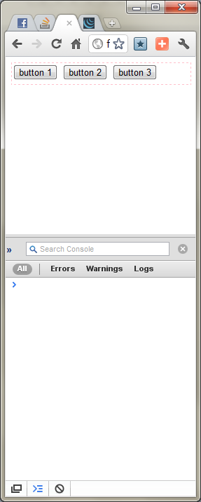
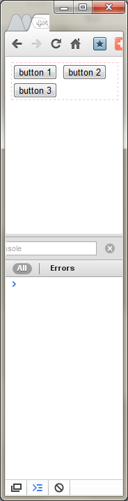
<html>
<head>
    <script type="text/javascript" language="javascript" src="http://code.jquery.com/jquery-1.6.1.min.js"></script>
    <script type="text/javascript" language="javascript">
            $('#test_div').bind('resize', function(){
                console.log('resized');
            });
    </script>
</head>
<body>
    <div id="test_div" style="width: 100%; min-height: 30px; border: 1px dashed pink;">
        <input type="button" value="button 1" />
        <input type="button" value="button 2" />
        <input type="button" value="button 3" />
    </div>
</body>
</html>
#1st floor
There is a very effective way to determine if the size of an element has changed.
http://marcj.github.io/css-element-queries/
The library has a ResizeSensor class that can be used for resize detection.
It uses an event-based approach, so damn fast and doesn't waste CPU time.
Example:
new ResizeSensor(jQuery('#divId'), function(){
    console.log('content dimension changed');
});
Do not use the jQuery onresize plug-in because it uses the setTimeout() loop to check for changes.
This is slow and inaccurate.
Disclosure: I have direct contact with this library.
#2nd floor
There is only Window.onResize in the specification, but you can always use IFrame to generate new Windows objects in DIV.
Please check this Answer .There's a new little jquery plug-in Portable and easy to use.You can always check the source code to see how it is done.
<!-- (1) include plugin script in a page -->
<script src="/src/jquery-element-onresize.js"></script>

// (2) use the detectResizing plugin to monitor changes to the element's size:
$monitoredElement.detectResizing({ onResize: monitoredElement_onResize });

// (3) write a function to react on changes:
function monitoredElement_onResize() {
    // logic here...
}
#3rd floor
I thought it couldn't be done, but later I thought you could manually resize the div by style = "resize:both;".To do this, you must click it, so an onclick function is added to check the height and width of the element, and it works fine.Use only five lines of pure JavaScript (make sure it's probably shorter) http://codepen.io/anon/pen/eNyyVN
<div id="box" style="
                height:200px;
                width:640px;
                background-color:#FF0066;
                resize: both;
                overflow: auto;"
                onclick="myFunction()">
    <p id="sizeTXT" style="
                font-size: 50px;">
       WxH
    </p>
    </div>

<p>This my example demonstrates how to run a resize check on click for resizable div.</p>

<p>Try to resize the box.</p>


<script>
function myFunction() {
var boxheight = document.getElementById('box').offsetHeight;
var boxhwidth = document.getElementById('box').offsetWidth;
var txt = boxhwidth +"x"+boxheight;
document.getElementById("sizeTXT").innerHTML = txt;
}
</script>
#4th floor
The best solution is to use so-called element queries.However, they are not standard and there is no specification - if you want to do so, the only option is to use one of the available polyfills / libraries.
The idea behind element queries is to allow specific container responses on the page to provide it with space.This will allow you to write the component once, then place it anywhere on the page, while adjusting its contents to the current size.No matter how big the window is.This is the first difference we see between element queries and media queries.Everyone wants to create a specification at some point to standardize element queries (or things that achieve the same goals) and make them native, clean, simple and robust.Most people think that media queries are limited and do not help with modular design and true responsiveness.
There are some polyfills / libraries that solve problems in different ways (although they can be called alternatives, not solutions):
- CSS Element Query-https: //github.com/marcj/css-element-queries
- BoomQueries- https://github.com/BoomTownROI/boomqueries
- eq.js- https://github.com/Snugug/eq.js
- ElementQuery- https://github.com/tysonmatanich/elementQuery
- There are others that I don't list here, but you can search freely.I can't say which of the currently available options is the best.You have to try something and make a decision.
I've seen other solutions to similar problems.Usually they use the window/viewport size under the timer or engine cover, which is not a real solution.In addition, I think ideally this should be done primarily in CSS, not in javascript or html.
#5th floor
Using Clay.js ( https://github.com/zzarcon/clay ), it is very simple to detect changes in element size:
var el = new Clay('.element');

el.on('resize', function(size) {
    console.log(size.height, size.width);
});