code:
- FAQ: when filling in the background, the image size is inconsistent, repeated and so on. It is recommended to add the background image directly in the div without img tag when inserting the image, which is conducive to the change of the background image.
-
Insert picture:
background-image: url(../img/product-auto/benz-amg-s63-01.jpg)
-
Image tiling de duplication operation:
background-repeat: no-repeat;
-
Zoom the picture to exactly the area where the background is defined.
background-size: cover;
-
picture centering
background-position: center;
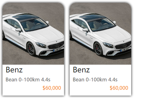
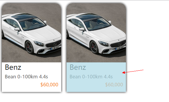
- css dynamic effect: when the mouse moves to the picture, the background color will appear and the text will be covered
To achieve the above effect steps of mouse movement:
-
Set the transition attribute. All indicates that all the attributes set in the style where the transition is located have transition effects. 5s indicates the displayed time length. Otherwise, if the time length is 0, the transition effect will not be generated.
transition: all .5s ease;
- Mouse move event effect, the transform attribute allows us to rotate, scale, move, or tilt elements. Rotate, translateY moves up.
			.container:hover .img {
				transform: rotate(-2deg)
			}
<!DOCTYPE html>
<html>
	<head>
		<meta charset="UTF-8">
		<title></title>

		<style>

			* {
				margin: 0px;
				padding: 0px;
			}

			.container {

				display: inline-block;

				margin: 10px 0px 0px 10px;

				height: 300px;
				width: 200px;

				border-radius: 20px 20px 0px 0px;
				overflow: hidden;

				box-shadow: 0px 0px 10px black;

				position: relative;

			}

			.container:hover .img {
				transform: rotate(-2deg)
			}

			.container:hover .buy {
				transform: translateY(-100px)
			}


			.img {
				height: 200px;
				width: 200px;

				background-repeat: no-repeat;
				background-size: cover;
				background-position: center;

				transition: all .5s ease;
			}
			.content {
				height: 100px;
				width: 200px;

				font-family: "Microsoft YaHei ";
				text-indent: 10px;
			}

			.title {
				font-size: 24px;
				color:  #212121;
			}

			.detail {
				margin-top: 6px;
				color: #616161;
			}
			.price {
				margin: 6px 10px 0px 0px;
				text-align: right;
				color: #F57C00;
			}


			.buy {
				height: 100px;
				width: 200px;
				background-color: lightblue;

				opacity: .7;

				position: absolute;

				top: 300px;

				transition: all .5s ease;
			}


			.border {
				border: 1px solid red;

			}


		</style>

	</head>
	<body>

		<div class="container ">

			<div class="img" style="background-image: url(../img/product-auto/benz-amg-s63-01.jpg);"></div>

			<div class="content ">

				<div class="title">
					Benz
				</div>
				<div class="detail">
					Bean 0-100km 4.4s
				</div>
				<div class="price">
					$60,000
				</div>

			</div>

			<div class="buy">

			</div>

		</div>


	</body>
</html>