Common solutions to mobile terminal layout are:
1.flex flexible layout
1) The height is fixed, the width is adaptive, and px is used as the unit of elements.
2) As the screen width changes, the page will also change. The effect is similar to the fluid layout of the PC page. When the width needs to be adjusted, just use the responsive layout adjustment (such as Netease News), so as to realize "adaptation".
2. Percentage
3. Frame the page
4.viewport adaptation
4.1 advantages:
1) Avoid complex calculations and directly use the standard pixel values of the UI
4.2 disadvantages:
2) meta tags cannot be used. The picture is seriously distorted
5. media query
6.rem+viewport zoom (also known as 1px adaptation)
1) Enlarge the page by dpr according to rem, and then set the viewport to 1/dpr
5.1 advantages:
1) media query can judge the device pixel ratio with simple method and low cost, especially when maintaining the same set of code for mobile and PC. Currently, frameworks such as Bootstrap are laid out in this way
2) The picture is easy to modify, just modify the css file
3) When adjusting the screen width, you can display it responsively without refreshing the page
5.2 disadvantages:
1) The amount of code is relatively large, which is inconvenient to maintain
2) In order to take into account large screen or HD devices, it will cause a waste of resources of other devices, especially loading picture resources
3) In order to give consideration to the respective responsive display effects of the mobile terminal and the PC terminal, it is inevitable to lose their unique interaction modes
6.rem+less (sass) adaptation
1) The viewport is also fixed
<meta name="viewport" content="width=device-width,initial-scale=1,maximum-scale=1,user-scalable=no">.
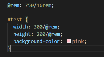
2) Control the reference value of rem through code (the actual size of the design is measured by 720px width)
3) css is precompiled by sass. Set the measured px value to convert the variable $px of REM: (1 / 100) + rem;
flex layout
Set display: flex for parent element
The child elements can set the scaling scale, scaling conditions, arrangement mode, etc. through the flex parameter
Disadvantages: compatibility problems
rem layout
Here are two ideas:
Train of thought 1
1) Set the font size of the root node to (for convenience, it can be flexibly set: 16, 32, 100, etc.), and use the original px/@rem to obtain the value of rem during layout;
2) Just calculate the clientwidth of the current device in js, and then use clientwidth/16 (font size = 1rem) – here it means that 16rem is the device size, that is, the devices are divided into one
3) Suppose we use a 750px design draft,
give an example:
  (function () {
    var styleNode = document.createElement("style");
    /* When not divided by 16, 1em occupies the viewport width,
    Then we set the width and height of the elements in the page to be less than 1rem, and the calculation of the browser will not be particularly accurate and prone to deviation */
    // var w = document.documentElement.clientWidth;
    /* So at this time, we divide by 16 to make 16 REM occupy the full screen, and the rem of most elements in the page will exceed 1 rem */
    var w = document.documentElement.clientWidth / 16;//Get viewport size
    /* Set the fontsize of the root element at this time, and add the font size attribute to the style of html*/
    styleNode.innerHTML = "html{font-size:" + w + "px!important}";
    //Add a style tag to the head tag that contains HTML {font size: W;}
    document.head.appendChild(styleNode);
  })()
 (function () {
    var styleNode = document.createElement("style");
    /* When not divided by 16, 1em occupies the viewport width,
    Then we set the width and height of the elements in the page to be less than 1rem, and the calculation of the browser will not be particularly accurate and prone to deviation */
    // var w = document.documentElement.clientWidth;
    /* So at this time, we divide by 16 to make 16 REM occupy the full screen, and the rem of most elements in the page will exceed 1 rem */
    var w = document.documentElement.clientWidth / 16;//Get viewport size
    /* Set the fontsize of the root element at this time, and add the font size attribute to the style of html*/
    styleNode.innerHTML = "html{font-size:" + w + "px!important}";
    //Add a style tag to the head tag that contains HTML {font size: W;}
    document.head.appendChild(styleNode);
  })()
In the less file (this eliminates complex conversion)
Idea 2:
1) Set the font size of the root node to 100px (mainly for convenience of calculation), and use the original px/100 to obtain the rem value during layout;
2) Suppose we use a 640px design draft (i.e. iPhone 5, resolution 320x, dpr=2), we only need to calculate the clientwidth of the current device in js, and then use 100*(clientwidth/640) to adapt to the current device
code:
(function (doc, win) { var docEl = doc.documentElement, resizeEvt = 'orientationchange' in window ? 'orientationchange' : 'resize', recalc = function () { var clientWidth = docEl.clientWidth; if (!clientWidth) return; if(clientWidth>=640){ docEl.style.fontSize = '100px'; }else{ docEl.style.fontSize = 100 * (clientWidth / 640) + 'px'; } }; if (!doc.addEventListener) return; win.addEventListener(resizeEvt, recalc, false); doc.addEventListener('DOMContentLoaded', recalc, false); })(document, window);
Frame the page
1 – bootstrap (jQuery based responsive tool for mobile, pad, pc)
2. – ElementUI (PC), MintUI (mobile terminal), vue component library development, etc
Media query (it is adapted according to several devices you need. The code is as follows: (note!!!!! The following is only useful for the devices you have set up media query) ------- therefore, there are improvement methods. You can continue to look down (i.e. rem adaptation)
 html{
        font-size: 100px;
    }
     /* ip6 */
    @media screen and (min-width:375px) {
        html{/*When the screen size is greater than 375px*/
            font-size: 117.1875px;
        }
    }
       /* ip6p */
    @media screen and (min-width:414px) {
        html{
            font-size: 129.375px;
        }
    }
       /* ipad */
    @media screen and (min-width:768px){
        html{
            font-size: 240px;
        }
    }
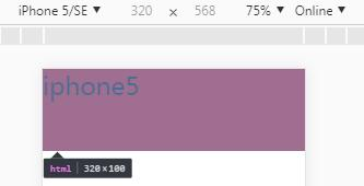
1) This is based on the screen resolution 320 of iPhone 5. The font size is set to 100px to calculate rem. because the font size in Google browser is 16px by default, with such an operation 1rem=16px, when you set the font size to 100px, 1rem=100px, the conversion will be easier. Just divide PX by 100
2) So how to calculate the font size of iPhone 6 and even ipad through the screen resolution of iPhone 5 320 and the size of 100px?
3) We know that the screen width of the iPhone 6 is 375, so its font size is (375100) / 320, or 117.1875px. Similarly, you can calculate the size of other devices.
Relationships involved here:
Current device font / current device width = design draft font / design draft width
Therefore: current device font = current device width design draft font / design draft width, i.e. (375 * 100) / 320
Example introduction:
body settings:
<div> iphone5 </div>
css settings:
 width: 100%;
 height: 1rem;
 background-color: red;
 font-size: 30px
With the above settings, it won't be written here.
Effect: on iPhone 5:
Under iPhone 6:
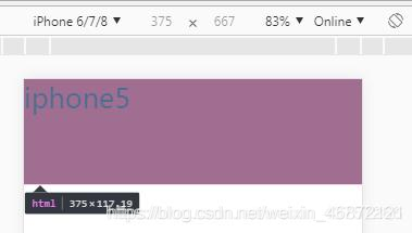
It can be seen that the height of div changes to 117.19px, indicating that the method is established.
rem adaptation using js (supplemented by rem adaptation idea 2)
code:
(function (doc, win, undefined) {
            var docEl = doc.documentElement,
              resizeEvt = 'orientationchange' in win? 'orientationchange' : 'resize',
              recalc = function () {
                var clientWidth = docEl.clientWidth;
                if (clientWidth === undefined) return;
                //Based on ip5
                docEl.style.fontSize =(clientWidth*100) / 320 + 'px';
             };
           if (doc.addEventListener === undefined) return;
           win.addEventListener(resizeEvt, recalc, false);
           doc.addEventListener('DOMContentLoaded', recalc, false)
         })(document, window);
Let's look at the meaning of this code separately: (here is based on 320. Generally, the design draft is based on 750 and 680. Just replace 320 with 750 or 680)
docEl.style.fontSize =(clientWidth*100) / 320+ 'px';
This means that you multiply your current screen size by 100, which is equivalent to changing the default font size to 100px (so when converting to rem, divide the PX unit you get by 100) and then divide by 320, which is the screen size of the iPhone 5.
The algorithm is the same as the above. If you understand the above, you will understand the here.
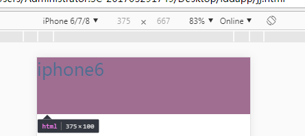
If you want to use iPhone 6 as the benchmark, you just need to change the screen size to that of iPhone 6:
docEl.style.fontSize =(clientWidth*100) / 375+ 'px';
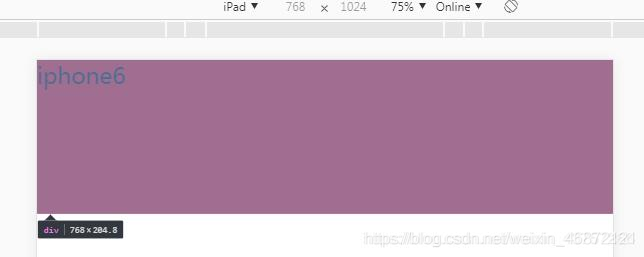
Effect drawing based on iPhone 6: (the body and css code are the same as above)
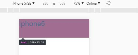
The height is 1rem, so this is 100px
On other devices:
On the iPhone 5: the height is 85.33
I.e. (320 * 100) / 375
On the ipad:
Finally, if the page is written according to the size of the design, if it is 640, it is set according to the screen size of iPhone 5. When setting, the font size should be set to 50px, because the size of the design 640 is twice the screen size of iPhone 5 320, and there is a DPR, which is 2.0.
So I give you a design draft and ask you to write a page. If the size is 640, which is set according to the screen size of iPhone 5, the font size is set to 50px;
Similarly, if the design size is 750, that is, it is set according to the screen size of iPhone 6, the font size should also be set to 50px.
But! When converting: divide the px size you get by 100!
viewport adaptation
<!DOCTYPE html>
<html>
	<head>
		<meta charset="UTF-8">
		<meta name="viewport" content="width=device-width,initial-scale=1,user-scalable=no" />
		<title></title>
		<style type="text/css">
			*{
				margin: 0;
				padding: 0;
			}
			#box{
				width: 160px;
				height: 160px;
				background: deeppink;
			}
		</style>
		<!--
			ui: 320px
			320px --- 375px
			viewport Adaptation:
				Turn the entire design drawing into the size of the screen area (screen reality) css Pixel size = 320) == The layout viewport becomes 320

				Option 1: width=320 (Android phones do not support)
				Option 2: initial-scale = 375/320  --- Zoom in operation
		-->
	</head>
	<body>
		<div id="box"></div>
	</body>
	<script type="text/javascript">

		//optimization
		!(function(){
			//Screen width
			var width = document.documentElement.clientWidth; //375
			//Target width
			var targetW = 320;
			//proportion
			var scale = width/targetW;
			var metaNode = document.querySelector('meta[name="viewport"]')
			metaNode.setAttribute('content','initial-scale='+ scale +',user-scalable=no')
		})();

	</script>
</html>
ort zoom (also known as 1px fit)
Use code 1:
<!DOCTYPE html>
<html>
	<head>
		<meta charset="UTF-8">
		<meta name="viewport" content="width=device-width,initial-scale=1,user-scalable=no" />
		<title></title>
		<style type="text/css">
			*{
				margin: 0;
				padding: 0;
			}
			#box{
				width: 8rem;
				height: 8rem;

				border: 1px solid #000;
			}

		</style>
		<!--
			1px Adaptation  -- Physical pixel
			1.Layout element units rem
			2.Border unit px
			3.adopt dpr Let the element scale, initial-scale=0.5
			4.Layout element units rem ,Multiply the scale back by 2

		-->
	</head>
	<body>
		<div id="box"></div>
	</body>
	<script type="text/javascript">
		//Get dpr
		var dpr = window.devicePixelRatio; // 2
		//Scale / / 0.5
		var scale = 1/dpr;
//		var width = document.documentElement.clientWidth;//375
		//3. Scale the elements through dpr, initial scale = 0.5
		var metaNode = document.querySelector('meta[name="viewport"]');
		metaNode.setAttribute('content','width=device-width,initial-scale='+ scale +',user-scalable=no')
		var width = document.documentElement.clientWidth;//750
		//4. The layout element unit is rem, and the scaling scale is inversely multiplied by 2
		var styleN = document.createElement('style');
//		styleN.innerHTML = 'html{font-size: '+ width/16*dpr +'px !important;}';
//		styleN.innerHTML = 'html{font-size: '+ width*dpr/16 +'px !important;}';
//		styleN.innerHTML = 'html{font-size: '+ 750/16 +'px !important;}';
		styleN.innerHTML = 'html{font-size: '+ width/16 +'px !important;}';
		document.head.appendChild(styleN);
	</script>
</html>
Or use code 2:
!function (d) {
    var c = d.document;
    var a = c.documentElement;
    var b = d.devicePixelRatio;
    var f;

    function e() {
      var h = a.getBoundingClientRect().width, g;
      if (b === 1) {
        h = 720
      }
      if(h>720) h = 720;//Set the limit value of the reference value
      g = h / 7.2;
      a.style.fontSize = g + "px"
    }

    if (b > 2) {
      b = 3
    } else {
      if (b > 1) {
        b = 2
      } else {
        b = 1
      }
    }
    a.setAttribute("data-dpr", b);
    d.addEventListener("resize", function () {
      clearTimeout(f);
      f = setTimeout(e, 200)
    }, false);
    e()
  }(window);