Author: wanglei, Huawei UI programming framework technical expert
Since its birth, HarmonyOS has been designed to meet distributed multi device application scenarios, ranging from smart screen, car machine and tablet to mobile phone and watch. The development of application UI interface in multi device scenario faces new difficulties and challenges, as shown in the following figure:
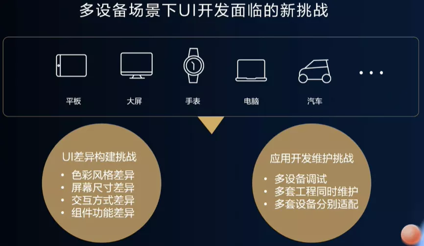
Figure 1 challenges of multi device development
In order to make the UI interface display normally under the differences of color style, screen size, interaction mode and component function, developers undoubtedly need to spend a lot of energy on UI adaptation. Developers often need to implement multiple sets of interface layouts (or even multiple sets of projects) to meet the design differences between different devices. Even if the page difference is small, you need to conduct multi device test, package and compile multiple times, and run on the device or simulator to see the effect. In the later maintenance process, you also need to constantly check the compatibility of different devices, which greatly increases the workload of application developers.
In order to solve the above problems and simplify the development and debugging cost of developers on multiple devices, we propose the design concept of one-time development and multi terminal deployment, which can be deployed to different devices on demand through a set of engineering code and one-time development. In order to achieve this goal, we provide developers with a variety of adaptation methods and capabilities from three aspects: Harmony system capability, ArkUI 3.0 framework capability and development tool capability.
Now we will introduce them one by one.
1, HarmonyOS system capability
First, introduce the capabilities provided at the system level. The system capability does not require the developer to adjust the page or business logic. The system can adapt multiple devices only by adding a few lines of configuration description. The system capability is independent of the development paradigm, so it can still be used under the new UI programming framework. Next, we introduce two system capabilities in turn: simulation window and parallel view.
1. Simulation window
Analog small window is the most commonly used and simplest multi device adaptation method. By using the suspension window ability of the system, low-resolution applications are displayed on the high-resolution screen in the form of suspension window. The common usage scenario is that the mobile application runs on a tablet or PC, as shown in the following figure:
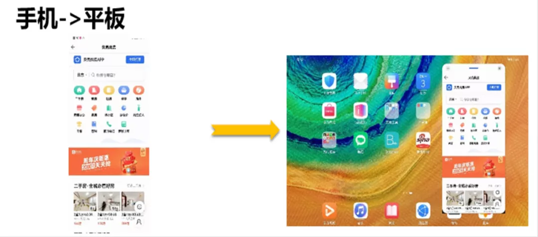
Fig. 2 simulation window
The use of the simulation window is very simple. Just add two descriptions in the config.json file of the project, configure the target device type of the application and the window size of the response respectively, and then run the low resolution application on the high-resolution device. The example code is as follows:
{
  "app": {
    ...
    "smartWindowSize":"360*640",
    "smartWindowDeviceType": [
      "tablet"
    ]
  },
  ...
}
This way of use can well ensure that the display effect of our application is consistent with that of the original platform, without additional interface adaptation by developers. However, this method also has limitations. The most significant problem is that there is no way to use all high-resolution screens. The amount of data displayed in the whole screen does not increase due to the increase of screen resolution, resulting in a waste of space on the screen. In order to solve this problem, the system provides another adaptation scheme - parallel horizon.
2. Parallel horizon
The system provides the ability of parallel view for folding screen and tablet devices. With the idea of split screen display, the screen is divided into left and right parts to display the two page contents associated with the application respectively. In this way, each area can maintain a good interface display effect, increase the amount of effective data in the screen, and make good use of the screen display area. For scenes commonly used in news and shopping, two related pages will be displayed at the same time, as shown in the following figure:
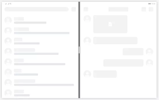
Figure 3 parallel horizon
When using parallel horizons, you first need to configure metaData in the config.json file to declare that it supports parallel horizons. At the same time, the easygo.json file needs to be added to configure the page routing relationship and guide the system to display in separate screens.
For detailed instructions on the use of parallel horizons, please refer to the official website:
2, ArkUI 3.0 framework capabilities
The above two are multi terminal adaptation schemes that can be realized through configuration. They are simple to use, but the use scenarios are relatively limited. In order to more accurately adapt the multi device interface, ArkUI 3.0 framework provides media query, polymorphic controls, atomic layout and grid system, which is convenient for developers to select appropriate capabilities for UI interface construction.
1. Media query
Media query is a standard capability provided by CSS and a key part of responsive Web design. This capability is still retained in the new UI paradigm as the most basic UI responsive design capability. In the new UI paradigm, media query capability is provided externally through API interface. The scope that can be explored includes page size, device resolution, screen direction, page aspect ratio, screen size, device type, screen type and theme mode. Developers can customize according to different query results. For example, when the screen direction changes, you can adjust the layout style and component display effect in the interface; You can also control the display and hiding of components according to different equipment types; And provide event notification when the query state changes.
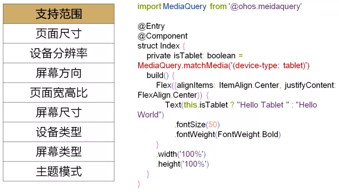
Figure 4 media query
2. Polymorphic components
UI interface construction is inseparable from the use of components. ArkUI 3.0 framework provides developers with polymorphic components, which encapsulate the styles and interaction modes of different devices, and complete most adaptation related work for developers. When using polymorphic components, developers do not need to consider device differences, but only focus on function implementation.
The following is an example to see the different effects of the same set of development code on mobile phones, smart screens and car machines.
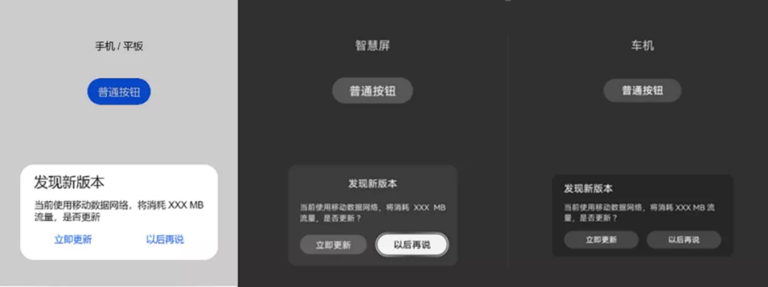
Figure 5 polymorphic components
The example code is as follows:
Column() {
    Text("mobile phone / Flat")
        .margin({top: 150})
    Button("Normal button")
        .margin({top: 40})
        .onClick(() => {
            AlertDialog.show({title: 'New version found', message: 'Currently using mobile data network, it will consume XXX MB Traffic, update',
            primaryButton: {
                value: 'Update now',
                action: () => {}
            },
            secondaryButton: {
                value: 'talk later',
                action: () => {}
            }})
        })
}
Product designers are often not satisfied with using the system default style, and want to be able to use custom styles for different platforms. In order to avoid developers adjusting the style one by one, the ArkUI 3.0 framework abstracts the component style related setting information (such as color, size, fillet radian, content text, etc.) to form a parameter table, which is mapped according to the parameter name and parameter value. UI component style attribute values are all from this parameter table. Developers and designers can adjust the display effect of components by adjusting the parameter values.
3. Atomic layout
The biggest difference between multiple devices is the screen resolution, and the difference resolution adaptation is inseparable from the ability of adaptive layout. For common development scenarios, we refine seven atomic layout capabilities. These layouts can be used independently or superimposed with multiple layouts. Let's introduce these seven atomic layout capabilities in turn:
(1) Line break layout: it is often used in the scene of horizontal and vertical screen adaptation or mobile phone switching to tablet. For example, the space in the vertical direction decreases, but the display area in the horizontal direction increases. At this time, you can consider using a broken line layout to change the layout in the vertical direction to the horizontal direction.
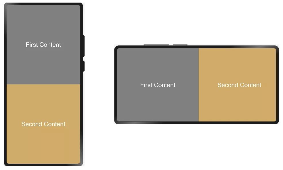
Figure 6 line break layout
The folding layout is realized by using the folding ability of Flex layout, and the folding layout effect can be realized by cooperating with the layout constraint setting. The example code is as follows:
Flex({direction: FlexDirection.Column, wrap: FlexWrap.Wrap}) {
    Flex({justifyContent: FlexAlign.Center, alignItems: ItemAlign.Center}) {
      Text("First Content")
      .fontColor(Color.White)
      .fontSize(30)
    }
    .constraintSize({minWidth: '50%', minHeight: '50%', maxWidth: 400})
    .backgroundColor(Color.Gray)
    Flex({justifyContent: FlexAlign.Center, alignItems: ItemAlign.Center}) {
      Text("Second Content")
      .fontSize(30)
      .fontColor(Color.White)
    }
    .constraintSize({minWidth: '50%', minHeight: '50%', maxWidth: 400})
    .backgroundColor('rgb(207, 171, 103)')
(2) Evenly distributed Bureau: it is often used in scenes where the content quantity is fixed and evenly displayed, such as toolbar, bottom menu bar, etc.
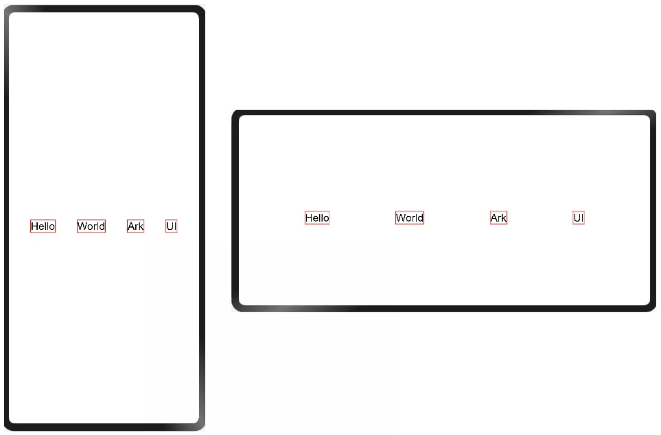
Fig. 7 average distribution
The example code is as follows:
@Entry
@Component
struct Index {
    build() {
        Flex({direction: FlexDirection.Row, alignItems: ItemAlign.Center, justifyContent: FlexAlign.SpaceEvenly}) {
            Text('Hello')
                .fontSize(20)
                .borderColor(Color.Red)
                .borderWidth(1)
            Text('World')
                .fontSize(20)
                .borderColor(Color.Red)
                .borderWidth(1)
            Text('Ark')
                .fontSize(20)
                .borderColor(Color.Red)
                .borderWidth(1)
            Text('UI')
                .fontSize(20)
                .borderColor(Color.Red)
                .borderWidth(1)
        }
        .width('100%')
        .height('100%')
    }
}
Just configure the flexalign.spaceonly mode to evenly display the content in the Flex component.
(3) Hidden layout: it is an advanced layout method. It is often used in scenes with large resolution changes and different display contents under different resolutions. The main idea is to maintain the best display effect by increasing or reducing the display content. For example, the media playback controller can completely display all the controls (including play, pause, previous song, next song, fast forward, rewind, maybe a little praise and favorite buttons) in the widescreen scene, while only some controls (such as play, pause, previous song and next button) are reserved in the low resolution scene.
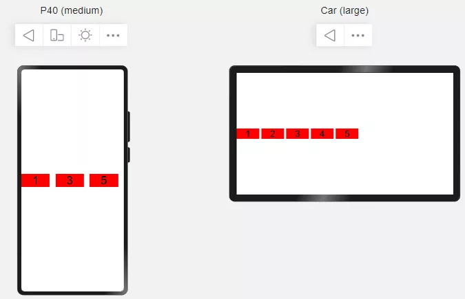
Figure 8 hidden layout
The use of hidden layout is very simple. You only need to set the display priority through the displayPriority method, and the elements with the same priority will be displayed or hidden at the same time. During layout calculation, the currently displayable components will be calculated and displayed according to the current available space. The example code is as follows:
Row({space: 10}) {
  Text('1')
    .width(100)
    .textAlign(TextAlign.Center)
    .fontSize(40)
    .backgroundColor(Color.Red)
    .displayPriority(2)
  Text('2')
    .width(100)
    .fontSize(40)
    .textAlign(TextAlign.Center)
    .backgroundColor(Color.Red)
    .displayPriority(1)
  Text('3')
    .width(100)
    .textAlign(TextAlign.Center)
    .fontSize(40)
    .backgroundColor(Color.Red)
    .displayPriority(3)
  Text('4')
    .width(100)
    .textAlign(TextAlign.Center)
    .fontSize(40)
    .backgroundColor(Color.Red)
    .displayPriority(1)
  Text('5')
    .width(100)
    .textAlign(TextAlign.Center)
    .fontSize(40)
    .backgroundColor(Color.Red)
    .displayPriority(2)
}
(4) Proportion layout: it is a very common layout, which is displayed in proportion according to the container size.
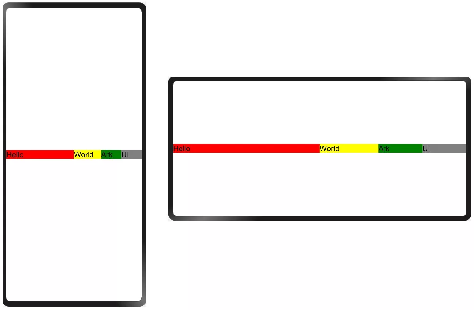
Figure 9 proportion layout
Scale adjustment can be achieved by setting the percentage size. The example code is as follows:
@Entry
@Component
struct Index {
    build() {
        Row() {
            Text('Hello')
                .fontSize(20)
                .width('50%')
                .backgroundColor(Color.Red)
            Text('World')
                .fontSize(20)
                .width('20%')
                .backgroundColor(Color.Yellow)
            Text('Ark')
                .fontSize(20)
                .width('15%')
                .backgroundColor(Color.Green)
            Text('UI')
                .fontSize(20)
                .width('15%')
                .backgroundColor(Color.Gray)
        }
        .width('100%')
        .height('100%')
    }
}
(5) Stretch and scale layout: the component size changes with the size of the parent container to produce the display effect of stretching or scaling.
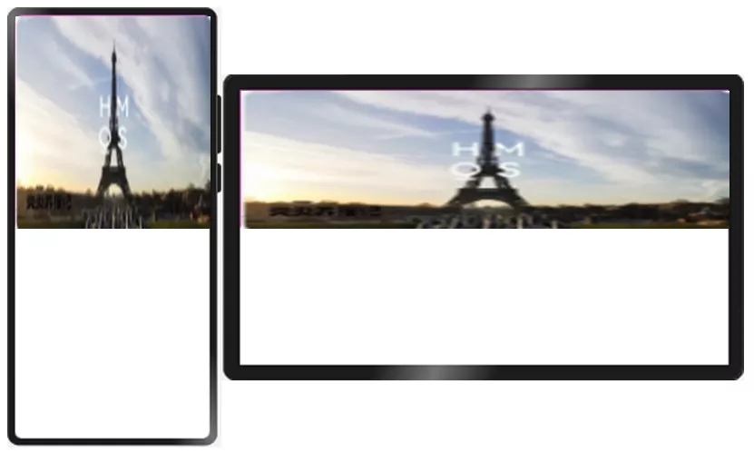
Figure 10 Stretch zoom layout
By setting the scale relative to the container, the display effect of stretching or scaling can be realized. The example code is as follows:
Row() {
        Image($r('app.media.background'))
          .objectFit(ImageFit.Fill)
          .width('100%')
          .height('100%')
    }
(6) Fixed aspect ratio layout: maintain its own aspect ratio when stretching and scaling. It is usually used in picture scaling scenes to keep the picture display effect normal and avoid the picture being elongated or flattened, resulting in display distortion.
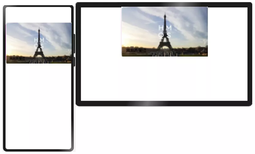
Figure 11 fixed aspect ratio layout
By setting the aspect ratio, keep the stretching display according to the fixed aspect ratio to ensure that the picture will not be deformed. The example code is as follows:
Row() {
    Image($r('app.media.background'))
      .objectFit(ImageFit.Fill)
      .width('100%')
      .height('100%')
      .aspectRatio(1.2)
}
(7) Extended layout: adjust the content display quantity according to the size, mainly through the ability such as list.
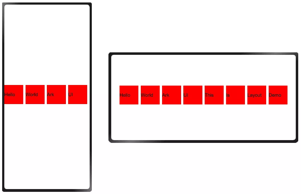
Figure 12 extended layout
Different amounts of content are displayed according to different widths, and more content can be displayed through sliding operation. The example code is as follows:
@Entry
@Component
struct Index {
    private data: string[] = ['Hello', 'World', 'Ark', 'UI', 'This', 'Is', 'Layout', 'Demo']
    build() {
        Flex({direction:FlexDirection.Column, justifyContent: FlexAlign.Center}) {
          List({space: 10}) {
              ForEach(this.data, (item) => {
                  ListItem() {
                      Text(item)
                        .fontSize(20)
                        .width(80)
                  }.height(80)
                  .backgroundColor(Color.Red)
              })
          }
          .listDirection(Axis.Horizontal)
          .width('100%')
          .height(100)
        }
        .width('100%')
        .height('100%')
    }
}
This example uses List as a layout container for linear content layout and supports sliding response.
4. Grid system
The ArkUI 3.0 framework also provides a complete grid system. The so-called grid system is a grid design from UX design, which divides the screen width into different columns according to different numbers of grids, and the size of components occupies one or more grids. The layout system designed in this way is called grid system. Using the grid system, you can mask the difference of screen resolution and keep the relative size of display content consistent on screens with different resolutions.
Common grid systems include 8 grid systems and 12 grid systems, while we provide a dynamic grid system, which can dynamically adjust the number of grids according to different screen sizes. When using the dynamic grid system, devices with different resolutions use different grid configurations. For example, the mobile phone vertical screen adopts the 4 grid system, the mobile phone horizontal screen and folding screen adopt the 8 grid system, and the large screen adopts the 12 grid system.
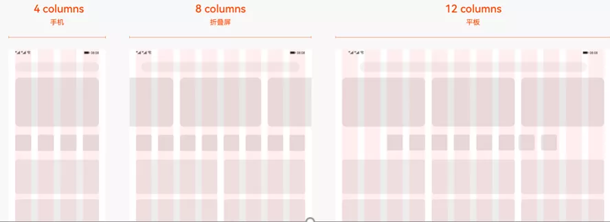
Figure 13 dynamic grid system
For the convenience of developers, the ArkUI 3.0 framework provides a grid layout container GridContainer. Let's take a look at an example. The code is as follows:
Stack() {
  GridContainer({sizeType: SizeType.Auto}) {
    Row() {
      Button('OK')
        .fontSize(30)
        .gridSpan(2)
        .useSizeType({lg: 4})
    }
  }
}
The grid layout container can be set to a fixed number of grids or to Auto mode. This example uses Auto mode, and the grid layout container dynamically adjusts the number of grids according to the width. At the same time, through the useSizeType property method, you can set the number of grids occupied by components in different grid modes. For example, ". useSizeType({lg: 4})" means that in the large grid system (i.e. 12 grid system), the width of the Button component occupies 4 grid display.
Therefore, the display effect of this example on mobile phones and tablets is as follows:
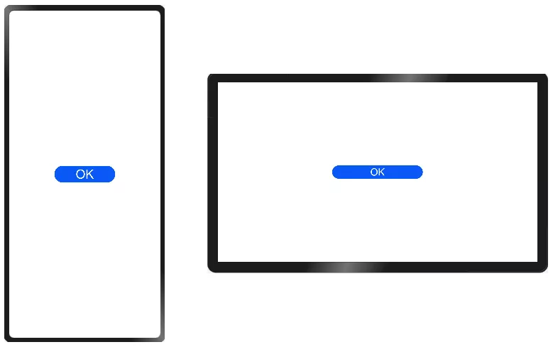
Figure 14 shows the effect
3, Development tool capability
In addition to the above system capabilities and ArkUI 3.0 framework capabilities, we also provide developers with a variety of development templates and multi device preview capabilities from the aspect of development tools (DevEco Studio), so as to reduce developers' development and debugging costs and improve development efficiency.
1. Development template
Development templates mainly include project templates and card templates.
- Project templates: DevEco Studio has preset rich project templates, which can easily create projects suitable for various equipment according to the project wizard, and automatically generate corresponding code and resource templates. When creating a project, developers can select the appropriate project template.
- Card template: DevEco Studio provides various types of card templates. Developers can flexibly select templates according to the information types to be displayed and quickly build service cards.
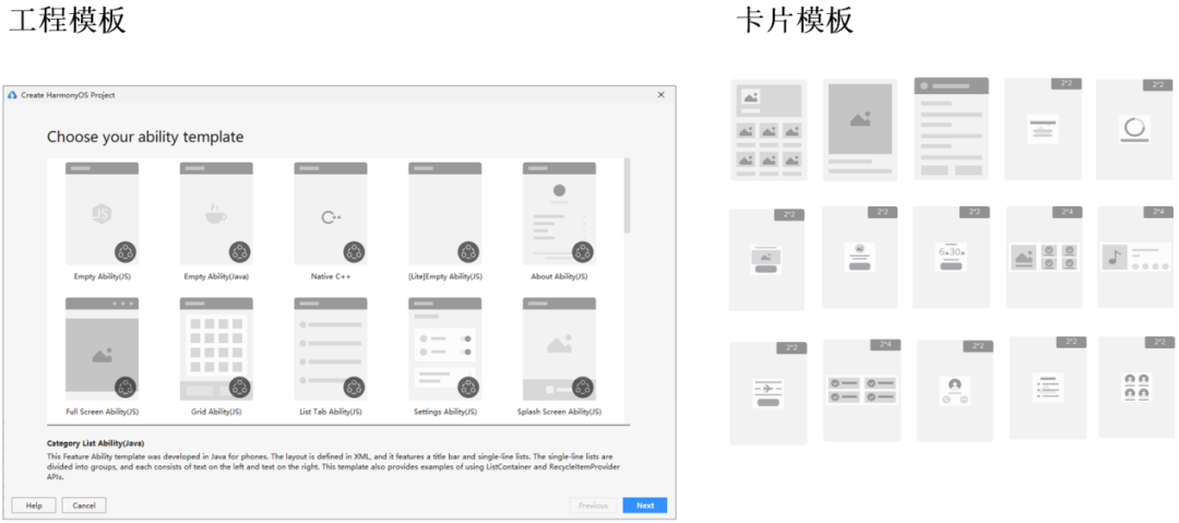
Figure 15 project template and card template
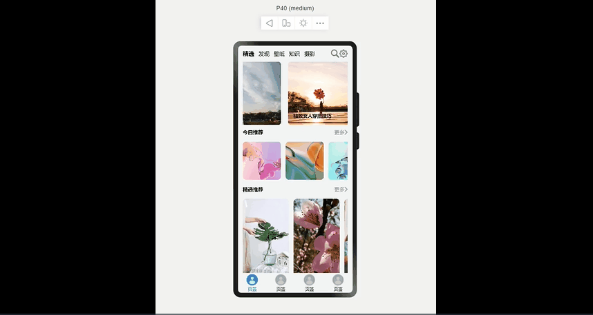
2. Multi device Preview
DevEco Studio also supports multi device preview capability. Developers can view the display effect of UI interfaces under multiple devices at the same time in the same window. The previewer and the real machine equipment adopt the same rendering engine and UI framework, which can maximize the consistency between the preview effect and the real machine operation effect. The following dynamic diagram shows the preview capability of multiple devices:
Interested partners can download and experience the new version of DevEco Studio from the official website: https://developer.harmonyos.com/cn/develop/deveco-studio
4, Conclusion
The perfect one-time development and multi terminal deployment effect cannot be achieved without the participation of developers. The UI development framework and system have made a preliminary exploration in the process of realizing one-time development and multi terminal deployment. It is also expected that developers can feed back more pain points in the process of multi Device UI development and the capabilities provided by the system framework.
Welcome developers to join us in enriching the ability of one-time development and multi terminal deployment in the open source community!
Scan code to add Developer Assistant wechat
Get more information about HarmonyOS development resources and developer activities