We then went on to the previous project. The first part mainly talked about the skills we need to master at the front end, and quickly built the project through vue.js and element-ui. But as I said before, I don't like using third-party things very much. So I don't need bootstrap, nor jquery, nor any tripartite components. I only use Vue family bucket to implement it, of course. In real projects, the tripartite components of some large factories are also trustworthy.

When we develop iOS, we use Xcode as our development tool, but when we develop H5, what software should we use? Notepad? You must have lived in the last century, DW? WebStrom? It can only be said that your teacher teaches well, sublime, well, general development uses this, and I use Atom developed by github. Atom Download Address Of course, you can also use VSCode from Microsoft, which is currently the most popular product. The reason I don't use it is simply because the icon is too ugly.
After downloading, we can install the plug-in. Because it's github's son, it's very convenient to integrate. The following plug-ins are recommended for you to use: atom-beatify, atom-ternjs, language-vue, and others are happy to see you.~
To get right to the point, let's empty the previous Home.vue content and delete the configuration of Element-UI, so that all the previous things will disappear, which is not important. Because the navigation bar is not hungry, we need to create a new sub-component named navigation.vue. (In the code, I renamed Home.vue Inde.) X.vue)
Add the following code to navigation.vue:
<template>
<div>
  <div class="nav">
    <div class="content">
      <div class="title">
        XXXXX
      </div>
      <div class="items">
        <span>XXXXX</span>
        <span>XXXXX</span>
        <span>XXXXX</span>
        <span>XXXXX</span>
        <span>XXXXX</span>
        <span>XXXXX</span>
      </div>
    </div>
  </div>
  <div class="nav-offset">

  </div>
</div>
</template>
As I said before, HTML is semantics. My habit is to use div and span.
<style scoped>
.nav {
  position: fixed;  //fixed positioning to fix the navigation bar
  background-color: rgba(0, 0, 0, 0.8);
  width: 100%;
  height: 50px;
  z-index: 1; //Always on the top floor
}

.nav-offset {
  height: 50px; //Fill in the positioning space
}

.nav .content {
  margin: 0 auto; //horizontally
  width: 1000px; //Write-to-death width
  height: inherit;
}

.nav .content .title { //Three-stage selector
  line-height: 50px; //Set the row height and center vertically.
  font-size: 28px;
  display: inline-block; //Intra-line block label
  text-indent: 40px; //Character indentation
  color: white; //Font color
}

.nav .content .items {
  line-height: 50px;
  width: 700px;
  display: inline-block;
  float: right; //Key Technologies for Right Floating
}

.nav .content .items span {
  width: 112px;
  text-align: center; //Font centered
  line-height: 50px;
  display: inline-block;
  color: white;
}
</style>
Focus on the part of CSS. To be honest, the front-end code is absolutely slag in reusability. Especially the part of CSS, I don't know why to design this way, which may be a legacy of history. At present, if we write the front-end, one is to write dead positioning according to px, and the other is to respond layout. I think domestic people like to do two sets, while foreign countries prefer to respond layout. There are pros and cons, but I don't like bootstrap for responsive layout, preferring to use @media for my own implementation. I'm currently using PX positioning method, not excluding time for responsive layout, but it's not important.
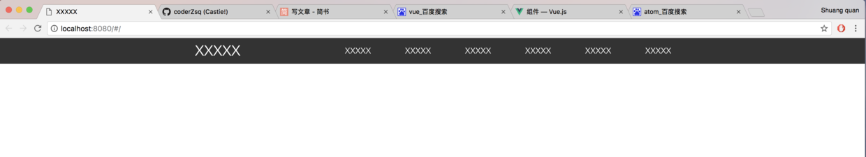
After completing the component part, we import navigation.vue into the parent component Index.vue for use:
<template>
<div>
  <navigation></navigation>
</div>
</template>
<script>
import navigation from './navigation' //Introducing subcomponents
export default {
  data() {
    return {

    }
  },
  components: { //Integrated sub-components
    navigation
  }
}
</script>
In two simple steps, we add the navigation bar to our parent component. Let's see the effect.
What's better than hungry? It's better to customize. It's better to customize. It's better to customize. It's important to say three times.
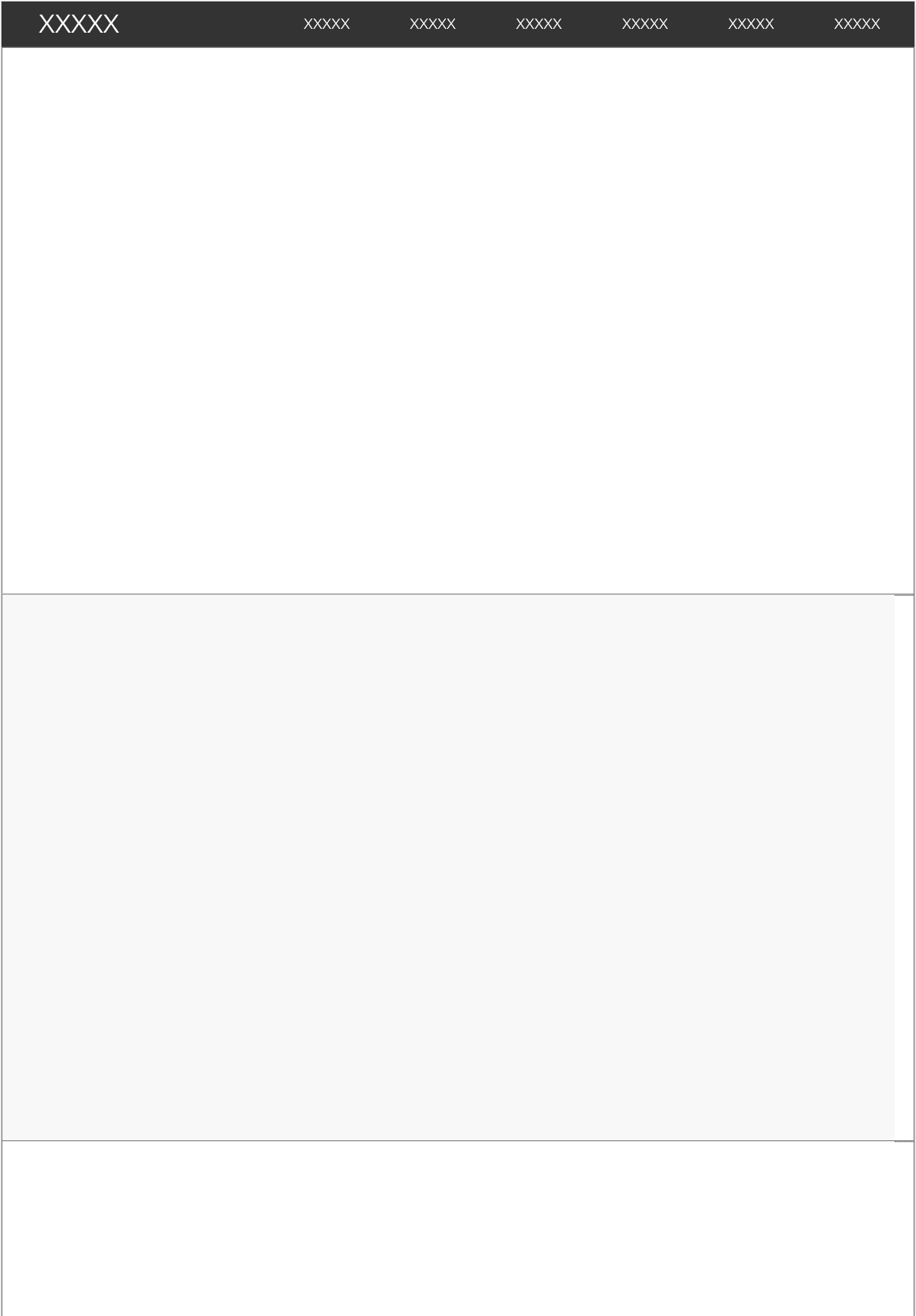
After making the navigation bar, we make the theme content, so we divide the resume into six parts, corresponding to personal introduction, project, blog, GitHub, experience and contact information. But I have a habit of doing the front-end. I like to do layout before deducting details, so I use XXXXX XX to replace it. Add three groups of code as follows:
  <div class="odd">
    <div class="content">

    </div>
  </div>
  <div class="even">
    <div class="content">

    </div>
  </div>
By odd and even class es to distinguish odd rows from even rows, here is to say, don't think div sets div will consume much memory or anything, the front end and mobile are different, HTML tags are the form of virtual dom, the specific details I do not understand, anyway, even nested 100 layers, will only consume the resources loaded out of the screen, so indulge in impatience!
.even {
  width: 100%;
  height: 600px;
  background-color: rgba(248, 248, 248, 1);
}

.odd {
  width: 100%;
  height: 600px;
  background-color: white;
}

.content {
  margin: 0 auto;
  width: 1000px;
  height: inherit;
  border: 1px solid gray; //Better concepts with boxes
}
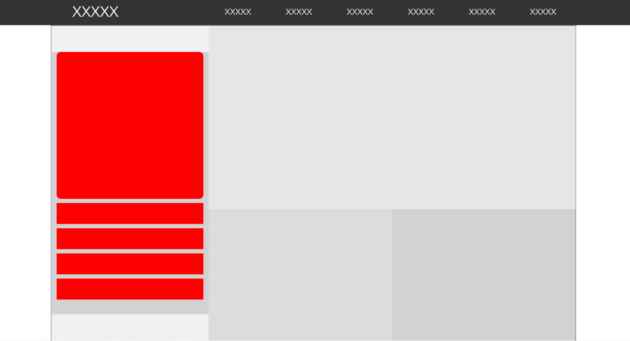
Here we also render div by class selector. Let's see the effect after rendering.
After setting up the basic layout, we will complete the internal structure. In fact, because there is no design plan, how the layout depends on the feeling, what color and how many pixels, follow the feeling.
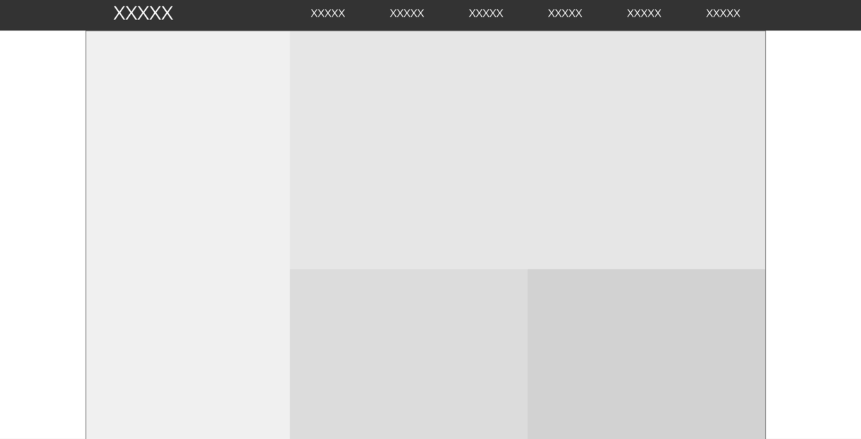
Let's go through the layout of the first part. The first part is made up of four areas: left, right, right, left, right, right and right. Let's go ahead and implement it. Add the following code to the content:
<div class="user"> //left
</div>
<div class="introduction">
        <div class="main"> //Right upper
        </div>
        <div class="left"> //Right lower left
        </div>
        <div class="right"> //Right lower right
        </div>
</div>
.user {
  background-color: rgba(240, 240, 240, 1);
  width: 300px;
  height: inherit;
  display: inline-block;
  position: relative;//Relative layout, absolute positioning using sub-view
}

.introduction {
  width: 700px;
  height: inherit;
  display: inline-block;
  float: right;
}

.introduction .main {
  background-color: rgba(230, 230, 230, 1);
  width: inherit;
  height: 350px;
  position: relative;
}

.introduction .left {
  background-color: rgba(220, 220, 220, 1);
  width: 350px;
  height: 250px;
  display: inline-block;
  position: relative;
}

.introduction .right {
  background-color: rgba(210, 210, 210, 1);
  width: 350px;
  height: 250px;
  float: right;
  display: inline-block;
  position: relative;
}
Complete the big layout, we also do the small layout, add in user:
<div class="user-block">
      <div class="icon">

      </div>
      <div class="row1">

      </div>
      <div class="row2">

      </div>
      <div class="row3">

      </div>
      <div class="row4">

      </div>
</div>
.user .user-block {
  position: absolute; //Absolute positioning, son and father
  width: 300px;
  height: 500px;
  top: calc(50% - 250px); //Key Technologies for Vertical Centralization of Block Labels Using Location
  background-color: rgba(210, 210, 210, 1);
}

.user .user-block .icon {
  margin: 0 auto;
  width: 280px;
  height: 280px;
  background-color: red;
  border-radius: 8px; //fillet
}

.user .user-block .row1,
.user .user-block .row2,
.user .user-block .row3,
.user .user-block .row4 {
  margin: 0 auto;
  margin-top: 8px;
  width: 280px;
  height: 40px;
  background-color: red;
}
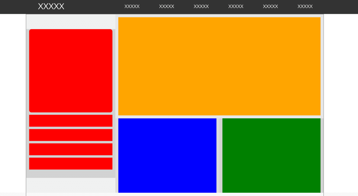
Now that the hardest part is done, let's do the rest together.~
  <div class="main">
      <div class="main-block">

      </div>
 </div>
 <div class="left">
      <div class="left-block">

      </div>
 </div>
 <div class="right">
      <div class="right-block">

      </div>
 </div>
.introduction .main .main-block {
  background-color: orange;
  position: absolute;
  width: 680px;
  height: 330px;
  top: calc(50% - 165px);
  left: calc(50% - 340px);
}

.introduction .left .left-block {
  background-color: blue;
  width: 330px;
  height: 250px;
  left: calc(50% - 165px);
  position: absolute;
}

.introduction .right .right-block {
  background-color: green;
  width: 330px;
  height: 250px;
  left: calc(50% - 165px);
  position: absolute;
}
So we will step by step to make a web page layout, in fact, there is no technical content, ha ha. Of course, the front-end introduction is simple, I heard that proficiency is difficult, but no one told me what proficient definition, and I do not care, because it is not important, as a funeral X, do their own happy things, you say?
About:
