Grid is the most powerful CSS layout scheme, stronger than flex.
It divides web pages into grids, and can combine different sizes of grids to make a variety of layouts.
As shown in the above figure, it is the grid layout application, and for example, the main page dashboard of the management system, which is implemented by grid layout.
Flex layout is a grid layout. You can only specify the location of "project" for grid lines, which can be regarded as a one-dimensional layout. Grid layout is to divide the container into "row" and "column", generate cells, and then specify the "project" cell, which can be regarded as a two-dimensional layout.
I. concept
Containers: elements with grid layout
Project: direct child elements of the container (independent of grandchildren)
Line: horizontal area inside the container
Column: vertical area inside the container
Cells: intersection of rows and columns
Gridlines: horizontal gridlines are divided into trips and vertical gridlines are divided into columns.
Normally, n rows have n + 1 horizontal gridlines, m columns have m + 1 vertical gridlines, for example, three rows have four horizontal gridlines.
Grid attribute: in grid layout, there are two types of attributes: one is defined on the container, and the other is defined in the project.
II. Grid layout
Set display:grid or inline grid to the corresponding element
<div class="container">
  <span class="item item-1">1</span>
  <span class="item item-2">2</span>
  <span class="item item-3">3</span>
  <span class="item item-4">4</span>
  <span class="item item-5">5</span>
  <span class="item item-6">6</span>
</div>
.container {
  display: grid;
}

By default, child elements are block level elements, and there is only one column by default (that is, grid template columns: only one value;)
If you set it to display: inline grid; you can see that it is still a column, except that the width is not 100% tiled, but the actual width.
Note: after the grid layout is set, the float, display: inline block, display: table cell, vertical align, column - * and other settings of the container project will be invalid.
III. container properties
1,grid-template-columns
Defines the column width for each column.
.container {
  display: grid;
  grid-template-columns: 100px 100px 100px;
}
There are several values, indicating that several columns have been specified. Columns with undefined column width will automatically run to the next row, while redundant columns will take up space.
The following picture:

1.1 percentage
Indicates that the width of the current column is defined as a percentage of the width of the parent element.
.container {
  display: grid;
  grid-template-columns: 33% 33%;
}

1.2 repeat function
Indicates repetition. The first parameter is several times, and the latter parameter indicates the value of each time
.container {
  display: grid;
  grid-template-columns: repeat(3, 33.33%);
}
repeat(3, 33.33%); equal to 33.33% 33.33% 33.33%

1.3 auto fill keyword
For example, each column is a fixed width, but how many columns does a row contain? I don't know. I only know that with the screen width, the remaining space will be automatically replenished.


1.4 fr keyword
fr stands for proportional relationship
.container {
  display: grid;
  grid-template-columns: 1fr 2fr; //Represents two columns defined, one for two
}

Above grid template columns: 1fr 2fr; equivalent to grid template columns: 33.33% 66.66%;
It can even be written like this
grid-template-columns: 150px 1fr 2fr;
1.5 minmax()
The minmax() function produces a length range that indicates that the length is in that range. It takes two parameters, minimum and maximum.
.container {
  display: grid;
  grid-template-columns: 1fr 1fr minmax(200px, 1fr);
}

1.6 auto keyword
Indicates that the browser determines the length.
.container {
  display: grid;
  grid-template-columns: 50px auto auto auto;
}

Above grid template columns: 50px auto auto auto; equivalent to
grid-template-columns: 50px 1fr 1fr 1fr;
2,grid-template-rows
Defines the row height of each row, which defaults to the row height of child elements
.container {
  display: grid;
  grid-template-rows: 100px 100px 100px;
}
There are several values, indicating that several rows are specified. Undefined rows will adopt the default row height (they will not automatically run to the next column). Redundant rows will take up space
As shown in the figure, only the first three lines are defined, and the last three lines adopt the default values.
1. Combination of grid template columns and grid template rows
By default, the number of columns is calculated by grid template columns, and then the number of rows is calculated automatically.
When grid template columns and grid template rows are combined, there will be a mismatch.
For example, there are 6 items in total, and I have defined 3 columns(
Grid template columns), that is, automatic 2 lines, but at this time, 3 lines (grid template rows) are specified, that is, 3 * 3 grid.
And there are 6 items in total. I have defined 3 columns, so the automatic is 2 lines, and now I specify 1 line, so it will not be 31 or 32 at this time
The grid specified by grid template columns and grid template rows can be called standard grid,
When there are more actual projects than the defined standard grid. We call the excess part the extended grid.
Standard Grid and extended Grid form Grid layout Grid.
Later, we will define the width and height of the extended grid through other attributes.
3,grid-auto-flow
After the grid is divided, the sub elements of the container are automatically placed in each grid in order. The default placement order is "first, then column", that is, first fill the first row, and then start to put the second row, that is, the order of the numbers in the figure below.
The default value of grid auto flow is row, which means "first before column". If column, columns first, then rows.
.container {
  display: grid;
  grid-template-columns: 100px 168px 100px;
  grid-template-rows: 137px 100px 100px;
  grid-auto-flow: row;
}

.container {
  display: grid;
  grid-template-columns: 100px 168px 100px;
  grid-template-rows: 137px 100px 100px;
  grid-auto-flow: column;
}
Grid auto flow no matter row or column, the following columns can't be arranged. Then the line will break. At this time, there will be blank space after the previous row.
If row deny and column deny are set, the blank space in the previous line will be filled with the first element that can be dropped in sequence.
.container {
  display: grid;
  grid-template-columns: 100px 168px 100px;
  grid-template-rows: 137px 100px 100px;
  grid-auto-flow: row;
}
.item-1{
  grid-column-start: 1;
  grid-column-end: 3;
}
.item-2{
  grid-column-start: 1;
  grid-column-end: 3;
}
You'll see a space at the top right, because item-3 follows item-2.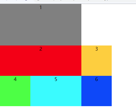
.container {
  display: grid;
  grid-template-columns: 100px 168px 100px;
  grid-template-rows: 137px 100px 100px;
  grid-auto-flow: row dense;
}
.item-1{
  grid-column-start: 1;
  grid-column-end: 3;
}
.item-2{
  grid-column-start: 1;
  grid-column-end: 3;
}
If you change it to row deny, you will find that item-1 and item-2 can't capture item-1, and then line break, and then find item-3 in order to supplement after item-1.
So when you add a deny, it will "fill in as many spaces as possible"
4,row-gap
Set row to row spacing (row spacing)
.container {
  display: grid;
  grid-template-columns: 100px 100px 100px;
  grid-template-rows: 100px 100px 100px;
  row-gap: 20px;
}

5,column-gap
Set column to column spacing (column spacing)
.container {
  display: grid;
  grid-template-columns: 100px 100px 100px;
  grid-template-rows: 100px 100px 100px;
  row-gap: 20px;
  column-gap: 20px;
}

Row gap and column gap can be abbreviated as
gap:<row-gap> <column-gap>
If gap omits the second value, the browser assumes that the second value is equal to the first value.
.container {
  display: grid;
  grid-template-columns: 100px 100px 100px;
  grid-template-rows: 100px 100px 100px;
  gap: 20px 20px;
}
6,grid-template-areas
Grid layout allows you to specify an area number for use in a project.
(no impact on existing layout)

You can also merge, which is the same name
.container {
  display: grid;
  grid-template-columns: 100px 168px 100px;
  grid-template-rows: 137px 100px 100px;
  grid-template-areas:
        "header header header"
        "main main sidebar"
        "footer footer footer";
}
7,justify-items
Set the horizontal position (left, middle and right) of all cell contents under the container. The gridlines are fixed, based on the location of gridlines. It's for all cells.
Justify items: start | end | center | stretch (default);
.container {
  display: grid;
  grid-template-columns: 100px 168px 100px;
  grid-template-rows: 137px 100px 100px;
  justify-items: start;
}
Since it is not stretch, the width of the project is its own
8,align-items
Set the vertical position (top, middle and bottom) of the contents of all cells under the container. The gridlines are fixed and based on the position of gridlines. It's for all cells.
Align items: start | end | center | stretch (default);
.container {
  display: grid;
  grid-template-columns: 100px 168px 100px;
  grid-template-rows: 137px 100px 100px;
  align-items: start;
}

The above justify items and align items can be combined into one attribute: place items
place-items: <align-items> <justify-items>;
.container {
  display: grid;
  grid-template-columns: 100px 168px 100px;
  grid-template-rows: 137px 100px 100px;
  place-items: start start;
}

9,justify-content
The horizontal position of the entire content area in the container (left, middle and right), the grid line will move, based on the edge of the grid.
justify-content: start | end | center | stretch | space-around | space-between | space-evenly;
The difference between space around and space event is that space around means that the distance between the project and the project is the same, but the distance from the edge is half of the distance between the projects, and even the space event is equal to the distance between the projects.
.container {
  display: grid;
  width: 600px;
  height: 400px;
  background-color: antiquewhite;
  grid-template-columns: 100px 168px 100px;
  grid-template-rows: 137px 100px 100px;
  justify-content: space-around;
}

.container {
  display: grid;
  width: 600px;
  height: 400px;
  background-color: antiquewhite;
  grid-template-columns: 100px 168px 100px;
  grid-template-rows: 137px 100px 100px;
  justify-content: space-evenly;
}

10,align-content
The vertical position (top, middle and bottom) of the whole content area in the container, grid lines will move, based on the edge of grid.
align-content: start | end | center | stretch | space-around | space-between | space-evenly;
.container {
  display: grid;
  width: 600px;
  height: 400px;
  background-color: antiquewhite;
  grid-template-columns: 100px 168px 100px;
  grid-template-rows: 137px 100px 100px;
  align-content: space-around;
}

.container {
  display: grid;
  width: 600px;
  height: 400px;
  background-color: antiquewhite;
  grid-template-columns: 100px 168px 100px;
  grid-template-rows: 137px 100px 100px;
  align-content: space-evenly;
}

The above align content and justify content can be combined into place content.
place-content: <align-content> <justify-content>
.container {
  display: grid;
  width: 600px;
  height: 400px;
  background-color: antiquewhite;
  grid-template-columns: 100px 168px 100px;
  grid-template-rows: 137px 100px 100px;
  place-content: space-evenly space-around;
}

11,grid-auto-rows
It is used to set the standard grid size defined by grid template columns and grid template rows. Compared with the actual project, it is redundant, that is, the size of columns and rows of the extended grid.
Redundant columns and rows by default use the size of the actual content of the elements in the project.
.container {
  display: grid;
  grid-template-columns: 100px 168px 100px;
  grid-template-rows: 137px;
}
A grid with 3 columns and 1 row is defined, which can place 3 items in total. The following are 6 items, which means that items-4 to item-6 are outside the grid. Use the actual content size of your element
<div class="container">
  <span class="item item-1">1</span>
  <span class="item item-2">2</span>
  <span class="item item-3">3</span>
  <span class="item item-4">4</span>
  <span class="item item-5">5</span>
  <span class="item item-6">6</span>
</div>

But we can use grid auto rows to display the row height of the specified, redundant parts. It only affects redundant projects, and will not affect the original grid projects.
.container {
  display: grid;
  grid-template-columns: 100px 168px 100px;
  grid-template-rows: 137px;
  grid-auto-rows: 50px;
}

12,grid-auto-columns
It is used to set the grid size defined by grid template columns and grid template rows. Compared with the actual project, the size of extra project columns and rows is smaller.
Redundant columns and rows by default use the size of the actual content of the elements in the project.
But unlike grid auto rows, the extra rows of grid auto rows will adopt the actual row height of their own elements, while the extra columns of grid auto columns will fill the remaining space (even span, strange)
.container {
  display: grid;
  grid-auto-flow: column;
  grid-template-columns: 100px;
  grid-template-rows: 100px 100px 100px;
}
A 1-column, 3-row, 1-supply can place 3 items. Then the second column is redundant.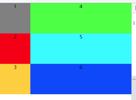
After using grid auto columns.
.container {
  display: grid;
  grid-auto-flow: column;
  grid-template-columns: 100px;
  grid-template-rows: 100px 100px 100px;
  grid-auto-columns: 20px;
}

IV. project properties
The first 12 attributes are defined on the container, while the following attributes are defined on the items in the container.
1,grid-column-*
Grid column start defines the starting grid (integer) of the vertical direction of the project. For example, if grid template columns defines three values, then grid column start can take 1 to 4)
Grid column end defines the ending grid (integer) in the vertical direction of the project. For example, if grid template columns defines three values, then grid column start can take 1 to 4)
.container {
  display: grid;
  grid-template-columns: 100px 168px 100px;
  grid-template-rows: 137px 100px 100px;
}

.item-1{
   grid-column-start: 1;
   grid-column-end: 3;
}
item-1 starts from 1 and ends at 3 vertically
2,grid-row-*
Grid row start defines the starting grid (integer) for the horizontal direction of the project. For example, if grid template rows defines three values, then grid column start can take 1 to 4)
Grid row end defines the end grid (integer) of the horizontal direction of the project. For example, if grid template rows defines three values, then grid column start can take 1 to 4)
.container {
  display: grid;
  grid-template-columns: 100px 168px 100px;
  grid-template-rows: 137px 100px 100px;
}

.item-1{
   grid-column-start: 1;
   grid-column-end: 3;
   grid-row-start: 2;
   grid-row-end: 4;
}
item-1 starts from 1 in vertical direction, ends at 3, and ends at 2 and ends at 4 in horizontal direction
The - start and - end above can be changed to gridlines.
.container {
  display: grid;
  grid-template-columns: 100px 168px 100px;
  grid-template-rows: 137px 100px;
  grid-template-areas:
        "header header setting"
        "main main sidebar"
}
The first row above defines two columns of header setting, so their grid lines are header start, header end and setting start, setting end. It's the same with everything else.
.item-1{
  grid-column-start: header-start;
  grid-column-end: header-end;
  grid-row-start: main-start;
  grid-row-end: footer-end;
}

3,grid-area
Specify which area to place the project in
.container {
  display: grid;
  grid-template-columns: 100px 168px 100px;
  grid-template-rows: 137px 100px;
  grid-template-areas:
        "header header setting"
        "main main sidebar"
}
.item-1{
  grid-area: header;
}

In fact, we found that
grid-area: header;
Just like the following effect.
 grid-row-start: header;
 grid-column-start: header;
 grid-row-end: header;
 grid-column-end: header;
4,justify-self
Setting the horizontal position of the cell content (left, center, right) is exactly the same as the use of the justify items property, but only works on a single item.
justify-self: start | end | center | stretch;
.container {
  display: grid;
  grid-template-columns: 100px 168px 100px;
  grid-template-rows: 137px 100px;
}
.item-1{
  justify-self: center;
}

5,align-self
Setting the vertical position (top, middle and bottom) of the cell content is exactly the same as the use of the align items attribute, but only works on a single item.
align-self: start | end | center | stretch;
.container {
  display: grid;
  grid-template-columns: 100px 168px 100px;
  grid-template-rows: 137px 100px;
}
.item-1{
   align-self: center;
}

You can also use the place self attribute
place-self: <align-self> <justify-self>;