The basic arrangement in grid layout is realized by float, so different size block elements will appear when floating, floating bug
Case: Style under pc screen

Style under slab
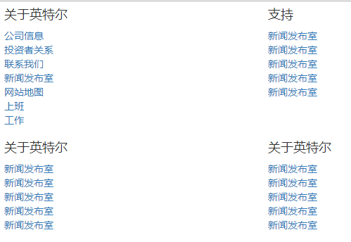
If you look at one row and four columns on the pc screen, you will have problems like the following
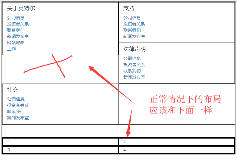
So how to solve it?
In fact, the pc screen should be designed in such a way that there is one column in a row and two rows in a column, each of which occupies six spaces. Each row has two columns, each of which occupies six spaces. Under the flat screen, these two rows occupy 12 spaces, which realizes full automatic line wrapping, thus avoiding the above floating bug. The specific code is as follows:
<div class="container">
    <div class="row">
        <div class="col-md-6 col-xs-12">
            <div class="row">
                <div class="col-sm-6 col-xs-12">
                    <h4>About Intel</h4>
                    <ul class="list-unstyled">
                        <li><a href="#"> Company Information</a></li>
                        <li><a href="#"> investor relations</a></li>
                        <li><a href="#"> contact us</a></li>
                        <li><a href="#"> Press Room</a></li>
                        <li><a href="#"> Site Map</a></li>
                        <li><a href="#"> go to work</a></li>
                        <li><a href="#"> work</a></li>
                    </ul>
                </div>
                <div class="col-sm-6 col-xs-12">
                    <h4>Support</h4>
                    <ul class="list-unstyled">
                        <li><a href="#"> Press Room</a></li>
                        <li><a href="#"> Press Room</a></li>
                        <li><a href="#"> Press Room</a></li>
                        <li><a href="#"> Press Room</a></li>
                        <li><a href="#"> Press Room</a></li>
                    </ul>
                </div>
            </div>
        </div>
        <div class="col-md-6 col-xs-12">
            <div class="row">
                <div class="col-sm-6 col-xs-12">
                    <h4>About Intel</h4>
                    <ul class="list-unstyled">
                        <li><a href="#"> Press Room</a></li>
                        <li><a href="#"> Press Room</a></li>
                        <li><a href="#"> Press Room</a></li>
                        <li><a href="#"> Press Room</a></li>
                        <li><a href="#"> Press Room</a></li>
                    </ul>
                </div>
            </div>
        </div>
    </div>
</div>