How do I indent the first line of a paragraph?
I didn't think of it at first sight text-indent🤣,Its provisions are as follows

    Applies to block elements
    Until the unit is as follows
        Length value: px em rem
        Percentage: depends on the number of blocks contained width
        keyword: each-line: Text indentation affects the first line, as well as the use of
        The first line after forced line breaking; hanging: This value will reverse indent all rows: all rows except the first row will be indented, as if the first row had set a negative indent value.
        Global Value: inherit initial unset
How to use CSS to enlarge the first letter or first word of a paragraph?
::first-letter Pseudo element selector

p::first-letter {
  font-size: 2em;
  font-weight: bold;
}
What's the difference between border radius: 50% and border radius: 100%?
This can actually be distinguished carefully. Specifically, the two pictures upstairs should be border-top-left-radius 50 of%And 100%The difference between,

If we set it directly border-radius: 100%; Or 50%

We will find that there is no difference between the two figures (the same is true for rectangles), so we need to know border-radius The true meaning of value,
If its value is a percentage, it is equivalent to the percentage of the width and height of the box, so border-radius 50%So the square will show a circle when we increase it to 100%In this process, his display results will not change because W3c Yes, for'Curve coincidence'In this specification, when the sum of the radii of two adjacent corners exceeds the total side length, the browser will recalculate to ensure that they will not coincide, so it is recommended to use border-radius:50%To avoid unnecessary calculations by the browser
Give an example to illustrate the usage of pseudo class: focus within
Similar to the bubbling mechanism of events, you can bubble from the element that gets the focus to the root element
Please use css to write a code scanning loading animation
@Keyframes donut-spin {
0% {
transform: rotate(0deg);
}
100% {
transform: rotate(360deg);
}
}
.donut {
display: inline-block;
border: 4px solid rgba(0, 0, 0, 0.1);
border-left-color: #7983ff;
border-radius: 50%;
width: 30px;
height: 30px;
animation: donut-spin 1.2s linear infinite;
}
What is the difference between height and line height?
    height: element content area Height of
    line-height: Element, the distance from the baseline of the multiline text
Handwriting an effect of rotating coins using css3
Two implementation methods: 1 animation+keyframes 2,transition:
//The first implementation
<style type="text/css"> .around{ width:200px; height:200px; background:orange; /*If it's round, you can't see the effect, so the border radius doesn't take 50%*/ border-radius:40%; transform:rotate(0deg); animation:move 3s ease; } @Keyframes move{ 0%{ transform:rotate(0deg); } 50%{ transform:rotate(360deg); } 100%{ transform:rotate(0deg); } } </style>

//The second implementation
<style type="text/css"> .around{ width:200px; height:200px; background:orange; /*If it's round, you can't see the effect, so the border radius doesn't take 50%*/ border-radius:40%; transform:rotate(0deg); transition:transform 3s linear; } .around:hover{ transform:rotate(360deg); } </style>
Use css3 to make a magic cube rotation effect
In general, some 3 D The style of the effect, such as translate3d,rotate3d,perspective,transform-style: preserve-3d; If you are interested, you can look at its style file
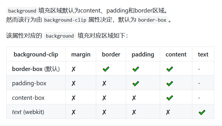
If you set background color for an element, what areas will its color fill?
When the national mourning day, how to make the whole website gray?
body{
  -webkit-filter: grayscale(1);
  filter: grayscale(1);
}

/* OR */

body{
  -webkit-filter: grayscale(100%);
  filter: grayscale(100%);
}
How to use pure CSS to prevent mouse click events?
pointer-events: none;
yes css3 The new attribute means that the mouse click event is prohibited. When this attribute is present in the element, the link and click events will become invalid.
Realize a layout that is fixed up and down and automatically filled in the middle
utilize flex Layout, flex-direction:column Define the arrangement direction as vertical
header footer Fixed height, middle part flex:1; The same can be achieved
 It should be noted that body and container The container needs to be set to a height of 100%;
Please write out the execution order of: link,: visited,: hover,: active
    :link

        Link not visited

    :visited

        Visited links

    :hover

        Mouse over

    :active

        Mouse down

Incidentally, there is another interactive component

    :focus

        Selected status (mouse click TAB (key)
For example, what are the clear values?
    none Default value. Allow floating elements to appear on both sides.
    left Floating elements are not allowed on the left.
    right Floating elements are not allowed on the right.
    both Floating elements are not allowed on either side.
    inherit Inherit from parent element clear The value of the property.
For example, what are the commonly used cursor values?
1,cursor: move; (move)
2,cursor: pointer;(Hand type)
3,cursor: not-allowed;(Disable)
Have you ever used vw layout? How is it different from using rem?
vw/vh Is the percentage of the screen view,
rem Is based on html of font-size To set the relative value of.
Vertical typesetting of text
writing-mode: vertical-lr;/From left to right from right to left writing-mode: vertical-rl;/
writing-mode: tb-lr;/IE Left to right, right to left writing-mode: tb-rl;/
How to make the image width adaptive?
percentage vw padding:percentage
How to center the picture and text in div up and down at the same time?
<div>
  <img src="./"/>
 <label>Text content</label>
</div>

<style>
 img {
    vertical-align: middle;
}
</style>

to img set up vertical-align: middle; also vertical-align It is only valid for elements in rows and cells in tables. It has no effect on the vertical centering of block level elements
For example: what are the usage scenarios of not()
/* Leave 10px gap between children */
.gap-right-10 > :not(:last-child) {
  margin-right: 10px;
}

/* Add a title when there is data */
.list-wrap:not(:empty):before {
  content: attr(data-title);
}

/* flex No width is compressed in the container */
.flex-row {
  display: flex;
  align-items: center;
  & > .grow { flex-grow: 1; }
  & > :not(.grow) { flex-shrink: 0 }
}
Use css to write a horizontal flipping text effect
letter-spacing: -2em;
box-reflect: below;
Do you use: valid and: invalid to verify the form?
It's hard to control. Take the required as an example,:invalid Marked red.
It was red at the beginning, so :focus:invalid Well, blur No bid;
Just. focus It's marked red. It's not necessarily what the design wants,:placeholder-shown Can solve a little.
Later, some were added js,Because demand changes faster than the pit to solve it.
Illustrate the usage scenario of attr()
css content of attr() Ah, at first I thought it was jquery of attr()

    Can be used for tooltips
    It can be used for text replacement of multiple contents, such as menu effect
    deposit i18n information

In general, some text exists html In, in css Can be used in.
How to use pure css to stretch and drag left and right?
Core attributes
resize:horizontal
Implementing pie chart effect with css
Method 1: use pseudo elements + transform + css Gradient implementation

    .pie {
            width: 100px;
            height: 100px;
            border-radius: 50%;
            background: yellowgreen;
            background-image: linear-gradient(to right, transparent 50%, #655 0);
        }

        .pie::before {
            content: '';
            display: block;
            margin-left: 50%;
            height: 100%;
            border-radius: 0 100% 100% 0 / 50%;
            background-color: inherit;
            transform-origin: left;
            transform: rotate(.3turn);
        }

Method 2 svg Solution

 <svg width="100" height="100">
        <circle r="25" cx="50" cy="50"/>
 </svg>

   circle {
            fill: yellowgreen;
            stroke: #655;
            stroke-width: 50;
            stroke-dasharray: 60 158;
       }

        svg {
            transform: rotate(-90deg);
            background: yellowgreen;
            border-radius: 50%;
       }
Using css to achieve the effect of reflection
box-reflect
How to solve the problem that you cannot scroll smoothly when using overflow: scroll?
scroll-behavior: smooth;
Please describe your understanding of css object model (CSSOM)
CSSOM Is a set of allowed JavaScript operation CSS of API. It is very similar to DOM,But for CSS instead of HTML. It allows users to read and modify dynamically CSS Style.
Use css to draw a five pointed star
#star-five {
      margin: 50px 0;
      position: absolute;
      display: block;
      color: red;
      width: 0;
      height: 0;
      border-right: 100px solid transparent;
      border-bottom: 70px solid red;
      border-left: 100px solid transparent;
      transform: rotate(35deg);
      left: 200px;
    }
    #star-five:before {
      border-bottom: 80px solid red;
      border-left: 30px solid transparent;
      border-right: 30px solid transparent;
      position: absolute;
      height: 0;
      width: 0;
      top: -45px;
      left: -65px;
      display: block;
      content: '';
      transform: rotate(-35deg);
    }
    #star-five:after {
      position: absolute;
      display: block;
      color: red;
      top: 3px;
      left: -105px;
      width: 0px;
      height: 0px;
      border-right: 100px solid transparent;
      border-bottom: 70px solid red;
      border-left: 100px solid transparent;
      transform: rotate(-70deg);
      content: '';
    }
Name at least ten css specifications you understand
    Naming conventions (hyphens)-(delimited string)
    File width limit (80 characters per line)
    add comments of explanations
    Writing selectors should facilitate reuse
    Try not to add it !important
    Avoid using CSS expression
    choice<link> Abandon @import
    Avoid using filters( IE Proprietary AlphaImageLoader (filter)
    Put the style sheet at the top / hold CSS Put in external file
    compress CSS
Write an animation, move 100px up at a constant speed and 200px down at 1.5 times the speed, and keep repeating the cycle
  .animation-block {
        width: 50px;
        height: 50px;
        background: red;
        margin-top: 200px;
        animation: up 1s linear, down 1.5s linear 1s;
    }

    @keyframes up {
        0% {
            transform: translateY(0px);
        }

        50% {
            transform: translateY(-100px);
        }

        100% {
            transform: translateY(0px);
        }
    }

    @keyframes down {
        0% {
            transform: translateY(0px);
        }

        50% {
            transform: translateY(100px);
        }

        100% {
            transform: translateY(0px);
        }
    }

<div class="animation-block"></div>


var box = document.querySelector('.animation-block');
var i = 0
box.addEventListener("webkitAnimationEnd", function() {
    i++
    if (i == 2) {
        i = 0
        box.classList.remove('animation-block');
        setTimeout(function() {
            box.classList.add('animation-block');
        }, 0)
    }
}, false);
Why is @ import not recommended in css?
@import belong to CSS,Therefore, the import statement should be written in CSS Note that the import statement should be written at the beginning of the style sheet, otherwise the external file cannot be imported correctly;

@import yes CSS2.1 Therefore, if the browser version is low, the external style file cannot be imported correctly;

When HTML When the file is loaded, link The referenced files are loaded at the same time, and @import The referenced files will be loaded after all pages are downloaded;
When using opacity, the child elements of the element will also be transparent. What if you don't want the child elements to be transparent?
When the parent element uses opacity The child element inherits the transparency even if the transparency is reset. The two methods upstairs are either to give up opacity,Or give up the parent-child relationship. But this is not in line with the meaning of the topic. According to the meaning of the question, it is necessary to use opacity There is no solution for the time being.
What are the consequences of triggering hasLayout?
Inherit the layout of the parent element.
What is the prefix of compatible ie browser in css
-webkit- Google
-moz- Firefox
-o- opera
-ms- ie
What is the difference between class and id selectors in css?
id In some browsers js Variables with the same name will be generated directly in the;
id Get the uniqueness of the id of dom When, the same name will be taken id The former;
id The stacking weight is very high, 1000 class Can't cover it id The style of the;
class You can set multiple values for the same element with spaces class,id Using spaces will make id invalid;
id You can play with link anchors.
How to achieve full screen background when the mobile terminal page is less than one screen?
body {
  min-height: 100vh;
}
Write a transition animation with a height from 0 to auto
No, max-height The fixed value is OK
How to set the background picture not to scroll with the text content?
Directly to div set up background: url Isn't that good? Code on.

<!DOCTYPE html>
<html lang="en">
<head>
    <meta charset="UTF-8">
    <title>Demo</title>
    <style>
      .img-wrap {
        width: 800px;
        height: 500px;
        background: url("./src/assets/404_images/404.png") 100% no-repeat;
        background-size: 100% 100%;
        overflow: auto;
      }
      p {
        font-size: 30px;
      }
    </style>
</head>
<body>
<div class="img-wrap">
  <p>
    Ha ha ha ha ha ha ha ha ha ha ha ha ha ha ha ha ha ha ha ha ha ha ha ha ha ha ha ha ha ha ha ha ha ha ha ha ha ha ha ha ha ha ha ha ha ha ha ha ha ha ha ha ha ha ha ha ha ha ha ha ha ha ha ha ha ha ha ha ha ha ha ha ha ha ha ha ha ha ha ha ha ha ha ha ha ha ha ha ha ha ha ha ha ha ha ha ha ha ha ha ha ha ha ha ha ha ha ha ha Ha ha ha ha ha ha ha ha ha ha ha ha ha ha ha ha ha ha ha ha ha ha ha ha ha ha ha ha ha ha ha ha ha ha ha ha ha ha ha ha ha ha ha ha ha ha ha ha ha ha ha ha ha ha ha ha ha ha ha ha ha ha ha ha ha ha ha ha ha ha ha ha ha ha ha ha ha ha ha ha ha ha ha ha ha ha ha ha ha ha ha ha ha ha ha ha ha ha ha ha ha ha ha ha ha ha ha ha ha Ha ha ha ha ha ha ha ha ha ha ha ha ha ha ha ha ha ha ha ha ha ha ha ha ha ha ha ha ha ha ha ha ha ha ha ha ha ha ha ha ha ha ha ha ha ha ha ha ha ha ha ha ha ha ha ha ha ha ha ha ha ha ha ha ha ha ha ha ha ha ha ha ha ha ha ha ha ha ha ha ha ha ha ha ha ha ha ha ha ha ha ha ha ha ha ha ha ha ha ha ha ha ha ha ha ha ha ha ha Ha ha ha ha ha ha ha ha ha ha ha ha ha ha ha ha ha ha ha ha ha ha ha ha ha ha ha ha ha ha ha ha ha ha ha ha ha ha ha ha ha ha ha ha ha ha ha ha ha ha ha ha ha ha ha ha ha ha ha ha ha ha ha ha ha ha ha ha ha ha ha ha ha ha ha ha ha ha ha ha ha ha ha ha ha ha ha ha ha ha ha ha ha ha ha ha ha ha ha ha ha ha ha ha ha ha ha ha ha Ha ha ha ha ha ha ha ha ha ha ha ha ha ha ha ha ha ha ha ha ha ha ha ha ha ha ha ha ha ha ha ha ha ha ha ha ha ha ha ha ha ha ha ha ha ha ha ha ha ha ha ha ha ha ha ha ha ha ha ha ha ha ha ha ha ha ha ha ha ha ha ha ha ha ha ha ha ha ha ha ha ha ha ha ha ha ha ha ha ha ha ha ha ha ha ha ha ha ha ha ha ha ha ha ha ha ha ha ha Ha ha ha ha ha ha ha ha ha ha ha ha ha ha ha ha ha ha ha ha ha ha ha ha ha ha ha ha ha ha ha ha ha ha ha ha ha ha ha ha ha ha ha ha ha ha ha ha ha ha ha ha ha ha ha ha ha ha ha ha ha ha ha ha ha ha ha ha ha ha ha ha ha ha ha ha ha ha ha ha ha ha ha ha ha ha ha ha ha ha ha ha ha ha ha ha ha ha
  </p>
</div>
</body>
</html>
<script>
</script>
How to use the properties of CSS3 to set the simulated border to be the same as the border effect?
<!DOCTYPE html>
<html lang="en">
<head>
  <meta charset="UTF-8">
  <title>Title</title>
  <style>
    .box {
      width: 200px;
      height: 200px;
      background-color: #000;
      position: relative;
    }
    .box:after {
      content: '';
      width: 204px;
      height: 204px;
      background-color: red;
      position: absolute;
      top: 50%;
      left: 50%;
      transform: translate(-50%, -50%);
      z-index: -1;
    }
  </style>
</head>
<body>
<div class="box">
</div>
</body>
</html>
How to use margin:0 auto under IE6; Can't center it?
Browser resolution problems, IE6 Next, you need to set the centered element text-align:center Property to make it margin:0 auto;take effect.
Using css to achieve the effect of rainbow
<!DOCTYPE html>
<html lang="en">
<head>
  <meta charset="UTF-8">
  <title>rainbow</title>
  <style>
    .rainbow-wrap {
      width: 500px;
      height: 500px;
      background-color: red;
      position: relative;
      left: 20px;
      top: 20px;
      border-radius: 100%;
    }
    .rainbow-wrap::after {
      content: '';
      width: 500px;
      height: 250px;
      background-color: white;
      position: absolute;
      bottom: 0;
    }
    .rainbow-wrap::before {
      content: '';
      width: 200px;
      height: 200px;
      background-color: white;
      position: absolute;
      bottom: 0;
      border-radius: 100%;
      top: 150px;
      z-index: 10;
      left: 150px;
    }
    .rainbow-wrap .rainbow-item {
      position: absolute;
      width: 400px;
      height: 400px;
      border-radius: 100%;
      background-color: yellow;
      top: 50%;
      left: 50%;
      transform: translate(-50%, -50%);
    }
    .rainbow-item:nth-child(2) {
      background-color: blue;
      width: 300px;
      height: 300px;
    }
    .rainbow-item:nth-child(3) {
      background-color: green;
      width: 200px;
      height: 200px;
    }
  </style>
</head>
<body>
<div class="rainbow-wrap">
  <div class="rainbow-item"></div>
  <div class="rainbow-item"></div>
  <div class="rainbow-item"></div>
</div>
</body>
</html>
Are padding and margin relative to parent or child elements in css?
padding Is to stuff your body (in the box), margin Just get dressed (outside the box).
==>padding Relative to child elements, margin Relative to parent element
Have you ever used vmax and vmin? Tell me about your understanding of them
    vmax and vmin Are units of length relative to the size of the window.
    100vmax Equivalent to 100%The length of the current window length or width, whichever is the largest, vmin conversely.
    If css function max()and min()After popularization, 100 vmax amount to max(100vw, 100vh)

What is most commonly used by individuals vmin,You can ensure that elements do not exceed the window range regardless of how the window is scaled while maintaining the aspect ratio.
Explain css3's flexbox (elastic box layout model) and its application scenarios?
Three section layout commonly used in mobile terminal, It can modify the position and sorting mode of all child elements under the parent element, which is more powerful than floating. Note that specifying flex after,Of child elements float,clear and vertical-align Property will be invalidated
How to reasonably set the font size of the root label when using rem layout?
UI Double draft, and then use js Calculate current equipment and UI The proportional relationship between design drafts is adopted resize Calculate the font size of the root label in real time.
What should I pay attention to when using rem?
Look at absolute units and relative units.

em Is relative to the element itself font-size The relative unit of, such as the element itself font-size It's 14 px,So 1.2em = 1.2 * 14px = 16.8px. Note that it is relative to the element itself font-size,As the element font-size Change as you change.

rem yes root em Abbreviation for, relative to the root element font-size Relative units, such as the root element font-size It's 14 px,So 1.2rem = 1.2 * 14px = 16.8px. Note that it is relative to the root element font-size,No matter where the element is, the cardinality of multiplication is 14 px(Root element font-size).

em Half is used to set the value of the element padding, margin, border-radius Wait.
rem Half is used to set the value of the element font-size.
px Half for setting border.

If used em set up font-size It's easy to have unexpected problems. Such as nested div.

// css
div {
  font-size: 0.8em;
}

<!--html-->
<div>
div1
<div>div2</div>
</div>

The above code assumes that the root element uses the default value of 16 px,So the first one div Your font is 0.8 * 16px = 12.8px,the second div Your font will inherit the first one first div of font-size = 12.8px,Then multiply by 0.8,0.8 * 12.8px = 10.24px,It will lead to two div The font is not the same size.

If using rem,Then the cardinality is 16 px,Two div All sizes are 12.8px.
When the page adopts rem layout, how to solve the page layout dislocation caused by user setting font size?
Prevent users from zooming pages
What are the advantages and disadvantages of using rem? What's the difference between and percentage?
rem There will be errors when dealing with decimals. The percentage should be calculated according to the size of the parent. It is not flexible
How does rem implement adaptive layout?
Its size is the same as the setting html Relative root size
 adopt js Get the width of the current page and adjust it dynamically
html{
font-size: 5px;
}
To change the font size of the whole page
How to achieve 1 pixel in rem?
First use px Development, and finally px convert to rem
How do you compress fonts?
Compressed font file? It has been studied. It is usually used font-spider.
webpack Integration has not been practiced, only know url-loader.

There are three different compression processing strategies,

Decide which text to compress and pack, such as FontZip,iconFont
 Automatically detect which text to compress and pack, such as font-spider
 Dynamically generate documents of what words are on this page, such as word library
forever-z-133/blogs#3
 It's also worth mentioning that font subcontracting is really great,
Such as fonts A Contains large characters and fonts B Contains the word Lao, and then uses font-family: A B It is feasible.
For example, there is 1 after compression M So large, it can be divided into 6000 common words and uncommon words loaded asynchronously.
How to draw a hamburger menu using CSS
There are two common methods:

Using the element itself::before and::after Pseudo element draws three rectangles with the same length and width, and then sets its y Offset value.
Use up and down border And its own element content drawing:
.burger {
	--width: 20px;
	--thickness: 4px;
	--color: black;

	display: inline-block;
	width: var(--width);
	height: var(--thickness);
	background-color: var(--color);
	background-clip: content-box;
	border-top: solid var(--thickness) var(--color);
	border-bottom: solid var(--thickness) var(--color);
	padding-top: var(--thickness);
	padding-bottom: var(--thickness);
}
The head setting meta can also be adaptive. Why use rem?
If the media query needs to adapt to more situations, you have to write code for multiple conditions. The code is too much and cumbersome rem It can be adjusted only by judging how many times the graph is
Explain what PPI and DP are?
PPI(pixel per inch): Pixel density, the number of pixels displayed on a 1-inch screen. The higher the value, the finer the screen.
DP(Density-independent pixel): A unit of length used for Android development.
1dp Equal to screen pixel density of 160 ppi Hour 1 px Length, therefore dp The size is fixed throughout the system.
Formula: 1 dp=(screen ppi / 160)px.
How to modify and beautify the default styles of radio and checkbox?
utilize after Pseudo element customization radio perhaps checkbox
 Or use the picture to modify the style
Tell me the difference between display:none and visibility:hidden
display:none dom Objects do not render.
visibility:hidden Hidden but dom Object rendering.
What's the use of css's user select: all?
none:
Text cannot be selected
text:
Text can be selected
all:
When all content as a whole can be selected. If you double-click or click a child element in the context, the selected part will be the highest ancestor element traced upward with the child element.
element:
You can select text, but the selection range is constrained by the element boundary
How to make a block element absolutely centered?
div{
position:fixed;
right:0;
left:0;
bottom:0;
top:0;
margin: auto auto
}
Do you know what CSS in JS is? Tell me what you know about it
There are many kinds. I can only list a few I know

const styles = {
  color: red,
};

return <div style={styles} />
// index.module.css
.x { color: red }

// index.js
import styles from './index.module.css';
return <div className={styles.x} />
const styles = {
  x: { color: red }
};

return <div className={styles.x} />
const styles = {
  x: { color: red }
};

return <styles><div className="x" /></style>
Analyze and compare the advantages, disadvantages and applicable scenarios of opacity: 0, visibility: hidden and display: none
opacity 0: Simple visual effects are normal except invisible.
visibility: hidden: Can inherit or overwrite.
display: none: Elements are not rendered, do not affect the layout, and are not css Counting is not supported transition.
How much do you know about pseudo classes? Divided into several categories?
:hover ::after ::before :nth-child :nth-of-child :first-child :last-child
 The summary is divided into two categories: page node effect operation and obtaining specified element selector
 A piece of small slag can only be written out.
What are the ways to use sass?
Have to compile, some projects can be used<style type="sass"> To use (also have to compile) can't remember clearly
Why use sass/less?
In order to prompt development efficiency, make css More flexible writing
How does sass define variables?
sass Variables can be understood as $+A key value pair whose variable name is a key, for example $color-black:#000
Which instruction detects errors in sass?
@debug The pseudo instruction detects an error and will SassScript The expression value is displayed to the standard error output stream.
Have you ever used the Mixin function in sass? What does it do?
1.Mixed usage
2.Function usage

1. @mixin ellipsis-one {
  overflow: hidden;
  text-overflow: ellipsis;
  white-space: nowrap;
}
 .test {
   @inculde ellipsis-one;
 }

2. @mixin hoverColor ($color, $deepColor) {
    color: $color;
    cursor: pointer;
    &:hover {
       color: $deepColor;
   }
}
.test {
 @inculde hoverColor(#555, #333);
}
Can Boolean operations be performed in sass?
Boolean operation? sass yes @if @else if @else,This can be regarded as a joint relationship
What features of sass do you think are great
Pretreatment
 nesting
 variable
 modular
 inherit
 calculation
Please use CSS to draw a circle with a jagged border
@import
How does css eliminate font aliasing?
-webkit-font-smoothing: antialiased;
How to solve the problem of aliasing in css image scaling distortion?
1,-ms-interpolation-mode,This is for IE Solutions. Its value is set to bicubic.
2,image-rendering,This provides a speed VS The image scaling relationship between quality.
Additional thinking:
1,When uploading pictures on wechat, the server will automatically process the pictures in different sizes. We can use this idea to solve the problem of image scaling.
2,SVG Technology is a solution of vector graph. Scaling will not produce distortion. We can turn the picture into SVG To show.
3,canvas Technology is also a drawing technology, which can turn pictures into canvas.
How to clear the useless css code in the project?
1,IDE In, the unused styles will be detected by themselves. When deleting, you also need to delete them manually.
2,webpack In, there are based on eliminating useless css Plug in for( purifycss-webpack purify-css),However, it needs to be provided html File template, because you need to traverse this template to know what is used css.
3,In single page applications, because they are component-based development, it is impossible to provide a final version html Document, so the scheme provided in 2 above cannot be applied.
How to prevent style conflicts when a page references multiple files?
Coding level:
1,Customization rules: add different prefixes to different style file tables.
2,Distinguish files by function: different file style sheets write styles for different parts of the page, and confirm the style boundary through style hierarchy. (for example) header part:#header p { },footer part:#footer p { }).

Tool level:
1,postCss Use of
2,vue in scoped,react Medium css module Configuration, etc
Use css to convert pictures into black and white effects
filter: saturate(0);
Please use css3 to simulate the effect of Chinese / English typing
:after Add a vertical bar to flash and flash. As for the text appearing one by one, text-indent You need to know the number of words, clip-path You need to know the width and height. It seems that there is no particularly good way. Of course, if it is a single line text, use it width overflow It's also broad.
Draw a fan using css3
Four semicircles are superimposed and adjusted in half z-index

.container {
width: 200px;
height: 200px;
position: relative;
border-radius: 100%;
}

div {
width: 50%;
height: 100%;
position: absolute;
left: 0;
top: 0;
}

.fan-1,
.fan-3 {
background: #CC9999;
}

.fan-2,
.fan-4 {
background: white;
}

.fan-1,
.fan-2 {
border-radius: 100px 0 0 100px;
transform-origin: 100% 50%;
z-index: 2;
}

.fan-3,
.fan-4 {
z-index: 1;
left: 50%;
border-radius: 0 100px 100px 0;
transform-origin: 0% 50%;
}

.fan-4 {
animation: rotate-2 2s linear both infinite;
}

.fan-2 {
animation: rotate-1 2s linear both infinite;
}

.fan-3 {
animation: zIndex 2s linear both infinite;
}

@keyframes zIndex {
from {
z-index: 1;
}

50% {
z-index: 1;
}

50.000001% {
z-index: 2;
}

to {
z-index: 2;
}
}

@keyframes rotate-1 {
from {
transform: rotate(0);
}

50% {
transform: rotate(0);
}

to {
transform: rotate(180deg);
}
}

@keyframes rotate-2 {
from {
transform: rotate(0);
}

50% {
transform: rotate(180deg);
}

to {
transform: rotate(180deg);
}
}

clip-path Cut polygons, border-radius Cutting

1 .sector { display: inline-block; margin: 20px; background: #CC9999; width: 100px; height: 100px; border-radius: 100%; animation: sector 4s linear both infinite; transform: rotate(45deg); }
@keyframes sector{
from {
clip-path: polygon(50% 50%, 0% 0%, 0% 0%);
}
25% {
clip-path: polygon(50% 50%, 0% 0%, 100% 0%);
}
25.000001% {
clip-path: polygon(50% 50%, 0% 0%, 100% 0%, 100% 0%);
}
50%{
clip-path: polygon(50% 50%, 0% 0%, 100% 0%, 100% 100%);
}
50.000001%{
clip-path: polygon(50% 50%, 0% 0%, 100% 0%, 100% 100%, 100% 100%);
}
75%{
clip-path: polygon(50% 50%, 0% 0%, 100% 0%, 100% 100%, 0% 100%);
}
75.000001%{
clip-path: polygon(50% 50%, 0% 0%, 100% 0%, 100% 100%, 0% 100%, 0% 100%);
}
to{
clip-path: polygon(50% 50%, 0% 0%, 100% 0%, 100% 100%, 0% 100%, 0% 0%);
}
}

Static:
First draw a circle, plus two semicircles with absolute positioning
 The sector can be achieved by rotating two semicircles as masks to expose the corresponding angle
 This can only cut 180°Sector within
 Over 180°The circle is used as the background color and the two masks are used as the components of the fan

To get different degrees of fan, change mask The degree in the style is enough.

1 2 3 4 5 .contain { position: relative; width: 200px; height: 200px; } .main { height: 100%; background: lightgreen; border-radius: 100px; } .common { position: absolute; top: 0; width: 50%; height: 100%; } .mask1 { transform: rotate(83deg); border-radius: 100px 0 0 100px; left: 0; transform-origin: right center; background: red; } .mask2 { transform: rotate(-76deg); transform-origin: left center; left: 100px; border-radius: 0 100px 100px 0; background: blue; }
Do you know what a dynamic pseudo class is?
Anchor pseudo class( a (label)
1,:link Inactive links
2,:visited The link has been accessed once:visited,:link/:active It doesn't work anymore.

User behavior pseudo class
1,:hover Mouse over the element
2,:active Click the element with the mouse
3,:focus Mouse in input box input

UI Element state pseudo class
1,:enabled
2,:disabled
3,:checked
baseline in css, you know?
baseline It is a positioning in Western Fonts, vertical-align:baseline It refers to the text in the elements in the line. In the vertical direction, it is arranged according to the baseline of the font. The baseline is a grid with lines that can be similar to that when we write English letters in primary school, axec At the bottom of these letters is baseline,then lh of baseline The same is true, g of baseline It lies in the middle, that is, how the Western Font rehearses on an invisible line to form a neat visual effect. Chinese characters are rarely mentioned baseline But Chinese characters have the saying of Zhonggong.
How to restore all css attributes of an element to the initialization state?
all:upset
What are the problems and solutions of mobile 1px pixels?
viewport combination rem Solve pixel ratio problem
 Like in devicePixelRatio=2 set up meta
<meta name="viewport" content="initial-scale=0.5, maximum-scale=0.5, minimum-scale=0.5, user-scalable=no">

stay devicePixelRatio=3 set up meta
<meta name="viewport" content="initial-scale=0.3333333333333333, maximum-scale=0.3333333333333333, minimum-scale=0.3333333333333333, user-scalable=no">
tab switching with CSS
1.use label Combine radio buttons radio Accept switch tab Click
2.use zindex Level to display the current tab Page corresponding content
3.use css Select the corresponding tab Tab and content tab, and add corresponding styles
Using CSS to realize a rotation chart
use CSS If implemented, you can use animat Properties and overflow:hidden Properties.
Which attribute is used for the thickness of a font? What attribute values does it have?
font-size It should refer to the font size, and the font thickness should be font-weight,Value has normal,bold,bolder,lighter,inherit,You can also define 100 by yourself~900 A value between
For example, what are the attributes related to fonts
font-size: font size
font-weight: Font weight
font-family: Font type
color: Font color
 wait
What advanced css skills do you understand?
Various animation effects can be used css Can not use js It's written. It's very advanced for me
What is the difference between body{height:100%} and html,body{height:100%}? Why should html be set to height:100%. Isn't html the whole window?
html yes body If the parent of the parent is missing the width and height of the parent body Setting a gradient background will not display normally.
Have you ever used the font size adjust attribute? What is its function?
Rarely used.
Actual application scenario:
Practical application scenario

When specifying fonts, for security reasons, people usually specify multiple fonts for an element. They want the browser to automatically use alternative fonts when the preferred font is not available.

If, the following styles will Verdana Font as the preferred font for paragraphs, when Verdana Use when fonts are not available Georgia Font, when Georgia Use when fonts are not available Times typeface:

p {
	font-family: Verdana, Georgia,Times;
}
because Georgia and Times Font ratio Verdana Typeface aspect The value should be small. When using alternative fonts, it will inevitably affect the legibility of the text and even lead to confusion in the page layout.

To avoid this, in CSS3 New added font-size-adjust Properties. In practical application, just put font-size-adjust Property to the value of the preferred font aspect Value to ensure that the display size of the text does not change after using the alternative font.
When using @ font face, why add local to src?
The statements on the Internet are one-sided and different, CSDN And nuggets didn't see the correct response, and then I MDN Found a more clear statement.

MDN of   @font-face   This is a CSS @Rule that allows web developers to specify online fonts for their web pages. In this way, the author's own font,@font-face It can eliminate the dependence on users' computer fonts.

src
 Location of remote font file URL Or the font name on the user's computer, you can use local Syntax specifies the font on the user's local computer by name( i.e. src: local('Arial'); ).  If the font is not found, it will try another source until it is found.

code:

@font-face {
font-family: MyHelvetica;
src: local("Helvetica Neue Bold"),
local("HelveticaNeue-Bold"),
url(MgOpenModernaBold.ttf);
font-weight: bold;
}
The user's local font is used"Helvetica Neue Bold"Backup of; If the current user(browser)The font is not installed(Both possible font names have been tried),Will use the downloaded font"MgOpenModernaBold.ttf"Instead. It means joining local After code loading, computer resources will be preferentially used instead of loading from the network, which can speed up the loading speed and improve the user experience.
How to solve the cross domain problem of css loading fonts?
I just met one css Load font cross domain problem, record it.
The dynamic request of the site is different from the static file request. The domain name of the site is www.domain.com,The domain name of the static file is st.domain.com.
Question:
Load in page css File:<link rel="stylesheet" href="http://st.domain.com/css/uniform.css" />
this css The external font is invoked as follows:
@font-face {
font-family: 'FontAwesome';
src: url('../font/fontawesome-webfont.eot');
}
The browser reported a cross domain error in the request.

Solution:
We use Access-Control-Allow-Origin: * By enabling cors To solve cross domain problems.
The specific steps are as follows:
1.open apache of mod_headers modular
LoadModule headers_module modules/mod_headers.so

2.set up Access-Control-Allow-Origin
<FilesMatch "\.(ttf|otf|eot|woff)$">
<IfModule mod_headers.c>
Header set Access-Control-Allow-Origin "*"
</IfModule>
</FilesMatch>

done!
Tell me about your understanding of the attribute values initial, inherit, unset and revert of css style
initial(Initial) inherit(Inheritance) unset((not set) revert((restore)
inherit You can inherit the attributes of the parent element, initial Is not inherited
unset - Indicates that if the property is inheritable by default, the value is inherit,Otherwise, the value is initial
revert - Represents the default value of the element attribute defined in the style sheet. If the user defines an explicit setting in the style sheet, press this setting; Otherwise, the style settings in the style sheet are defined according to the browser; Otherwise, equivalent to unset .


In fact, I still understand the first two, and I don't quite understand the latter two
How to cancel CSS styles inherited from parent elements?
If you are restoring a single attribute style, for example font-size,have access to

font-size: initial;
If you are restoring all attribute styles to the default state, you can use

all: initial;
Which attribute of css can reset the attributes of all elements or their parent elements?
all:unset
What do you think is the biggest difference between sass and less? Which one do you like? Why?
less There is no loop, only recursion;
less No, if only when;
sass Multiple @function Great, otherwise you can only heap variables;
less The string of splicing class name needs to be added with ~;
There should be many different built-in methods, but they haven't been used yet.

Actually, I prefer stylus,write flex: left center This custom attribute is very simple and comfortable,
But this will certainly be added to the overall situation. When many people cooperate, they are afraid that someone will play disorderly. So the most used is sass.

Besides, No mixin It will cause a lot of waste code, and scss Need to add @include some($x) Just do it,
At this time, I feel less It's comfortable,.some(@x) All right.
But, uh, less Recursion and conditions are really uncomfortable to play with, so I chose sass.
What is your understanding of sass nesting rules?
Nesting types include selector nesting, attribute nesting, pseudo class nesting and group selector nesting.
.tenant-detail {
background: transparent!important;
.tenant-container { //1. Selector nesting
width: 100%;
> div {
margin: 0{ //2. Attribute nesting is equivalent to margin: 10px 0;
top:10px
}
&:hover{ //3. Pseudo class nesting: hover
background:#fff;
}
}
p,h2,h3{ //4. Group selector nesting
color:red;
}
}
}
What is the difference between height:100% and height:inherit of css?
Last week, I make complaints about micro-blog's inherit under the integrity of the movie.
Microblog inherit immoral jokes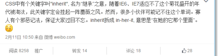
However, inherit is really a good thing. It not only saves code, but also deals with background people; It is also conducive to maintenance.
Note that if you want to inherit the background image, you can't abbreviate it like this, which will be naive:
background: #fff inherit left top;
You can do this:
background-image: inherit;
2, Similarities and differences between height:100% and height:inherit
-
Compatibility differences
height:100% IE6+ √
height:inherit IE8+ √ -
In most cases, the effect is the same
Apart from compatibility, in most cases, the two functions are the same, and it is even difficult to come up with different reasons.
① The parent container height: auto, whether height:100% or height:inherit, is auto
② The height of the parent container is set at h eight: 100px. Whether height:100% or height:inherit, the performance is 100px high
Is there no difference? Is there no reason to use height:inherit? Of course, remember, everything that happens in the Jianghu is by no means accidental!
- Absolute positioning is very different
When the child element is an absolute positioning element and the position value of the parent container is static, the difference between height:100% and height:inherit can be clearly reflected!
ha-ha
You can click here: height:100% and height:inherit difference demo
CSS is as follows:
.outer {
display: inline-block;
height: 200px; width: 40%;
border: 5px solid #cd0000;
}
.height-100 {
position: absolute;
height: 100%; width: 200px;
background-color: #beceeb;
}
.height-inherit {
position: absolute;
height: inherit; width: 200px;
background-color: #beceeb;
}
The HTML is as follows:
As a result, height:100% broke through the clouds. Oh, no, it's going deep into regional Hell: height:100% screenshot of going deep into regional hell! [insert picture description here]( https://img-blog.csdnimg.cn/20210131184427860.png?x-oss-process=image/watermark,type_ZmFuZ3poZW5naGVpdGk,shadow_10,text_aHR0cHM6Ly9ibG9nLmNzZG4ubmV0L3dlaXhpbl80MzM5MjQ4OQ==,size_16,color_FFFFFF,t_70)
However, height:inherit is perfectly highly adaptive to parent elements without positioning characteristics:
Absolute positioning elements are highly adaptive and common elements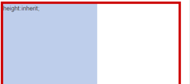
Those who know something about absolute positioning should know the reason, so I won't explain it.
In short, it can be seen that height:inherit is powerful and easy to use. Looking back, the height of the container has changed, and the absolute positioning elements inside are still highly adaptive. This is a great feature, because if the page is very complex, avoiding position: relative will save you a lot of trouble in z-index chaotic hierarchical coverage.
How to prevent long press to save or copy an image?
img {pointer-event:none;-webkit-user-select:none;-moz-user-select:none;user-select:none;}
Why can img tags be set in width and height when they are inline elements
original CSS There is also a concept in: replaceable elements

MDN It is explained as follows:

stay CSS In, replaceable elements( replaced element)The display effect of is not caused by CSS These elements are external objects, and their appearance rendering is independent of CSS of

Simply put, their contents are not affected by the style of the current document. CSS You can affect the location of the replaceable element, but not the content of the replaceable element itself. For example <iframe> Elements may have their own style sheets, but they do not inherit the style of the parent document. Typical replaceable elements are:

<iframe>

<video>

<embed>

<img>

Some elements are treated as replaceable elements only in specific cases, such as:

<input> "image" Type <input> Elements are like<img>Same replaceable

<option>

<audio>

<canvas>

<object>

<applet>((obsolete)

CSS of content Property is used in the ::before and ::after Inserts content into a pseudo element. use content Property inserts anonymous replaceable elements.

One thing these elements have in common is that their content is not through adding text to the label, but through an attribute( src,data(<object>),label(<option>)or js Control(<canvas>))To display the content.

Replaceable elements have built-in width and height, and they can be set width and height. They are of the same nature display:inline-block Consistent elements.

ps: When I read other people's information, I saw a misunderstanding, textarea,button And so on are not replaceable elements. They are the browser's default inline block elements.

display: inline-block;
display: inline-block;


Additional knowledge:

1. When it is necessary to set a fixed width and height for the picture and do not stretch (such as similar cases),
1)Background image, background-size coordination background-position. ((for decorative pictures)
background-size: [ <length-percentage> | auto ]{1,2} | cover | contain;
background-position: [ left | center | right | top | bottom | <length-percentage> ]{1,2}
background-position The value can also be an edge offset: for example: background-position: bottom 10px right 20px;
2)img Elements, object-fit coordination object-position. ((for content pictures)
object-fit: fill | contain | cover | none | scale-down;
object-position: with background-position;
object-position and background-position The difference is that the default values are different,
object-position The default is 50% 50%;
background-position The default is 0% 0%;

2. picture img There is a blank area under the element because vertical-align and line-heigh

white space
 white space
 solve: img element display: block;


3.vertical-align It is only effective for in row elements and table cell elements. vertical-align: baseline | sub | super | text-top | text-bottom | middle | top | bottom | <percentage> | <length>;
Are selectors, attributes, and attribute values case sensitive in css?
Selectors and attributes are case sensitive. If the attribute value is color, it can be case insensitive
Talk about your understanding of relative positioning, absolute positioning and fixed positioning
position Property specifies the location type of the element.

position The five values of the attribute are:

static((default)
relative(Relative positioning)
fixed(Fixed positioning)
absolute(Absolute positioning)
sticky(Viscous positioning)
relative Relative positioning: positioning relative to the original of its own element.

Move the relative positioning element, but the space it originally occupies will not change.
Relative positioning elements are often used as container blocks for absolute positioning elements.
Purpose:
The first is to fine tune the position of the element
 Second, make a reference for absolute positioning(Father Xiangzi Jue)
absolute Absolute positioning: the position of the absolutely positioned element is relative to the nearest positioned parent element. If the element has no positioned parent element, its position is relative to<html>(Initial include block)

absolute Positioning makes the position of the element independent of the document flow, so it does not occupy space.
absolute The positioned element overlaps with other elements.
fixed Fixed positioning: the position of the element is fixed relative to the browser window.

Even if the window is scrolling, it will not move
Fixed Positioning makes the position of the element independent of the document flow, so it does not occupy space
Fixed The positioned element overlaps with other elements
 Purpose:
An element fixed to a fixed position in the browser window
 Follow navigation
 Back to the top
sticky Sticky positioning: the element of sticky positioning depends on the user's scrolling position:relative And position:fixed Switch between positioning.

It behaves like position:relative; When the page scrolls beyond the target area, it behaves like position:fixed;,It will be fixed at the target position.
Element positioning is relative positioning before crossing a specific threshold, and then fixed positioning.
This particular threshold refers to top, right, bottom or left One, in other words, specify top, right, bottom or left One of the four thresholds can make the viscous positioning effective. Otherwise, its behavior is the same as relative positioning.
Purpose: page ceiling effect
What is hack? What are the hacks of css?
1, Summary
1. CSS hack: because browsers of different manufacturers, such as Internet Explorer, Safari, Mozilla, Firefox, chrome, etc., or different versions of browsers of the same manufacturer, such as IE6 and IE7, do not have the same understanding of CSS parsing, the generated page effects will be different and the page effects we need will not be obtained. At this time, we need to write different CSS for different browsers, so that it can be compatible with different browsers at the same time, and we can get the page effect we want in different browsers.
2. Hack: original meaning: modify, extended to the secondary modification of the software. css hack means browser compatibility
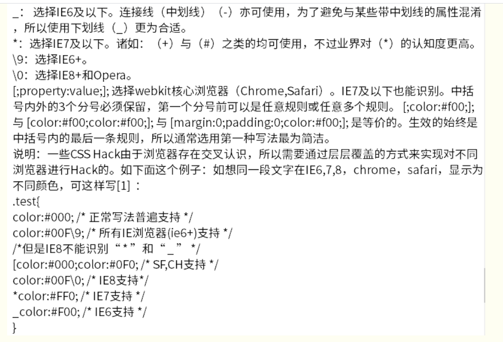
3. Hack instance: 1. Attribute level hack: for example, IE6 can recognize underscore "" and asterisk "", IE7 can recognize asterisk "", but cannot recognize underline " ”, firefox doesn't know either.
2, What's hack
Because different browsers, such as Internet Explorer 6,Internet Explorer 7,Mozilla Firefox, etc., have different understanding of CSS parsing, it will lead to different page effects and can not get the page effects we need.
At this time, we need to write different CSS for different browsers, so that it can be compatible with different browsers at the same time, and we can get the page effect we want in different browsers.
This process of writing different CSS code s for different browsers is called CSS hack, also known as writing CSS hack.
Hack, as the name suggests, means modification. This common vocabulary has been widely used in IT: 1. For Discuz! System, Dvbbs system and other forum software secondary modification. Hack is the basis of open source program, which adds, deletes, modifies and optimizes its code to make IT meet new requirements in function. At present, hack is mostly confused with plug-ins. In fact, there are great differences between the two: plug-ins generally use the API (Interface) of the program, reuse the bottom layer of the program, and make new small works by using some existing functions and classes of the program. Generally, files are added, and plug-ins that meet the standards have a certain format in their directory structure and file name (for example, the plug-in file of Discuz! Needs to be placed in the plugin directory) While hack is a direct modification of the original program files, there are naturally no strict regulations on the format, and generally there is no increase in files. Because the foundation is open source and free, hack is also open source and free in general. Many program lovers will make some small hacks according to their own or friends' needs in the official exchange forums of various programs (for example, the hack of mobile network will be published in the plug-in area of mobile network communication forum), so as to obtain the affirmation and encouragement of webmasters and officials.
3, So what exactly does CSS hack mean in HTML?
CSS hack allows different browsers to recognize different symbols by adding some special symbols to CSS styles (what kind of browser recognizes what kind of symbols has a standard, CSS hack is to let you remember this standard), so as to achieve the purpose of applying different CSS styles, such as. kwstu{width:300px;_width:200px;} Generally, browsers will first use the style of width:300px; for elements, followed by a _width:200px; because the underline _widthis only recognized by IE6, this style actually sets the width of the object to 200px in IE6, and the latter overwrites the previous one, but other browsers do not recognize _widthand will not execute _width:200px; this style is set in other browsers The width of the object is 300px;
The following is the definition quoted from Baidu Encyclopedia
CSS hack because browsers of different manufacturers, such as Internet Explorer, Safari, Mozilla, Firefox, chrome, etc., or different versions of browsers of the same manufacturer, such as IE6 and IE7, have different understanding of CSS parsing, so the generated page effects will be different and the page effects we need will not be obtained. At this time, we need to target different browsers To write different CSS, so that it can be compatible with different browsers at the same time, and we can get the page effect we want in different browsers.
In short, the purpose of CSS hack is to make your CSS code compatible with different browsers. Of course, we can also use CSS hack to customize and write different CSS effects for different versions of browsers.
Note: we usually mainly consider IE6, IE7, IE8, chrome and Mozilla Firefox. As for our commonly used TT browser of Aoyou and QQ, we use the browser kernel of the system installed in your computer, so we only need to be compatible with the above browsers to be compatible with TT Aoyou browser.
There are three common forms of CSS Hack:
CSS attribute hack, CSS selector hack and IE condition comment hack. Hack is mainly aimed at IE browser.
1. Attribute level Hack: for example, IE6 can recognize underscore "" and asterisk "", IE7 can recognize asterisk "", but cannot recognize underline " ”, firefox doesn't know either.
2. Selector level Hack: for example, IE6 can recognize HTML. Class {}, IE7 can recognize + HTML. Class {} or *: first child + HTML. Class {}.
CSS < wbr > Hack technology introduction and collection of commonly used Hack skills
3. Ie conditional comment Hack: ie conditional comment is a non-standard logical statement provided by Microsoft IE5. For example, for all ie: <! - [if ie] > <! - your code - > <! [ENDIF] >, for IE6 and below: <! - [if it IE 7] > <! - your code - > <! [ENDIF] - >. This kind of Hack will not only take effect on CSS, but also take effect on all codes written in judgment statements.
PS: conditional comments can only be executed in IE browser. This code is ignored as comments in non IE browser. Different CSS, JS, HTML and server code can be loaded through IE conditional comments.
Back to the top
2, Practical application of CSS hack
CSS hack is used to solve the problem that some css attributes display different effects in different browsers. For example, the distance of margin attribute displayed in IE6 is twice as wide as that displayed in other browsers, that is, margin left: 20px; in IE6, the actual display distance from the left object is 40px, while in non IE6, the distance from the left object is the set value of 20px; therefore, to set Set the distance between an object and the object on the left to be 20px in all browsers. The width style should be:. Kwstu{margin left: 20px; _marginleft: 20px;}. For example, to distinguish between IE6 and firefox browsers, you can write this:
div{
background:green;/forfirefox/
*background:red;/forIE6/(bothIE6&&IE7)
}
I see red in IE6 and green in firefox.
Explain: in firefox, the css above can't recognize what the asterisk behind it is, so it filters it out and ignores it. The parsing result is div{background:green}, so of course the background of this div is green. In IE6, both its backgrounds can be recognized, and the parsing result is div{background:green;*background:red;}, so according to the priority, the red in the back has higher priority, so of course, the background color of this div is red. CSS hack: distinguish IE6, IE7 and firefox from different browsers. CSS hack writing method:
Difference between IE6 and FF:
background:orange;*background:blue;
Differences between IE6 and IE7:
background:green!important;background:blue;
Difference between IE7 and FF:
background:orange;*background:green;
Differences FF, IE7, IE6:
background:orange;background:green;_background:blue;
background:orange;background:green!important;background:blue;
Note: ie can recognize; standard browsers (such as FF) cannot recognize; IE6 can recognize; cannot recognize! important; IE7 can recognize *, can recognize! important;FF cannot recognize *, but can recognize! important;
Browser priority:
FF<IE7<IE6,CSS hack
The writing order is generally FF IE7 IE6
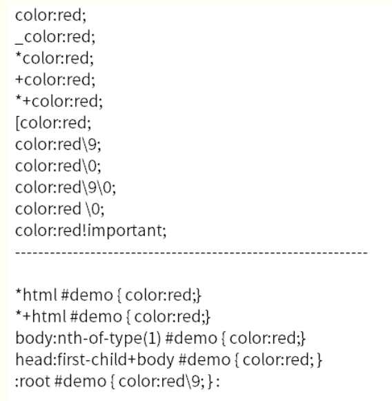
Take: "#demo {width:100px;}" as an example:
#demo {width:100px;} / executed by Firefox, IE6 and IE7/
- html #demo {width:120px;} / * will be executed by IE6, and the previous definitions will be overwritten by later ones, so the width of #demo is 120px in IE6*/
+html #demo {width:130px;} / will be executed by IE7/
Finally, #demo width is interpreted in three browsers as: FIREFOX:100px; ie6:120px; ie7:130px;
IE8 latest css hack:
"9" example: "border:1px 9;" here "9" can distinguish all IE and FireFox. (only for IE9 Hack)
"0" is recognized by IE8, but IE6 and IE7 cannot
"" IE6 and IE7 can recognize. IE8 and FireFox cannot
"IE6 can recognize", IE7, IE8 and FireFox cannot
IE6 hack
_background-color:#CDCDCD;/ie6/
IE7 hack
background-color:#dddd00; / ie 7*/IE8 hack
background-color:red 0; /* ie 8/9*/IE9 hack
background-color:blue 90; Firefox, Aoyou, general browser
background-color:red!important;
Note the order in which hack is written, where:
background-color:red0; Both IE8 and IE9 support;
background-color:blue90; Only IE9 supports;
In addition, background color: ee9; The HACK of supports IE6-IE8, but IE8 does not recognize CSS hacks of "*" and "".
The above rules can be applied flexibly.
Differences between IE9 and IE8 and other versions
background-color:blue; All browsers know it. It's for firefox here;
background-color:red9;9. All ie browsers can be recognized;
background-color:yellow0; 0 is reserved for ie8, and the latest version of opera also knows it. Later, hack wrote it for opera. Therefore, 0 is considered to be reserved for ie8;
+background-color:pink; + ie7 fixed;
_ background-color:orange; _ Dedicated to the magical ie6;
: root #test {background color: purple9;}: root is for ie9. A version circulated on the Internet is: root #test {background - color:purple0;}. This is also known by the new opera. Therefore, after repeated verification by the author, the unique feature of ie9 is: root selector {attribute 9;}
@Media all and (min width: 0px) {#test {background color: black0;}} This is a magical opera that always scrambles with ie to recognize 0. You must add a 0, otherwise firefox, chrome and safari all know...
@Media screen and (- WebKit min device pixel ratio: 0) {#test {}} finally, this is the browser of upstart chrome and safari.
Selector level HackCSS internal selector level Hack syntax
selector{ sRules }
Note select different browsers and versions to minimize the use of CSS Hack. Hack is risky and should be used with caution. Generally, unless otherwise specified, the default running environment of all codes and examples in this document is standard mode. Some CSS hacks have cross recognition among browsers, so they need to hack different browsers through layer by layer coverage. A few examples:
- html .test{color:#090;} /* For IE6 and earlier */
-
- html .test{color:#ff0;} /* For IE7 /
.test:lang(zh-cn){color:#f00;} / For IE8+ and not IE /
.test:nth-child(1){color:#0ff;} / For IE9+ and not IE */
Internal attribute HackCSS internal attribute level Hack syntax:
- html .test{color:#ff0;} /* For IE7 /
selector{?property:value?;}
Value:
Note: no matter what method is used, the writing order is that firefox is written first, IE7 is written in the middle, and IE6 is written last. Supplement: IE6 can recognize *, but not! important,IE7 can recognize * and! important;FF cannot recognize *, but it can! important; Underline_ ", IE6 supports underscores, and IE7 and firefox do not support underscores.
Back to the top
3, Why not use CSS hack to solve compatibility problems
CSS hack is a remedy adopted to be compatible with various browsers because existing browsers have different interpretations of standards. CSS hack is a means of cheating to achieve compatibility by cheating browsers. It is to solve the compatibility problem of browsers by using the compatibility differences of browsers. Therefore, at the beginning of design, writing CSS hack needs to follow the following three principles Then:
Valid: it can pass the verification of Web standards
Only for the old / no longer developed / abandoned browsers, not the current mainstream browsers
The code should be ugly. Let people remember that this is a last resort hack. Always remember to find a way to get rid of it. Now many hacks have abandoned the original principle, and abusing hack will lead to more compatibility problems after browser updates. Therefore, CSS hack is not recommended to solve compatibility problems.
Back to the top
Common CSS Hack
The code is as follows:
Do you know what object-oriented css (oocss) is? Have you practiced it?
oocss(Object Oriented CSS)It's not a technology or a language, it's a language css The core of the writing method is to write the cleanest in the simplest way css Code, making the code more reusable, maintainable and extensible.
OOCSS There are two main criteria:
1.Structure and skin separation;
2.Container and content separation;

For example, some common font sizes padding,margin Values, etc. can be encapsulated into public styles, html Multiple similar class names are referenced in UI Effect, reduce characteristics css Amount of code
.text-12{ font-size: 12px; } .text-14{ font-size: 14px; } .text-16{ font-size: 16px; }
What are the disadvantages of flex layout? (in addition to compatibility)
The number of columns cannot be defined directly(To do this as a percentage)
padding will affect the size of the element. What should I do if I don't want it to affect the width of the element?
box-sizing:border-box
How to make IE6 support min width and max width?
utilize IE Peculiar css grammar
.className {
    max-width:620px;
    min-width:1px;
    _width:expression(this.scrollWidth > 620 ? "620px":(this.scrollWidth < 1? "1px":"auto"));
}
How to solve the BUG of double margin when IE6 floats?
1.When a block level element has a floating style, it is added to the element margin-left and margin-right Styles, in ie6 Double margins will appear under
 2.Add a style to the current element so that the current element is not a block, such as: display:inline;display:list-item In this way, when the element floats, it will not be in the ie6 Now there is the problem of double margin
What are the benefits of OOCSS? What are the corresponding libraries?
Semantic class name and logical hierarchical relationship
 Reusability, separation of style and structure, separation of container and content
Kite
Which properties in CSS will cause GPU rendering and increase power consumption?
Unscrupulous opening GPU Hardware acceleration will lead to a large amount of power consumption of equipment and reduce battery life.
How to automatically switch page colors between day and night?
The contents of the media query are the attributes of the device: width, height, rotation direction, print style and resolution
 Therefore, if media query is used, the user's device needs to have the function of switching dark mode
 With the help of js If you switch the page color, that is

Get geographic location
 Query sunrise and sunset time
 Modify global by time theme
How to set a gradient for the color of text
.text {
  background: -webkit-linear-gradient(#eee, #333);
  -webkit-background-clip: text;
  -webkit-text-fill-color: transparent;
}
Why don't you use descendant selectors when you can use descendant selectors in css?
Select to resolve the match from right to left, so the descendant selector will find all its parents,
The child selector will only select the direct parent; reduce the number of matches and improve efficiency
Have you ever used the "owl like" selector?
Used to be used, such as

li + li {
	margin-top: 1rem;
}
This can be given in addition to the first one li Outside li Specify a style, such as in two li Add between margin
Draw a Pentagon and a hexagon with css
pentagon:

clip-path: polygon(50% 0%, 100% 38%, 82% 100%, 18% 100%, 0% 38%);
hexagon:

clip-path: polygon(50% 0%, 100% 25%, 100% 75%, 50% 100%, 0% 75%, 0% 25%);
Hexagon:

clip-path: polygon(50% 0%, 90% 20%, 100% 60%, 75% 100%, 25% 100%, 0% 60%, 10% 20%);
Use pure css to create a slider
 .checke{
            position: relative;
            -webkit-appearance: none;
            width:90px;
            height: 44px;
            line-height: 44px;
            background: #eee;
            border-radius: 30px;
            outline: none;
        }
        .checke:before{
            position: absolute;
            left: 0;
            content: '';
            width: 44px;
            height: 44px;
            border-radius: 50%;
            background: #eee;
            box-shadow: 0px 0px 5px #ddd;
            transition: all 0.2s linear;
        }

        .checke:checked{
           background: #18ff0a;
        }
        .checke:checked:before{
            left: 45px;
            transition: all 0.2s linear;
        }
Use css3 to achieve the effect of a zebra crossing
@ferrinweb If you need many or unlimited zebra crossings, your scheme has disadvantages
@cxwht Your plan needs additional elements, which is not ideal
 The best way is to use a gradient background
linear-gradient( [ [ <angle> | [top | bottom] || [left | right] ],]? <color-stop>[, <color-stop>]+);
/*Angle | direction, start color start position, end color end position*/
We can get the stripe pattern by setting the start position and the end position equal to or greater than.

Example: https://codepen.io/xiangshuo1992/pen/qLdWdY (including 11 demo s)

Horizontal stripe
{
    background: linear-gradient(#fb3 33.3%,
                #58a 0, #58a 66.6%, yellowgreen 0);
    background-size: 100% 45px;
}
Vertical stripe
{
    background: linear-gradient(to right, /* Or 90deg */
                #fb3 50%, #58a 0);
    background-size: 30px 100%;
}
45deg Oblique stripe
{
    background: linear-gradient(45deg,
                #fb3 25%, #58a 0, #58a 50%,
                #fb3 0, #fb3 75%, #58a 0);
    background-size: 30px 30px;
}

/*Accurate calculation of 15px wide oblique fringe*/
{
    background: linear-gradient(45deg,
                #fb3 25%, #58a 0, #58a 50%,
                #fb3 0, #fb3 75%, #58a 0);
    background-size: 42.43px 42.43px;
}
Better oblique stripes
/*Circular gradient to achieve oblique stripes*/
{
    background: repeating-linear-gradient(45deg,
                #fb3, #fb3 15px, #58a 0, #58a 30px);
}

/*Combination of the two methods*/
{
    background: repeating-linear-gradient(45deg,
                #fb3 0, #fb3 25%, #58a 0, #58a 50%);
    background-size: 42.43px 42.43px;
}
Flexible homochromatic stripes
{
    background: #58a;
    background-image: repeating-linear-gradient(30deg,
                      hsla(0,0%,100%,.1),
                      hsla(0,0%,100%,.1) 15px,
                      transparent 0, transparent 30px);
}
How to use css to achieve the minimum height across browsers?
   div{
       height:auto!important;
       height:200px;
       min-height:200px;
   }
This first one has important The following property settings should be useless
 There are few browser compatible contacts. At present, the project is only compatible blink
How to set the mandatory hand shape on clickable elements?
cursor attribute
Using css to realize floating prompt text
<div class="tips-demo" data-tips="Prompt text">Presentation text</div>

<style>
.tips-demo {
  position: fixed;
  bottom: 15px;
  right: 15px;
}

.tips-demo:after {
    content: attr(data-tips);
    position: absolute;
    top: 0;
    left: 0;
	right: 0;
	margin: 0 auto;
    white-space: nowrap;
	opacity: 0;
    transform: translateY(-150%);
    transition: .1s;
}

.tips-demo:hover:after {
	opacity: 1;
    transform: translateY(-100%);
}
</style>
How do i disable moving selection highlighting?
   *{
     -webkit-touch-callout:none;  /*The system default menu is disabled*/
     -webkit-user-select:none; /*webkit browser*/
     -khtml-user-select:none; /*Early browser*/
     -moz-user-select:none;/*Firefox*/
     -ms-user-select:none; /*IE10*/
     user-select:none;
  }
  *{ -webkit-tap-highlight-color: rgba(0,0,0,0);
     -webkit-tap-highlight-color: transparent; /* For some Androids */
  }
What do the letters of color hsla mean?
H: Hue(tone). 0(Or 360)Indicates red, 120 indicates green, 240 indicates blue, or other values can be used to specify the color. Value: 0 - 360
S: Saturation(saturation). Value: 0.0% - 100.0%
L: Lightness(brightness). Value: 0.0% - 100.0%
A: Alpha Transparency. Value 0~1 between.
Tell me about your understanding of table layout. What are its application scenarios?
table-layout Value is fixed The width of the cell is only related to the width of the table cell, not to the content
table-layout Value is auto The width of the cell is calculated as the width of the longest row of the current column
 If you want one table Fixed size, and the text inside is forced to wrap(Especially when there is a long string of English text and there is no space between them),In order to make the long text not break the table, the style is generally used: table-layout:fixed.
How to use css to select empty links?
<!DOCTYPE html>
<html lang="en">
<head>
    <meta charset="UTF-8">
    <title>Title</title>
    <style type="text/css">
        a[href=''], a:not(href) {
            color: #ff3333;
        }

    </style>
</head>
<body>

Hello<a>Earthman</a>

</body>
</html>
Have you ever used the writing mode attribute of css? What are its application scenarios?
Used to specify the writing method of text
horizontal-tb Left to right, top to bottom(Horizontal writing)
vertical-rl Top to bottom, right to left (Vertical writing)
vertiacl-lr Top to bottom, left to right
sideways-rl: The contents are arranged vertically from top to bottom
sideways-lr: The content is arranged vertically from bottom to top
How to hide audio and video without mute and automatic playback?
The browser has disabled automatic playback when opening a page. You can use iframe Play first triggers play permission, and then play
 Make one opacity:0 False hiding
Using css to achieve the effect of dialog bubbles
Method: use the rounded rectangle as the main box of the dialogue, add additional triangles on the left or right, and use border The combination of relative positioning and absolute positioning makes the triangle attached to the left or right side of the rounded rectangle;
html:
<div class="dialog-box">Test dialog box</div>
css:

.dialog-box{
      display: inline-block;
      background-color: #ccc;
      font-size: 14px;
      padding: 10px;
      border-radius: 5px;
      color: #fff;
      position: relative;
    }
    .dialog-box:before{
      content: "";
      width: 0;
      height: 0;
      border-width: 6px;
      border-style: solid;
      border-color: transparent #ccc transparent transparent;
      position: absolute;
      left: -12px;
      top: 50%;
      margin-top: -6px;
    }
What are the application scenarios for the scroll behavior attribute in css?
When the user manually clicks navigation or API When the call causes the scroll operation to be triggered, scroll-behavior Property to set the scrolling behavior for the scroll box. auto Means to scroll to the specified position immediately, smooth It indicates a smooth transition and requires a certain excessive time to scroll to the corresponding position.
Poor compatibility support:
What is the application scenario of the scroll snap align attribute?
When scrolling a list, a block in the control list is always completely within the visual area,If you scroll halfway, you can rebound and keep the whole block in the visible area.
How to use css to change "I don't love 996" into "699 don't love me"?
unicode-bidi Attribute and direction Property to set or return whether text is rewritten to support multiple languages in the same document.
use direction Property settings rtl Indicates from right to left. The default is ltr From left to right, in addition to matching unicode-bidi: bidi-override,That's it
Give an example to illustrate your understanding of pointer events
pointer-events CSS Property specifies when (If so) A specific graphic element can be the of a mouse event target.
When point-events by none When, for example a The connection is no longer valid
What is the difference between hover in css and mouseover in js?
JavaScript Middle mouse events are:

  onmouseover and onmouseout:  Events are triggered when the mouse moves in and out

  onmousedown and onmouseup:  An event is triggered when the mouse button is pressed or released

  onclick and ondbclick : An event is triggered when the mouse clicks or double clicks

  onmousemover : Event triggered when the mouse moves

  CSS: hover yes css A pseudo class selector in, which refers to the process of moving the mouse in and out. This operation can change the style of an element, and its corresponding subclasses are also changed. But the content of the element cannot be changed. For example, the mouse realizes the effect of pop-up window by using onmousemove Implemented, if used hover There is no way to make such an effect.

  Summary: CSS Only the style of the element can be changed, but the content of the element cannot be changed. If you want to change the content, you should use JavaScript Mouse event onmouseover and onmouseout. So just for style effect, use CSS Pseudo class of hover,Select if dynamic changes are required js Events.
Use attr() of css to write a prompt box similar to a tag title
  .box{
       position:relative;
   }
   .box:hover{
       content: attr(data-title);
       display: inline-block;
       padding: 10px 14px;
       border: 1px solid #ddd;
       border-radius: 5px;
       position: absolute;
       top: -50px;
       left: -10px;
   }
For example, how to inherit box sizing from html elements?
  html{
      box-sizing:border-box;
  }
  *,*:before,*:after{
      box-sizing:inherit;
  }
What are the ways to load CSS asynchronously?
Load CSS asynchronously
Isn't it easy to load CSS? Like this:
It's over!
That's right! But this has a problem - it will block rendering! When the browser sees this tag, it will stop its work, load CSS and parse it.
Of course, if the CSS file is needed for the content to be rendered next, it's understandable. You must have this CSS before you can render. Blocking is also reasonable.
However, the actual situation is that many of our CSS content is not needed on the first screen, at least until later, so it is wrong to load these CSS to block content rendering at this time.
In other words, for CSS with low priority (temporarily unavailable), we should find a way to load it asynchronously without blocking browser rendering.
So how?
an old prescription
Now let's introduce the first old method: asynchronously load CSS code by dynamically inserting the link tag in JS, like this:
var myCSS = document.createElement( "link" );
myCSS.rel = "stylesheet";
myCSS.href = "mystyles.css";
document.head.insertBefore( myCSS, document.head.childNodes[ document.head.childNodes.length - 1 ].nextSibling );
It's easy to understand. It's to create a link tag to load CSS code during subsequent JS execution.
Another way is to use the media attribute on the link to set it to a value that does not match the user's current browser environment, such as media = "print", or even to a completely invalid value such as media = "jscourse".
In this way, the browser will think that the CSS file has a very low priority and will load it without blocking. However, in order for the CSS rules to take effect, the media value should be changed to right at last. Therefore, this method is implemented in the code as follows:
After introducing the old prescription, let's take a look at the new prescription.
New asynchronous loading mode
The new formula is to use the newly added rel = "preload" in the specification, like this:
The value of the preload attribute tells the browser that this resource file will be used later. Please load it in advance. But this is only loading, so you see, after it is loaded, you still need to change the rel value back to make the CSS take effect.
Do you want to ask: it's not much different from the old prescription!
It does seem so, but it's better semantically. In addition, you will find the as="style" attribute carefully, so preload can be used not only in CSS files, but also in most resource files. For example: JS file
Then, when you want to use it, create a script tag to point to it:
var script = document.createElement("script");
script.src = "scriptfile.js";
document.body.appendChild(script);
At this time, the browser will take the file directly from the cache and will not send a request again, because it has been loaded before.
What resource files does the as attribute in preload support? The following can be:
audio
document
embed
fetch
font
image
object
script
style
track
worker
video
Can't wait to try? Let me tell you the bad news. At present, only Chrome supports preload perfectly, and other browsers are terrible. Alas!
Will css loading block DOM tree parsing and rendering? Why?
css Loading of will not be blocked DOM Tree parsing
css The load of will be blocked DOM Tree rendering because css After the download of is completed, it is parsed into CSSOM And DOM After the rendering tree is generated, the page will be rendered and drawn
Will css loading block js running? Why?
Will block js Because js You may get or change the style of elements, so in order not to render repeatedly,
Wait for all css Execute after loading rendering js
Can you monitor some user information using pure css? How?
utilize:active Pseudo class to monitor user clicks
.button-1:active::after {
   content: url(./pixel.gif?action=click&id=button1);
  display: none;
}
.button-2:active::after {
    content: url(./pixel.gif?action=click&id=button2);
    display: none;
}
Please use css3 to realize the smooth conversion of pictures
Through global listening a Tracing point of label view Dynamically switch pages, just put a Label with id of href The value of the property refers to the anchor point and is used CSS3 Switch pages with animation.
Use css to draw the time scale of a clock
Write down the idea. First define the size and position of a clock absolute,From 1 o'clock to 12 o'clock ul,li. each li Can use nth-child(Corresponding number)To control the position and angle transform,Then the minute scale also controls the position separately as usual, using 48 li,This should be done slowly.

<div id="watch">
  <ul class="minute-marks">
    <li></li><li></li><li></li><li></li><li></li><li></li>
    <li></li><li></li><li></li><li></li><li></li><li></li>
    <li></li><li></li><li></li><li></li><li></li><li></li>
    <li></li><li></li><li></li><li></li><li></li><li></li>
    <li></li><li></li><li></li><li></li><li></li><li></li>
    <li></li><li></li><li></li><li></li><li></li><li></li>
    <li></li><li></li><li></li><li></li><li></li><li></li>
    <li></li><li></li><li></li><li></li><li></li><li></li>
  </ul>
  <ul class="digits">
    <li>1</li><li>2</li><li>3</li><li>4</li><li>5</li><li>6</li>
    <li>7</li><li>8</li><li>9</li><li>10</li><li>11</li><li>12</li>
  </ul>
</div>
ul { list-style:none; margin:0; padding:0 }

#watch .minute-marks li {
  display:block;
  width:.2em;
  height:.6em;
  background:#929394;
  position:absolute;
  top:50%; left:50%;
  margin:-.4em 0 0 -.1em;
}
#watch .minute-marks li:first-child {transform:rotate(6deg) translateY(-12.7em)}
#watch .minute-marks li:nth-child(2) {transform:rotate(12deg) translateY(-12.7em)}
#watch .minute-marks li:nth-child(3) {transform:rotate(18deg) translateY(-12.7em)}
#watch .minute-marks li:nth-child(4) {transform:rotate(24deg) translateY(-12.7em)}
#watch .minute-marks li:nth-child(5) {transform:rotate(36deg) translateY(-12.7em)}
#watch .minute-marks li:nth-child(6) {transform:rotate(42deg) translateY(-12.7em)}
#watch .minute-marks li:nth-child(7) {transform:rotate(48deg) translateY(-12.7em)}
#watch .minute-marks li:nth-child(8) {transform:rotate(54deg) translateY(-12.7em)}
#watch .minute-marks li:nth-child(9) {transform:rotate(66deg) translateY(-12.7em)}
#watch .minute-marks li:nth-child(10) {transform:rotate(72deg) translateY(-12.7em)}
#watch .minute-marks li:nth-child(11) {transform:rotate(78deg) translateY(-12.7em)}
#watch .minute-marks li:nth-child(12) {transform:rotate(84deg) translateY(-12.7em)}
#watch .minute-marks li:nth-child(13) {transform:rotate(96deg) translateY(-12.7em)}
#watch .minute-marks li:nth-child(14) {transform:rotate(102deg) translateY(-12.7em)}
#watch .minute-marks li:nth-child(15) {transform:rotate(108deg) translateY(-12.7em)}
#watch .minute-marks li:nth-child(16) {transform:rotate(114deg) translateY(-12.7em)}
#watch .minute-marks li:nth-child(17) {transform:rotate(126deg) translateY(-12.7em)}
#watch .minute-marks li:nth-child(18) {transform:rotate(132deg) translateY(-12.7em)}
#watch .minute-marks li:nth-child(19) {transform:rotate(138deg) translateY(-12.7em)}
#watch .minute-marks li:nth-child(20) {transform:rotate(144deg) translateY(-12.7em)}
#watch .minute-marks li:nth-child(21) {transform:rotate(156deg) translateY(-12.7em)}
#watch .minute-marks li:nth-child(22) {transform:rotate(162deg) translateY(-12.7em)}
#watch .minute-marks li:nth-child(23) {transform:rotate(168deg) translateY(-12.7em)}
#watch .minute-marks li:nth-child(24) {transform:rotate(174deg) translateY(-12.7em)}
#watch .minute-marks li:nth-child(25) {transform:rotate(186deg) translateY(-12.7em)}
#watch .minute-marks li:nth-child(26) {transform:rotate(192deg) translateY(-12.7em)}
#watch .minute-marks li:nth-child(27) {transform:rotate(198deg) translateY(-12.7em)}
#watch .minute-marks li:nth-child(28) {transform:rotate(204deg) translateY(-12.7em)}
#watch .minute-marks li:nth-child(29) {transform:rotate(216deg) translateY(-12.7em)}
#watch .minute-marks li:nth-child(30) {transform:rotate(222deg) translateY(-12.7em)}
#watch .minute-marks li:nth-child(31) {transform:rotate(228deg) translateY(-12.7em)}
#watch .minute-marks li:nth-child(32) {transform:rotate(234deg) translateY(-12.7em)}
#watch .minute-marks li:nth-child(33) {transform:rotate(246deg) translateY(-12.7em)}
#watch .minute-marks li:nth-child(34) {transform:rotate(252deg) translateY(-12.7em)}
#watch .minute-marks li:nth-child(35) {transform:rotate(258deg) translateY(-12.7em)}
#watch .minute-marks li:nth-child(36) {transform:rotate(264deg) translateY(-12.7em)}
#watch .minute-marks li:nth-child(37) {transform:rotate(276deg) translateY(-12.7em)}
#watch .minute-marks li:nth-child(38) {transform:rotate(282deg) translateY(-12.7em)}
#watch .minute-marks li:nth-child(39) {transform:rotate(288deg) translateY(-12.7em)}
#watch .minute-marks li:nth-child(40) {transform:rotate(294deg) translateY(-12.7em)}
#watch .minute-marks li:nth-child(41) {transform:rotate(306deg) translateY(-12.7em)}
#watch .minute-marks li:nth-child(42) {transform:rotate(312deg) translateY(-12.7em)}
#watch .minute-marks li:nth-child(43) {transform:rotate(318deg) translateY(-12.7em)}
#watch .minute-marks li:nth-child(44) {transform:rotate(324deg) translateY(-12.7em)}
#watch .minute-marks li:nth-child(45) {transform:rotate(336deg) translateY(-12.7em)}
#watch .minute-marks li:nth-child(46) {transform:rotate(342deg) translateY(-12.7em)}
#watch .minute-marks li:nth-child(47) {transform:rotate(348deg) translateY(-12.7em)}
#watch .minute-marks li:nth-child(48) {transform:rotate(354deg) translateY(-12.7em)}
#watch .digits {
  width:30em;
  height:30em;
  border-radius:15em;
  position:absolute;
  top:0; left:50%;
  margin-left:-15em;
}
#watch .digits li {
  font-size:1.6em;
  display:block;
  width:1.6em;
  height:1.6em;
  position:absolute;
  top:50%; left:50%;
  line-height:1.6em;
  text-align:center;
  margin:-.8em 0 0 -.8em;
  font-weight:bold;
}
#watch .digits li:nth-child(1) { transform:translate(3.9em, -6.9em) }
#watch .digits li:nth-child(2) { transform:translate(6.9em, -4em) }
#watch .digits li:nth-child(3) { transform:translate(8em, 0) }
#watch .digits li:nth-child(4) { transform:translate(6.8em, 4em) }
#watch .digits li:nth-child(5) { transform:translate(3.9em, 6.9em) }
#watch .digits li:nth-child(6) { transform:translate(0, 8em) }
#watch .digits li:nth-child(7) { transform:translate(-3.9em, 6.9em) }
#watch .digits li:nth-child(8) { transform:translate(-6.8em, 4em) }
#watch .digits li:nth-child(9) { transform:translate(-8em, 0) }
#watch .digits li:nth-child(10) { transform:translate(-6.9em, -4em) }
#watch .digits li:nth-child(11) { transform:translate(-3.9em, -6.9em) }
#watch .digits li:nth-child(12) { transform:translate(0, -8em) }
What is the relationship between px, pt, ppi, dpi, dp and sp in ui design?
After several mobile terminal projects, I deeply feel the necessity of mobile terminal size conversion, and make a summary here.

Let's first introduce their definitions:

px: pixel,Pixel, the most basic unit that constitutes a picture or photograph on an electronic screen
pt: point,Point, common unit in printing industry, equal to 1/72 inch
ppi: pixel per inch,Pixels per inch, the higher the value, the finer the screen
dpi: dot per inch,How many points per inch? The higher the value, the finer the picture
dp: dip,Density-independent pixel, Is the length unit used for Android development, 1 dp Indicates that the pixel density on the screen is 160 ppi Hour 1 px length
sp: scale-independent pixel,Font size unit for Android development.
The following is the conversion relationship:

I pt and px
 Formula 1: 1 pt= (DPI / 72) px

When photoshop The resolution of the new canvas in is 72 ppi( I.e. 72 dpi Time ), 1pt=1px; When a new canvas is created, the resolution is 72*2=144ppi When, 1 pt=2px

II ppi and dpi
dpi Originally used to measure the dot density per inch on a print. DPI The smaller the value, the less fine the picture is. When DPI When the concept of is used on a computer screen, it should be called ppi. Similarly: PPI Is the number of pixels that can be displayed per inch on the computer screen. Therefore, it is mentioned in the electronic screen display ppi and dpi Is the same, can think

Formula 2: dpi=ppi

III ppi computing method
ppi Refers to the pixel density on the screen, which is calculated as follows:

Formula 3: ppi= The number of pixels on the diagonal of the screen/Diagonal length = √ (Screen landscape pixels^2 + Screen vertical pixels^2)/Diagonal length

In Millet 2 s For example, the screen resolution is 720 px*1280px,4.3 Inches. Then the point density is √ (720^2 +1280^2) /4.3 = 342ppi.

IV px and dp
dp The length unit developed for Android, according to different screen resolutions, and px There are different corresponding relationships.

The screen size of Android terminal is different. According to its pixel density, it is divided into the following specifications:

QQ20150717160404

1dp Defined as the screen density value of 160 ppi 1 at px,That is, in mdpi When, 1 dp = 1px.  with mdpi As a standard, the density value ratio of these screens is: ldpi : mdpi : hdpi : xhdpi : xxhdpi = 0.75 : 1 : 1.5 : 2 : 3;That is, in xhdpi Density, 1 dp=2px;stay hdpi In this case, 1 dp=1.5px. Other analogies.

Formula 4: 1 dp=(screen ppi/ 160)px

with WVGA For example, the screen is 480 px*800px,Press 3.8 Inch screen calculation, point density √ (480^2 + 800^2) / 3.8 = 245,Approximately equal to 240, corresponding to hdpi Screen, so this screen 1 dp=1.5px

V dp and sp
dp and sp All Android developers, dp Is the unit of length, sp Is the font unit. sp And dp Similar, but can be scaled according to the user's font size preferences. Android The system allows users to customize the text size (small, normal, large, super large, etc.),

Formula 5: when the text size is "normal", 1 sp=1dp,When the text size is "large" or "super large", 1 sp>1dp.

In general, it can be considered that sp=dp.

Conclusion: because the design is based on xhdpi As a template, xhdpi Under conditions, 1 dp=2px. When creating a new canvas, set the canvas resolution to 144 ppi,Then 1 pt=2px=1dp. At this point, you can pt Equivalent to dp. When labeling the length, divide the length pixels by 2 dp Value.

PS: stay photoshop cc In the case of tangency, you can directly.png Add 200 before the picture layer name%Get 2 times the size of the image, cut images of other scales, and so on. The premise that the output double graph is not fuzzy is that the graph is photoshop Non rasterized graphics drawn with the shape tool in, rather than rasterized layers or externally imported pictures.

android Obtain screen size and density
 Sometimes we need to get Android Mobile phone or Pad The physical size of the screen to facilitate the design of the interface or the realization of other functions. Here's how to get the physical size of the screen:
I found a lot of information on the Internet and found that obtaining the screen size is not a very complex programming operation. The following code can obtain the screen size.
In a Activity of onCreate Method, write the following code:
DisplayMetrics metric = new DisplayMetrics();
getWindowManager().getDefaultDisplay().getMetrics(metric);
int width = metric.widthPixels; // Screen width (pixels)
int height = metric.heightPixels; // Screen height (pixels)
float density = metric.density; // Screen density (0.75 / 1.0 / 1.5)
int densityDpi = metric.densityDpi; // Screen density DPI (120 / 160 / 240)
However, it should be noted that on a low-density small screen mobile phone, the above code alone can not obtain the correct size. For example, a 240 x320 Pixel low-density mobile phone, if you run the above code, the obtained screen size is 320 x427. Therefore, the study found that if multi-resolution support is not set, Android The system will x320 The low density (120) size is converted to the size corresponding to the medium density (160), which greatly affects the coding of the program. Therefore, it is necessary in the construction of the project AndroidManifest.xml File, add supports-screens Node, the specific contents are as follows:

In that case, the current Android The program supports multiple resolutions, so you can get the correct physical size.
For example, what are the purposes of the shape outside attribute?
shape-outside Defines a non rectangular shape around which adjacent inline content should be wrapped.

For example, use shape-outside: circle(); Property to achieve the effect that text circles around the picture.
Draw a three-dimensional magic cube with css3
<!DOCTYPE html>
<html>
<head>
    <meta charset="utf-8">
    <meta http-equiv="X-UA-Compatible" content="IE=edge">
    <title>Cube</title>
    <style>

        .box{
            width: 300px;
            height: 300px;
            margin: 100px auto;
            perspective: 500px;
        }
        .con{
            position:relative;
            width:300px;
            height:300px;
            transform-style:preserve-3d;
            transform-origin:50% 50% -150px;
            animation:rotate 4s infinite;
        }
        .con .side{
            position:absolute;
            width:300px;
            height:300px;
            font-size:44px;
            line-height: 300px;
            text-align: center;
        }
        .con .before{
            background-color: rgba(0,0,0,0.4);
        }
        .con .left{
            background-color: rgba(255,0,0,0.4);
            left:-300px;
            top:0;
            transform:rotateY(-90deg);
            transform-origin:right;
        }
        .con .right{
            background-color: rgba(255,255,0,0.4);
            left:300px;
            top:0;
            transform:rotateY(90deg);
            transform-origin:left;
        }
        .con .top{
            background-color: rgba(0,255,0,0.4);
            left:0;
            top:-300px;
            transform:rotateX(90deg);
            transform-origin:bottom;
        }
        .con .bottom{
            background-color: rgba(0,0,255,0.4);
            left:0;
            top:300px;
            transform:rotateX(-90deg);
            transform-origin:top;
        }
        .con .back{
            background-color: rgba(200,122,0,0.4);
            transform:translateZ(-300px);
        }

        @keyframes rotate{
            0%{
                transform:rotateX(0) rotateY(0);
            }
            50%{
                transform:rotateX(0) rotateY(360deg);
            }
            100%{
                transform:rotateX(360deg) rotateY(360deg);
            }
        }
    </style>
</head>
<body>
<div class="box">
    <div class="con">
        <div class="side before">front</div>
        <div class="side back">after</div>
        <div class="side top">upper</div>
        <div class="side bottom">lower</div>
        <div class="side left">Left</div>
        <div class="side right">right</div>
    </div>
</div>
</body>
</html>
How do I override inline styles? What are the methods (at least two)?
1, !important highest
2, var divStyle = document.querySelector('#div').style;   modify attribute
Which tags do not support pseudo elements?
First, we need to know what pseudo elements are:
::after ::before ::first-letter ::fist-line (Single or double colons)
::selection ::backdrop ((double colons only)
Although pseudo elements are powerful, there are still some specific tags that do not support pseudo elements before and after of

such as img ,input,iframe,These tags do not support similar img::before Use this way.

The reason is that in order to support pseudo elements, the element needs to be able to insert content, that is, the element should be a container. and input,img,iframe And other elements can't contain other elements, so you can't insert content through pseudo elements.
What is the difference between class and [class=xxx]? Are they equivalent?
Inequivalence
class Is a class selector that can act on any dom element
[class=xxx]Yes, property selectors can only act on specific types of dom element
Why is it better to animate opacity than box shadow?
opacity The animation process does not affect the layout and does not require redrawing
Can you use pure css to block your browser? How?
Yes, calculate attributes with calc,variable
How to use css to realize mouse following?
Covered with elements,hover + box-shadow
Have you ever used the background blend mode attribute of css? What are its application scenarios?
Mixed mode of background,It can be a mixture of background picture and background picture,It can also be a mixture between the background picture and the background color.
Using css3 to achieve the effect of text luminescence
<!DOCTYPE html>
<html lang="en">

<head>
  <meta charset="UTF-8">
  <meta name="viewport" content="width=device-width, initial-scale=1.0">
  <meta http-equiv="X-UA-Compatible" content="ie=edge">
  <title>Neon text</title>
</head>
<style>
  @import url(https://fonts.googleapis.com/css?family=Pacifico);

  body {
    display: flex;
    height: 100vh;
    justify-content: center;
    align-items: center;
    text-align: center;
    background: black;
  }

  .neon {
    color: #cce7f8;
    font-size: 2.5rem;
    font-family: 'Pacifico', cursive;
    text-transform: uppercase;
    animation: shining 0.1s alternate infinite;
  }

  @keyframes shining {
    from {
      text-shadow: 0 0 6px rgba(182, 211, 207, 0.9),
        0 0 30px rgba(182, 211, 207, 0.3), 0 0 12px rgba(15, 115, 223, 0.5),
        0 0 21px rgba(15, 115, 223, 0.9), 0 0 34px rgba(15, 115, 223, 0.8),
        0 0 54px rgba(15, 115, 223, 0.9);
    }

    to {
      text-shadow: 0 0 6px rgba(182, 211, 207, 1),
        0 0 30px rgba(182, 211, 207, 0.4), 0 0 12px rgba(15, 115, 223, 0.6),
        0 0 22px rgba(15, 115, 223, 0.8), 0 0 38px rgba(15, 115, 223, 0.9),
        0 0 60px rgba(15, 115, 223, 1);
    }
  }
</style>

<body>
  <div class="neon">Good evening, and good night!</div>
</body>

</html>
Using css3 to realize the text effect of Pseudo 3D
<!DOCTYPE html>
<html lang="en">

<head>
  <meta charset="UTF-8">
  <meta name="viewport" content="width=device-width, initial-scale=1.0">
  <meta http-equiv="X-UA-Compatible" content="ie=edge">
  <title> Staggered jump 3 D Loading</title>
</head>
<style>
  body {
    display: flex;
    height: 100vh;
    justify-content: center;
    align-items: center;
    text-align: center;
    background: #2980b9;
  }

  .loading {
    display: flex;
    color: white;
    font-size: 5em;
    text-transform: uppercase;
  }

  .loading span {
    text-shadow: 0 1px #bbb, 0 2px #bbb, 0 3px #bbb, 0 4px #bbb, 0 5px #bbb, 0 6px transparent, 0 7px transparent, 0 8px transparent, 0 9px transparent, 0 10px 10px rgba(0, 0, 0, 0.4);
    transform: translateY(20px);
    animation: bounce 0.3s ease infinite alternate;
  }

  @keyframes bounce {
    to {
      text-shadow: 0 1px #bbb, 0 2px #bbb, 0 3px #bbb, 0 4px #bbb, 0 5px #bbb, 0 6px #bbb, 0 7px #bbb, 0 8px #bbb, 0 9px #bbb, 0 50px 25px rgba(0, 0, 0, 0.2);
      transform: translateY(-20px);
    }
  }
</style>

<body>
  <div class="loading">Loading</div>
</body>

</html>
<script>
  let loading = document.querySelector(".loading");
  let letters = loading.textContent.split("");
  loading.textContent = "";
  letters.forEach((letter, i) => {
    let span = document.createElement("span");
    span.textContent = letter;
    span.style.animationDelay = `${i / 10}s`;
    loading.append(span);
  });
</script>
How to solve the problem that the html setting height: 100% is invalid?
Wrap a given height in the outer layer div
Use css to draw a circle with a check mark inside
#right {
        width: 150px;
        height: 150px;
        margin: 100px auto;
        border-radius: 50%;
        border: 5px solid #000000;
        display: flex;
        justify-content: center;
        align-items: center;
      }
      #right::before {
        content: "";
        display: block;
        width: 88px;
        height: 50px;
        border: 20px solid #000000;
        border-right: none;
        border-top: none;
        transform: rotate(-45deg) translate(7px, -10px);
      }
Use css to draw a circle with a cross inside
#cyc {
        width: 150px;
        height: 150px;
        margin: 100px auto;
        border-radius: 50%;
        border: 5px solid #000000;
        position: relative;
      }

      #cyc::before {
        content: "";
        display: block;
        width: 100px;
        height: 20px;
        background: #000;
        position: absolute;
        top: 50%;
        left: 50%;
        transform: translate(-50%, -50%) rotate(45deg);
      }
      #cyc::after {
        content: "";
        display: block;
        width: 100px;
        height: 20px;
        background: #000;
        position: absolute;
        top: 50%;
        left: 50%;
        transform: translate(-50%, -50%) rotate(-45deg);
      }
To be continued