In the process of web front-end development, UI designers often design some design drawings with gradient text. In the past, we can only use png pictures to replace text. Today, we can use pure CSS to realize gradient text. Here is how to implement 3 for your reference!
Basic Style:
.gradient-text{text-align: left;text-indent:30px;line-height: 50px;font-size:40px;font-weight:bolder; position: relative; }
The first method uses background-cli, text-fill-color:
.gradient-text-one{
    background-image:-webkit-linear-gradient(bottom,red,#fd8403,yellow);
    -webkit-background-clip:text;
    -webkit-text-fill-color:transparent;
}
Explain:
background: -webkit-linear-gradient(...) provides a gradient background for text elements.
webkit-text-fill-color: transparent fills text with transparent colors.
webkit-background-clip: text uses text to edit the background and fills the text with gradient background as color.
The second method uses mask-image:
.gradient-text-two{
   color:red;
}
.gradient-text-two[data-content]::after{
    content:attr(data-content);
    display: block;
    position:absolute;
    color:yellow;
    left:0;
    top:0;
    z-index:2;
    -webkit-mask-image:-webkit-gradient(linear, 0 0, 0 bottom, from(yellow), to(rgba(0, 0, 255, 0)));
}
Explain:
mask-image, like background-image, can take values not only as image paths, but also as gradients.
The third method uses linearGradient, fill:
.gradient-text-three{
    fill:url(#SVGID_1_);
    font-size:40px;
    font-weight:bolder;
}
<svg viewBoxs="0 0 500 300" class="svgBox">
<defs>
<linearGradient id="SVGID_1_" gradientUnits="userSpaceOnUse" x1="0" y1="10" x2="0" y2="50">
<stop offset="0" style="stop-color:yellow"/>
<stop offset="0.5" style="stop-color:#fd8403"/>
<stop offset="1" style="stop-color:red"/>
</linearGradient>
</defs>
<text text-anchor="middle" class="gradient-text-three" x="110px" y="30%">The time when spring breezes bring the news of the flowers</text>
</svg>Explain:
In SVG, there are two main types of gradients:
Linear Gradient
Radial Gradient
Gradients in SVG can be used to fill not only graphic elements, but also text elements.
dom example:
<!DOCTYPE html>
<html>
<head>
<meta charset="utf-8">
<meta name="viewport" content="width=device-width, user-scalable=no, initial-scale=1.0, maximum-scale=1.0, minimum-scale=1.0">
<title>CSS3 Gradient fonts</title>
<link rel="stylesheet" href="https://cdn.bootcss.com/bootstrap/3.3.7/css/bootstrap.min.css">
<script src="https://cdn.bootcss.com/jquery/2.1.1/jquery.min.js"></script>
<script src="https://cdn.bootcss.com/bootstrap/3.3.7/js/bootstrap.min.js"></script>
<style type="text/css">
*{margin:0;padding:0;}
body,html{width:100%;height:100%;}
.wrapper{width:80%;margin:0 auto;margin-top:30px;}
.gradient-text{text-align: left;text-indent:30px;line-height: 50px;font-size:40px;font-weight:bolder; position: relative; }
.gradient-text-one{
background-image:-webkit-linear-gradient(bottom,red,#fd8403,yellow);
-webkit-background-clip:text;
-webkit-text-fill-color:transparent;
}
.gradient-text-two{
color:red;
}
.gradient-text-two[data-content]::after{
content:attr(data-content);
display: block;
position:absolute;
color:yellow;
left:0;
top:0;
z-index:2;
-webkit-mask-image:-webkit-gradient(linear, 0 0, 0 bottom, from(yellow), to(rgba(0, 0, 255, 0)));
}
.gradient-text-three{
fill:url(#SVGID_1_);
font-size:40px;
font-weight:bolder;
}
</style>
</head>
<body>
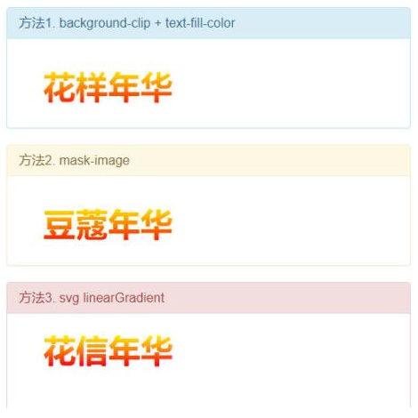
<section class="wrapper">
<div class="panel panel-info">
<div class="panel-heading">
<h3 class="panel-title">Method 1. background-clip + text-fill-color</h3>
</div>
<div class="panel-body">
<h3 class="gradient-text gradient-text-one">In the Mood for Love</h3>
</div>
</div>
<div class="panel panel-warning">
<div class="panel-heading">
<h3 class="panel-title">Method 2. mask-image</h3>
</div>
<div class="panel-body">
<h3 class="gradient-text gradient-text-two" data-content="Marriageable age">Marriageable age</h3>
</div>
</div>
<div class="panel panel-danger">
<div class="panel-heading">
<h3 class="panel-title">Method 3. svg linearGradient</h3>
</div>
<div class="panel-body">
<svg viewBoxs="0 0 500 300" class="svgBox">
    <defs>
        <linearGradient id="SVGID_1_" gradientUnits="userSpaceOnUse" x1="0" y1="10" x2="0" y2="50">
            <stop  offset="0" style="stop-color:yellow"/>
            <stop  offset="0.5" style="stop-color:#fd8403"/>
            <stop  offset="1" style="stop-color:red"/>
        </linearGradient>
    </defs>
    <text text-anchor="middle" class="gradient-text-three" x="110px" y="30%">The time when spring breezes bring the news of the flowers</text>
</svg>
</div>
</div>
</section>
</body>
</html>Effect: