In the world of fluent, everything is Widget, image, text, layout model and so on. Everything is Widget In the fluent, try to put the widget in the MaterialApp. It encapsulates some required widgets. MaterialApp is generally used as the top-level widget, while Scaffold is set inside MaterialApp, because Scaffold provides the basic implementation of layout such as page banner, as follows:
class MyApp extends StatelessWidget {
  @override
  Widget build(BuildContext context) {
    return MaterialApp(
      home:Scaffold(
        appBar: AppBar(
          title: Text(
            'flutter Demo'
            )
        ),
        body: HomeCenter()
      )
    );
  }
If you need to set the margin, padding, background and other properties of a Widget, you can place the Widget in the Container, as follows:
Center(
      child: Container(
        child: Text('I am a txt'),
        height: 300.0,
        width: 300.0,
        decoration: BoxDecoration(
          color: Colors.blue,
          border: Border.all(
            color: Colors.green,
            width: 2.0
          )
        ),
      )
If you need to set the font and color of a paragraph of text, you can use the following properties:
Text(
          'I am a txt',
          textAlign: TextAlign.center,
          style: TextStyle(
            decoration: TextDecoration.lineThrough
          ),
       )
List components
It can be divided into vertical lists. Horizontal list. Dynamic list. Matrix list
The most frequently used layout in the fluent is the vertical (Column) or horizontal (Row),
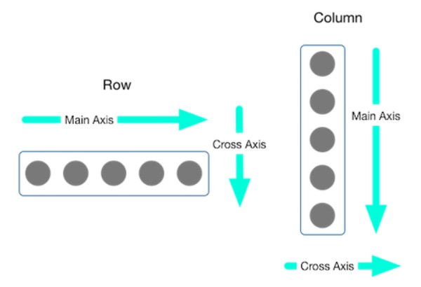
In fact, the skeleton of the interface can be implemented with Column and Row. The main axis alignment and crossaxis alignment attributes can be used to control how rows or columns align their children. **For a Row, the main axis extends horizontally and the cross axis extends vertically. For a Column, the main axis extends vertically and the cross axis extends horizontally * *
In addition to Row and Column layout lists, you can also use ListView for layout. The difference is that ListView can adapt to width and height. The usage is as follows:
ListView(
      padding: EdgeInsets.all(10),
      children: <widget>[
			//ListTile is usually used to fill in ListView in Flutter
        ListTile(
				//Main title
          title: Text( 'Headline 1',),
			//Subheading
          subtitle: Text('Subheading 1')
        ),
    )
Add an image or icon to the beginning of the list. This is usually an icon.
ListTile(
  leading: CircleAvatar(
    backgroundImage: NetworkImage(imageUrl),
  ),
  title: Text('Horse'),
)
Setting a trail places an image at the end of the list. This is particularly useful for indicating the master detail layout.
ListTile(
  title: Text('Horse'),
  trailing: Icon(Icons.keyboard_arrow_right),
)
Through the scrollDirection property, whether a list is horizontal or vertical (the default is vertical) scrollDirection: Axis.horizontal
GridView is used to create a grid layout. Note that there must be crossAxisCount and specify how many columns of the grid layout, otherwise the interface cannot be displayed. The example is as follows:
GridView.count(
      // Control how many columns, the following shows three columns
      crossAxisCount: 3,
      children: this._getData()
    )
In addition to controlling padding through Container, you can also directly control padding as follows:
Padding(
          padding: EdgeInsets.fromLTRB(10, 10, 0, 0),
          child: Container(width: 30, height: 30, color: Colors.yellow),
        )
Expanded can control the extension of an element to occupy the remaining space. When you want to control the proportion of multiple expanded, you can use flex, as follows:
Row(
        children: <widget>[
          Expanded(
            flex: 1,
            child: IconContainer(Icons.search,Colors.red)
          ),
          Expanded(
            flex: 2,
            child: IconContainer(Icons.search,Colors.yellow)
          ),
          Expanded(
            flex: 1,
            child: IconContainer(Icons.search,Colors.black)
          )
        ],
      )
If you need to realize absolute positioning and relative positioning, you can use Stack stack Stack component, Stack and Align, Stack and Positioned to realize positioning layout
	Stack(
          children: <widget>[
            Align(
              alignment: Alignment.topLeft,
              child: Icon(Icons.home,size:40,color:Colors.white)
            ),
            Align(
              alignment: Alignment.center,
              child: Icon(Icons.search,size:40,color:Colors.white)
            ),
            Align(
              alignment: Alignment.bottomRight,
              child: Icon(Icons.send,size:40,color:Colors.white)
            )
          ],
      )
	//With Positioned, you can have left and top to achieve more accurate positioning
	Stack(
          children: <widget>[
            Positioned(
              left: 100,
              top: 100,
              child: Icon(Icons.home,size:40,color:Colors.white)
            ),
            Positioned(
              left: 50,
              child: Icon(Icons.search,size:40,color:Colors.white)
            ),
            Positioned(
              bottom: 0,
              child: Icon(Icons.send,size:40,color:Colors.white)
            )
          ],
      )
If you want to achieve the effect of the Card, you can use the Card
Card(
          margin: EdgeInsets.all(10),
          child: Column(
            children: <widget>[
              // Configure the aspect ratio of child elements
              AspectRatio(
                aspectRatio: 20/9,
                child: Container(
                  color: Colors.red,
                )
              ),
              ListTile(
                leading: ClipOval(
                  child: Container(width: 50,height: 50,color: Colors.yellow)
                ),
                title: Text('Title'),
                subtitle: Text('Subheading'),
              )
            ],
          ),
        )
According to the Image component Image, there are two main methods to insert a picture into a page:
- Remote image: Image.network. Just pass the url of the picture to network as a parameter, as follows:
Image.network(
          'https://himg2.huanqiucdn.cn/attachment2010.jpg',
          // Orientation, you can set the orientation of the picture
          alignment: Alignment.center,
          // cover is the most commonly used
          fit: BoxFit.cover
        )
If you want to set a circular picture, you can wrap the Image with ClipOval, as follows:
ClipOval(
          child: Image.network(
            'https://himg2.huanqiucdn.cn/attachment2010.jpg',
            width: 300,
            height: 300,
            fit: BoxFit.cover
            ),
        )
- Local image: Image.asset
tips:
1. When instantiating a class in dart, you can not write new
2. In the fluent, all numbers are related to double, and all use double types, such as width, height, etc.
Scan code attention to the public number, there are more exciting articles waiting for you.
 </widget></widget></widget></widget></widget>