# Free Code Camp
Section 2 Front End Development
Responsive Design with Bootstrap
1.Use Responsive Design with Bootstrap Fluid Containers
<link href="//fonts.gdgdocs.org/css?family=Lobster" rel="stylesheet" type="text/css">
<style>
  .red-text {
    color: red;
  }
  h2 {
    font-family: Lobster, Monospace;
  }
  p {
    font-size: 16px;
    font-family: Monospace;
  }
  .thick-green-border {
    border-color: green;
    border-width: 10px;
    border-style: solid;
    border-radius: 50%;
  }
  .smaller-image {
    width: 100px;
  }
</style>
<div class=container-fluid>
<h2 class="red-text">CatPhotoApp</h2>

<p>Click here for <a href="#">cat photos</a>.</p>

<a href="#"><img class="smaller-image thick-green-border" src="/images/relaxing-cat.jpg"></a>

<p>Things cats love:</p>
<ul>
  <li>cat nip</li>
  <li>laser pointers</li>
  <li>lasagna</li>
</ul>
<p>Top 3 things cats hate:</p>
<ol>
  <li>flea treatment</li>
  <li>thunder</li>
  <li>other cats</li>
</ol>
<form action="/submit-cat-photo">
  <label><input type="radio" name="indoor-outdoor"> Indoor</label>
  <label><input type="radio" name="indoor-outdoor"> Outdoor</label>
  <label><input type="checkbox" name="personality"> Loving</label>
  <label><input type="checkbox" name="personality"> Lazy</label>
  <label><input type="checkbox" name="personality"> Crazy</label>
  <input type="text" placeholder="cat photo URL" required>
  <button type="submit">Submit</button>
</form>
</div>- Now let's go back to our Cat Photo application. This time, we'll beautify it with the popular responsive framework Bootstrap.
- Bootstrap will adjust the size of HTML elements according to the size of your screen -- emphasizing the concept of responsive design.
- With responsive design, you don't need to design a mobile version of your website. It will look good on any size screen.
- You just need to add Bootstrap to any application by adding the following code to the beginning of your HTML:
<link rel="stylesheet" href="//cdn.bootcss.com/bootstrap/3.3.1/css/bootstrap.min.css"/>
- First, we need to put all HTML content under the div with class container-fluid.
2.Make Images Mobile Responsive
<a href="#"><img class="smaller-image thick-green-border" src="/images/relaxing-cat.jpg"></a>
<img class="img-responsive" src=/images/running-cat.jpg>- First, add a new image below the existing one. Set its src attribute to / images/running-cat.jpg.
- If the size of the picture is exactly equal to the size of our mobile phone, it must be excellent.
- With Bootstrap, all we need to do is add the img-responsive class attribute to the image. This way the width of the picture will match the width of your page perfectly.
3.Center Text with Bootstrap
<h2 class="red-text text-center">CatPhotoApp</h2>- Now that we're using Bootstrap, we can make it look better by centering the head element. All we need to do is add the text-center class attribute to the h2 element.
4.Create a Bootstrap Button
<img src="/images/running-cat.jpg" class="img-responsive">
<button class="btn">Like</button>- Bootstrap has its own button style and looks much better than the default button.
5.Create a Block Element Bootstrap Button
<button class="btn btn-block">Like</button>- Usually, your button element is only as wide as the text it contains. By making it a block-level element, your button will stretch and fill the entire horizontal space of the page, and any element under it will float to the next line of the block.
- Note: These buttons still need btn class.
- Add Bootstrap's btn-block class to your button.
6.Taste the Bootstrap Button Color Rainbow
<button class="btn btn-block btn-primary">Like</button>- Dark blue btn-primary is the main color of your application and is used for the operations that users mainly take.
- Add the btn-primary class attribute of Bootstrap to the button label.
- Note: This button still needs the BTN and btn-block attributes!
7.Call out Optional Actions with Button Info
<button class="btn btn-block btn-primary">Like</button>
<button class="btn btn-block btn-info">Info</button>- Bootstrap comes with some predefined button colors. Light blue btn-info is used for operations that users may take.
- Add a block-level Bootstrap button with the text "Info" under your "Like" button and add the btn-info and btn-block class attributes to it.
- Note: These buttons still need the BTN and btn-block class properties
8.Warn your Users of a Dangerous Action
<button class="btn btn-block btn-danger">Delete</button>- Bootstrap comes with some predefined button colors. Red btn-danger is used to remind users that the operation is "destructive", such as deleting an image of a cat.
- Create a button with text "Delete" and add classbtn-danger to it.
- Note: These tags still need BTN and btn-blockclass.
9.Use the Bootstrap Grid to Put Elements Side By Side
<div class="row">
  <div class="col-xs-4">
    <button class="btn btn-block btn-primary">Like</button>
  </div>
  <div class="col-xs-4">
    <button class="btn btn-block btn-info">Info</button>
  </div>
  <div class="col-xs-4">
    <button class="btn btn-block btn-danger">Delete</button>
  </div>
</div>- Bootstrap uses a responsive grid layout that makes it easy to put multiple elements in one row and specify the relative width of each element. Most class attributes in Bootstrap can be set in div elements.
- The following chart shows how the 12-column grid layout of Bootstraps works:
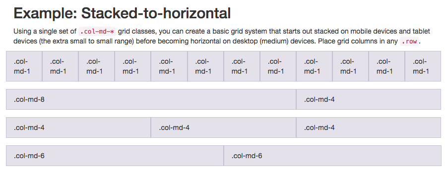
Note that the class attribute col-md-* is being used in this diagram. In this case, MD represents medium, and * represents a number, which specifies the column width occupied by this element. From the property settings of this chart, it can be seen that the column widths of elements are specified on medium-sized screens (such as laptops). - In the CatPhoto App we created, we will use col-xs-*, where XS is an abbreviation for extra small (for smaller screens, such as mobile screens)* which is the number you need to fill in, representing the column width that each element should occupy in a row.
- Put the Like, Info and Delete buttons together into a <div class="row"> element; then, each button needs to be wrapped by a <div class="col-xs-4"> element.
- When the div element sets the class attribute row, the buttons can be embedded in it.
10.Ditch Custom CSS for Bootstrap
<link href="//fonts.gdgdocs.org/css?family=Lobster" rel="stylesheet" type="text/css">
<style>
  h2 {
    font-family: Lobster, Monospace;
  }
  .thick-green-border {
    border-color: green;
    border-width: 10px;
    border-style: solid;
    border-radius: 50%;
  }
</style>
<div class="container-fluid">
  <h2 class="text-primary text-center">CatPhotoApp</h2>
<a href="#"><img class="img-responsive thick-green-border" src="/images/relaxing-cat.jpg"></a>- Now let's clean up the previous code to make our CatPhoto application look more concise, replacing our previously customized style with Bootstrap built-in style.
- Delete the. red-text,p, and. smaller-image CSS declarations in the style element so that only h2 and thick-green-border declarations are left by your style.
- Then delete the p element containing the dead link. Remove the red-text class of the h2 element and replace it with the text-primary class of Bootstrap.
- Finally, remove the "smaller-image" class of the first img element and replace it with the img-responsive class of Bootstrap.
11.Use Spans for Inline Elements
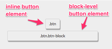
<p>Things cats <span class="text-danger">love:</span></p>- You can use the span tag to create in-line elements. Remember how we used. btn-block to create buttons that filled the whole line?
- This figure shows the difference between inline elements and block-level block-level elements:
- By using the span element, you can put several elements together. You can even use this to specify styles for different parts of an element.
- Put "love" in "Things cats love" under the space label. Then add text-danger class to make the text red.
12.Create a Custom Heading
<div class="row">
  <div class="col-xs-8">
    <h2 class="text-primary text-center">CatPhotoApp</h2>
  </div>
  <div class="col-xs-4">
    <a href="#"><img class="img-responsive thick-green-border" src="/images/relaxing-cat.jpg"></a>
  </div>
</div>- Let's do a navigation for the Cat Photo application by putting the title on the same line as the pleasant cat image.
- Remember, Bootstrap uses a responsive grid system, which makes it easy to put elements in rows and specify widths for each element. Most Bootstrap class es can be used on div elements.
13.Add Font Awesome Icons to our Buttons
<button class="btn btn-block btn-primary"><i class="fa fa-thumbs-up"></i>Like</button>- Font Awesome is a very convenient icon library. These icons are vector graphics and are saved in. svg file format. These icons are just like fonts. You can specify their sizes in pixel units, and they will inherit the font sizes of their parent HTML elements.
- You can add Font Awesome icon library to any application by simply adding the following code to your HTML header: <link rel="stylesheet" href="//cdn.bootcss.com/font-awesome/4.2.0/css/font-awesome.min.css"/>
- The I element was originally used to make other elements italic, but now it is commonly used to refer to icons. You can add the class attribute in Font Awesome to the I element and turn it into an icon, such as: <i class= "fa-info-circle"> </i>
- You can add a thumbs-up icon to your like button through the Font Awesome library by adding class attributes FA and fa-thumbs-up to the i element.
14.Add Font Awesome Icons to all of our Buttons
<div class="row">
  <div class="col-xs-4">
    <button class="btn btn-block btn-primary"><i class="fa fa-thumbs-up"></i> Like</button>
  </div>
  <div class="col-xs-4">
    <button class="btn btn-block btn-info"><i class="fa fa-info-circle"></i>Info</button>
  </div>
</div>- Use Font Awesome to add the info-circle icon to your info button and the trash icon to your delete button.
15.Responsively Style Radio Buttons
<div class="row">
  <div class="col-xs-6">
    <label><input type="radio" name="indoor-outdoor"> Indoor</label>
  </div>
  <div class="col-xs-6">
    <label><input type="radio" name="indoor-outdoor"> Outdoor</label>
  </div>
</div>- You can also use Bootstrap's col-xs - * in the form element. In this way, our radio buttons can be spread out evenly on the page without knowing how wide the screen resolution is.
- Place two radio buttons in a < div class= "row"> element. Then, add the < div class= "col-xs-6"> element and wrap each radio button separately.
16.Responsively Style Checkboxes
    <div class="row">
      <div class="col-xs-4">
        <label><input type="checkbox" name="personality"> Loving</label>
      </div>
      <div class="col-xs-4">
        <label><input type="checkbox" name="personality"> Lazy</label>
      </div>
      <div class="col-xs-4">
        <label><input type="checkbox" name="personality"> Crazy</label>
      </div>
</div>- You can also use Bootstrap's col-xs - * in the form element. This allows our checkboxes to expand evenly on the page, regardless of the resolution of the screen.
- Place all your checkboxes in a <div class="row"> element. Then place each button in a < div class= "col-xs-4" > element, respectively.
17.Style Text Inputs as Form Controls
    <input type="text" class="form-control" placeholder="cat photo URL" required>
<button type="submit" class="btn btn-primary"><i class="fa fa-paper-plane"></i> Submit</button>- You can add the fa-paper-plane icon of Font Awesome to your button submission button by adding <i class="fa-paper-plane"> </i> to the element.
- Add classform-control to the text input box of your form. Add classbtn btn-primary to your form submission button. Similarly, add the fa-paper-plane icon of Font Awesome to the submit button.
18.Line up Form Elements Responsively with Bootstrap
    <div class="row">
      <div class="col-xs-7">
        <input type="text" class="form-control" placeholder="cat photo URL" required>
      </div>
      <div class="col-xs-5">
        <button type="submit" class="btn btn-primary"><i class="fa fa-paper-plane"></i> Submit</button>
      </div>
</div>- Now let's put the input element on the same line as the submit button button. We will use the same method as before: by using div elements with rowclass attributes and other div elements with col-xs-*class attributes within them.
- Put the input text box and submit button in your form into a div element with rowclass attribute. Place your input in the div element with class col-xs-7. Place the submit button of your form in the div element with the class attribute col-xs-5.
19.Create a Bootstrap Headline
<h3 class="text-primary text-center">jQuery Playground</h3>- Now let's practice our HTML, CSS and Bootstrap technologies from scratch.
- We will build a jQuery playground, which will be put into use in our next jQuery course.
- First, create an h3 element with the text content jQuery Playground.
- In the h3 element, set the class attribute text-primary of Bootstrap to color it, and add the class attribute text-center of Bootstrap to make the text center.
20.House our page within a Bootstrap Container Fluid Div
<div class="container-fluid">
  <h3 class="text-primary text-center">jQuery Playground</h3>
</div>- Now let's make sure that everything on the page is responsive.
- Let's put the h3 element in a div element whose class attribute is container-fluid.
21.Create a Bootstrap Row
<div class="container-fluid">
  <h3 class="text-primary text-center">jQuery Playground</h3>
  <div class="row">
  </div>
</div>- Now we will create a Bootstrap row for our inline element.
- Create a div element under the h3 tag with the class attribute row.
22.Split your Bootstrap Row
  <div class="row">
    <div class="col-xs-6">
    </div>
    <div class="col-xs-6">
    </div>
</div>- Now that we have a Bootstrap line, let's split it into two columns to place our elements.
- Add two div elements in your line, each with the col-xs-6class attribute.
23.Create Bootstrap Wells
    <div class="col-xs-6">
      <div class="well">
      </div>
</div>- Bootstrap has a class attribute called well, which creates a visual sense of depth (a visual effect, a hands-on code experience) for the set columns.
- A div element with a well class attribute is embedded in each div element of your class col-xs-6.
24.Add Elements within your Bootstrap Wells
    <div class="col-xs-6">
      <div class="well">
        <button></button>
        <button></button>
        <button></button>
      </div>
</div>- Now we have several div elements nested in each column in the row. That's enough. Now let's add the button element.
- Place three button elements under each well div element.
25.Apply the Default Bootstrap Button Style
<button class="btn btn-default"></button>- Bootstrap also has a class attribute called btn-default that belongs to the button.
- Add two class attributes for each button element: BTN and btn-default.
26.Create a Class to Target with jQuery Selectors
<button class="btn btn-default target"></button>- Not every class attribute is used for CSS. Sometimes we create classes just to make it easier to select these elements in jQuery.
- Add target class for each button you make.
27.Add ID Attributes to Bootstrap Elements
    <div class="col-xs-6">
      <div class="well" id="left-well">
        <button class="btn btn-default target"></button>
        <button class="btn btn-default target"></button>
        <button class="btn btn-default target"></button>
      </div>
    </div>
    <div class="col-xs-6">
      <div class="well" id="right-well">
        <button class="btn btn-default target"></button>
        <button class="btn btn-default target"></button>
        <button class="btn btn-default target"></button>
      </div>
</div>- Recall that in addition to adding class attributes to elements, we can also add an id attribute to each element.
- The id of each specified element is unique and can only be used once per page.
- Now give us a unique id for each div element that contains class well.
- Remember, you can give an element Id like this: <div class="well" id="center-well">
- Give the well on the left an id left-well. Give the well on the right an id right-well.
28.Label Bootstrap Wells
    <div class="col-xs-6">
      <h4>#left-well</h4>
      <div class="well" id="left-well">
        <button class="btn btn-default target"></button>
        <button class="btn btn-default target"></button>
        <button class="btn btn-default target"></button>
      </div>
    </div>
    <div class="col-xs-6">
      <h4>#right-well</h4>
      <div class="well" id="right-well">
        <button class="btn btn-default target"></button>
        <button class="btn btn-default target"></button>
        <button class="btn btn-default target"></button>
      </div>
</div>- Let's mark our wells with their id s.
- On top of left-well, in the div element with class col-xs-6, add an h4 element with text # left-well.
- On top of right-well, in the div element with class col-xs-6, add an h4 element with text # right-well.
29.Give Each Element a Unique ID
    <div class="col-xs-6">
      <h4>#left-well</h4>
      <div class="well" id="left-well">
        <button class="btn btn-default target" id="target1"></button>
        <button class="btn btn-default target" id="target2"></button>
        <button class="btn btn-default target" id="target3"></button>
      </div>
    </div>
    <div class="col-xs-6">
      <h4>#right-well</h4>
      <div class="well" id="right-well">
        <button class="btn btn-default target" id="target4"></button>
        <button class="btn btn-default target" id="target5"></button>
        <button class="btn btn-default target" id="target6"></button>
      </div>
</div>- We can also use jQuery to identify each button by its unique id.
- Give each button a unique id, starting with target1 and ending with target6.
30.Label Bootstrap Buttons
    <div class="col-xs-6">
      <h4>#left-well</h4>
      <div class="well" id="left-well">
        <button class="btn btn-default target" id="target1">#target1</button>
        <button class="btn btn-default target" id="target2">#target2</button>
        <button class="btn btn-default target" id="target3">#target3</button>
      </div>
    </div>
    <div class="col-xs-6">
      <h4>#right-well</h4>
      <div class="well" id="right-well">
        <button class="btn btn-default target" id="target4">#target4</button>
        <button class="btn btn-default target" id="target5">#target5</button>
        <button class="btn btn-default target" id="target6">#target6</button>
      </div>
</div>- Just as we label every wells, we also want to label every button.
- Select the same text for each button element as its id selector.
31.Use Comments to Clarify Code
<!--Only change code above this line.-->
<div class="container-fluid">
  <h3 class="text-primary text-center">jQuery Playground</h3>
  <div class="row">
    <div class="col-xs-6">
      <h4>#left-well</h4>
      <div class="well" id="left-well">
        <button class="btn btn-default target" id="target1">#target1</button>
        <button class="btn btn-default target" id="target2">#target2</button>
        <button class="btn btn-default target" id="target3">#target3</button>
      </div>
    </div>
    <div class="col-xs-6">
      <h4>#right-well</h4>
      <div class="well" id="right-well">
        <button class="btn btn-default target" id="target4">#target4</button>
        <button class="btn btn-default target" id="target5">#target5</button>
        <button class="btn btn-default target" id="target6">#target6</button>
      </div>
    </div>
  </div>
</div>- When we start using jQuery, we will modify HTML elements, but in fact we do not modify them directly in HTML text.
- We have to make sure that everyone knows that they shouldn't modify the code directly on this page.
- Keep in mind that you can comment on <!- for the beginning, -> for the end. (Like this, <! - I'm a commentary - >)
- Please add the following comment at the top of your HTML: Only change code above this line.
Note: Data are reproduced from FCC Chinese Station.