/ Beginning/
Since the release of Wechat, the animation of the bottom navigation bar has always been enjoyed by developers, and with the update of the version, the animation of the bottom navigation bar has also been improving. Recently, in my spare time, I watched the bottom navigation bar animation of Wechat, and thought about the principle of this animation. It was very interesting, so I wrote this article.
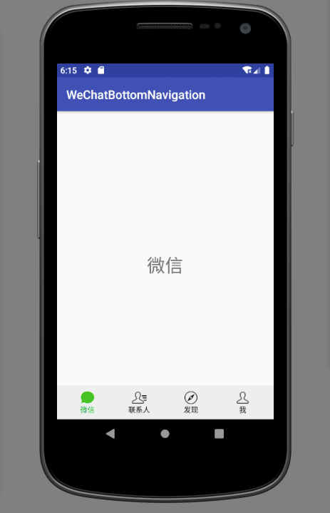
The following picture is the effect I achieved. You can compare the effect of Wechat with that of fake.
/ Animation process/
As for the process of this animation, I have just been watching it for a long time, because if we do not understand the process of animation is also impossible to achieve, so the animation process is very important, this animation actually has two processes.
- The first is the default image contour discoloration.
- When the outline is discolored to a certain extent, the whole picture appears green filling effect, that is, the whole picture begins to turn green until the whole picture completely turns green. In fact, this is the result of the transparency transformation of the two pictures.
/ The principle of animation implementation/First of all, as a whole, sliding pages can be implemented with ViewPager. In the process of sliding, a sliding ratio can be obtained by monitoring the sliding events of ViewPager. The four Tabs in the bottom navigation bar can be implemented by customizing a View, which I call TabView. Then, in the sliding process, the TabView of the current page performs fading animation, and the latter page performs discoloration animation. The exact step of animation execution is definitely determined by the sliding scale of ViewPager. So TabView needs a way to receive the scale of the animation progress to control the degree of animation. / Code implementation / As the saying goes, Talk is cheap, show me the code!. So let's use the code to realize our previous guess. It must be a very passionate journey! Because I don't want to be too big, I omitted some of the ViewPager template code, because these are basic skills. If you don't use ViewPager, searching the Internet is a bunch of articles that you can easily grasp. So this article is mainly about how to customize the TabView. There are many ways to customize View, and I believe many people understand it better than I do. What I chose was to combine system controls to implement this custom View. Then I might be asked if I could completely customize a View for better rendering performance. Of course, that's OK. After learning this article, you can do this bullish operation. However, this improvement in rendering performance can be neglected in today's highly configurable mobile phones. Then in order to develop efficiency, the combination system control should be the first choice. / The layout of the composite controls needed to implement the layout of the composite controls/TabView is as follows.
// tab_layout.xml

<?xml version="1.0" encoding="utf-8"?>
<LinearLayout xmlns:android="http://schemas.android.com/apk/res/android"
    android:layout_width="match_parent"
    android:layout_height="40dp"
    android:gravity="center_horizontal"
    android:orientation="vertical">

    <FrameLayout
        android:layout_width="wrap_content"
        android:layout_height="0dp"
        android:layout_weight="1">

        <ImageView
            android:id="@+id/tab_image"
            android:layout_width="wrap_content"
            android:layout_height="match_parent" />

        <ImageView
            android:id="@+id/tab_image_top"
            android:layout_width="wrap_content"
            android:layout_height="match_parent" />
    </FrameLayout>

    <TextView
        android:id="@+id/tab_title"
        android:layout_width="wrap_content"
        android:layout_height="wrap_content"
        android:textSize="12sp" />
</LinearLayout>
The TextView of the layout must be used to display the title, but there are still two ImageViews. Why is it designed like this? This is related to the realization of our animation. @+ The ImageView of id/tab_image is at the bottom. It is used to display a default image. I call it a contour map. For example, the contour of TabView on the first page is as follows. We need to change the color of the contour. You can observe the process of animation. The first process is obviously the change of the contour. @+ The ImageView of id/tab_image_top is above. It is used to display the selected picture of a page and the final picture to be displayed in the animation. For example, the selected picture of TabView of the first page is as follows.
 Now let's illustrate how to use this layout to achieve animation.
- First, all TabView s display contour maps, and the selected maps are hidden. How to hide? I choose to use transparency to hide the selected image, because the entire animation process has transparency changes.
- When sliding the ViewPager, TabView gets the sliding progress value, and we start to discolor the contour of the contour. So how to change color, there is a very convenient method, Drawable.setTint() method. The principle of this method is PorterDuff.Mode.DST_IN mixed mode. If you are interested, you can study the principle.
- When the ViewPager slides to a certain distance, if the finger is loosened, the page will automatically slide to the next page. What is the ratio? I haven't studied it yet. I suppose it's 0.5. When the sliding comparison is more than 0.5, the transparency of the contour map will gradually change to 0, that is, slowly invisible. At the same time, the transparency of the selected map will gradually change to 255, which is also slowly clear. In this way, the overall color filling effect of the contour map will appear.
Well, is the idea interesting? Let's implement the custom ViewTabView according to this idea. / Implementing TabView / Load Layout Now that you have a layout, you first use the constructor of TabView to load the layout.
public TabView(Context context, @Nullable AttributeSet attrs) {
        super(context, attrs);
        // Loading layout
        inflate(context, R.layout.tab_layout, this);
}
Custom attributes and parsing In order to better use TabView in XML layout, I extracted custom attributes for TabView.
// res/values/tabview_attrs.xml

<?xml version="1.0" encoding="utf-8"?>
<resources>
    <declare-styleable name="TabView">
        <attr name="tabColor" format="color|integer" />
        <attr name="tabImage" format="reference" />
        <attr name="tabSelectedImage" format="reference" />
        <attr name="tabTitle" format="string|reference" />
    </declare-styleable>
</resources>
- tabColor represents the final color to be displayed, which can be obtained from the selected image using a color picker.
- tabImage represents the default outline.
- TabSelected Image represents the selected graph.
- The tabTitle represents the title to be displayed.
With these custom attributes, you must parse these custom attributes in TabView.
public TabView(Context context, @Nullable AttributeSet attrs) {
        super(context, attrs);
        // Loading layout
        inflate(context, R.layout.tab_layout, this);

        TypedArray a = context.obtainStyledAttributes(attrs, R.styleable.TabView);
        for (int i = 0; i < a.getIndexCount(); i++) {
            int attr = a.getIndex(i);
            switch (attr) {

                case R.styleable.TabView_tabColor:
                    // Get the final shading of the title and outline
                    mTargetColor = a.getColor(attr, DEFAULT_TAB_TARGET_COLOR);
                    break;

                case R.styleable.TabView_tabImage:
                    // Getting Contour Map
                    mNormalDrawable = a.getDrawable(attr);
                    break;

                case R.styleable.TabView_tabSelectedImage:
                    // Get the selected graph
                    mSelectedDrawable = a.getDrawable(attr);
                    break;

                case R.styleable.TabView_tabTitle:
                    // Get title
                    mTitle = a.getString(attr);
                    break;
            }

        }
        a.recycle();
    }
After the custom property is resolved, the control needs to be initialized with these property values. View's onFinishInflate() method represents the completion of layout loading, so get the control here and initialize it.
@Override
    protected void onFinishInflate() {
        super.onFinishInflate();

        // 1. Set the title by default to black.
        mTitleView = findViewById(R.id.tab_title);
        mTitleView.setTextColor(DEFAULT_TAB_COLOR);
        mTitleView.setText(mTitle);

        // 2. Set the outline picture, opaque, default color to black
        mNormalImageView = findViewById(R.id.tab_image);
        mNormalDrawable.setTint(DEFAULT_TAB_COLOR);
        mNormalDrawable.setAlpha(255);
        mNormalImageView.setImageDrawable(mNormalDrawable);

        // 3. Set the selected picture to be transparent and the default color is black.
        mSelectedImageView = findViewById(R.id.tab_selected_image);
        mSelectedDrawable.setAlpha(0);
        mSelectedImageView.setImageDrawable(mSelectedDrawable);
    }
The title has a default color DEFAULT_TAB_COLOR, which is black. Similarly, black is set for the outline of the contour. The transparency of the contour is initially 255, that is, completely visible, while the transparency of the selected image is set to 0, that is, completely invisible. All of this is the initial state of animation. Controlling the progress of animation mentioned one thing in the previous explanation of the principle of animation. TabView needs to use ViewPager sliding progress value to control the progress of animation, so it also defines a method to receive the progress value for TabView.
/**
     * Discoloration and transparency are processed according to the progress value.
     *
     * @param percentage Schedule value, take value [0, 1].
     */
    public void setXPercentage(float percentage) {
        if (percentage < 0 || percentage > 1) {
            return;
        }

        // 1. Color Transform
        int finalColor = evaluate(percentage, DEFAULT_TAB_COLOR, mTargetColor);
        mTitleView.setTextColor(finalColor);
        mNormalDrawable.setTint(finalColor);

        // 2. Transparency transformation
        if (percentage >= 0.5 && percentage <= 1) {
            // The principle is as follows
            // Progress value: 0.5-1
            // Transparency: 0 - 1
            // Formula: percentage - 1 = Alpha - 1 * 0.5
            int alpha = (int) Math.ceil(255 * ((percentage - 1) * 2 + 1));
            mNormalDrawable.setAlpha(255 - alpha);
            mSelectedDrawable.setAlpha(alpha);
        } else {
            mNormalDrawable.setAlpha(255);
            mSelectedDrawable.setAlpha(0);
        }

        // 3. update UI
        invalidateUI();
    }
In this open interface, we first need to calculate the color of the contour according to the progress value. The initial color is black, the final color is green, and then we have a progress value. So how to calculate the corresponding color value of a progress? In fact, there is a class in attribute animation, ArgbEvaluator, which provides a method of calculating color. The code is as follows.
public Object evaluate(float fraction, Object startValue, Object endValue) {
        int startInt = (Integer) startValue;
        float startA = ((startInt >> 24) & 0xff) / 255.0f;
        float startR = ((startInt >> 16) & 0xff) / 255.0f;
        float startG = ((startInt >>  8) & 0xff) / 255.0f;
        float startB = ( startInt        & 0xff) / 255.0f;

        int endInt = (Integer) endValue;
        float endA = ((endInt >> 24) & 0xff) / 255.0f;
        float endR = ((endInt >> 16) & 0xff) / 255.0f;
        float endG = ((endInt >>  8) & 0xff) / 255.0f;
        float endB = ( endInt        & 0xff) / 255.0f;

        // convert from sRGB to linear
        startR = (float) Math.pow(startR, 2.2);
        startG = (float) Math.pow(startG, 2.2);
        startB = (float) Math.pow(startB, 2.2);

        endR = (float) Math.pow(endR, 2.2);
        endG = (float) Math.pow(endG, 2.2);
        endB = (float) Math.pow(endB, 2.2);

        // compute the interpolated color in linear space
        float a = startA + fraction * (endA - startA);
        float r = startR + fraction * (endR - startR);
        float g = startG + fraction * (endG - startG);
        float b = startB + fraction * (endB - startB);

        // convert back to sRGB in the [0..255] range
        a = a * 255.0f;
        r = (float) Math.pow(r, 1.0 / 2.2) * 255.0f;
        g = (float) Math.pow(g, 1.0 / 2.2) * 255.0f;
        b = (float) Math.pow(b, 1.0 / 2.2) * 255.0f;

        return Math.round(a) << 24 | Math.round(r) << 16 | Math.round(g) << 8 | Math.round(b);
    }
If you are familiar with attribute animation, you should know that the parameter float fraction ranges from 0.f to 1.f, so you can copy this method and use it. After calculating the color value, the title and outline can be colored. The second step, according to the animation principle mentioned before, when the sliding progress reaches 0.5, the contour map and the selected map should be transformed transparently. So first we have to calculate the transparency of a schedule. Obviously, this is a mathematical problem. The range of progress is from 0.5 to 1.0, and the transformation of transparency is from 0 to 1.0 (then multiplied by 255 to get the actual transparency). The ratio of transparency to progress is 2, so we can get a formula alpha - 1 = percentage - 1.0 * 2. With this formula, the transparency corresponding to any progress value can be calculated. When that's all in place, we'll use the killer's mace, update the UI, and redraw the system. / Linking with ViewPager / The most important custom View is ready, and it's time to test the results. So we have to know how to get the sliding progress value of ViewPager. We can set the sliding monitor for ViewPager.
mViewPager.addOnPageChangeListener(new ViewPager.SimpleOnPageChangeListener() {
            @Override
            public void onPageScrolled(int position, float positionOffset, int positionOffsetPixels) {

            }
        });
The parameter floatposition Offset is a progress value, but it still needs a little trick to use. Let's first look at the source code and explain it.
/**
         * This method will be invoked when the current page is scrolled, either as part
         * of a programmatically initiated smooth scroll or a user initiated touch scroll.
         *
         * @param position Position index of the first page currently being displayed.
         *                 Page position+1 will be visible if positionOffset is nonzero.
         * @param positionOffset Value from [0, 1) indicating the offset from the page at position.
         * @param positionOffsetPixels Value in pixels indicating the offset from position.
         */
        void onPageScrolled(int position, float positionOffset, int positionOffsetPixels);
As can be seen from the annotations, onPageScrolled method is called when sliding. The parameter position represents the page currently displayed. This table can easily be misinterpreted. In fact, whether sliding from left to right or from right to left, position always represents the page on the left, so position + 1 always generates. The page on the right of the table. The parameter positionOffset represents the sliding progress value, and it's also important that most people ignore that if the parameter positionOffset is a non-zero value, it means that the page on the right is visible. That is to say, if the value of positionOffset is zero, the page on the right is invisible, which will appear in the code. Come out now. Now that you know the parameters, let's look at the implementation.
public void onPageScrolled(int position, float positionOffset, int positionOffsetPixels) {
                // Animate the left View
                mTabViews.get(position).setXPercentage(1 - positionOffset);
                // If positionOffset is not zero, then the View on the right side is visible, which means that animation of the View on the right side is required.
                if (positionOffset > 0) {
                    mTabViews.get(position + 1).setXPercentage(positionOffset);
                }
            }
MTabViews is an ArrayList that holds all TabViews, and we have four TabViews on our page. mTabViews.get(posistion) retrieves the page on the left when sliding, and mTabViews.get(position + 1) retrieves the page on the right. When sliding from left to right, the position Offset value of the left page is from 0 to 1. At this time, we need the TabView of the left page to perform fading animation. However, in our TabView design, when the progress value reaches 1, the implementation is a discolored animation, not faded animation, so the TabView progress value of the left page needs to be changed, take 1 - position Offset. Then the page on the right will naturally be positionOffset. The principle of sliding from right to left is actually the same as that of sliding from left to right. You can see the clue from Log. However, when animating the TabView on the left, we must make sure that there are pages on the right. As we said earlier, if positionOffset is zero, the right page is invisible, so we need to do some excluding action, which is reflected in the code.
/ Code optimization/
What is the critical point at which ViewPager can automatically slide to the next page? TabView needs this critical point to control the transformation of transparency. TabView can only control the display of pictures through XML attributes, control the final color and other functions, in fact, these can be dynamically controlled by code, we can achieve an external interface. If you are a person who strives for excellence, you can study and realize these two points.
/ End/
This article explains the principles of animation and how to implement them in code, which are the key parts. However, I did not give the code for the other parts. For the convenience of people who want to view demo, I upload the code to github.
The project address is: https://github.com/buxiliulian/WeChatBottomNavigation
How to Become an Android Architect? (Architecture Video + Interview Documents + Learning Notes)