matplotlib is inspired by MATLAB. Matlab is a widely used language and tool in the field of data drawing. MATLAB language is process oriented. Using function call, matlab can easily use a line of command to draw lines, and then use a series of functions to adjust the results.
Matplotlib has a set of drawing interface which completely imitates the function form of MATLAB in the matplotlib.pyplot module. This set of function interface is convenient for matlab users to transition to Matplotlib package
Official website
Learning method: start from the official website examples
learn
Xi
import matplotlib.pyplot as plt
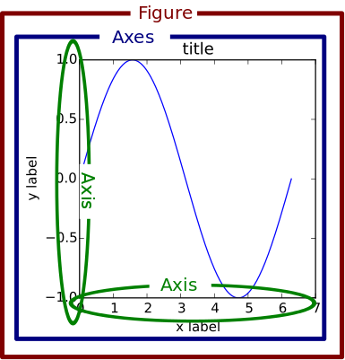
In the drawing structure, figure creates a window, and subplot creates a subplot. All painting can only be done on the subgraph. plt represents the current subgraph. If not, create a subgraph. All you will see is that some tutorials use plt for setting, and some tutorials use sub graph properties for setting. They often have corresponding function.
Figure: panel (Figure). All the images in matplotlib are located in Figure object. An image can only have one figure object.
Plot: sub plot. One or more plot objects (axes) are created under the figure object to draw the image.
- Configuration parameters:
| Parameter name | Parameter description |
|---|---|
| axex | Sets the color, scale value size, and grid display for axis boundaries and surfaces |
| figure | Controls dpi, border color, graph size, and subplot settings |
| font | font family, font size, and style settings |
| grid | Set mesh color and linearity |
| legend | Set the display of the legend and the text in it |
| line | Set lines (color, linetype, width, etc.) and markers |
| patch | Is a graphic object that fills 2D space, such as polygons and circles. Controls lineweight, color, anti aliasing settings, and more. |
| savefig | You can make separate settings for saved drawings. For example, set the background of the rendered file to white. |
| verbose | Set matplotlib to output information during execution, such as silent, helpful, debug, and debug announcing. |
| xticks,yticks | Sets the color, size, direction, and label size for the major and minor divisions of the X and Y axes. |
- Line related property tag settings
| Line style linestyle or ls | describe |
|---|---|
| '-' | Solid line |
| ':' | Dotted line |
| '–' | Broken line |
| 'None',' ','' | Don't draw anything |
| '-.' | Dot marking |
- Line marking
| Labelled maker | describe |
|---|---|
| 'o' | circle |
| '.' | spot |
| 'D' | diamond |
| 's' | Square |
| 'h' | Hexagon 1 |
| '*' | Asterisk |
| 'H' | Hexagon 2 |
| 'd' | Small diamond |
| '_' | Level |
| 'v' | A triangle with one corner down |
| '8' | Eight sided shape |
| '<' | A triangle with one corner to the left |
| 'p' | Pentagon |
| '>' | A triangle with one corner to the right |
| ',' | pixel |
| '^' | A triangle with one corner up |
| '+' | Plus |
| '\ ' | Vertical line |
| 'None','',' ' | nothing |
| 'x' | x |
- colour
| alias | colour |
|---|---|
| b | blue |
| g | green |
| r | Red |
| y | yellow |
| c | Cyan |
| k | black |
| m | Magenta |
| w | white |
If these two colors are not enough, there are two other ways to define color values:
- 1. Use the HTML hex string color = '(123456') and use the legal HTML color name ('red ',' chartreuse ', etc.).
- 2. You can also pass in an RGB ancestor normalized to [0,1]. color=(0.3,0.3,0.4)
- Background color
By providing an axis BG parameter to methods such as matplotlib.pyplot.axes() or matplotlib.pyplot.subplot(), you can specify the background color of the coordinate.
subplot(111,axisbg=(0.1843,0.3098,0.3098))
Note: the statement to set the size of the graph in matplotlib is as follows:
fig = plt.figure(num=None, figsize=(a, b), dpi=dpi)
Parameter Description:
num – if this parameter is not provided, a new figure object will be created, and the figure count value will be increased. If this parameter is available, and there is a figure object with corresponding id. if the value of num is a string, the window title will be set as this string.
dpi – sets the number of points per inch for the graph
pi**
Drawing operation steps (take point drawing and line drawing as examples)
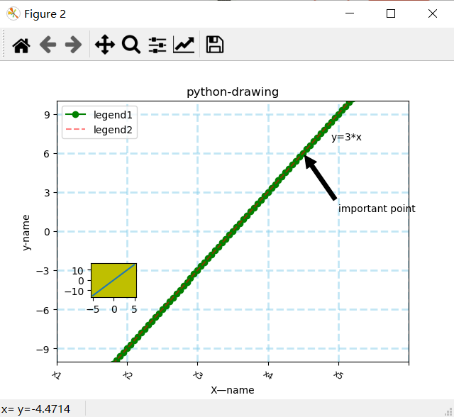
# Import into storage import numpy as np import pandas as pd import matplotlib.pyplot as plt from matplotlib.ticker import MultipleLocator # Using numpy to generate data x = np.arange(-5, 5, 0.1) y = x*3 # Create windows, subgraphs # Method 1: create a window first, and then create a sub graph. (must be drawn) fig = plt.figure(num=1, figsize=(15, 8), dpi = 80) ax1 = fig.add_subplot(2, 1, 1) # Add the subgraph through fig. parameters: number of rows, number of columns, the first few. ax2 = fig.add_subplot(2, 1, 2) print(fig, ax1, ax2) # Method 2: create windows and multiple subgraphs at once. (blank not drawn) fig, axarr = plt.subplots(4, 1) # Open a new window, add 4 subgraphs and return to the array of subgraphs ax1 = axarr[0] # Get a subgraph from the subgraph array print(fig, ax1) # Method 3: create a window and a subgraph at once. (blank not drawn) ax1 = plt.subplot(1, 1, 1, facecolor='white') # Open a new window and create a sub graph. facecolor sets the background color print(ax1) # Get the reference to the window, which is applicable to the above three methods # fig = plt.gcf() # Get the current figure # fig=ax1.figure #Get the window to which the specified sub graph belongs # fig.subplots_adjust(left=0) #Set the left inner margin of the window to 0, that is, leave the left blank to 0 # Set the basic elements of the subgraph ax1.set_title("python-drawing") # Set up body, plt.title ax1.set_xlabel("X—name") # Set x-axis name, plt.xlabel ax1.set_ylabel('y-name') # Set y-axis name, plt.ylabel plt.axis([-6, 6, -10, 10]) # Set the range of abscissa and ordinate axis, which is divided into the following two functions in the subgraph ax1.set_xlim(-5, 5) # Setting the horizontal axis range will cover the above horizontal coordinate, plt.xlim ax1.set_ylim(-10, 10) # Setting the vertical axis range will cover the above vertical coordinate, plt.ylim xmajorLocator = MultipleLocator(2) # Defines the scale difference of the horizontal major scale label as a multiple of 2. It's just a few ticks apart to display a label text ymajorLocator = MultipleLocator(3) # Defines the scale difference of the vertical major scale label as a multiple of 3. It's just a few ticks apart to display a label text ax1.xaxis.set_major_locator(xmajorLocator) # The x axis applies the defined horizontal major scale format. Default scale format if not applied ax1.yaxis.set_major_locator(ymajorLocator) # The y-axis applies the defined vertical major scale format. Default scale format if not applied ax1.xaxis.grid(True, which='major') # Grid of x axis uses defined major scale format ax1.yaxis.grid(True, which='major') # Grid of y axis uses defined major scale format ax1.set_xticks([]) # Remove axis scale ax1.set_xticks((-5,-3,-1,1,3,5)) # Set axis scale ax1.set_xticklabels(labels=['x1','x2','x3','x4','x5'],rotation=-30,fontsize='small') # Set the display text of scale, rotation angle, font size plot1=ax1.plot(x, y, marker='o', color='g', label='legend1') # Point drawings: marker icons plot2=ax1.plot(x, y, linestyle='--', alpha=0.5, color='r', label='legend2') # Line chart: linestyle linear, alpha transparency, color color, label legend text ax1.legend(loc='upper left') # Display legend, plt.legend() ax1.text(2.8, 7, r'y=3*x') # Display text at specified position, plt.text() ax1.annotate('important point', xy=(2, 6), xytext=(3, 1.5), # Add dimensions, parameters: annotation text, pointing point, text position, arrow attribute arrowprops=dict(facecolor='black', shrink=0.05), ) # Displays the grid. The values of which parameter are major (only draw large scale), minor (only draw small scale), and both. The default value is major. axis is' x','y','both ' ax1.grid(b=True, which='major', axis='both', alpha= 0.5, color='skyblue', linestyle='--', linewidth=2) axes1 = plt.axes([.2, .3, .1, .1], facecolor='y') # Add a subgraph in the current window, rect = [left, bottom, width, height], which is the absolute layout used, and do not occupy space with the existing window axes1.plot(x, y) # Draw a picture on a subgraph plt.savefig('aa.jpg',dpi=400,bbox_inches='tight') # savefig saves the picture, dpi resolution, and the size of white space around bbox includes subgraph plt.show() #Open the window. For the window created by method 1, the drawing must be done. For the window created by method 2, method 3, if all coordinate systems are blank, the drawing will not be done
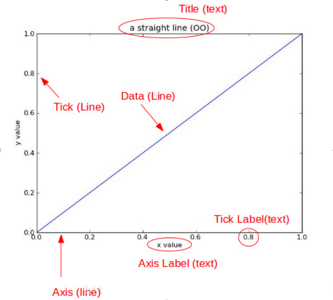
The attributes that can be set during plot include the following:
| attribute | Value type |
|---|---|
| alpha | Floating point value |
| animated | [True / False] |
| antialiased or aa | [True / False] |
| clip_box | matplotlib.transform.Bbox instance |
| clip_on | [True / False] |
| clip_path | Path instance, Transform, and Patch instance |
| color or c | Any matplotlib color |
| contains | Hit test function |
| dash_capstyle | ['butt' / 'round' / 'projecting'] |
| dash_joinstyle | ['miter' / 'round' / 'bevel'] |
| dashes | Connect / disconnect ink sequence in dots |
| data | (np.array xdata, np.array ydata) |
| figure | matplotlib.figure.Figure instance |
| label | Any string |
| linestyle or ls | [ '-' / '–' / '-.' / ':' / 'steps' / ...] |
| linewidth or lw | Floating point value in points |
| lod | [True / False] |
| marker | [ '+' / ',' / '.' / '1' / '2' / '3' / '4' ] |
| markeredgecolor or mec | Any matplotlib color |
| markeredgewidth or mew | Floating point value in points |
| markerfacecolor or mfc | Any matplotlib color |
| markersize or ms | Floating point value |
| markevery | [None / integer value / (STARTIND, strip)] |
| picker | For interactive line selection |
| pickradius | Pick selection radius of line |
| solid_capstyle | ['butt' / 'round' / 'projecting'] |
| solid_joinstyle | ['miter' / 'round' / 'bevel'] |
| transform | matplotlib.transforms.Transform instance |
| visible | [True / False] |
| xdata | np.array |
| ydata | np.array |
| zorder | Any numerical value |
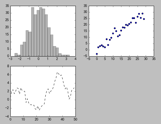
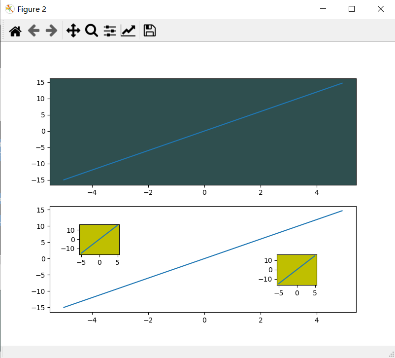
Multiple graphs in one window
#One window, multiple graphs, multiple data
sub1=plt.subplot(211,facecolor=(0.1843,0.3098,0.3098))  #Divide the window into 2 lines and 1 column, draw in the first one, and set the background color
sub2=plt.subplot(212)   #Divide the window into 2 lines and 1 column, and draw in the second
sub1.plot(x,y)          #Drawing subgraph
sub2.plot(x,y)          #Drawing subgraph

axes1 = plt.axes([.2, .3, .1, .1], facecolor='y')  #Add a sub coordinate system, rect = [left, bottom, width, height]
plt.plot(x,y)           #Draw the sub coordinate system,
axes2 = plt.axes([0.7, .2, .1, .1], facecolor='y')  #Add a sub coordinate system, rect = [left, bottom, width, height]
plt.plot(x,y)
plt.show()
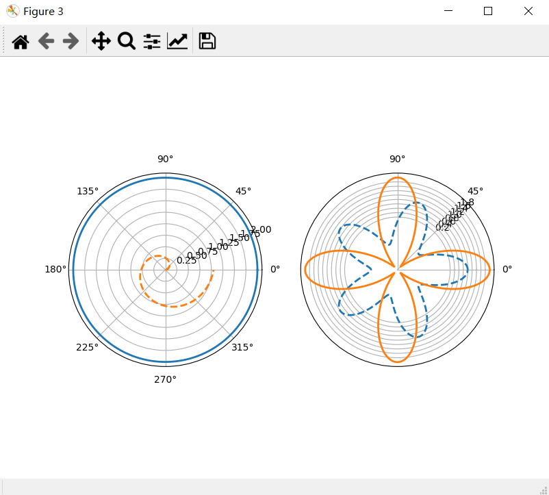
polar coordinates
Property settings are the same as in point and line drawings
fig = plt.figure(3)                                #Open a new window
ax1 = fig.add_subplot(1,2,1,polar=True)                  #Start a polar subgraph
theta=np.arange(0,2*np.pi,0.02)              #Angle series value
ax1.plot(theta,2*np.ones_like(theta),lw=2)   #Drawing, parameters: angle, radius, lw line width
ax1.plot(theta,theta/6,linestyle='--',lw=2)           #Drawing, parameters: angle, radius, linestyle style, lw line width

ax2 = fig.add_subplot(1,2,2,polar=True)                  #Start a polar subgraph
ax2.plot(theta,np.cos(5*theta),linestyle='--',lw=2)
ax2.plot(theta,2*np.cos(4*theta),lw=2)

ax2.set_rgrids(np.arange(0.2,2,0.2),angle=45)   #Distance from grid axis, axis scale and display position
ax2.set_thetagrids([0,45,90])                   #Angle grid axis, range 0-360 degrees

plt.show()Insert code piece here
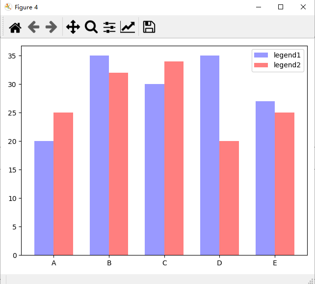
Cylindrical graph
Property settings are the same as in point and line charts.
plt.figure(4)
x_index = np.arange(5)   #Column index
x_data = ('A', 'B', 'C', 'D', 'E')
y1_data = (20, 35, 30, 35, 27)
y2_data = (25, 32, 34, 20, 25)
bar_width = 0.35   #Define a number to represent the width of each individual column

rects1 = plt.bar(x_index, y1_data, width=bar_width,alpha=0.4, color='b',label='legend1')            #Parameters: left offset, height, column width, transparency, color, legend
rects2 = plt.bar(x_index + bar_width, y2_data, width=bar_width,alpha=0.5,color='r',label='legend2') #Parameters: left offset, height, column width, transparency, color, legend
#As for the left offset, it is not necessary to care about the centrality of each column, because it is only necessary to set the scale line in the middle of the column
plt.xticks(x_index + bar_width/2, x_data)   #x-axis tick mark
plt.legend()    #Show Legend
plt.tight_layout()  #This method can't control the space between images very well
plt.show()
iv>
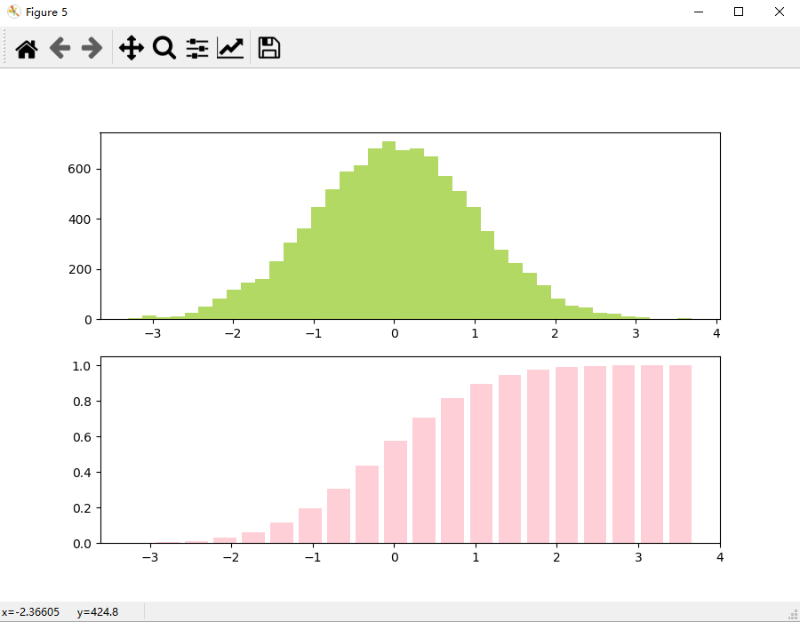
* histogram
*
fig,(ax0,ax1) = plt.subplots(nrows=2,figsize=(9,6))     #Add 2 subgraphs to the window
sigma = 1   #standard deviation
mean = 0    #mean value
x=mean+sigma*np.random.randn(10000)   #Random number of normal distribution
ax0.hist(x,bins=40,normed=False,histtype='bar',facecolor='yellowgreen',alpha=0.75)   #Normalization, histogram type, facecolor, alpha transparency
ax1.hist(x,bins=20,normed=1,histtype='bar',facecolor='pink',alpha=0.75,cumulative=True,rwidth=0.8) #The number of bins columns, whether cumulative distribution is calculated, rwidth column width
plt.show()  #All Windows running
Scatter plot
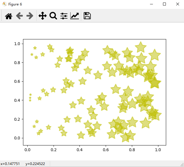
fig = plt.figure(6)          #Add a window
ax =fig.add_subplot(1,1,1)   #Add a subgraph to the window
x=np.random.random(100)      #Generate random array
y=np.random.random(100)      #Generate random array
ax.scatter(x,y,s=x*1000,c='y',marker=(5,1),alpha=0.5,lw=2,facecolors='none')  #x abscissa, y ordinate, s image size, c color, marker picture, lw image border width
plt.show()  #All Windows running
Three dimensional graph
fig = plt.figure(5)
ax=fig.add_subplot(1,1,1,projection='3d')     #Draw 3D

x,y=np.mgrid[-2:2:20j,-2:2:20j]  #Get x-axis data, y-axis data
z=x*np.exp(-x**2-y**2)   #Get z-axis data

ax.plot_surface(x,y,z,rstride=2,cstride=1,cmap=plt.cm.coolwarm,alpha=0.8)  #Drawing 3D surfaces
ax.set_xlabel('x-name')     #x axis name
ax.set_ylabel('y-name')     #y axis name
ax.set_zlabel('z-name')     #z axis name

plt.show()
Draw rectangles, polygons, circles, and ellipses
fig = plt.figure(8)   #Create a window
ax=fig.add_subplot(1,1,1)   #Add a subgraph
rect1 = plt.Rectangle((0.1,0.2),0.2,0.3,color='r')  #Create a rectangle with parameters: (x,y),width,height
circ1 = plt.Circle((0.7,0.2),0.15,color='r',alpha=0.3)  #Create an ellipse. Parameters: center point, radius. By default, the circle will be compressed with the window size
pgon1 = plt.Polygon([[0.45,0.45],[0.65,0.6],[0.2,0.6]])  #Create a polygon, parameters: coordinates of each vertex

ax.add_patch(rect1)  #Add shapes to child diagrams
ax.add_patch(circ1)  #Add shapes to child diagrams
ax.add_patch(pgon1)  #Add shapes to child diagrams

fig.canvas.draw()  #Subgraph rendering
plt.show()

