1. Content Generation
Role: Adding new content to existing tags using css
Method: Through pseudo-element selector (before, after)
1. Attribute:content
 2. Value:
    1. String: plain text, caused by the use of ""
    2. url(): Generate an image to a specified content area
    3. Counter
Using content generation to generate icons: 
div{
    text-align:center;
    height:30px;
    line-height:30px;
}

div:before{
    content:url('...');
    display:inline-block;
    width:16px;
    height:16px;
    margin:0 5px;
}
Using content generation to solve the outer margin overflow problem (before):
div:before{
    content:'';
    display:table;
}
Content generation is used to solve the height problem of parent elements of floating elements (after):
.clear:after{
    content:'';
    display:block;
    clear:both;
}
Counter
1. Declare counter: counter-reset
Function: Declare or reset a counter
 Value: Name initial value;
ex:1,counter-reset:c1 0;
   2,counter-reset:c1 0 c2 10;
Note: Initial values can be omitted, if omitted, 0
        counter-reset:c1;
        counter-reset:c1 c2;
2. Setting the increment of counter (range of change)
Attribute: counter-increment
 Function: Set the increment of the counter for each occurrence of a selector, default increment is 1
 Value: Incremental value of counter name;
ex:counter-increment:c1 1;
3. Use counters
Function: counter (counter name)
<!doctype html>
<html>
  <head>
    <title>Counter</title>
    <meta charset="utf-8">
    <style>
      /*1,Declare counter*/
      body{
        counter-reset:c1;
      }
      /*2,Setting Counter Increment*/
      h3{
        counter-increment:c1;
        /*Declare or reset c2 counter*/
        counter-reset:c2 0;
      }
      h4{
        counter-increment:c2;
      }
      /*3,Use counters*/
      h3:before{
        content:counter(c1)",";
      }
      h4:before{
        content:counter(c1)"."counter(c2)",";
        margin-left:15px;
      }
    </style>
  </head>
  <body>
    <h3>Web Basic knowledge</h3>
    <h4>Foundation 1</h4>
    <h4>Foundation 2</h4>
    <h4>Foundation 3</h4>
    <h3>HTML quick get start</h3>
    <h4>Introduction 1</h4>
    <h4>Introduction 2</h4>
    <h3>Text in Web Pages</h3>
    <h4>Text 1</h4>
    <h4>Text 2</h4>
  </body>
</html>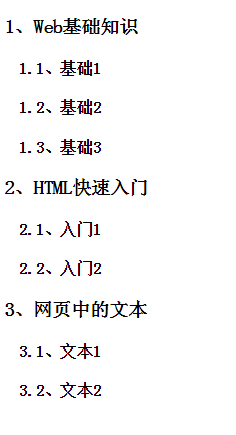
2. conversion
Conversion, applying 2D or 3D conversions to elements, including rotation, zooming, movement, and tilting
1. What Is Conversion
Conversion is to change the position, size, shape and angle of elements on the page. It can be divided into 2-D conversion and 3-D conversion.
Attribute: transform
 Value: none: Default value, i.e. no conversion effect
    transform-functions: Represents a set of transformation functions separated by spaces.

Origin: transform-origin
    Convert the default location of the origin, at the center of the element
 Value: Two values: the position of the origin on the x and y axes
     Three values: the position of the origin on the x, y and z axes
 Unit: Number/Percentage/Keyword
ex:transform-origin:35% 28%;
   transform-origin:0px 0px;
   transform-origin:right bottom;
1. 2D Displacement: Changing the Position of Elements on the x and y Axis
Value (function):
    translate(x): Moving distance on the x-axis
        X is positive, move right, x is negative, move left
    translate(x,y): Moving distance on the X and Y axes
        X is positive, move right, x is negative, move left
        Y is positive, move down, y is negative, move up
    translateX(x): Moving distance on the x-axis
    translateY(y): Moving distance on the Y axis
2, 2D, 3D Scaling: Changing the size of elements in a page
Value (function):
    scale(value): The scaling ratio of coordinate axes is the same
        Value value: 1, default value is 1 ==> original size
                  2. Reduce: decimal between 0 and 1
                  3. Amplification: Values greater than 1
    Scale (x, y) 2D scaling
    Scale (x, y, z) 3D scaling
                  Scaling Ratio of x:x Axis
                  Scaling Ratio of y:y Axis
                  Scaling Ratio of z:z Axis
    Scale X (x) Scale X axis scaling ratio
    Scale Y (y) Y axis scaling ratio
    Scale Z (z) Z axis scaling ratio
3. 2D Rotation: Changing the Angle of Elements
Value (function):
    Rotate (ndeg); n is the angular value of the specific rotation
        If the value is positive, it rotates clockwise, and if the value is negative, it rotates counter-clockwise.

Note: 1. Angle conversion will be achieved according to the origin of conversion.
     2. When the element rotates, it rotates with the coordinate axis.
4. 2D Tilt: Change the shape of the element to a parallelogram
Value (function):
    skew(xdeg): the angle of inclination along the x-axis (changing the y-axis inclination angle)
    skew(xdeg,ydeg):
    skewX(xdeg): The angle of inclination along the x-axis (changing the y-axis inclination angle)
    skewY(ydeg): The angle of inclination along the y axis (changing the angle of the tangent of the x axis)

Note: The tilt of the x-axis eventually changes the tilt angle of the y-axis.
     The tilt of the y-axis will eventually change the tilt angle of the x-axis.
Before we talk about 3D conversion, we first talk about two attributes:
perspective: Defines the distance between the human eye and the 3D projected object, that is, setting the angle from which to view an element, in pixels.
Note: This attribute is defined on the parent element of the 3D transformation element
 Compatibility: Currently, browsers do not support perspective s.
       Chrome and Safari:-webkit-
       Firefox: -moz-
       ex: -webkit-perspective:1000px;
Transf-style: Specifies how nested elements are rendered in three-dimensional space, written on the parent elements of elements that achieve three-dimensional effects
Value: 1. Default value of flat, all child elements are rendered in 2D plane.
     2. Preservate-3d All Subelements Presented in 3D Space
5. 3D Rotation: It enables elements to rotate on x, y and z axes respectively.
Value (function):
    rotateX(xdeg); take the x-axis as the center axis to realize the rotation of elements
    rotateY(ydeg); take y axis as the center axis to realize the rotation of elements
    rotateZ(zdeg); take z axis as the center axis to realize element rotation
    rotate3D(x,y,z,ndeg)
    rotate3D(1,0,0,45deg)  -->rotatex(45deg)
    Rotate3D (1,1,0,45deg) --> 1 means to rotate, 0 means not to rotate.
    rotate3D(1,1,1,45deg)
= transform:rotatex(45deg) rotatey(45deg) rotatez(45deg)
Note: 1. Angle conversion will be achieved according to the origin of conversion.
     2. When the element rotates, it rotates with the coordinate axis.
Therefore, we should pay attention to the order of function writing, first rotation and then displacement, first displacement and then rotation, the results are different.
6. 3-D Displacement: On the basis of 2-D Displacement, the displacement distance control on z-axis is increased.
Value (function):
    translate(x,y,z):
    translateX(x):
    translateY(y):
    translateZ(z):
<!doctype html>
<html>
  <head>
    <title>Insert a title</title>
    <meta charset="utf-8">
    <style>
      #parent{
        width:400px;
        height:400px;
        border:1px solid #333;
        margin:100px auto;
        position:relative;
        /*Keep the 3D position of its child elements*/
        transform-style:preserve-3d;
        -webkit-transform-style:preserve-3d;
      }
      #parent div{
        width:200px;
        height:200px;

        position:absolute;
        left:100px;
        top:100px;
      }
      #s1{
        background-color:red;
        /*Backward: 200px*/
        transform:translatez(-200px);
      }
      #s2{
        background-color:blue;
        /*Standing still*/
      }
      #s3{
        background-color:green;
        /*Forward 200 PX*/
        transform:translatez(200px);
      }

      #stage{
        perspective:1200px;
        -webkit-perspective:1200px;
      }

      #parent{
        transform:rotatex(-20deg);
      }
    </style>
  </head>
  <body>
    <div id="stage">
      <div id="parent">
        <div id="s1">1</div>
        <div id="s2">2</div>
        <div id="s3">3</div>
      </div>
    </div>
  </body>
</html>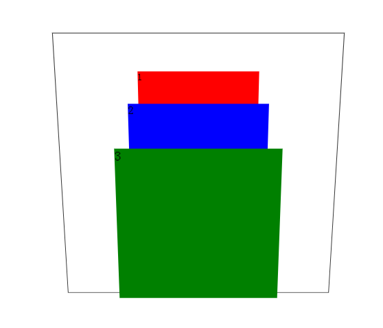
3. transition
Transition is the gradual change of elements from one style to another. To achieve this, two elements must be stipulated:
1. Specify CSS properties to add effects
 2. The duration of the specified effect.
Attribute transition: Defined under the tag to implement the function
Options:
    transition-property: specifies the name of the css attribute that sets the transition effect
    transition-duration: (must) specify how many seconds or milliseconds it takes to complete an excess
    transition-timing-function: Speed and curve for specifying speed effects
        Value: 1.ease default
             2.linear uniform velocity
             3.ease-in starts slowly and ends quickly
             4.ease-out starts quickly and ends slowly 5.ease-in-out slow-fast-slow
    transition-delay: specifies the time to wait before the transition effect starts, in seconds or milliseconds, default 0
Abbreviation transition: property duration timing-function delay
Ex: transition: transform 1s ease 0s;
    transition:background 2s linear,border-radius 2s linear;
Attributes for transitional effects can be set:
1. Color attributes 2. Attributes with values 3. Conversion attributes 4. Gradient attributes 5. Shadow attributes 6.visibilitty
Note: The transition is placed on the': hover'and so on, regardless of the return, on the elements, tube to tube back.
<!doctype html>
<html>
  <head>
    <title>Insert a title</title>
    <meta charset="utf-8">
    <style>
      #d1{
        width:200px;
        height:200px;
        border:2px solid #333;
        background-color:#E4393C;
        /*Statement of transition: take care of it*/
        /*Increased transition*/
        /*1,Specify attributes (required)*/
        transition-property:background,border-radius;
        /*2,Specified duration (required)*/
        transition-duration:2s;
        /*3,Designated Speed Time Rate*/
        transition-timing-function:linear;
        /*4,Designated delay*/
        /*transition-delay:5s;*/
      }
      #d1:hover{
        background-color:#005aa0;
        border-radius:50%;
        /*Statement of transition: just go back*/
      }

      #scroll{
        width:50px;
        height:50px;
        background-color:#e4393c;
        border:2px solid #005aa0;
        text-align:center;
        line-height:50px;
        border-radius:50%;
        font-weight:bold;
        font-size:24px;
        color:#fff;
        /*Statement of transition: take care of it*/
        transition:transform 3s;
      }
      #scroll:hover{
        transform:translate(500px) rotate(1080deg);
      }
    </style>
  </head>
  <body>
    <div id="scroll">rolling</div>
    <div id="d1"></div>
  </body>
</html>
4. animation
Animation is a complex version of the transition!
1. What is animation?
The process of gradually changing elements from one style to another by controlling each step of animation through key frames
Key Frame: Time Point and Style of the Current Key Frame
2. Steps to use animation
1. Declaration Animation
    Specify a name for the animation
    Define key frames in animation (time points, styles)
2. Calling Animation
3. Declaration Animation
Syntax:
    @ keyframes animation name{
        /* Declare several key frames*/
        0%{Style of Elements at the Start of Animation}
        25%{The animation runs to 1/4 of the display style}
        ... ...
        100%{Style displayed at the end of animation run}
    }
4. Call animation-animation properties
1. Specify the name of the calling animation
    Attribute: animation-name
    Value: The name of the declared keyframes

2. Specify the execution time of the animation: the time taken to complete a cycle
    Attribute: animation-duration
    Value: s | ms as a unit of value

3. Designated animation speed-time curve function
    Attribute: animation-timing-function
    Values: ease,linear,ease-in,ease-out,ease-in-out

4. Specify animation delay
    Attribute: animation-delay
    Value: Value in s | ms

5. Specify the number of times the animation is played
    Attribute: animation-iteration-count
    Value: 1. Specific value; Number of execution
         2. infinite; infinite times

6. Specify the direction of animation play
    Attribute: aniamtion-direction
    Value: 1. normal: Forward play, from 0% to 100%.
         2. reverse: reverse playback, from 100% to 0%.
         3. alternate: play in turn

7. Animation attributes (abbreviation)
    animation: name (name) duration (duration) timing-function (rate) delay (delay) iteration-count (number) direction (direction);

8. Specify Filling Mode for Animation
    Function: specify the display mode of animation before or after playback
    Attribute: animation-fill-mode
    Value: 1, none
         2,forwards
            When the animation is completed, keep the animation in the state of the last frame
         3,backwards
            Before the animation is played (in the delay time), the animation will be applied to the state of the first frame.
         4. both: Fill-in modes before and after playback are referenced

9. Specify the playback status of the animation
    Attribute: animation-play-state
    Value: 1. paused pause
         2. running Play

10. compatibility
    Solve compatibility problems by browser prefix:
    Firefox : -moz-keyframes
    Chrome and Safari: - webkit-keyframes
<div id="stage">
    <div id="parent">
        <div id="child1"></div>
        <div id="child2"></div>
        <div id="child3"></div>
        <div id="child4"></div>
        <div id="child5"></div>
        <div id="child6"></div>
    </div>
</div>

<style>
    #stage{
        width:800px;
        height:100px;
        margin: 50px auto;
        padding: 100px 0;
        border:1px solid red;
    }
    #parent:hover{
        animation-play-state:paused;
    }
    #parent div{
        width:100px;
        height:100px;
        border:1px solid #333;
        position:absolute;
        left:50px;
    }

    #child1{
        background:url(image/kaola.jpg) no-repeat;
        background-size:100% 100%;
        transform:translateZ(200px);
        animation:child1 5s linear infinite alternate;
    }
    #child2{
        background:url(image/baxianhua.jpg) no-repeat;
        background-size:100% 100%;
        transform:rotatey(60deg) translatez(200px);
        animation:child2 5s linear infinite alternate;
    }
    #child3{
        background:url(image/image31.jpg) no-repeat;
        background-size:100% 100%;
        transform:rotatey(120deg) translatez(200px);
        animation:child3 5s linear infinite alternate;
    }
    #child4{
        background:url(image/image32.jpg) no-repeat;
        background-size:100% 100%;
        transform:rotatey(180deg) translatez(200px);
        animation:child4 5s linear infinite alternate;
    }
    #child5{
        background:url(image/image33.jpg) no-repeat;
        background-size:100% 100%;
        transform:rotatey(240deg) translatez(200px);
        animation:child5 5s linear infinite alternate;
    }
    #child6{
        background:url(image/img3.jpg) no-repeat;
        background-size:100% 100%;
        transform:rotatey(300deg) translatez(200px);
        animation:child6 5s linear infinite alternate;
    }
    @keyframes xuanzhuan{
        0%{
            transform:rotateX(-20deg) rotatey(0deg);
        }
        50%{
            transform:rotateX(-20deg) rotatey(180deg);
        }
        100%{
            transform:rotateX(-20deg) rotatey(360deg);
        }
    }
    @-moz-keyframes xuanzhuan{
        0%{
            transform:rotateX(-20deg) rotatey(0deg);
        }
        50%{
            transform:rotateX(-20deg) rotatey(180deg);
        }
        100%{
            transform:rotateX(-20deg) rotatey(360deg);
        }
    }
    @-webkit-keyframes xuanzhuan{
        0%{
            transform:rotateX(-20deg) rotatey(0deg);
        }
        50%{
            transform:rotateX(-20deg) rotatey(180deg);
        }
        100%{
            transform:rotateX(-20deg) rotatey(360deg);
        }
    }

    @-moz-keyframes child1{
        0%{
            transform:rotatey(0deg) translatez(200px);
        }
        50%{
            transform:rotatey(0deg) translatez(100px);
        }
        100%{
            transform:rotatey(0deg) translatez(0px);
        }
    }
    @-moz-keyframes child2{
        0%{
            transform:rotatey(60deg) translatez(200px);
        }
        50%{
            transform:rotatey(60deg) translatez(100px);
        }
        100%{
            transform:rotatey(60deg) translatez(0px);
        }
    }
    @-moz-keyframes child3{
        0%{
            transform:rotatey(120deg) translatez(200px);
        }
        50%{
            transform:rotatey(120deg) translatez(100px);
        }
        100%{
            transform:rotatey(120deg) translatez(0px);
        }
    }
    @-moz-keyframes child4{
        0%{
            transform:rotatey(180deg) translatez(200px);
        }
        50%{
            transform:rotatey(180deg) translatez(100px);
        }
        100%{
            transform:rotatey(180deg) translatez(0px);
        }
    }
    @-moz-keyframes child5{
        0%{
            transform:rotatey(240deg) translatez(200px);
        }
        50%{
            transform:rotatey(240deg) translatez(100px);
        }
        100%{
            transform:rotatey(240deg) translatez(0px);
        }
    }
    @-moz-keyframes child6{
        0%{
            transform:rotatey(300deg) translatez(200px);
        }
        50%{
            transform:rotatey(300deg) translatez(100px);
        }
        100%{
            transform:rotatey(300deg) translatez(0px);
        }
    }
    @-webkit-keyframes child1{
        0%{
            transform:rotatey(0deg) translatez(200px);
        }
        50%{
            transform:rotatey(0deg) translatez(100px);
        }
        100%{
            transform:rotatey(0deg) translatez(0px);
        }
    }
    @-webkit-keyframes child2{
        0%{
            transform:rotatey(60deg) translatez(200px);
        }
        50%{
            transform:rotatey(60deg) translatez(100px);
        }
        100%{
            transform:rotatey(60deg) translatez(0px);
        }
    }
    @-webkit-keyframes child3{
        0%{
            transform:rotatey(120deg) translatez(200px);
        }
        50%{
            transform:rotatey(120deg) translatez(100px);
        }
        100%{
            transform:rotatey(120deg) translatez(0px);
        }
    }
    @-webkit-keyframes child4{
        0%{
            transform:rotatey(180deg) translatez(200px);
        }
        50%{
            transform:rotatey(180deg) translatez(100px);
        }
        100%{
            transform:rotatey(180deg) translatez(0px);
        }
    }
    @-webkit-keyframes child5{
        0%{
            transform:rotatey(240deg) translatez(200px);
        }
        50%{
            transform:rotatey(240deg) translatez(100px);
        }
        100%{
            transform:rotatey(240deg) translatez(0px);
        }
    }
    @-webkit-keyframes child6{
        0%{
            transform:rotatey(300deg) translatez(200px);
        }
        50%{
            transform:rotatey(300deg) translatez(100px);
        }
        100%{
            transform:rotatey(300deg) translatez(0px);
        }
    }
    @keyframes child1{
        0%{
            transform:rotatey(0deg) translatez(200px);
        }
        50%{
            transform:rotatey(0deg) translatez(100px);
        }
        100%{
            transform:rotatey(0deg) translatez(0px);
        }
    }
    @keyframes child2{
        0%{
            transform:rotatey(60deg) translatez(200px);
        }
        50%{
            transform:rotatey(60deg) translatez(100px);
        }
        100%{
            transform:rotatey(60deg) translatez(0px);
        }
    }
    @keyframes child3{
        0%{
            transform:rotatey(120deg) translatez(200px);
        }
        50%{
            transform:rotatey(120deg) translatez(100px);
        }
        100%{
            transform:rotatey(120deg) translatez(0px);
        }
    }
    @keyframes child4{
        0%{
            transform:rotatey(180deg) translatez(200px);
        }
        50%{
            transform:rotatey(180deg) translatez(100px);
        }
        100%{
            transform:rotatey(180deg) translatez(0px);
        }
    }
    @keyframes child5{
        0%{
            transform:rotatey(240deg) translatez(200px);
        }
        50%{
            transform:rotatey(240deg) translatez(100px);
        }
        100%{
            transform:rotatey(240deg) translatez(0px);
        }
    }
    @keyframes child6{
        0%{
            transform:rotatey(300deg) translatez(200px);
        }
        50%{
            transform:rotatey(300deg) translatez(100px);
        }
        100%{
            transform:rotatey(300deg) translatez(0px);
        }
    }
</style>
Animation Resource Base
Animate.css is a powerful preset css3 animation library
5.Flex
Flex is the abbreviation of Flexible Box, meaning "flexible layout", which is used to provide maximum flexibility for box models. Any container can be specified as a Flex layout.
Writing: display: flex | inline-flex;
Note: When the element sets the flex attribute, its float,clear vertical-align attribute will fail
Compatibility
Webkit kernel browsers must be prefixed with - webkit.
.box{
  display: -webkit-flex; /* Safari */
  display: flex;
}
container
By default, there are two axes in the container: the horizontal main axis and the vertical cross axis. The starting position (the intersection point with the border) of the spindle is called main start, and the ending position is called main end; the starting position of the cross-axis is called cross start, and the ending position is called cross end.
Projects are arranged along the main axis by default. The main axis space occupied by a single project is called main size, and the intersection axis space occupied is called cross size.
Horizontal spindle: main start, main end
 Vertical cross axis: cross start, cross end
 Occupy space: main size cross size
Container property: flex-direction: the order of subelements
Value: row: default, the spindle is horizontal, starting on the left
     row-reverse: The spindle is horizontal and the starting point is on the right.
     column: The spindle is vertical with the starting point at the upper edge
     column-reverse: The spindle is vertical, starting at the lower edge
Container Properties: flex-wrap: How to Break Lines
Value: nowrap: default, no line change
     Wrap: wrap down
     Wrap-reverse: wrap-reverse
Abbreviation: flex-flow: flex-direction flex-wrap
Container property: justify-content: the alignment of subelements in the principal axis direction
Value: flex-start: default, left aligned
     flex-end: right alignment
     center:Centralization
     space-between: Aligned at both ends, with equal spacing between sub-elements
     space-around: The spacing between the two sides of the child element is equal (the distance between the child element is twice as long as the distance between the child element and the border).
Container attribute: align-items: the alignment of sub-elements on the intersection axis
Take value: stretch: default value. If the child element is not set height, it will be covered with the whole container.
     flex-start: starting point alignment
     flex-end: endpoint alignment
     center: midpoint alignment
     baseline: baseline alignment of the first line of text for child elements
Container property: align-content: Defines alignment of multiple axes
Value: stretch: default value, axis occupies the entire intersection axis
     flex-start: alignment with the starting point of the intersection axis
     flex-end: alignment with the end of the intersection axis
     center: alignment with the midpoint of the intersection axis
     flex-between: aligned with both ends of the intersection axis, with uniform distribution between the axes
     flex-around: The distance between the axes is equal (the distance between the axes is twice the distance between the axes and the frame).
Sub-element attributes: order: Defines the ordering of sub-elements
Value: Number, the smaller the number, the higher the ranking, default 0
Sub-element attribute: flex-grow th: When container space is surplus, magnification factor
Value: Number, default 0, no enlargement, all sub-elements are allocated the remaining space in proportion to the value, and equal value is divided equally.
Sub-element attribute: flex-shrink: Defines the reduction ratio of sub-elements
Value: Number, default 0, do not shrink, all sub-elements are reduced in proportion to the numerical value, the numerical value is equal, then uniformly shrink.
Subelement attributes: flex-basis: Specify the spindle space occupied by subelements (before allocating more and more space)
Value: (same width, height), default auto
Abbreviation: flex: flex-grow flex-shrink flex-basis
Default: 01 Auto
auto: (1 1 auto)
none: (0 0 auto)
Sub-element attribute: align-self: Allows a single sub-element to align differently from other sub-elements
Value: default auto, equivalent to atretch
     stretch: If the child element is not set height, it is covered with the whole container.
     flex-start: starting point alignment
     flex-end: endpoint alignment
     center: midpoint alignment
     baseline: baseline alignment of the first line of text for child elements
More introduction to Flex
Ruan Yifeng's Web Log: Flex Layout Tutorial
6.Filter
Define elements (usually) Visual effects (e.g. ambiguity and saturation).

For more details, you can see Ten Special Effects of CSS3 Filter
7. more columns
1. Separating columns: splitting a paragraph of text into columns
Attribute: column-count
 Value: Number
2. Column spacing: Set the horizontal distance between each two columns
Attribute: column-gap
 Value: px as a unit of value
3. Column Rules: Set the width, style and color of the partition line between each two columns
Attribute: column-rule
 Value: width style color
4. Compatibility
IE10 and Opera support multiple columns
 Solve compatibility problems by browser prefix:
Firefox : -moz-
Chrome and Safari: - webkit-
-moz-column-count:
-moz-column-gap:
-moz-column-rule:
8. CSS Hack
Hack with IE!! Although there are other browsers that may use Hack, it is also negligible.
CSS hack enables different browsers to recognize different symbols by adding some special symbols into the CSS style (which browser recognizes which symbols are standard, CSS hack lets you remember this standard), so as to achieve the purpose of applying different CSS styles.
css Hack Principle: Solving Compatibility Problems by Prioritizing css Attributes
CSS Hack solution:
1. Hack inside CSS class
Added prefixes recognized by specified browsers before or after attribute names to solve compatibility problems
2. Selector Hack
To solve compatibility problems, add an identifier that can be recognized by the specified browser before the selector
        * IE6 Recognition
        *+ IE7 Recognition
div{
    background-color:red;
}

/*The following browsers are recognized only in IE6*/
*div{
    background-color:green;
}
/*The following browsers are recognized only in IE7*/
*+div{
    background-color:blue;
}
3. HTML header reference Hack
IE conditional annotations to solve compatibility problems
 Embedding browser judgement conditions in annotations, executing content if conditions are met, and processing annotations if conditions are not met
 Syntax:
    <! - [if conditional IE version]>
        The content to be executed in the specified browser
    <![endif]-->
    Version: 6, 7, 8, 9, 10,
        Eliminate words that are not written to determine whether they are IE browsers
    Conditions:
        1. gt is normally parsed in browser versions above specified versions
            ex: <!--[if gt IE 6]>
                    This section of content can only be parsed in browsers larger than IE6
                <![endif]-->
        2. gte can be parsed normally when it is larger than or equal to the specified browser version
            ex: <!--[if gte IE 6]>
                    This section of content can only be parsed in IE6 and above browsers
                <![endif]-->
        3. lt is less than
        4. lte is less than or equal to
        5,! No, all versions except the specified version are parsed.
            ex: <!--[if !IE 6]>
                    This section will be parsed in browsers other than IE6
                <![endif]-->
#d1{
    width:200px;
    height:200px;
    background-color:black;
    background-color:green\0;/*IE8,9,10*/
    background-color:blue\9\0;/*IE9,10*/
    +background-color:pink;/*IE6 IE7*/
    -background-color:red;/*IE6*/
  }
<!-- Introduce a browser compatibility css file -->
<!--[if IE 6]>
<link rel="stylesheet" href="style_ie6.css">
<![endif]-->
<!--[if IE 7]>
<link rel="stylesheet" href="style_ie7.css">
<![endif]-->
<!--[if IE 8]>
<link rel="stylesheet" href="style_ie8.css">
<![endif]-->
<!--[if gt IE 8]>
<link rel="stylesheet" href="style_ie9.css">
<![endif]--><!doctype html>
<html>
<head>
<title>Insert a title</title>
<meta charset="utf-8">
<!--[if IE 6]>
<style>
h1{
color:red;
}
</style>
<![endif]-->
<!--[if IE 8]>
<style>
h1{
color:blue;
}
</style>
<![endif]-->
</head>
<body>
<h1>Normally displayed H1</h1>
<!--[if IE 6]>
<h1>Only in IE6 Contents executed in</h1>
<![endif]-->
<!--[if IE 8]>
<h1>Only in IE8 Contents executed in</h1>
<![endif]-->
<!--[if gt IE 6]>
<h1>The content of this paragraph is limited to IE6 The above browsers can only be displayed</h1>
<![endif]-->
</body>
</html>Resource link
W3C CSS3
Rookie Course CSS3