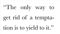
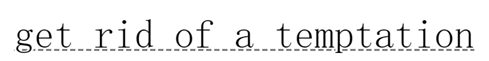
1. Hyphen line break
Question: When aligning the ends, the folding effect is sometimes really ugly.
Solution: Use the hyphens attribute.
Hyphens tells the browser how to use hyphens to connect words when changing lines. It can completely prevent the use of hyphens, control when the browser uses them, or let the browser decide when to use them.
It accepts three values: none, manual and auto. Its initial value is manual to match the existing behavior: we can use soft hyphens to break words manually.
width: 8.7em;
font: 180%/1.4 Baskerville, serif;
text-align: justify;
hyphens: auto;
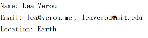
2. Insert newline
- Question: For table elements, how to make multiple < DD > elements in the same row and how to insert a newline after the last < DD > element
- Solution: Using pseudo-elements, insert line break "\ A" in the middle of <dd> <dt>.
Insert "," in the middle of < DD > < DD > using white-space: pre; reserve the space in the source code and the newline key code:
dd + dt::before {//Using pseudo-elements, insert the line break "\ A" in the middle of <dd> <dt>.
    content: "\A";
    white-space: pre;
}

dd + dd::before {//Insert ""in the middle of < DD > < dd>"
    content: ', ';
    font-weight: normal;
    margin-left: -.25em;
}
HTML:
<dl>
    <dt>Name:</dt>
    <dd>Lea Verou</dd>

    <dt>Email:</dt>
    <dd>lea@verou.me</dd>
    <dd>leaverou@mit.edu</dd>

    <dt>Location:</dt>
    <dd>Earth</dd>
</dl>
CSS:
dt, dd {
    display: inline;
    margin: 0;
}

dd {
    font-weight: 600;
}

dd + dt::before {//Using pseudo-elements, insert the line break "\ A" in the middle of <dd> <dt>.
    content: "\A";
    white-space: pre;
}

dd + dd::before {//Insert ""in the middle of < DD > < dd>"
    content: ', ';
    font-weight: normal;
    margin-left: -.25em;
}

body {
    font: 150%/1.6 Baskerville, Palatino, serif;
}
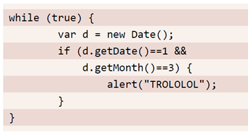
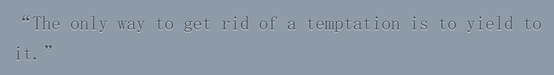
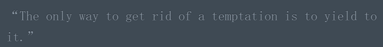
3. Zebra Stripes on Text Lines
- Solution: Using linear-gradient to create a stripe background to match the width and height of the stripe
- Note: padding can dislocate elements from the stripe background, so set background-origin:content-box on the background to eliminate the effect.
pre {
    padding: .5em;
    line-height: 1.5;
    background: hsl(20, 50%, 95%);
    background-image: linear-gradient(
                      rgba(120,0,0,.1) 50%, transparent 0);
    background-size: auto 3em; //Two elements
    background-origin: content-box;
    font-family: Consolas, Monaco, monospace;
}
code { font: inherit }
4. Adjust the width of tab
- Question: tab is 8 characters wide in the browser, and we usually adjust it to our usual width of 4 or 2.
tab-size: 2
5. Hyphenation
Problem: Some glyphs can cause display problems when they are adjacent to glyphs. For example, f and i in most serif fonts. In the third edition of css, font-variant-ligatures attribute is introduced.
font-variant-ligatures: comon-ligatures
                        discretionary-ligatures
                        historical-ligatures
6. Custom Underlines
Underline with background-image and its related attributes
a {
    background: linear-gradient(gray, gray) no-repeat;
    background-size: 100% 1px;
    background-position: 0 .9em;
    text-shadow: .05em 0 white, -.05em 0 white;
}
a {
    background: linear-gradient(90deg, gray 66%, transparent 0) repeat-x;
    background-size: .2em 2px;
    background-position: 0 .9em;
}
7. Textual effect in reality
Concave font effect
- Idea: Add light projection at the bottom or darker projection at the top
Bottom with light projection
p {
    padding: .8em 1em;
    background: hsl(210, 13%, 60%);
    color: hsl(210, 13%, 30%);
    text-shadow: 0 1px 1px hsla(0,0%,100%,.8);
}
Top with dark projection
p + p {
    background: hsl(210, 13%, 30%);
    color: hsl(210, 13%, 60%);
    text-shadow: 0 -1px 1px black;
}
Character protrusion effect
Idea: Use a long series of cumulative projections, without blurring, and gradually stagger with the span of 1px, so that the color gradually darkens, and then add a layer of strongly blurred dark projection to the bottom, so as to achieve the effect.
body {
    background: #58a;
    color: white;
    text-shadow: 0 1px hsl(0,0%,85%),
                 0 2px hsl(0,0%,80%),
                 0 3px hsl(0,0%,75%),
                 0 4px hsl(0,0%,70%),
                 0 5px hsl(0,0%,65%),//Brightness l gradually darkens
                 0 5px 10px black; //Add a strong blurred dark projection to the bottom
    font: bold 500%/1 Rockwell, serif;
}

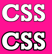
Hollow characters
Train of thought: using SVG edge-tracing method
<h1>CSS</h1>

<h1><svg overflow="visible" width="2em" height="1.2em"><use xlink:href="#css" /><text id="css" y="1em">CSS</text></svg></h1>
h1 {
    margin: 0;
    color: white;
}

h1:first-child { text-shadow: 1px 1px black, -1px -1px black, 1px -1px black, -1px 1px black; }

h1 text { fill: currentColor }
h1 use {
    stroke: black;
    stroke-width: 6;
    stroke-linejoin: round;
}

body {
    background: deeppink;
    font: bold 200%/1 Rockwell, serif;
}
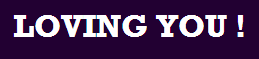
Outer glow of font
Idea: Prepare several overlapping text-shadow layers, regardless of offset, and keep the color the same as the font.
Transition effect can be added to make the mouse hover effect, transition:1s.
        a {
            padding: .5em;
            line-height:1.5;
            background: #203;
            color: white;
            transition: 1s;
        }

        a:hover {
            text-shadow: 0 0 .1em, 0 0 .3em;
        }
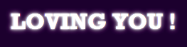
If the color of the font itself becomes transparent at hover, there will be a blurring effect.
    a:hover {
            color: transparent;
            text-shadow: 0 0 .1em white, 0 0 .3em white;
        }

Using filters to achieve blurring effect
a:hover {
            filter: blur(.1em);
        }

This article is compiled from CSS Revealing Secrets.