If you need to reproduce, please indicate the source: Flutter Learning Notes (24) -- Single ChildScrollView Scroll Component
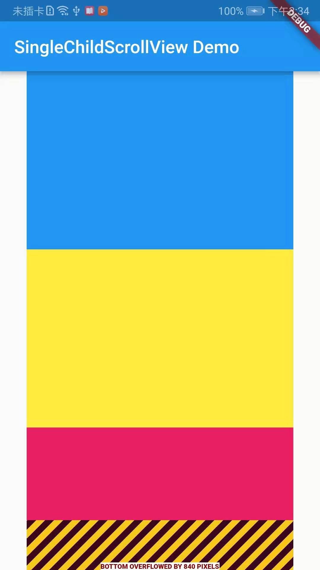
In our actual project development, we often encounter too much UI content on the page, which leads to an endless display of the mobile phone screen. Take Android as an example, when we encounter this kind of situation in Android, we usually use ScrollView to wrap up the content. If we do not do slidable processing, the content on Android will be displayed as the page. Some content can't be displayed, but in Flutter, if too much content can't be displayed completely, the screen boundary will give us a warning reminder of OVERFLOWED. In Flutter, we usually use SingleChildScrollView to handle sliding. It's important to note that SingleChildScrollView should only be in the expected content. This is because SingleChildScrollView does not support Liver-based delayed instantiation mode, so using SingleChildScrollView when it is expected that the viewport may contain too much content beyond the screen size will lead to poor performance, and some Sliver-enabled delayed loading should be used at this time. Scroll components, such as ListView.
Delayed build mode based on Liver:
Usually, the subcomponents of scrollable components may be very large, and the total height of scrollable components will be very large. If all the subcomponents are constructed at one time, the problem of poor performance will arise. For this reason, Flutter proposed a concept of Sliver (meaning "slice" in Chinese), if a scrollable component supports the Sliver model. Then the scrolling component can divide the sub-component into several slices (Sliver), and only when Sliver appears in the viewport will it be built. This model also becomes a "Sliver-based delayed build model". Many of the scrollable components support Liver-based delayed build models, such as ListView and GridView, but others do not support the model, such as Single ChildScrollView.
import 'package:flutter/material.dart';

void main() => runApp(DemoApp());

class DemoApp extends StatelessWidget {
  @override
  Widget build(BuildContext context) {
    return new MaterialApp(
      title: 'SingleChildScrollView Demo',
      home: new Scaffold(
        appBar: AppBar(
          title: new Text('SingleChildScrollView Demo'),
        ),
        body: new Center(
          child: new Column(
            children: <Widget>[
              Container(
                width: 300.0,
                height: 200.0,
                color: Colors.blue,
              ),
              Container(
                width: 300.0,
                height: 200.0,
                color: Colors.yellow,
              ),
              Container(
                width: 300.0,
                height: 200.0,
                color: Colors.pink,
              ),
              Container(
                width: 300.0,
                height: 200.0,
                color: Colors.blue,
              ),
            ],
          ),
        ),
      ),
    );
  }
}
The SingleChildScrollView component is needed to implement page sliding in Flutter. Similar to ScrollView in Android, SingleChildScrollView can only receive one sub-component. First, look at the source code of SingleChildScrollView:
const SingleChildScrollView({
  Key key,
  //Scroll direction, default is vertical direction
  this.scrollDirection = Axis.vertical,
  //Whether to slide in the opposite direction of reading
  this.reverse = false,
  //Content margin
  this.padding,
  //Whether to use widget Default in the tree PrimaryScrollController
  bool primary,
  //This property accepts a ScrollPhysics Type of object that determines how it can scroll in response to user actions, such as how the user continues to animate after he has finished sliding up his finger, or how to display when he slides to the boundary.
  //By default, Flutter Different platforms will be used separately ScrollPhysics Objects, corresponding to different display effects, such as when sliding to the boundary, continue to drag, in the iOS There will be elastic effect.
  //While in Android There will be a low-light effect. If you want to use the same effect on all platforms, you can specify a fixed one. ScrollPhysics.
  //Flutter SDK Contains two ScrollPhysics A subclass. One.ClampingScrollPhysics: Android Low light effect, 2.BouncingScrollPhysics: iOS Lower elastic effect
  this.physics,
  //This property receives one ScrollController Objects, ScrollController The main function is to control rolling position and monitor rolling events.
  //By default, Widget There will be a default in the tree PrimaryScrollController,If the scrollable component in the subtree is not specified controller,also primary Attribute value true When the scrollable component uses this default ScrollController.
  //The advantage of this mechanism is that the parent component can control scrollable scrollable behavior in the subtree, for example: scaffold It is precisely using this mechanism that iOS The function of clicking navigation back to the top is realized.
  this.controller,
  this.child,
})
Demo example:
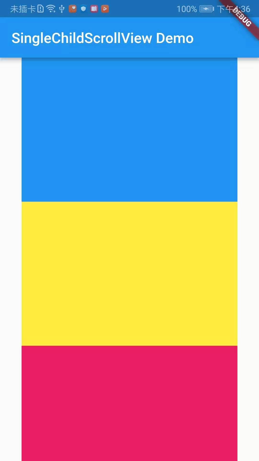
import 'package:flutter/material.dart';

void main() => runApp(DemoApp());

class DemoApp extends StatelessWidget {
  @override
  Widget build(BuildContext context) {
    return new MaterialApp(
      title: 'SingleChildScrollView Demo',
      home: new Scaffold(
        appBar: AppBar(
          title: new Text('SingleChildScrollView Demo'),
        ),
        body: new SingleChildScrollView(
          physics: BouncingScrollPhysics(),
          child: new Center(
            child: new Column(
              children: <Widget>[
                Container(
                  width: 300.0,
                  height: 200.0,
                  color: Colors.blue,
                ),
                Container(
                  width: 300.0,
                  height: 200.0,
                  color: Colors.yellow,
                ),
                Container(
                  width: 300.0,
                  height: 200.0,
                  color: Colors.pink,
                ),
                Container(
                  width: 300.0,
                  height: 200.0,
                  color: Colors.blue,
                ),
              ],
            ),
          ),
        ),
      ),
    );
  }
}
Effect screenshots: