If you need to reproduce, please indicate the source: Flutter Learning Notes (22) -- Layout Widget s for Single Subelements
Flutter has been learning for some time, Demo has used a lot of widgets, think about the overall combing, so today combines with Flutter Chinese Web and books combing the use of Widget s, first combing the layout of widgets with a single sub-element.
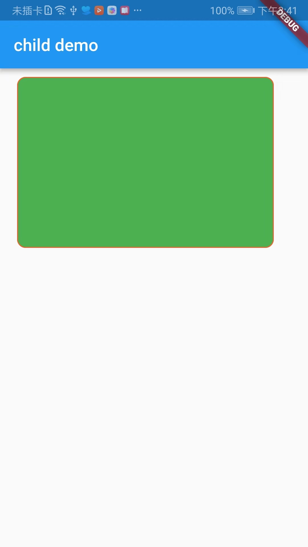
- Container: A Widget with Drawing, Locating, and Sizing
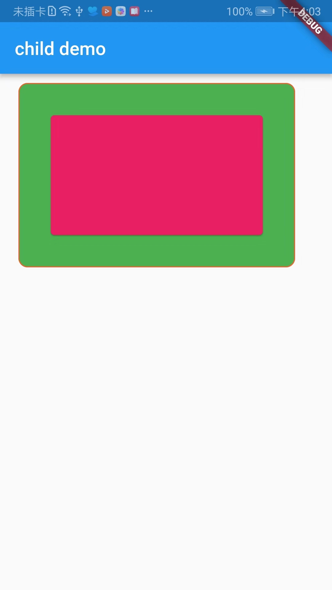
- Padding: A Widget that adds a specified fill to its child Widget
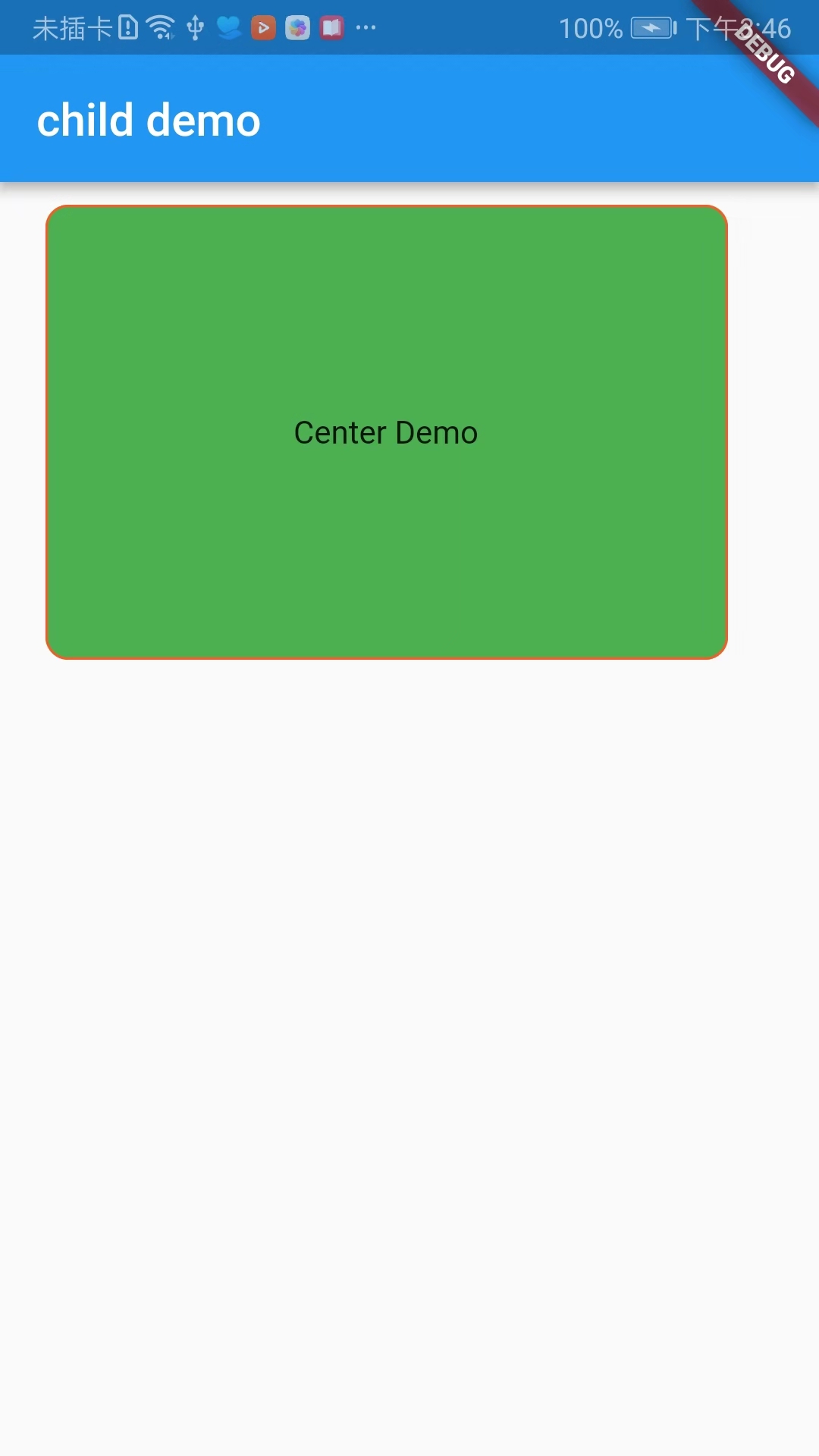
- Center: Centralize its child widgets and display them inside itself
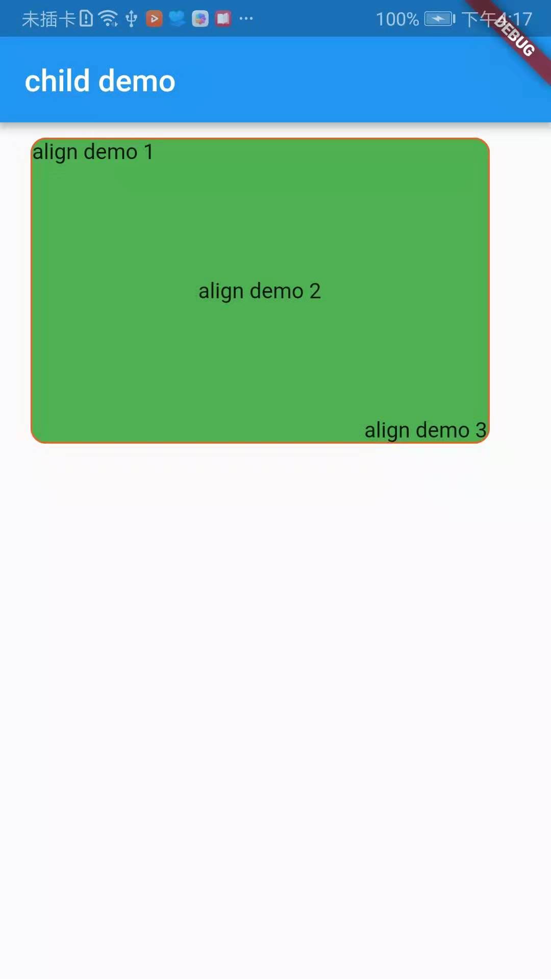
- Align: A widget that can automatically resize its child widgets to their size
- FittedBox: Adjust the size and location of its child Widget to its own size
- Baseline: Widget s that locate the positions of subitems based on their baselines
- Offstage: A layout Widget that controls the display and hiding of its child widgets
- Limited Box: A box that limits its size when it is not constrained by itself
- Overflow Box: Widget s that impose different constraints on their children, which may allow children to overflow their parents
- SizedBox: A box of a specific size, a Widget that forces its children to have a characteristic width and height. If the width or height is Null, the widget will resize itself to match the size of the child in that dimension
Next, follow the Widget s listed above, write Demos one by one, each Demo will be annotated, and will be accompanied by screenshots of the effects.
-
Container
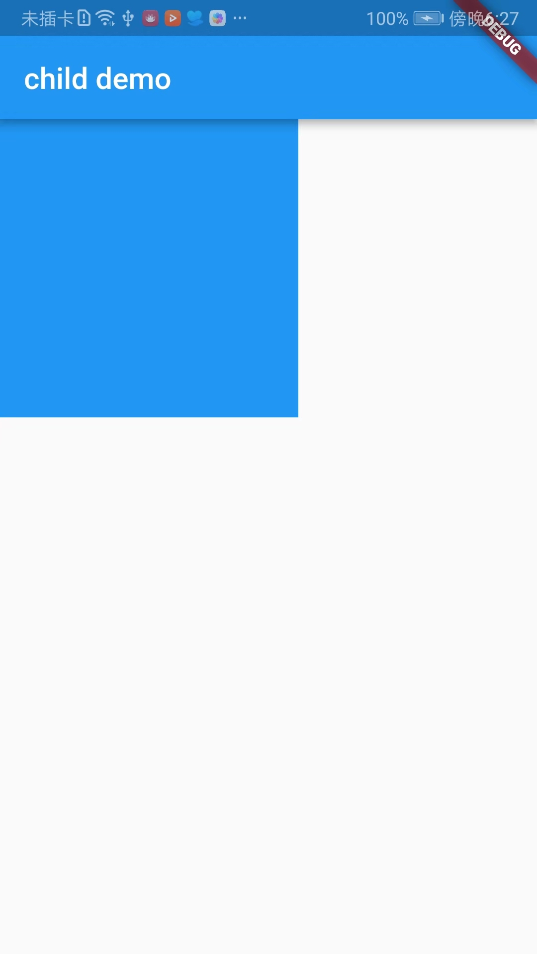
import 'package:flutter/material.dart';

void main() => runApp(DemoApp());

class DemoApp extends StatelessWidget{
  @override
  Widget build(BuildContext context) {
    return new MaterialApp(
      title: 'child demo',
      home: new Scaffold(
        appBar: AppBar(
          title: new Text('child demo'),
        ),
        body: new _containerDemo(),
      ),
    );
  }
}

class _containerDemo extends StatelessWidget {
  @override
  Widget build(BuildContext context) {
    return new Container(
      width: 300.0,
      height: 200.0,
//          color: Colors.cyan,
      margin: EdgeInsets.only(left: 20.0,top: 10.0,right: 0,bottom: 0),
      decoration: new BoxDecoration(
          color: Colors.green,//Filling colour
          border: new Border.all(
            color: Colors.deepOrange,//Border color
          ),
          borderRadius: BorderRadius.all(Radius.circular(10.0))//Roundness
      ),
    );
  }
}
-
Padding
import 'package:flutter/material.dart';

void main() => runApp(DemoApp());

class DemoApp extends StatelessWidget{
  @override
  Widget build(BuildContext context) {
    return new MaterialApp(
      title: 'child demo',
      home: new Scaffold(
        appBar: AppBar(
          title: new Text('child demo'),
        ),
        body: new _containerDemo(),
      ),
    );
  }
}

class _paddingDemo extends StatelessWidget {
  @override
  Widget build(BuildContext context) {
    return new Padding(
        padding: EdgeInsets.all(30.0),
        child: new Card(
          color: Colors.pink,
        ),
    );
  }
}

class _containerDemo extends StatelessWidget {
  @override
  Widget build(BuildContext context) {
    return new Container(
      width: 300.0,
      height: 200.0,
//          color: Colors.cyan,
      margin: EdgeInsets.only(left: 20.0,top: 10.0,right: 0,bottom: 0),
      decoration: new BoxDecoration(
          color: Colors.green,//Filling colour
          border: new Border.all(
            color: Colors.deepOrange,//Border color
          ),
          borderRadius: BorderRadius.all(Radius.circular(10.0))//Roundness
      ),
      child: new _paddingDemo(),
    );
  }
}

class _centerDemo extends StatelessWidget {
  @override
  Widget build(BuildContext context) {
    return new Center(
      child: Text('Center Demo'),
    );
  }
}
-
Center
import 'package:flutter/material.dart';

void main() => runApp(DemoApp());

class DemoApp extends StatelessWidget{
  @override
  Widget build(BuildContext context) {
    return new MaterialApp(
      title: 'child demo',
      home: new Scaffold(
        appBar: AppBar(
          title: new Text('child demo'),
        ),
        body: new _containerDemo(),
      ),
    );
  }
}

class _containerDemo extends StatelessWidget {
  @override
  Widget build(BuildContext context) {
    return new Container(
      width: 300.0,
      height: 200.0,
//          color: Colors.cyan,
      margin: EdgeInsets.only(left: 20.0,top: 10.0,right: 0,bottom: 0),
      decoration: new BoxDecoration(
          color: Colors.green,//Filling colour
          border: new Border.all(
            color: Colors.deepOrange,//Border color
          ),
          borderRadius: BorderRadius.all(Radius.circular(10.0))//Roundness
      ),
      child: new _centerDemo(),
    );
  }
}

class _centerDemo extends StatelessWidget {
  @override
  Widget build(BuildContext context) {
    return new Center(
      child: Text('Center Demo'),
    );
  }
}
-
Align
import 'package:flutter/material.dart';

void main() => runApp(DemoApp());

class DemoApp extends StatelessWidget{
  @override
  Widget build(BuildContext context) {
    return new MaterialApp(
      title: 'child demo',
      home: new Scaffold(
        appBar: AppBar(
          title: new Text('child demo'),
        ),
        body: new _containerDemo(),
      ),
    );
  }
}


class _containerDemo extends StatelessWidget {
  @override
  Widget build(BuildContext context) {
    return new Container(
      width: 300.0,
      height: 200.0,
//          color: Colors.cyan,
      margin: EdgeInsets.only(left: 20.0,top: 10.0,right: 0,bottom: 0),
      decoration: new BoxDecoration(
          color: Colors.green,//Filling colour
          border: new Border.all(
            color: Colors.deepOrange,//Border color
          ),
          borderRadius: BorderRadius.all(Radius.circular(10.0))//Roundness
      ),
      child: new _alignDemo(),
    );
  }
}

class _alignDemo extends StatelessWidget {
  @override
  Widget build(BuildContext context) {
    return new Stack(
      children: <Widget>[
        new Align(
          child: new Text('align demo 1'),
          alignment: FractionalOffset.topLeft,//Top left corner
        ),
        new Align(
          child: new Text('align demo 2'),
          alignment: FractionalOffset.center,//Center in horizontal and vertical directions
        ),
        new Align(
          child: new Text('align demo 3'),
          alignment: FractionalOffset.bottomRight,//Lower right corner
        ),
      ],
    );
  }
}
-
FittedBox
Layout behavior can be divided into two situations:
1. If there are external constraints, adjust its size according to the external constraints, then zoom in and adjust the child, and layout according to the specified conditions.
2. If there are no external constraints, the size of the child is the same, and the specified zoom and location attributes will not work.
FittedBox has two important properties, fit and alignment.
fit: The default attribute is BoxFit.Contain. The child is as large as possible in the FittedBox range, but it will not exceed its size. It should be noted here that contain is as full as possible under the premise of maintaining the wide-to-height ratio of the child. Normally, when the width or height reaches the maximum value, it will stop. Stop zooming.
BoxFit.none: There is no filling mode.
BoxFit.fill: Full coverage, not filled in accordance with the aspect ratio, content will not exceed the scope of the container.
BoxFit.contain: Fill in the same ratio of width to height mode, content will not exceed the container range.
BoxFit.cover: Fill the entire container pattern with the original size, and the content may exceed the container.
BoxFit.width: Fill the entire container with content width, and the content will not exceed the container.
BoxFit.height: Fill the entire container according to the height of the content, and the content will not exceed the container.
-
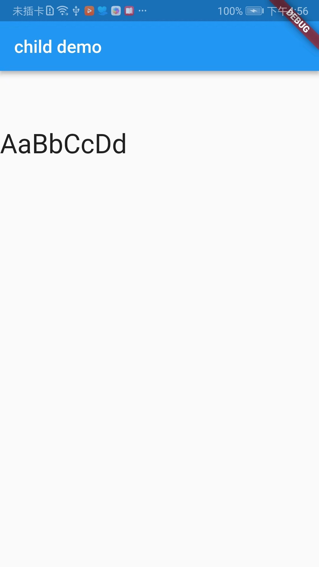
Baseline
Baseline baseline refers to placing the bottom of all elements on the same horizontal line.
import 'package:flutter/material.dart';

void main() => runApp(DemoApp());

class DemoApp extends StatelessWidget{
  @override
  Widget build(BuildContext context) {
    return new MaterialApp(
      title: 'child demo',
      home: new Scaffold(
        appBar: AppBar(
          title: new Text('child demo'),
        ),
        body: new _baselineDemo(),
      ),
    );
  }
}

class _baselineDemo extends StatelessWidget {
  @override
  Widget build(BuildContext context) {
    return new Row(
      children: <Widget>[
        new Baseline(
            baseline: 100.0,
            baselineType: TextBaseline.ideographic,
            child: new Text('AaBbCcDd',style: TextStyle(fontSize: 30.0),),
        ),
      ],
    );
  }
}
-
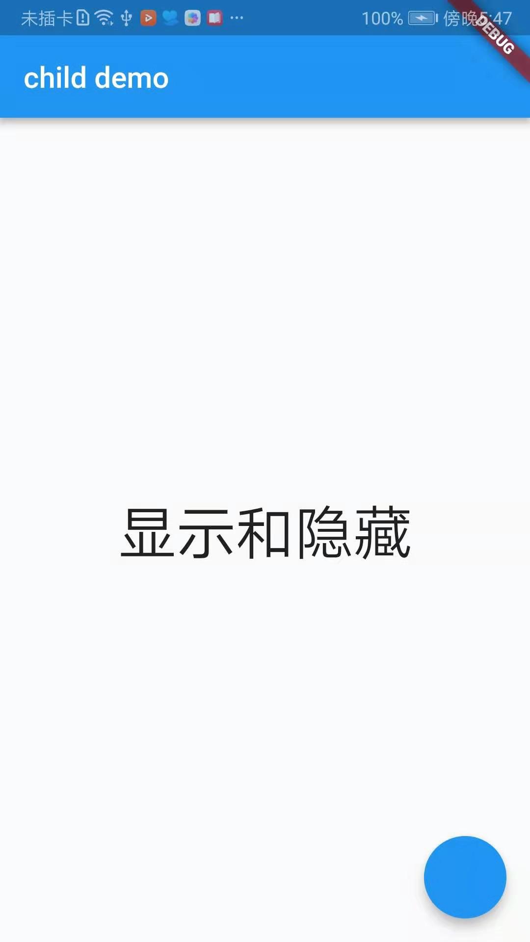
Offstage
The function of Offstage is very simple. It is also a common component to control whether the child is displayed or not through a parameter.
offstage attribute: The default is true, which means no display. When false, the component is displayed.
import 'package:flutter/material.dart';

void main() => runApp(DemoApp());

class DemoApp extends StatelessWidget{
  @override
  Widget build(BuildContext context) {
    return new MaterialApp(
      title: 'child demo',
      home: new _offstageDemo()
    );
  }
}

class _offstageDemo extends StatefulWidget {
  @override
  State<StatefulWidget> createState() {
    // TODO: implement createState
    return new _offstageDemoState();
  }
}

class _offstageDemoState extends State {
  bool _offstage = false;
  @override
  Widget build(BuildContext context) {
    return new Scaffold(
      appBar: AppBar(
        title: new Text('child demo'),
      ),
      floatingActionButton: FloatingActionButton(onPressed: (){
        setState(() {
          _offstage = !_offstage;
        });
      }),
      body: new Center(
        child: new Offstage(
          offstage: _offstage,
          child: new Text('Display and hide',style: TextStyle(fontSize: 40.0),),
        ),
      ),
    );
  }
}
-
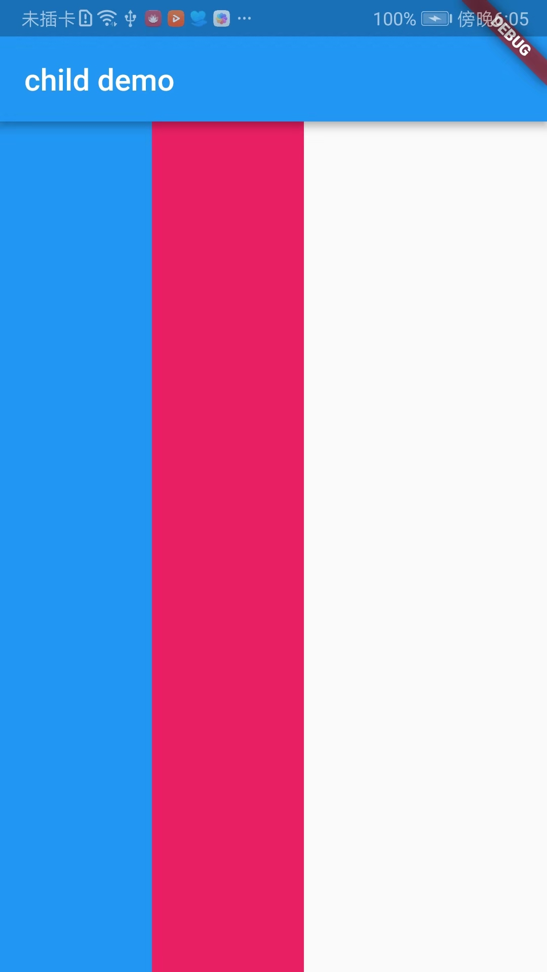
LimitedBox
import 'package:flutter/material.dart';

void main() => runApp(DemoApp());

class DemoApp extends StatelessWidget{
  @override
  Widget build(BuildContext context) {
    return new MaterialApp(
      title: 'child demo',
      home: new Scaffold(
        appBar: AppBar(
          title: new Text('child demo'),
        ),
        body: new Row(
          children: <Widget>[
            new Container(
              width: 100.0,
              color: Colors.blue,
            ),
            new LimitedBox(
              maxWidth: 100,
              child: new Container(
                color: Colors.pink,
                width: 300,
              ),
            )
          ],
        ),
      )
    );
  }
}
-
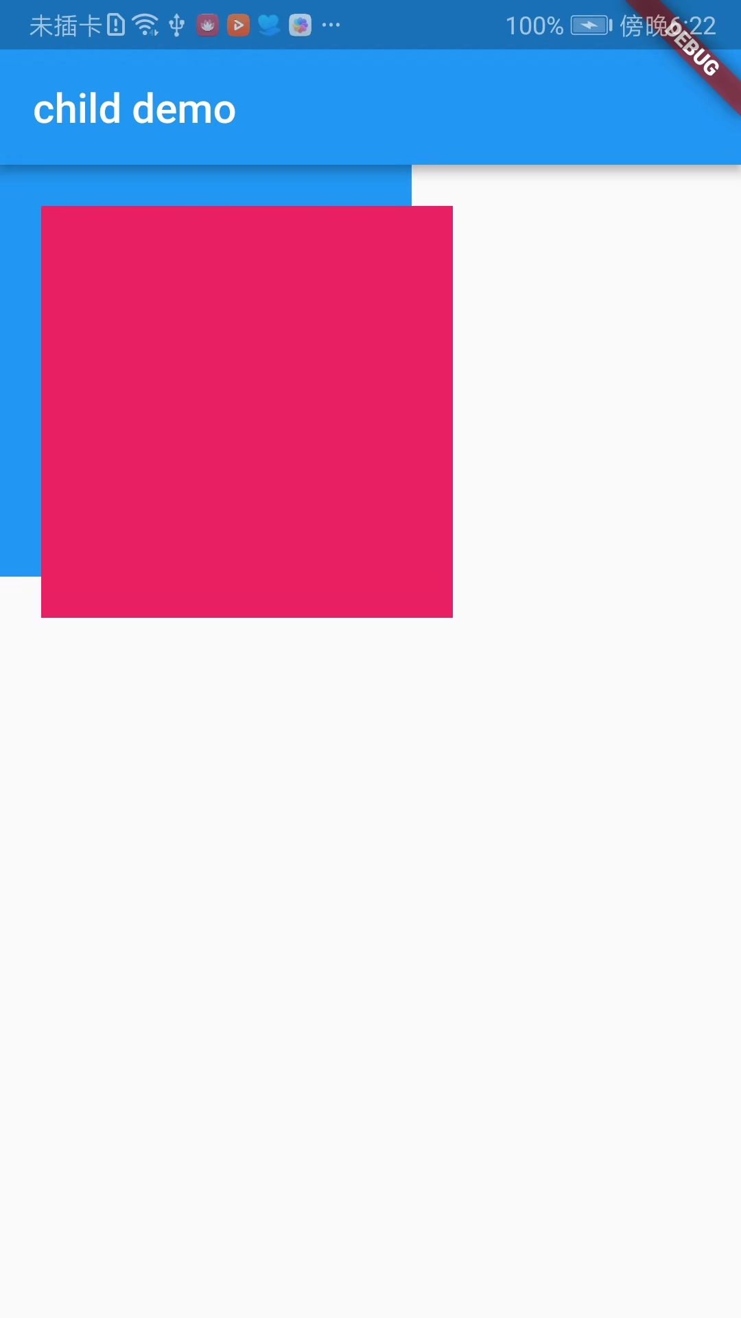
OverflowBox
import 'package:flutter/material.dart';

void main() => runApp(DemoApp());

class DemoApp extends StatelessWidget{
  @override
  Widget build(BuildContext context) {
    return new MaterialApp(
      title: 'child demo',
      home: new Scaffold(
        appBar: AppBar(
          title: new Text('child demo'),
        ),
        body: new Container(
          color: Colors.blue,
          width: 200,
          height: 200,
          padding: EdgeInsets.all(20.0),
          child: new OverflowBox(
            alignment: Alignment.topLeft,
            maxWidth: 200,
            maxHeight: 200,
            child: new Container(
              color: Colors.pink,
            ),
          ),
        ),
      )
    );
  }
}
-
SizedBox
The SizedBox component is a box of a specific size that forces its child to have a specific width and height. If the width and height are null, the component will resize itself to match the size of the child in that dimension.
import 'package:flutter/material.dart';

void main() => runApp(DemoApp());

class DemoApp extends StatelessWidget{
  @override
  Widget build(BuildContext context) {
    return new MaterialApp(
      title: 'child demo',
      home: new Scaffold(
        appBar: AppBar(
          title: new Text('child demo'),
        ),
        body: new SizedBox(
          width: 200,
          height: 200,
          child: new Container(
            width: 100,
            height: 600,
            color: Colors.blue,
          ),
        ),
      )
    );
  }
}
The above is the arrangement of widgets for single sub-elements, not very complete, I just combed the widgets that I think may be used frequently in development, and it is also convenient for me to view later!!!