If you need to reproduce it, please indicate the source: Flutter Learning Notes (21) --TextField Text Box Component and Card Card Component
Today, let's learn about the TextField text box and Card card components.
As long as the application is interactive, almost all applications will have username, password input box, search box and so on. We have written a Form-based input function before. Today, let's take a look at the TextField text box component. TextField component is the most common interactive way, TextField componentIs the component used for text input.Note that this should be distinguished from the Text component, which is mainly used to display text and cannot accept input text.
-
TextField Text Box Component
TextField component construction method:
const TextField({
Key key,
// controller yes TextField Controller, when TextField Callback when editing,
// If not set TextField Create your own by default controller,The point is if there are two TextField Use one controller,So if you type in one, the other will synchronize
this.controller,
this.focusNode,//Focus control
this.decoration = const InputDecoration(),//TextFieldDecorator, used to control the appearance and tips of TextField, etc.
TextInputType keyboardType,//Keyboard type, with number,phone,emailAddress,text etc.
this.textInputAction,//Keyboard event type, with send,search etc.
this.textCapitalization = TextCapitalization.none,//
this.style,//Style of input text
this.strutStyle,
this.textAlign = TextAlign.start,//Alignment, default start position alignment
this.textDirection,//Text direction, left to right by default
this.autofocus = false,//Whether to get focus automatically, default false
this.obscureText = false,//Whether the text content is encrypted or not, default false
this.autocorrect = true,//Whether to correct automatically
this.maxLines = 1,//Maximum number of rows
this.minLines,//Minimum number of rows
this.expands = false,
this.maxLength,//Maximum length
this.maxLengthEnforced = true,//Over maximum length input, error prompted, default true,If set false,You can continue typing but will be prompted for errors
this.onChanged,//Callback when content changes
this.onEditingComplete,//Callback when edit is complete
this.onSubmitted,//Callback on submission
this.inputFormatters,//A format that allows input, such as only numbers or letters
this.enabled,//Is Disabled
this.cursorWidth = 2.0,//Cursor Width
this.cursorRadius,//Cursor rounded corners
this.cursorColor,//Cursor color
this.keyboardAppearance,
this.scrollPadding = const EdgeInsets.all(20.0),
this.dragStartBehavior = DragStartBehavior.start,
this.enableInteractiveSelection,
this.onTap,//Called when the control is clicked
this.buildCounter,
this.scrollPhysics,
})
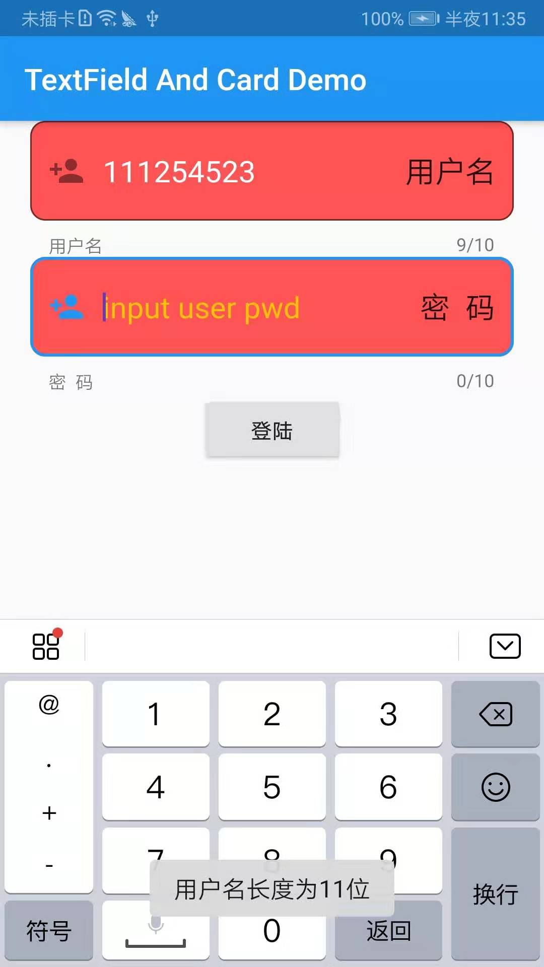
Simple implementation of a login function, limit the user name input box to enter content length of 10 bits, less than 10 bits, to toast prompt, Demo example:
import 'package:flutter/material.dart';
import 'package:fluttertoast/fluttertoast.dart';

void main() => runApp(DemoApp());

class DemoApp extends StatelessWidget{
  final TextEditingController _useController = new TextEditingController();
  final TextEditingController _pwdController = new TextEditingController();
  @override
  Widget build(BuildContext context) {
    _useController.addListener((){
      Fluttertoast.showToast(msg: 'You entered: ${_useController.text}');
    });
    return new MaterialApp(
      title: 'TextField And Card Demo',
      debugShowCheckedModeBanner: false,
      home: new Scaffold(
        appBar: AppBar(
          title: new Text('TextField And Card Demo'),
        ),
        body: new Column(
          children: <Widget>[
            Padding(
              padding: EdgeInsets.only(left: 20,top: 0,right: 20,bottom: 0),
              child: TextField(
                  controller: _useController,//binding controller
                  maxLines: 1,//Up to one line
                  maxLength: 10,//Enter up to 10 characters
                  autofocus: true,//Auto Focus
                  textAlign: TextAlign.left,//Align left to right
                  style: new TextStyle(color: Colors.white,fontSize: 20.0),//Enter content color and font size
                  cursorColor: Colors.deepPurple,//Cursor color
                  keyboardType: TextInputType.phone,
                  decoration: InputDecoration(
                    //Add decorative effect
                    filled: true,//Is the background filled
                    fillColor: Colors.redAccent,//Add a yellow fill color ( filled: true Must be set, otherwise setting the fill color separately will not take effect)
                    helperText: 'User name',
                    prefixIcon: Icon(Icons.person_add),//Left Icon
                    suffixText: 'User name',//Right Text Tip
                    suffixStyle: new TextStyle(fontSize: 20),//Right Tip Text Font Size
                    hintText: 'input user name',//hint Prompt copy
                    hintStyle: new TextStyle(color: Colors.amber),//hint Tip Copy Font Color
                    border: OutlineInputBorder(
                      borderRadius: BorderRadius.circular(10.0),//Add rounded corners
                    ),
                  )
              ),
            ),
            Padding(
              padding: EdgeInsets.only(left: 20,top: 0,right: 20,bottom: 0),
              child: TextField(
                  controller: _pwdController,//binding controller
                  maxLines: 1,//Up to one line
                  maxLength: 10,//Enter up to 10 characters
                  autofocus: true,//Auto Focus
                  textAlign: TextAlign.left,//Align left to right
                  style: new TextStyle(color: Colors.white,fontSize: 20.0),//Enter content color and font size
                  cursorColor: Colors.deepPurple,//Cursor color
                  keyboardType: TextInputType.phone,
                  decoration: InputDecoration(
                    //Add decorative effect
                    filled: true,//Is the background filled
                    fillColor: Colors.redAccent,//Add a yellow fill color ( filled: true Must be set, otherwise setting the fill color separately will not take effect)
                    helperText: 'Password',
                    prefixIcon: Icon(Icons.person_add),//Left Icon
                    suffixText: 'Password',//Right Text Tip
                    suffixStyle: new TextStyle(fontSize: 20),//Right Tip Text Font Size
                    hintText: 'input user pwd',//hint Prompt copy
                    hintStyle: new TextStyle(color: Colors.amber),//hint Tip Copy Font Color
                    border: OutlineInputBorder(
                      borderRadius: BorderRadius.circular(10.0),//Add rounded corners
                    ),
                  )
              ),
            ),
            RaisedButton(
                onPressed: _loginSubmit,
                child: new Text('Land'),
            )
          ],
        ),
      ),
    );
  }

  void _loginSubmit() {
    if(_useController.text.length != 10){
      Fluttertoast.showToast(msg: 'User name length is 11 bits');
    }
  }
}
Effect Screenshot:
Each of the above property settings has very detailed comments, so here are a few easy-to-walk pits to talk about!
1. Multiple TextFields must correspond to multiple controllers. Otherwise, multiple TextFields using the same controller will cause the contents of one input box to synchronize with other input boxes:
  final TextEditingController _useController = new TextEditingController();
  final TextEditingController _pwdController = new TextEditingController();
2. If you want to set the background fill color for TextField, the two properties filled and fillColor must appear in pairs, or you will find that the setting does not work:
filled: true,//Is the background filled
fillColor: Colors.redAccent,//Add a yellow fill color ( filled: true Must be set, otherwise setting the fill color separately will not take effect)
3. Get the input from the input box through the controller:
_useController.text
4. TextFieldContent change monitoring, generally used as amount input for dynamic calculation operations:
onChanged: (value){
    Fluttertoast.showToast(msg: value);
},
5.TextField decorator construction method
InputDecoration({
    this.icon,    //Picture outside decorator and in front of input box
    this.labelText,  //Used to describe an input box, such as whether it is used to enter a username or password, that floats up by default when it gets focus.
    this.labelStyle,  // control labelText Style,Receive one TextStyle Value of type
    this.helperText, //Auxiliary text, located below the input box, if errorText If it is not empty, helperText Will not show
    this.helperStyle, //helperText Style
    this.hintText,  //Prompt text, inside input box
    this.hintStyle, //hintText Style
    this.hintMaxLines, //Maximum number of rows of prompt information
    this.errorText,  //Error message prompt
    this.errorStyle, //errorText Style
    this.errorMaxLines,   //errorText Maximum number of rows
    this.hasFloatingPlaceholder = true,  //labelText Float or not, default is true,Modify to false be labelText Do not float and do not show when the input box gets focus
    this.isDense,   //Change whether the input box is dense or not, defaulting to false,Modify to true When the icon and spacing are reduced
    this.contentPadding, //Interior Spacing
    this.prefixIcon,  //The icon at the start of the input box.
    this.prefix,   //Prefilled Widget,with prefixText Only one can appear at a time
    this.prefixText,  //Pre-filled text, such as cell phone number preceded by area code, etc.
    this.prefixStyle,  //prefixText Style
    this.suffixIcon, //Picture behind input box,For example, a normal input box has an eye behind it to control whether the input is clear text or not
    this.suffix,  //The control at the end of the input box cannot be the same as the suffixText Use simultaneously
    this.suffixText,//Filled text at the end
    this.suffixStyle,  //suffixText Style
    this.counter,//A small control located at the lower right of the input box cannot be used with counterText Use simultaneously
    this.counterText,//Text displayed at the bottom right, often used to show the number of characters entered
    this.counterStyle, //counterText Style
    this.filled,  //If is true,Enter Use fillColor Specified color fill
    this.fillColor,  //Equivalent to background color of input box
    this.errorBorder,   //errorText Not empty, the border to be displayed when the input box has no focus
    this.focusedBorder,  //Border when input box has focus,If errorText This property is invalid if it is not empty
    this.focusedErrorBorder,  //errorText Border when input box has focus when not empty
    this.disabledBorder,  //The border displayed when the input box is disabled if errorText This property is invalid if it is not empty
    this.enabledBorder,  //The border to display when the input box is available, if errorText This property is invalid if it is not empty
    this.border, //Normally border
    this.enabled = true,  //Is Input Box Available
    this.semanticCounterText,
    this.alignLabelWithHint,
  })
-
Card Card Component
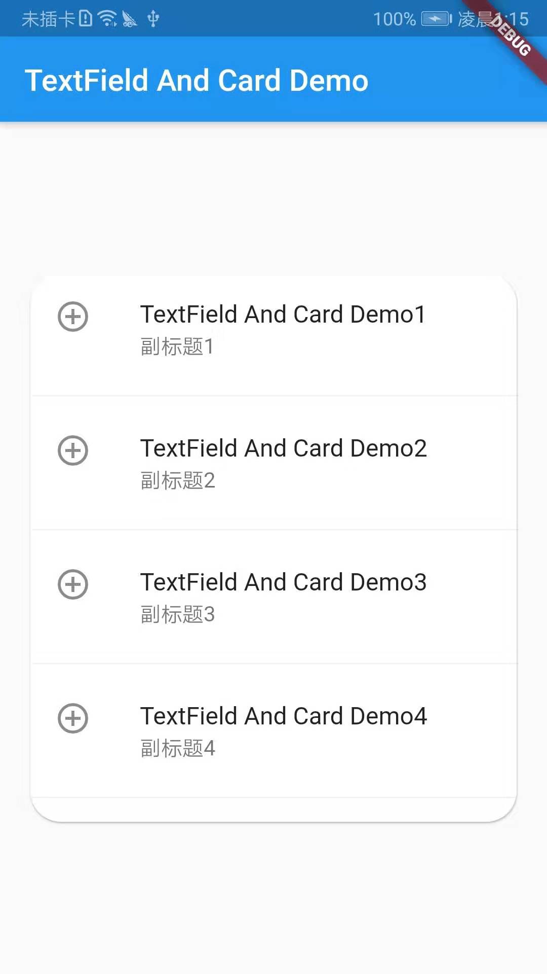
Card is a card component block. The content can be made up of most types of widgets, but it is often used with ListTitle. Card has a child, but it can be a column, row, grid, or other Widget that supports multiple children.By default, Cards are reduced to 0 pixels in size, and you can use SizeBox to limit the size of Cards, which have rounded corners and shadows in Flutter.
demo example:
import 'package:flutter/material.dart';
import 'package:fluttertoast/fluttertoast.dart';

void main() => runApp(DemoApp());

class DemoApp extends StatelessWidget{
  @override
  Widget build(BuildContext context) {
    // TODO: implement build
    return new MaterialApp(
      title: 'TextField And Card Demo',
      home: Scaffold(
        appBar: AppBar(
          title: new Text('TextField And Card Demo'),
        ),
        body: Center(
          child: new SizedBox(
            height: 360,
            child: Card(
              color: Colors.white,
              margin: EdgeInsets.only(left: 20,top: 0,right: 20,bottom: 0),
              shape: RoundedRectangleBorder(borderRadius: BorderRadius.circular(20)),//Set rounded corners
              child: Column(
                children: <Widget>[
                  new ListTile(
                    leading: Icon(Icons.add_circle_outline),
                    title: new Text('TextField And Card Demo1'),
                    subtitle: new Text('Subtitle 1'),
                  ),
                  new Divider(),
                  new ListTile(
                    leading: Icon(Icons.add_circle_outline),
                    title: new Text('TextField And Card Demo2'),
                    subtitle: new Text('Subtitle 2'),
                    onTap: (){

                    },
                  ),
                  new Divider(),
                  new ListTile(
                    leading: Icon(Icons.add_circle_outline),
                    title: new Text('TextField And Card Demo3'),
                    subtitle: new Text('Subtitle 3'),
                  ),
                  new Divider(),
                  new ListTile(
                    leading: Icon(Icons.add_circle_outline),
                    title: new Text('TextField And Card Demo4'),
                    subtitle: new Text('Subtitle 4'),
                  ),
                  new Divider(),
                ],
              ),
            ),
          ),
        )
      ),
    );
  }
}
Effect Screenshot:
That's what I learned today!!!