If you need to reproduce, please indicate the source: Flutter Learning Notes (17) -- Top Navigation TabBar, TabBarView, Default TabController
In the last article, we talked about the bottom navigation component of Bottm Navigation Bar. Today, let's learn about the top navigation component TabBar. The TabBar tab is usually located below the AppBar. TabBarView and TabController are commonly used with the TabBar (top navigation tab).
TabBar: Options component of the Tab page, which is arranged horizontally by default.
TabBarView: Tab page content container, Tab page content is generally processed to change as the tab changes.
TabController: The controller of TabBar and TabBarView, which is the bridge between the two components.
| Property name | type | Explain |
| isScrollable | bool | Can I move horizontally? |
| tabs | List<Widget> | Tab Options List |
| Property name | type | Explain |
| icon | Widget | Tab Icon |
| text | String | Tab text |
| Property name | type | Explain |
| controller | TabController | Controller for Specifying Views |
| children | List<Widget> | The child of the view component is a list, and a tab corresponds to a view. |
The TabController we mentioned above is in parallel with DefaultTabController. The difference between them is that TabController is generally used in stateful components, while DefaultTabController is generally used in stateless components.
Next, a Demo is implemented by associating TabBar and TabBarView with DefalutTabController:
import 'package:flutter/material.dart';
void main() => runApp(MyApp());
class MyApp extends StatelessWidget{
final List<Tab> _myTabs = <Tab>[
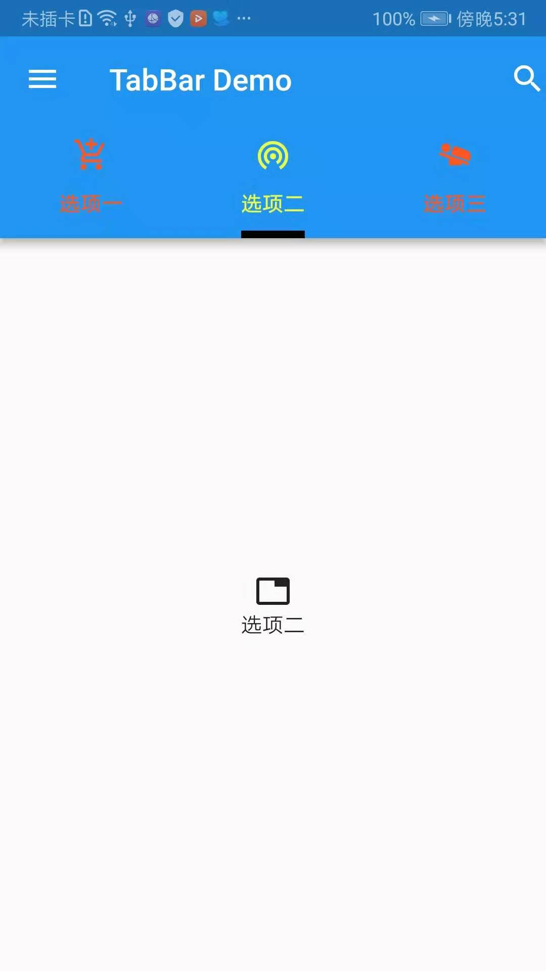
Tab(text: 'Option 1',icon: Icon(Icons.add_shopping_cart),),
Tab(text: 'Option 2',icon: Icon(Icons.wifi_tethering),),
Tab(text: 'Option 3',icon: Icon(Icons.airline_seat_flat_angled),)
];
@override
Widget build(BuildContext context) {
return new MaterialApp(
debugShowCheckedModeBanner: false,
title: 'TabBar Demo',
home: new Scaffold(
body: DefaultTabController(
length: _myTabs.length,
initialIndex: 1,
child: Scaffold(
appBar: new AppBar(
title: new Text('TabBar Demo'),
leading: Icon(Icons.menu),
actions: <Widget>[
Icon(Icons.search)
],
bottom: new TabBar(
tabs: _myTabs,
indicatorColor: Colors.black,
indicatorWeight: 5,
indicatorSize: TabBarIndicatorSize.label,
labelColor: Colors.limeAccent,
unselectedLabelColor: Colors.deepOrange,
),
),
body: new TabBarView(
children: _myTabs.map((Tab tab){
return Center(
child: new Column(
mainAxisSize: MainAxisSize.min,
children: <Widget>[
Icon(Icons.tab),
Text(tab.text)
],
),
);
}).toList(),
),
)
),
),
);
}
}
Effect screenshots:
Next, take a look at the constructors of DefaultTabController, TabBar, and TabBarView, respectively.
- DefaultTabController
  const DefaultTabController({
    Key key,
    @required this.length,
    this.initialIndex = 0,
    @required this.child,
  }) : assert(initialIndex != null),
       super(key: key);
- TabBar
  const TabBar({
    Key key,
    @required this.tabs,//Tab objects are usually used to display tag content, or other widgets.
    this.controller,//TabController object
    this.isScrollable = false,//Can I scroll?
    this.indicatorColor,//Indicator color
    this.indicatorWeight = 2.0,//Height of Indicator
    this.indicatorPadding = EdgeInsets.zero,//padding at the bottom of the indicator
    this.indicator,//Indicator decoration, such as border, etc.
    this.indicatorSize,//Calculating the size of the indicator, TabBar Indicator Size.tab: Follow each other tab Equal width, TabBarIndicatorSize.label: Equal width with text
    this.labelColor,//Select the label color
    this.labelStyle,//Select the label style
    this.labelPadding,each label Of padding
    this.unselectedLabelColor,//Unselected label color
    this.unselectedLabelStyle,//Unselected label style
  }) : assert(tabs != null),
       assert(isScrollable != null),
       assert(indicator != null || (indicatorWeight != null && indicatorWeight > 0.0)),
       assert(indicator != null || (indicatorPadding != null)),
       super(key: key);
- TabBarView
  const TabBarView({
    Key key,
    @required this.children,//Array Collection of Tab Page Content Components
    this.controller,//TabController object
    this.physics,
  }) : assert(children != null), super(key: key);
To sum up, the general process is to initialize the List of tabs, first initialize the tab options, then Default TabController associates TabBar with TabBarView, and finally set various attributes to TabBar and TabBarView to meet the requirements.