The first time I came into contact with Flutter was on mooc.com. I saw Flutter in Android course. At that time, I thought what kind of grammar it was, and I could write mobile terminal. Later, I saw the introduction of nuggets and knew that saltfish was developed with Flutter. I felt it was very powerful. I found this course again on mooc.com and bought it.
After a few days of my own research, the idea that everything is a component is a bit muddled. It's a bit confusing to put patterns and logical data together. Not as simple as vue.
I. components
1. Basic components:
- Container
- Row
- Column
- Image
- Text
- Icon
- RaiseButton
- Scaffold
- Appbar
- FlutterLogo
- Placeholder
II. Material Components Widgets
2.1 App structure and navigation
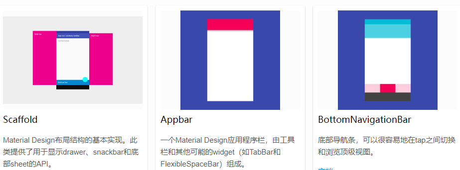
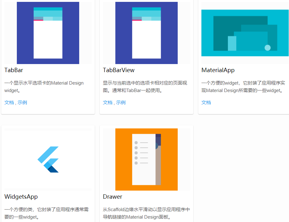
 Scaffold  //The basic realization of Material Design layout structure. This class provides an API for displaying drawer s, snapbars, and bottom sheet s.
 Appbar   //A Material Design application bar that consists of toolbars and other possible widget s, such as TabBar and FlexibleSpaceBar.
 BottomNavigationBar  //The bottom navigation bar makes it easy to switch between tabs and navigate to the top-level view.
 TabBar  //A Material Design widget that displays horizontal tabs.
 TabBarView  //Displays a page view corresponding to the currently selected tab. Usually used with TabBar.
 MaterialApp  //A convenient widget, which encapsulates some widgets needed by the application to implement Material Design
 WidgetsApp  //A convenient class that encapsulates some of the widget s that an application usually needs.
 Drawer  //Slide horizontally from the Scaffold edge to display the Material Design panel for navigation links in the application.
2.2 button
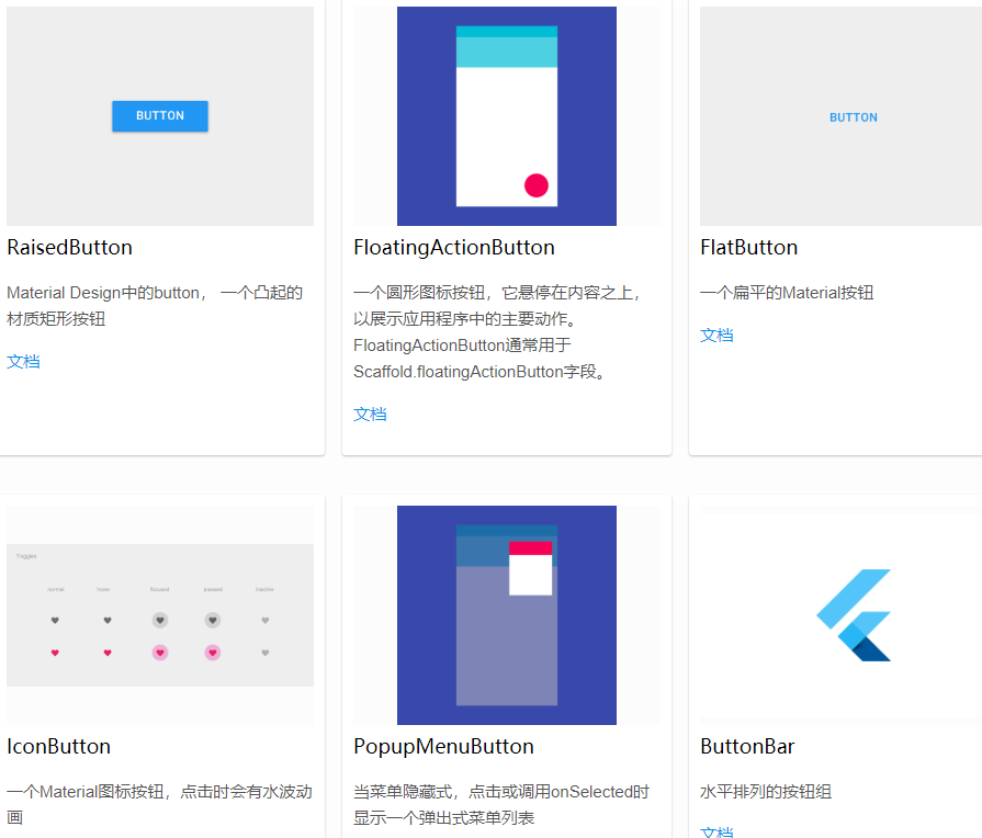
  RaisedButton   //Button in Material Design, a raised material rectangle button
  FloatingActionButton   //A circular icon button that hovers over the content to show the main actions in the application. FloatingActionButton is usually used for the Scaffold.floatingActionButton field
  FlatButton  //A flat Material button
  IconButton  //A Material icon button, when clicked, there will be a water wave animation
  PopupMenuButton   //When the menu is hidden, click or call onSelected to display a pop-up menu list
  ButtonBar  //Button groups arranged horizontally
2.3 input box and selection box
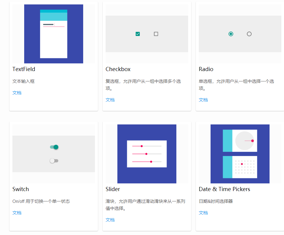
TextField   //Text input box
Checkbox   //Check box to allow the user to select multiple options from a group.
Radio	  //A radio box that allows the user to select an option from a group.
Switch   //On/off for switching a single state
Slider  //Slider, which allows the user to select from a series of values by sliding the slider.
Date & Time Pickers    //Date & time selector
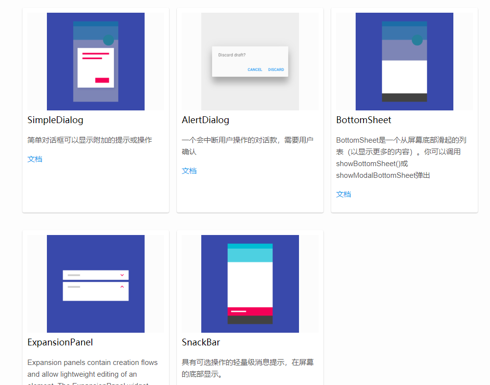
2.4 dialog, Alert, Panel
SimpleDialog  //Simple dialog box to display additional prompts or actions
AlertDialog  //A dialogue payment that will interrupt the user's operation, which needs to be confirmed by the user
BottomSheet //BottomSheet is a list that slides from the bottom of the screen (to show more content). You can call showBottomSheet() or showmodal BottomSheet to pop up
ExpansionPanel  //A lightweight message prompt with optional actions is displayed at the bottom of the screen.
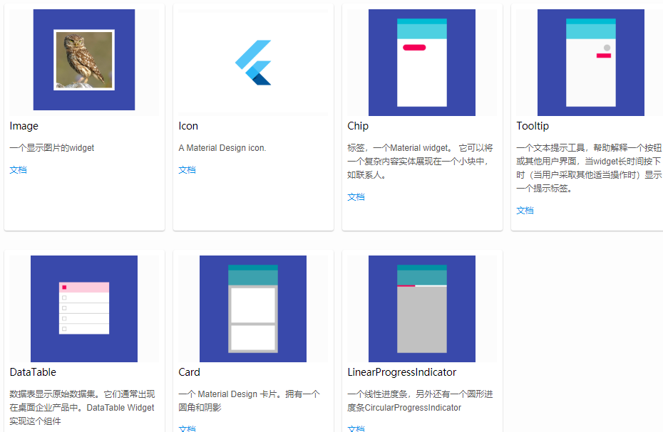
2.5 information display
Image
Icon
Chip
Tooltip
DataTable
Card
LinearProgressIndicator
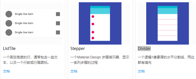
2.6 layout
ListTile
Stepper
Divider
The above content and pictures have all been screenshots of the official website page, and so many components have been written. First of all, I have a general understanding. In the past two days, I have followed the video tutorial, knocked out the basic four components, and figured out the writing method of fluent. But it's still covered. The state of being able to finish at a glance.