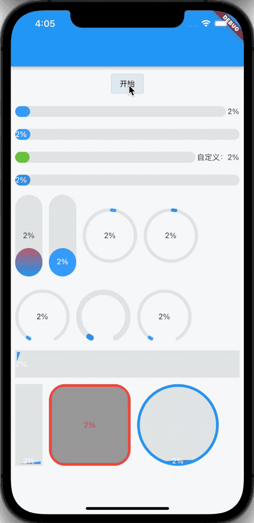
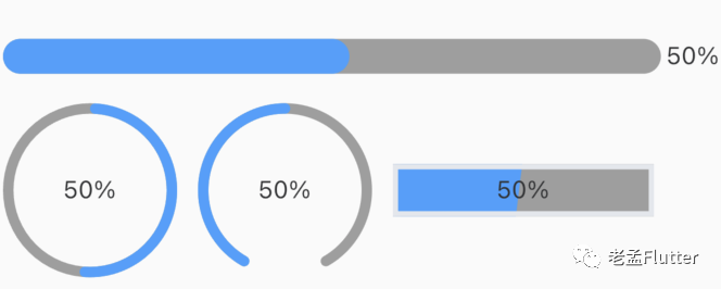
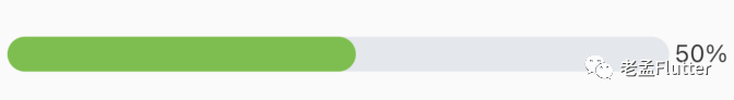
Look at the overall effect first
rely on
Dependency in "pubspec.yaml"
ele_progress:^version
The latest version number can be viewed in "pub": "ele_progress" address: https://pub.dev/packages/ele_progress
Import
import 'package:ele_progress/ele_progress.dart';
theme
The style of global setting "ele_progress" needs to use "EleTheme", and the code is as follows:
@override
Widget build(BuildContext context) {
  return MaterialApp(
    title: 'Flutter Demo',
    theme: ThemeData(
      primarySwatch: Colors.blue,
    ),
    home: EleTheme(
      data: EleThemeData(),
      child: ProgressDemo(),
    ),
  );
}
The library comes with a set of default styles.
attribute
- Progress: progress, value range: 0-100.
- "Colors": the color of the progress bar. This is an array type. Set one color to represent a solid color and multiple to be gradient colors.
- backgroundColor: the background color of the progress bar.
- "type": four progress bar styles are supported, namely "line", "circle", "dashboard" and "liquid".
- "strokeWidth": the width of the progress bar. The default is 6. It does not work when type=liquid.
- "showText": whether to display progress text. The default is true
- "textInside": whether the progress text is displayed in the progress bar. The default is false. It is only available when type=line and liquid.
- "true": indicates to follow the progress bar.
- "false": type=line and direction=horizontal. The text is displayed on the right side of the progress bar. In other cases, the text is displayed in the middle of the progress bar.
- format: customize the display progress text.
- "textStyle": progress text font style.
- "status": controls the color of the progress bar. It is used in conjunction with "theme". There are five states of "primary, success, info, warning and danger", corresponding to five colors: primaryColor, successColor, infoColor, warningColor and dangerColor. However, this attribute will be overwritten by the "colors" attribute.
- "Direction": the direction of the progress bar. It works when type=line and liquid.
- borderColor: border color. It works when type=liquid.
- "borderWidth": border width. It works when type=liquid.
- radius: border fillet. It works when type=liquid.
use
The simplest use
EProgress(progress: 50)
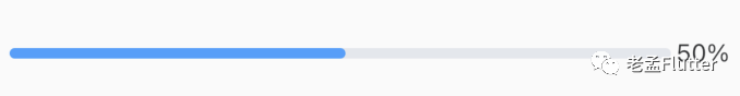
"Progress" indicates progress, and the value range is 0-100.
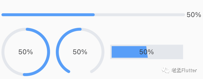
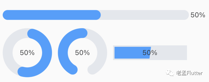
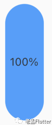
The progress bar supports four shapes: line, circle, dashboard and liquid.
EProgress(
  progress: 50,
  type: ProgressType.liquid,
)
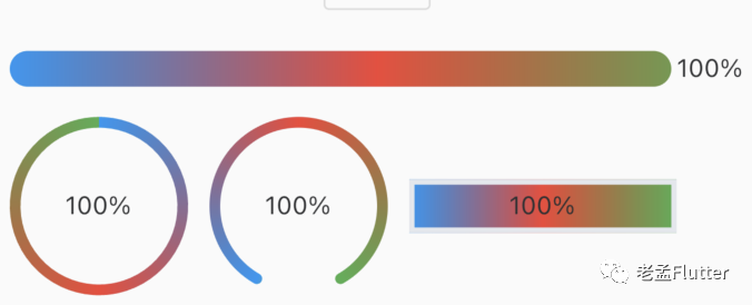
"Colors": indicates the color of the progress bar. This is an array type. Set one color to represent a solid color and multiple to be gradient colors.
EProgress(
  progress: _animation.value,
  strokeWidth: 20,
  colors: [
    Colors.blue,
    Colors.red,
    Colors.green,
  ],
)
backgroundColor: indicates the background color of the progress bar.
EProgress(
  progress: 50,
  strokeWidth: 20,
  backgroundColor: Colors.grey,
)
The width of the "strokeWidth" progress bar. The default is 6.
EProgress(
  progress: 50,
  strokeWidth: 20,
)
"strokeWidth" does not work in the "type=liquid" style.
Properties involving progress text are
- "showText": whether to display. The default is true
- "textInside": whether the progress text is displayed in the progress bar. The default is false. It is only available when type=line and liquid.
- "true": indicates to follow the progress bar.
- "false": type=line and direction=horizontal. The text is displayed on the right side of the progress bar. In other cases, the text is displayed in the middle of the progress bar.
- format: customize the display progress text.
- textStyle: font style.
EProgress(
  progress: _animation.value,
  strokeWidth: 20,
  textInside: true,
)

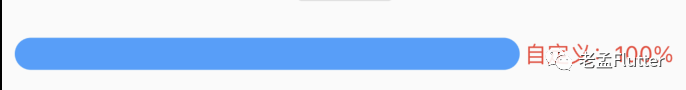
EProgress(
  progress: _animation.value,
  strokeWidth: 20,
  format: (progress) {
    return 'Custom: $progress%';
  },
  textStyle: TextStyle(color: Colors.red),
)
The "status" attribute is used in conjunction with "theme". There are five statuses of "primary, success, info, warning and danger" in the theme, corresponding to five colors
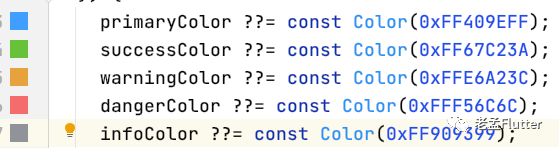
This color will be overwritten by "colors".
EProgress(
  progress: 50,
  strokeWidth: 20,
  status: EleThemeStatus.success,
)
"Direction" indicates the direction of the progress bar. It works when type=line and liquid.
EProgress(
  progress: _animation.value,
  strokeWidth: 50,
  direction: Axis.vertical,
)
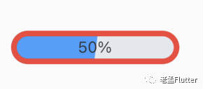
borderColor, borderWidth and radius are used to set the border style. They work when type=liquid.
EProgress(
  progress: 50,
  type: ProgressType.liquid,
  borderColor: Colors.red,
  borderWidth: 5,
  radius: 30,
)
Conclusion
This is the first component imitating the "Element" style, and there will be many later. Please click to read the original text for other components.