After reading God's flex tutorial, I decided to write a fake hand to have fun! I'm sure I can finish it by dividing three into five and dividing two. Yes! You're right! ~ ~
. . . . . . . . . . . . . . . . . . . . . . . . . . . . . . . . . . . .
. . . . . . . . . . . . . . . . . . . . . . . . . . . . . .
As a result, I haven't slept in the middle of the night.
The following link is harmful (Smile. jpg):
http://www.ruanyifeng.com/blog/2015/07/flex-grammar.html?utm_source=tuicool
Okay, get to the point. There are many small problems in the process of practice, so I'll sort them out today.
Our goal is (of course not without decay.) :

Looking at Taobao's homepage, besides the strong desire to buy and buy, as a novice front-end, of course, also want to write it out.
Open my webstorm and create a new project. For convenience, use Gulp to help me. Let's go one by one (the code for the style is scss format).
- Since it's for practicing layout, cut it as it is, first write the top of the mobile phone.

<div class="phoneHead">
        <div>
            <img src="img/1.jpg">
        </div>
        <div>
            <img src="img/4.jpg">
            <img src="img/3.jpg">
            <img src="img/2.jpg">
        </div>
    </div>
.phoneHead {
background-color: #ae3903;
display: flex;
div {
display: flex;
flex: 1;
img {
margin-left: 10px;
}
}
div:nth-child(1) {
flex-direction: row; //Left-aligned content
}
div:nth-child(2) {
flex-direction: row-reverse; //Right-aligned content
}
}-
Top of hand washing
Note that two small vertical lines on both sides of the search box are implemented with two div s
<header>
        <div class="scan">
            <img src="img/5.jpg">
            <p>Scan</p>
        </div>
        <div class="search">
            <div></div>
            <img src="img/21.jpg">
            <input type="text" value="Creativity of bedside lamp bedroom">
            <img src="img/22.jpg">
            <div></div>
        </div>
        <div class="message">
            <img src="img/8.jpg">
            <img src="img/9.jpg">
            <p>news</p>
        </div>
    </header>
header {
display: flex;
background-color: #ff5105;
padding-bottom: 15px;
.scan, .message {
flex: 1;
padding: 10px 0 0 0;
img {
width: 55px;
height: 55px; //Reasonable adjustment of picture size
display: block; //Allow div packages to occupy a separate line when they are not used
margin: auto;
}
p {
font-size: 20px;
text-align: center;
color: #ffffff;
}
}
.message{
position: relative;
img:nth-child(2){
width: 35px;
height:35px;
position: absolute;
top: 10px;
right: 30px;
}
}
.search {
display: flex;
flex: 3.3;
padding: 30px 0 0 0;
margin-bottom: 10px;
border-bottom: 2px solid #ffffff;
//Because the proportion of the five parts of the whole search box is different, the flex attribute value is equal to the size of the px value of its design width, so it is more convenient and accurate to set the proportion.
div:nth-child(1) {
flex: 10;
height: 10px;
border-left: 2px solid #ffffff;
margin-top: 40px;
}
div:nth-child(5) {
flex: 10;
height: 10px;
margin-top: 40px;
border-right: 2px solid #ffffff;
}
img:nth-child(2) {
flex: 35;
height: 35px;
}
img:nth-child(4) {
flex: 35;
height: 35px;
}
input {
flex: 344;
height: 35px;
outline: none; //Remove default attributes
border: none;
color: #fff7f8;
background-color: #ff5105;
font-size: 32px;
line-height: 35px;
}
}
}Rotary map is just a picture, let's not talk about it here.
-
This is the classic flex layout:
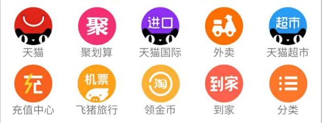
<ul class="entrance">
            <li>
                <a href="#">
                    <img src="img/11.jpg">
                    <p>Tmall</p>
                </a>
            </li>
            <li>
                <a href="#">
                    <img src="img/12.jpg">
                    <p>Juhuasuan</p>
                </a>
            </li>
            <li>
                <a href="#">
                    <img src="img/13.jpg">
                    <p>Tmall International</p>
                </a>
            </li>
            <li>
                <a href="#">
                    <img src="img/14.jpg">
                    <p>Take-out food</p>
                </a>
            </li>
            <li>
                <a href="#">
                    <img src="img/15.jpg">
                    <p>Tmall supermarket</p>
                </a>
            </li>
</ul>.entrance{
padding: 0.06rem 0;
width: 100%;
display: flex;
li{
display: flex;
justify-content:center; //Centralize each set of icons and text to set attributes for parent elements
flex: 1;
img{
display: block;
}
p{
font-size: 0.24rem;
color:#909090;
text-align: center;
line-height: 0.35rem;
}
}
}-
Message Roadcasting Section
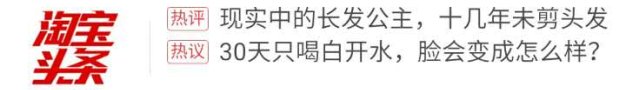
<div class="news">
        <img src="img/23.jpg">
        <div class="list">
            <p>
                <span> Comments</span>
                <span> The real long-haired Princess hasn't had her hair cut for more than ten years</span>
            </p>
            <p>
                <span> heated discussion</span>
                <span> What will your face look like if you don't drink boiled water for 30 days? </span>
            </p>
        </div>
</div>.news{
padding: 0.2rem 0;
display: flex;
img{
flex: 1;
padding: 0 0.33rem;
}
.list{
flex: 5;
border-left: 1px solid #dfdfdf; //Implementing Interval Vertical Line
p {
display: flex; //Without this attribute, the content of the p tag will be squeezed out
align-items: center; //Align two span s on the cross axis
height:0.4rem; //Combined with the previous attribute, the line-height of two span s equals 0.4rem
}
span:nth-child(1){
font-size: 0.2rem;
margin: 0 0.2rem;
text-align: center;
border: 1px solid #d90c00;
color: #d90c00;
}
span:nth-child(2){
font-size: 0.27rem;
}
}
}-
Another classic flex layout:
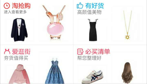
<div class="area1">
        <div class="area1-1">
            <div>
                <p>
                    <img src="img/24.jpg">
                    <span>Rush to buy</span>
                </p>
                <p>Enter to see more</p>
                <div><img src="img/28.jpg"></div>
            </div>
            <div><img src="img/32.jpg"></div>
        </div>
        <div class="area1-2">
            <div>
                <p>
                    <img src="img/25.jpg">
                    <span>Good goods</span>
                </p>
                <p>Beauty with High Face Value</p>
                <div><img src="img/29.jpg"></div>
            </div>
            <div><img src="img/33.jpg"></div>
        </div>
    </div>
    <div class="area1">
        <div class="area1-3">
            <div>
                <p>
                    <img src="img/26.jpg">
                    <span>Rush to buy</span>
                </p>
                <p>Enter to see more</p>
                <div><img src="img/30.jpg"></div>
            </div>
            <div><img src="img/34.jpg"></div>
        </div>
        <div class="area1-4">
            <div>
                <p>
                    <img src="img/27.jpg">
                    <span>Good goods</span>
                </p>
                <p>Beauty with High Face Value</p>
                <div><img src="img/31.jpg"></div>
            </div>
            <div><img src="img/35.jpg"></div>
        </div>
</div>.area1{
display: flex;
//Add different styles to each of the four pieces
.area1-1{
border-right: 1px solid #e4e4e4;
border-bottom: 1px solid #e4e4e4;
div:nth-child(1){
P:nth-child(1) {
span {
color: #d90c00;
}
}
}
}
.area1-2{
border-bottom: 1px solid #e4e4e4;
div:nth-child(1){
P:nth-child(1) {
span {
color: #00cbff;
}
}
}
}
.area1-3{
div:nth-child(1){
P:nth-child(1) {
span {
color: #db4761;
}
}
}
}
.area1-4{
border-left: 1px solid #e4e4e4;
div:nth-child(1){
P:nth-child(1) {
span {
color: #d53e61;
}
}
}
}
//Add the same style to four blocks
.area1-1,.area1-2,.area1-3,.area1-4{
flex: 1;
display: flex;
padding: 0.15rem 0.3rem;
div:nth-child(1){
flex: 1;
P:nth-child(1) {
display: flex;
span {
font-size: 0.3rem;
padding-left: 0.1rem;
}
}
p:nth-child(2) {
font-size: 0.24rem;
line-height: 0.34rem;
color: #757575;
}
div{
padding: 0.2rem 0.3rem 0 0.3rem;
}
}
div:nth-child(2){
flex: 1;
padding-top: 0.2rem;
}
}
}- Well, yes. Another classic flex layout:
Because the content is similar to the previous one, so I'll replace it with pictures. Ha-ha, it's very machine-wise (lan).~~~
<div class="area2">
        <div class="title1">
            <img src="img/36.jpg">
            <span>Super benefit</span>
        </div>
        <div class="area2-1">
            <img src="img/37.jpg">
            <img src="img/38.jpg">
            <img src="img/38.jpg">
            <img src="img/40.jpg">
        </div>
        <div class="area2-1">
            <img src="img/41.jpg">
            <img src="img/42.jpg">
            <img src="img/43.jpg">
            <img src="img/44.jpg">
        </div>
</div>.area2{
.title1{
display: flex;
justify-content: center;
padding: 0.25rem;
span{
line-height: 0.4rem;
text-align: center;
font-size: 0.3rem;
color: #d90c00;
}
}
.area2-1{
display: flex;
border-top: 1px solid #909090;
img{
display: block;
padding: 0.15rem 0.1rem;
border-left: 1px solid #909090;
}
img:nth-child(1){
flex: 1.8;
border: none;
}
img:nth-child(2),img:nth-child(3),img:nth-child(4){
flex: 1;
}
}
}-
Finally, there's only the bottom left!

<footer>
        <div>
            <a>
                <img src="img/45.jpg">
                <p>home page</p>
            </a>
        </div>
        <div>
            <a>
                <img src="img/46.jpg">
                <p>Micro scouring</p>
            </a>
        </div>
        <div>
            <a>
                <img src="img/47.jpg">
                <p>Ask everyone</p>
            </a>
        </div>
        <div>
            <a>
                <img src="img/48.jpg">
                <p>Shopping Cart</p>
            </a>
        </div>
        <div>
            <a>
                <img src="img/49.jpg">
                <p>My Taobao</p>
            </a>
        </div>
</footer>footer{
width: 100%;
padding: 20px 0;
background-color: #ffffff;
border-top: 1px solid #909090;
display: flex;
justify-content: center;
position: fixed;
bottom: 0;
left: 0;
div{
flex: 1;
display: flex;
justify-content: center;
img{
display: block;
margin: auto;
}
p{
font-size: 28px;
color: #3a3e3d;
line-height: 45px;
text-align: center;
}
}
}Well, staying up late is the more spiritual! Look at the effect:
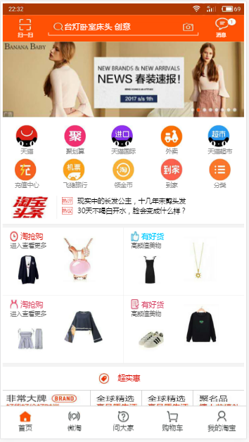
It's not exactly the same! My own fake hands are not bad, haha
. . . . . . . . . . . . . . . . . . . . . . . . . . . . . . . .
. . . . . . . . . . . . . . . . . . .
Then wash and sleep.
Good night everyone.