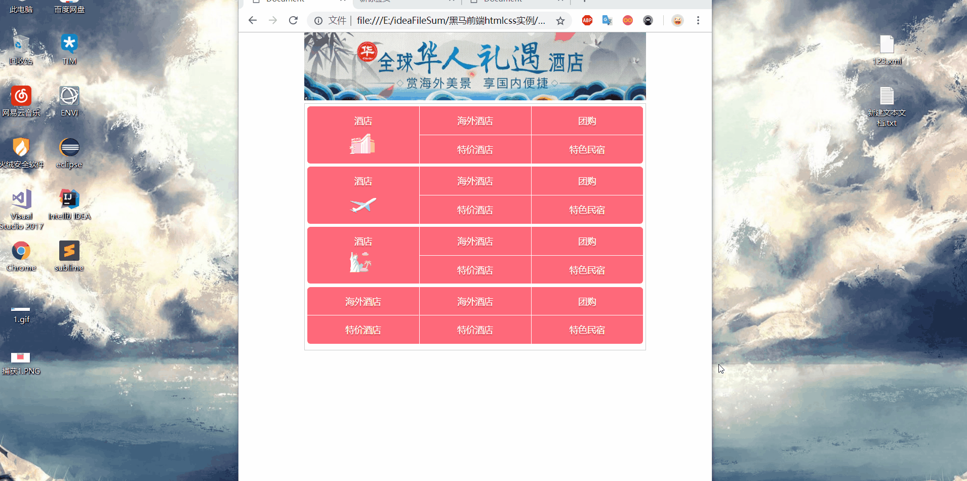
Main points:
1. Add the display:flex display effect to the parent element that needs to scale the layout, set the value of flex in the child element, and then divide it by proportion. If one subset element is 1 and the other is 2, one takes up one-third and the other two-thirds.
2. Font shadow takes up a lot of memory, not recommended
3. The zoom of background picture can be px and percentage (if you customize one, the other will be zoomed in the same proportion as the original picture)
The other two special attribute values, cover, scale the image equally until the height of the image is the same as that of the box
The width of the contain er is the same as that of the box
html code:
<!DOCTYPE html>
<html lang="en">
<head>
	<meta charset="UTF-8">
	<title>Document</title>
	<style>
		*{
			margin: 0;
			padding: 0;
			box-sizing: border-box;
		}
		html,body{
			min-width: 320px;
			max-width: 540px;
			margin:0 auto;
		}
		header img{
			height: 108px;
			width: auto;
		}
		nav{
			border: 1px solid #ccc;
			padding: 4px;
		}
		nav a,nav em{
			text-decoration: none;
			font-size: 14px;
			text-shadow: 0 2px 1px rgba(0,0,0,.2);
			color: #fff;
			/*Very memory intensive*/
		}

		.row{
			height: 90px;
			display: flex;
			/*Add flex to the parent box to complete the scalable layout*/
			border-radius: 5px;
			/*Add fillet to parent box*/
			overflow: hidden;
			/*Child elements will continue to emerge, to hide*/
			margin-bottom: 5px;
		}
		.row div{
			height: 100%;
			flex: 1;
			/*After adding the flex attribute to the parent box, each of the following child boxes takes up one share*/
			background-color: #ff697a;
			border-right: 1px solid #fff;
		}
		.row div:nth-child(3){
			border-right: 0;
		}
		.row div a{
			display: block;
			width: 100%;
			height: 100%;
			overflow: hidden;
		}
		.row em{
			display: block;
			height: 45px;
			text-align: center;
			line-height: 45px;
			font-style: normal;
		}
		.row i{
			display: block;
			width: 43px;
			height: 43px;
			margin: -5px auto 0;
			background:url(img/ctrip.png) no-repeat 0 -127px;
			/*-webkit-background-size:104px;*/
			background-size: 104px;
			/*Change the width to half, and the second item will be automatically scaled*/
		}
		.row div a .jipiao{
            background-position: 0 -288px;
		}
		.row div a .ggg{
			background-position: 0 -190px;
		}
		.row3{
			display: flex;
			flex-direction: column;
			/*Vertical dynamic distribution*/
		}
		.row3 a{
            flex: 1;
            /*Up and down half each*/
            text-align: center;
            line-height: 45px;
            color: #fff;
		}
		.row3 a:first-child{
			border-bottom: 1px solid  #fff;
		}
	</style>
</head>
<body>
	<header>
		<img src="img/banner.jpg">
	</header>
	<nav>
		<div class="row">
			<div>
				<a href="#">
					<em>Hotel</em>
					<i></i>
				</a>
			</div>
			<div class="row3">
				<a href="#"> overseas hotels</a>
				<a href="#"> special rates</a>
			</div>
			<div class="row3">
				<a href="#> group buying </a>
				<a href="#"> characteristic accommodation</a>
			</div>
		</div>
		<div class="row">
			<div>
				<a href="#">
					<em>Hotel</em>
					<i class="jipiao"></i>
				</a>
			</div>
			<div class="row3">
				<a href="#"> overseas hotels</a>
				<a href="#"> special rates</a>
			</div>
			<div class="row3">
				<a href="#> group buying </a>
				<a href="#"> characteristic accommodation</a>
			</div>
		</div>
		<div class="row">
			<div>
				<a href="#">
					<em>Hotel</em>
					<i class="ggg"></i>
				</a>
			</div>
			<div class="row3">
				<a href="#"> overseas hotels</a>
				<a href="#"> special rates</a>
			</div>
			<div class="row3">
				<a href="#> group buying </a>
				<a href="#"> characteristic accommodation</a>
			</div>
		</div>
		<div class="row">
			<div class="row3">
				<a href="#"> overseas hotels</a>
				<a href="#"> special rates</a>
			</div>
			<div class="row3">
				<a href="#"> overseas hotels</a>
				<a href="#"> special rates</a>
			</div>
			<div class="row3">
				<a href="#> group buying </a>
				<a href="#"> characteristic accommodation</a>
			</div>
		</div>
	</nav>
</body>
</html>
Effect;