flex yes flexible Box Abbreviation for Flexible Layout,
Used to provide maximum flexibility for box models, any container can be specified flex Layout.
- When the parent box is set to the flex layout, the float, clear, and vertical attributes of the child elements become invalid
- Scalable Layout=Elastic Layout=Scalable Box Layout=Elastic Box Layout=flex Layout
flex layout principle:
Control the location and arrangement of child boxes by adding flex attributes to the parent box
flex layout implements horizontal and vertical centering of a div element
<!DOCTYPE html>
<html lang="en">
<head>
  <meta charset="UTF-8">
  <meta http-equiv="X-UA-Compatible" content="IE=edge">
  <meta name="viewport" content="width=device-width, initial-scale=1.0">
  <title>Document</title>
  <style>
    * {
      margin: 0;
      padding: 0;
    }
    html,
    body {
      height: 100%;
    }
    body {
      display: flex;
      justify-content: center;
      align-items: center;
    }

    div {
      width: 200px;
      height: 200px;
      background: linear-gradient(skyblue 30%, deeppink 70%);
    }

  </style>
</head>
<body>
  <div class="box"></div>
</body>
</html>
The effect is as follows:
1.1 Common parent attributes
- flex-direction: Set the direction of the spindle
- justify-content: Sets the arrangement of child elements on the spindle
- flex-wrap: Sets whether child elements wrap
- align-content: Sets the arrangement of child elements on the side axis (multiple lines)
- align-items: Set the arrangement of child elements on the side axis (current row)
- flex-flow: Compliance property, equivalent to setting both flex-direction and flex-wrap
1.2 flex-direction sets the direction of the main axis
1. Spindle and side axes
In the flex layout, there are two directions, the main axis and the side axis. The same term is used for rows and columns
The default principal axis direction is the x-axis direction, horizontally to the right
The default side-axis direction is the y-axis direction, down horizontally
2. Attribute Values
The flex-direction attribute determines the direction of the spindle
Note: The spindle and side axes change depending on which is set as the main axis by flex-direction, and the rest is the side axis.
| Attribute Value | Explain |
|---|---|
| row | Default, left-to-right |
| row-reverse | Arrange from right to left |
| column | Arrange from top to bottom |
| column-reverse | Arrange from bottom to top |
<!DOCTYPE html>
<html lang="en">
<head>
  <meta charset="UTF-8">
  <meta http-equiv="X-UA-Compatible" content="IE=edge">
  <meta name="viewport" content="width=device-width, initial-scale=1.0">
  <title>Document</title>
  <style>
    * {
      margin: 0;
      padding: 0;
    }
    .box {
      display: flex;
      width: 666px;
      height: 333px;
      background: linear-gradient(skyblue, deeppink);
      margin: 50px auto;
      /* Default Properties */
      flex-direction: row;
    }
    .box > span {
      width: 200px;
      height: 100px;
      background: linear-gradient(orange, purple);
      color: #fff;
    }
  </style>
</head>
<body>
  <div class="box">
    <span>one</span>
    <span>two</span>
    <span>three</span>
  </div>
</body>
</html>
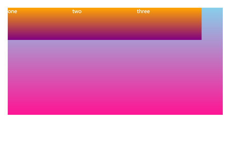
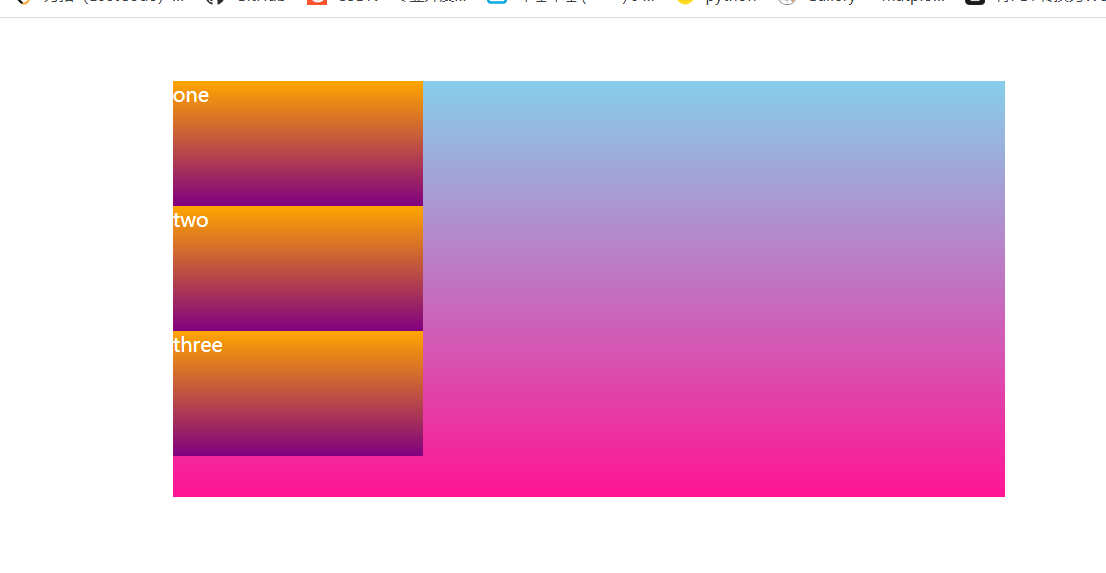
flex-direction: column;
1.3 justify-content setting spindle subelement arrangement
The justify-content property defines how items are aligned on the main axis
Note: Make sure you know which spindle is before using this property
| Attribute Value | Explain |
|---|---|
| flex-start | Default values start from the beginning If the spindle is x-axis, then left to right |
| flex-end | From tail |
| center | Align in the center of the spindle (horizontal if the spindle is x-axis) |
| space-around | Divide the remaining space equally |
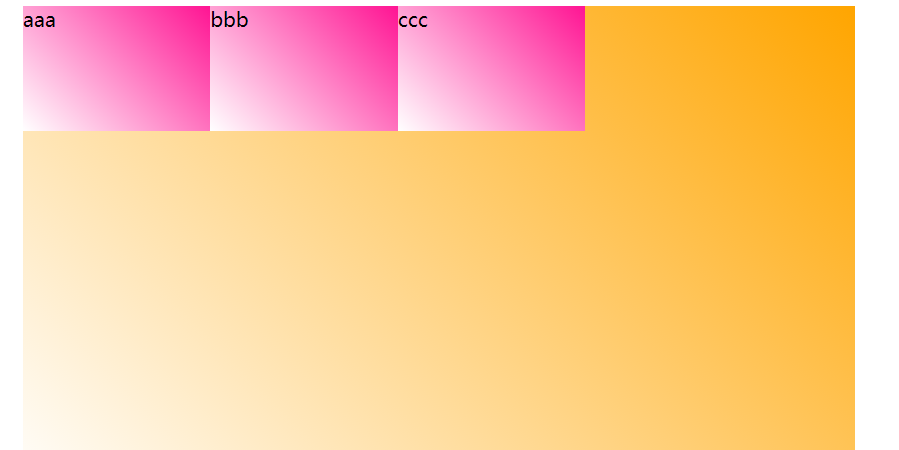
| space-between | Edge the two sides before dividing the remaining space (focus) |
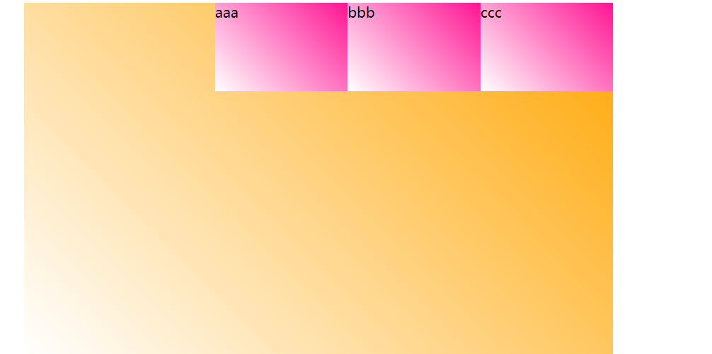
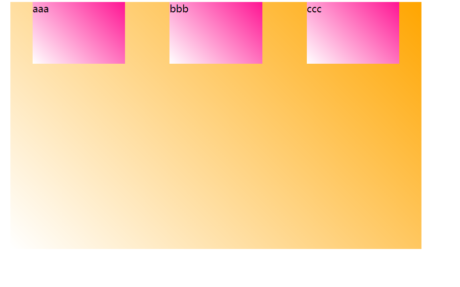
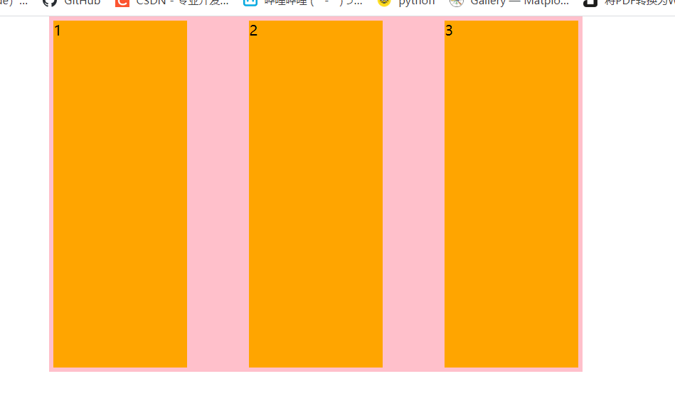
justify-content: flex-start
<!DOCTYPE html>
<html lang="en">
<head>
  <meta charset="UTF-8">
  <meta http-equiv="X-UA-Compatible" content="IE=edge">
  <meta name="viewport" content="width=device-width, initial-scale=1.0">
  <title>Document</title>
  <style>
    * {
      margin: 0;
      padding: 0;
    }
    .box {
      display: flex;
      width: 666px;
      height: 400px;
      margin: 10px auto;
      background: linear-gradient(45deg, #fff, orange);
      /* justify-content: flex-start; */
      /* justify-content: flex-end; */
      /* justify-content: center; */
      /* justify-content: space-around; */
      justify-content: space-between;
    }
    .box > span {
      width: 150px;
      height: 100px;
      background: linear-gradient(45deg, #fff, deeppink);
    }
  </style>
</head>
<body>
  <div class="box">
    <span>aaa</span>
    <span>bbb</span>
    <span>ccc</span>
  </div>
</body>
</html>
justify-content: flex-end
justify-content: center
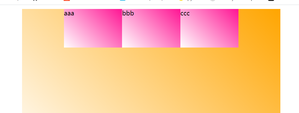
justify-content: space-between
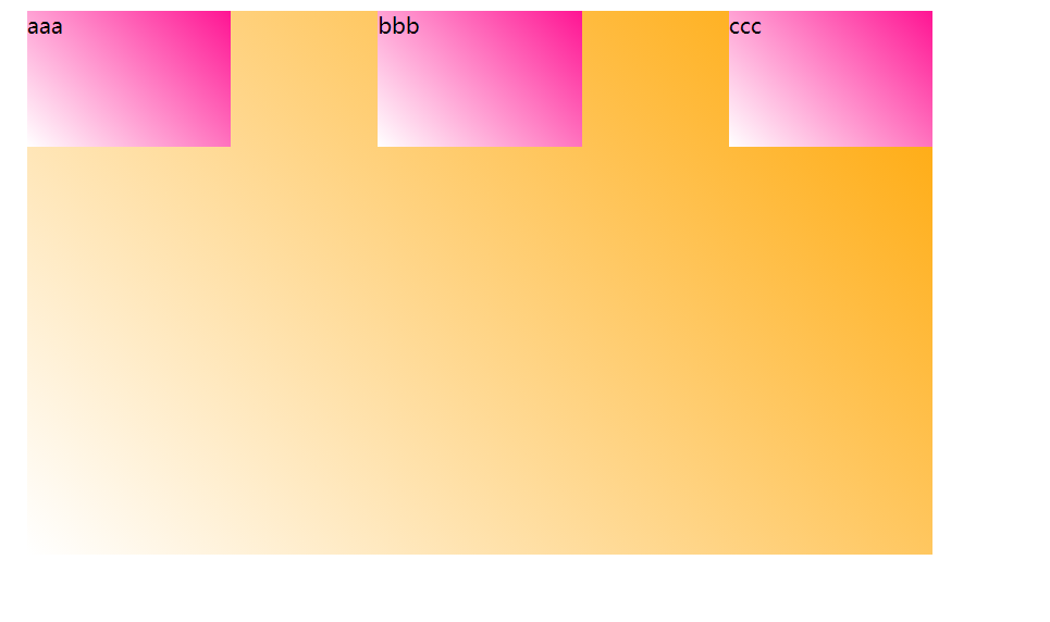
justify-content: space-around
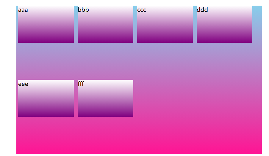
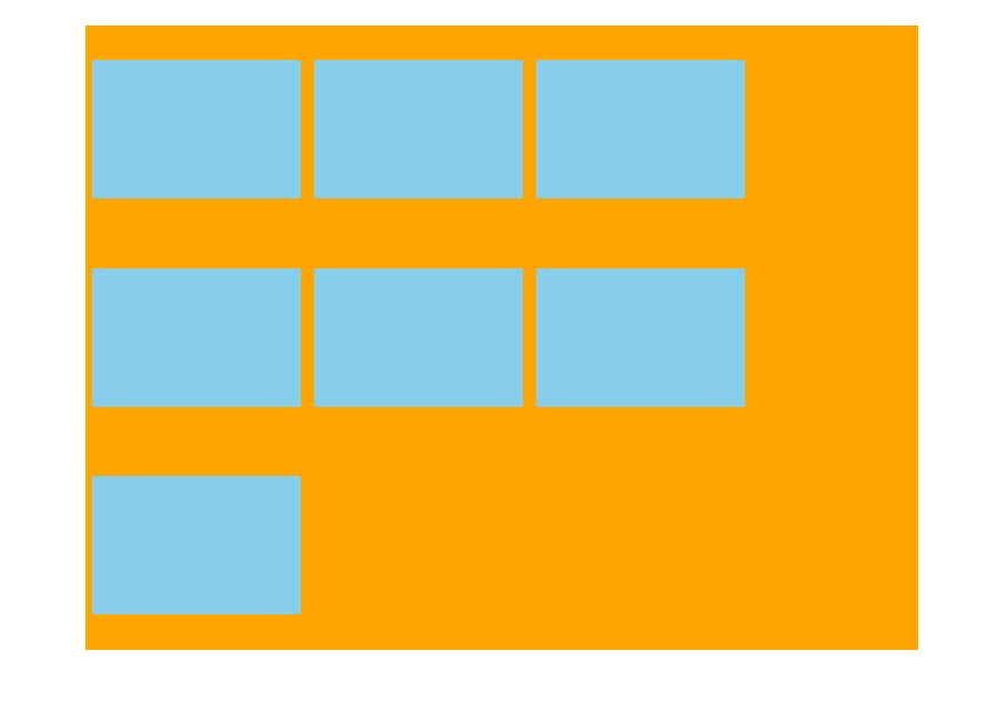
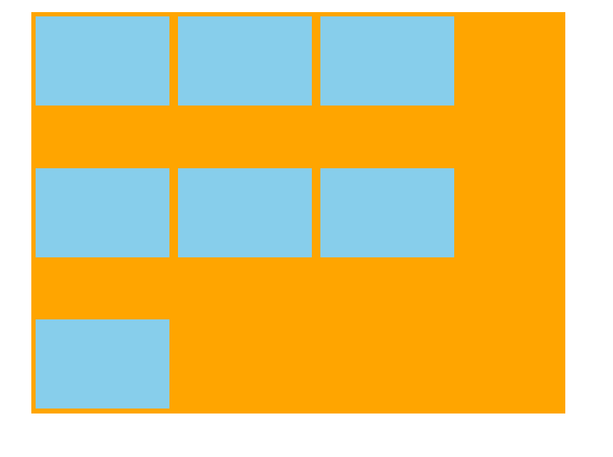
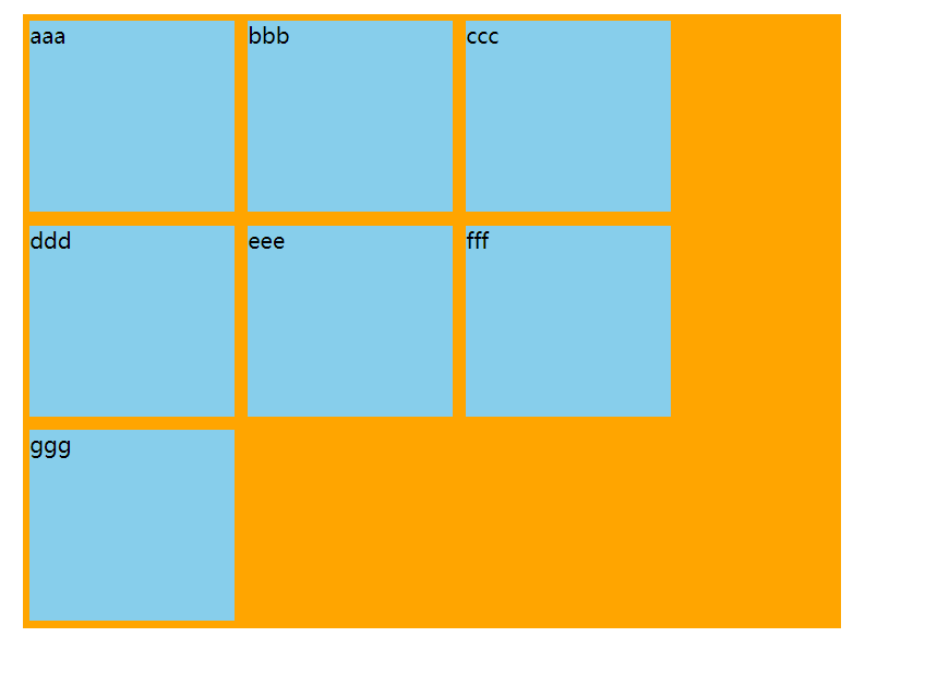
Whether the 1.4 flex-wrap subelement wraps
By default, items are arranged along a line (also known as the "axis"). The flex default child element does not wrap.
| Attribute Value | Explain |
|---|---|
| nowrap | Default value, no line break |
| wrap | Line Break |
<!DOCTYPE html>
<html lang="en">
<head>
  <meta charset="UTF-8">
  <meta http-equiv="X-UA-Compatible" content="IE=edge">
  <meta name="viewport" content="width=device-width, initial-scale=1.0">
  <title>Document</title>
  <style>
    * {
      margin: 0;
      padding: 0;
    }
    .box {
      display: flex;
      width: 660px;
      height: 400px;
      background: linear-gradient(skyblue, deeppink);
      margin: 50px auto;
      justify-content: flex-start;
      /* Default flex-wrap: nowrap; nowrap */
      /* flex-wrap: nowrap; */
      flex-wrap: wrap;
    }
    .box > span {
      width: 150px;
      height: 100px;
      margin: 0 5px;
      background: linear-gradient(#fff, purple)
    }
  </style>
</head>
<body>
  <div class="box">
    <span>aaa</span>
    <span>bbb</span>
    <span>ccc</span>
    <span>ddd</span>
    <span>eee</span>
    <span>fff</span>
  </div>
</body>
</html>
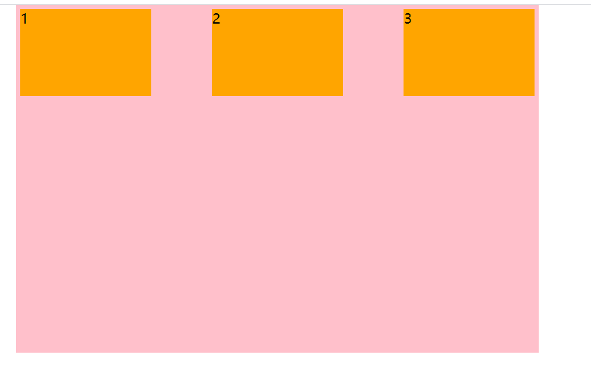
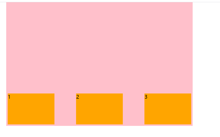
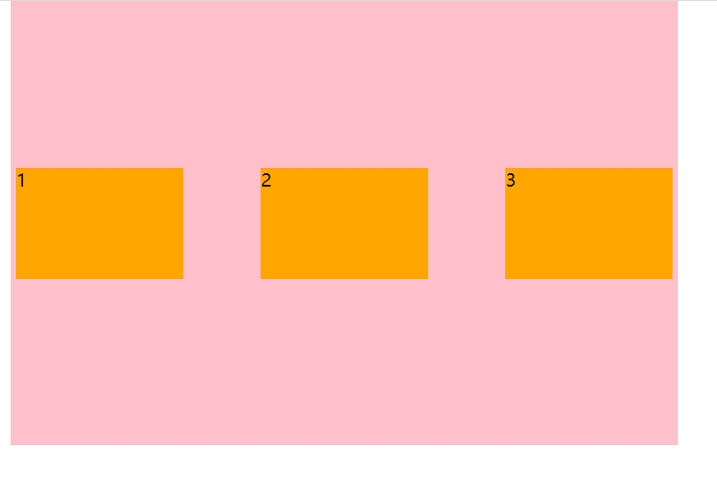
1.5 align-items Set Side Axis Subelement Arrangement
This property is used to control how subitems are arranged on the side axis (default is y axis) when subitems are single items
| flex-start | From top to bottom |
|---|---|
| flex-start | From top to bottom |
| flex-end | From bottom to top |
| center | Squeeze together to center (vertical center) |
| stretch | Stretch (default) elements have no height set |
<!DOCTYPE html>
<html lang="en">
<head>
  <meta charset="UTF-8">
  <meta http-equiv="X-UA-Compatible" content="IE=edge">
  <meta name="viewport" content="width=device-width, initial-scale=1.0">
  <title>Document</title>
  <style>
    * {
      margin: 0;
      padding: 0;
    }
    .box {
      display: flex;
      width: 600px;
      height: 400px;
      background: pink;
      margin: 0 auto;
      justify-content: space-between;
      align-items: flex-start;
      /* align-items: flex-end; */
      /* align-items: center; */
      /* align-items: stretch; */
    }
    span {
      width: 150px;
      height: 100px;
      background: orange;
      margin: 5px;
    }
  </style>
</head>
<body>
  <div class="box">
    <span>1</span>
    <span>2</span>
    <span>3</span>
  </div>
</body>
</html>
align-items: flex-start
align-items: flex-end
align-items: center
align-items: stretch
Note: No height setting will take effect
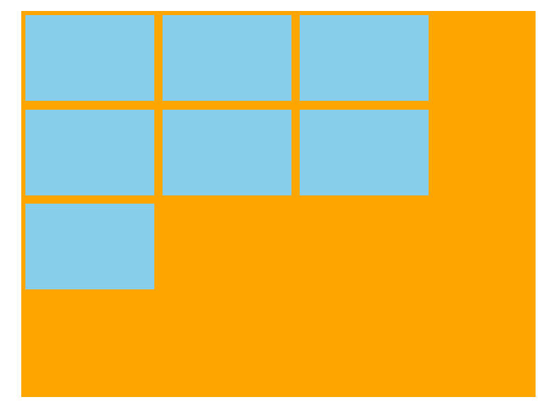
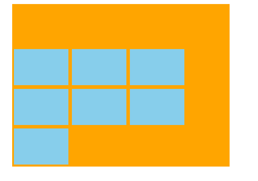
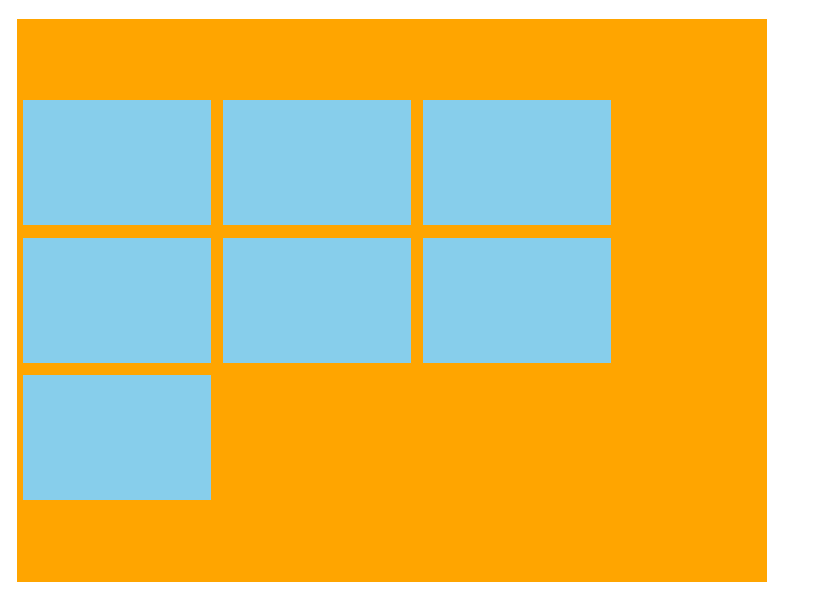
1.6 align-content Sets the arrangement of child elements on the side axis to be (multiple lines)
Set the way the subitems are arranged on the side axes and can only be used when the subitems break (multiple lines). Note: It is not effective under a single line
| Attribute Value | Explain |
|---|---|
| flex-start | Start by default at the head of the side axis |
| flex-end | Begin alignment at end of side axis |
| center | Show in the middle of the side axis |
| space-around | Subitems divide the remaining space equally on the side axis |
| space-between | Subitems are distributed at both ends of the side axis before equalizing the remaining space |
| stretch | Set child element height bisect parent element height |
<!DOCTYPE html>
<html lang="en">
<head>
  <meta charset="UTF-8">
  <meta http-equiv="X-UA-Compatible" content="IE=edge">
  <meta name="viewport" content="width=device-width, initial-scale=1.0">
  <title>Document</title>
  <style>
    * {
      margin: 0;
      padding: 0;
    }
    .box {
      display: flex;
      justify-content: flex-start;
      width: 600px;
      height: 450px;
      background: orange;
      margin: 20px auto;
      flex-wrap: wrap;
      align-content: flex-start;
      /* align-content: flex-end; */
      /* align-content: center; */
      /* align-content: space-around; */
      /* align-content: space-between; */
    }
    span {
      width: 150px;
      height: 100px;
      background: skyblue;
      margin: 5px;
    }
  </style>
</head>
<body>
  <div class="box">
    <span></span>
    <span></span>
    <span></span>
    <span></span>
    <span></span>
    <span></span>
    <span></span>
  </div>
</body>
</html>
align-content: flex-start
align-content: flex-end
align-content: center
align-content: space-around
align-content: space-between
align-content: stretch (no height to take effect)
The difference between align-content and align-items
align-items is suitable for single line cases, only top alignment, bottom alignment, centering and stretching
align-content is suitable for line-breaking (multi-line invalidation) situations (single-line invalidation), and can set attribute values such as alignment, bottom alignment, centering, stretching, and average allocation of remaining space.
Summary is to find align-items in one line and align-content in multiple lines.
1.7 flex-flow
The flex-flow attribute is a composite of the flex-direction and flex-wrap attributes
flex-flow: row wrap;
Common attributes of 2 flex layout subitems
2.1 flex attribute
The flex attribute defines how much space is left for a subproject and how many copies are represented by flex.
item {
	flex: <number>;  /*default 0*/
}
<!DOCTYPE html>
<html lang="en">
<head>
  <meta charset="UTF-8">
  <meta http-equiv="X-UA-Compatible" content="IE=edge">
  <meta name="viewport" content="width=device-width, initial-scale=1.0">
  <title>Document</title>
  <style>
    * {
      margin: 0;
      padding: 0;
    }
    section {
      display: flex;
      width: 400px;
      height: 50px;
      background: skyblue;
      margin: 20px auto;
    }
    section div:nth-child(1),
    section div:nth-child(3) {
      width: 40px;
      height: 100%;
    }
    section div:nth-child(2) {
      flex: 1;
    }
    section div:nth-child(1) {
      background: purple;
    }
    section div:nth-child(3) {
      background: orange;
    }
  </style>
</head>
<body>
  <section>
    <div></div>
    <div></div>
    <div></div>
  </section>
</body>
</html>

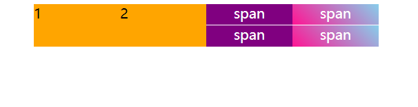
<!DOCTYPE html>
<html lang="en">
<head>
  <meta charset="UTF-8">
  <meta http-equiv="X-UA-Compatible" content="IE=edge">
  <meta name="viewport" content="width=device-width, initial-scale=1.0">
  <title>Document</title>
  <style>
    * {
      margin: 0;
      padding: 0;
    }
    li {
      list-style-type: none;
    }
    ul {
      display: flex;
      width: 400px;
      height: 50px;
      margin: 10px auto;
      background: pink;
    }
    li {
      display: flex;
      flex: 1;
      background: orange;
      flex-direction: column;
    }
    li > span {
      flex: 1;
      background: purple;
      text-align: center;
      color: #fff;
    }
    .top {
      border-bottom: 1px solid #fff;
    }
    .last>span {
      background: linear-gradient(45deg, deeppink, skyblue)
    }
  </style>
</head>
<body>
  <ul>
    <li>1</li>
    <li>2</li>
    <li>
      <span class="top">span</span>
      <span>span</span>
    </li>
    <li class="last">
      <span class="top">span</span>
      <span>span</span>
    </li>
  </ul>
</body>
</html>
Summary of flex attributes:
(1) The distribution of flex is related to the orientation of the principal axis. When the principal axis is x-axis, the child and parent elements are equal in height, and the horizontal direction is equal to the flex value, while the y-axis is opposite.
2.2 Alignment-self controls how the subitems themselves are arranged on the side axes
The align-self attribute allows a single item to be aligned differently from other items, overriding the align-items attribute, which defaults to auto, meaning the align-items attribute inherits the parent element and is equivalent to stretch if there is no parent element.