From: http://www.ruanyifeng.com/blog/2015/07/flex-examples.html
Author: Ruan Yifeng
Date: 14 July 2015
Last article This paper introduces the grammar of Flex layout, and today introduces the Flex writing of common layout.
As you can see, no matter what the layout is, Flex can usually be done with several lines of command.
I only list the code, please refer to the detailed grammar explanation. Flex Layout Course: Grammar Chapter . My main reference material is Landon Schropp Articles and Solved by Flexbox.
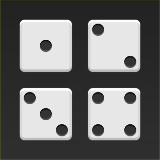
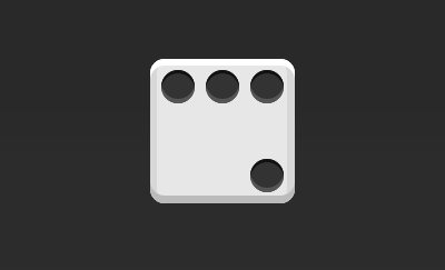
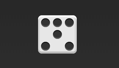
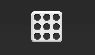
The layout of dice
On one side of the dice, you can place up to nine points.
Next, let's see how Flex works, from one point to nine points. You can go there. codepen Check Demo.

Without explanation, the HTML templates in this section are as follows.
<div class="box">
  <span class="item"></span>
</div>
In the code above, the div element (representing a face of the dice) is the Flex container, and the span element (representing a point) is the Flex project. If you have more than one project, add more than one span element, and so on.
1.1 Single Project
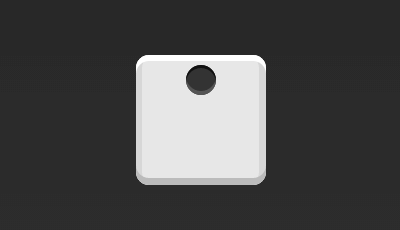
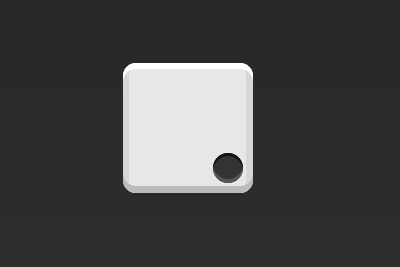
First, there is only one point in the upper left corner. Flex layout is left-aligned by default, so one line of code is enough.
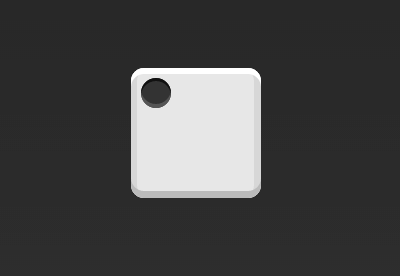
.box {
  display: flex;
}
Setting the alignment of items can achieve alignment in the center and right.
.box {
  display: flex;
  justify-content: center;
}
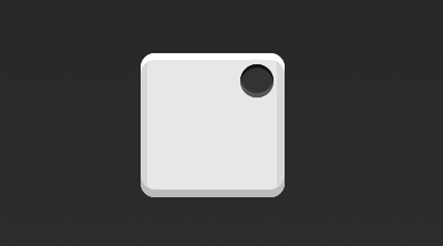
.box {
  display: flex;
  justify-content: flex-end;
}
Setting the alignment mode of cross axes, the spindle can be moved vertically.
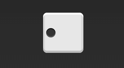
.box {
  display: flex;
  align-items: center;
}
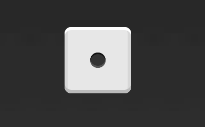
.box {
  display: flex;
  justify-content: center;
  align-items: center;
}
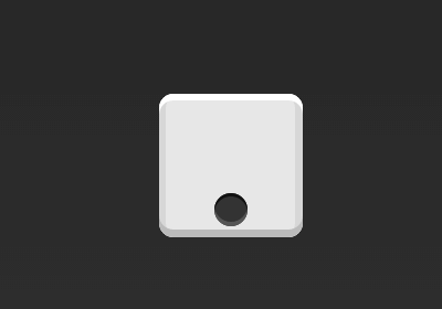
.box {
  display: flex;
  justify-content: center;
  align-items: flex-end;
}
.box {
  display: flex;
  justify-content: flex-end;
  align-items: flex-end;
}
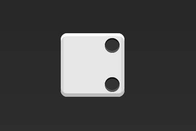
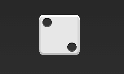
1.2 Double Project
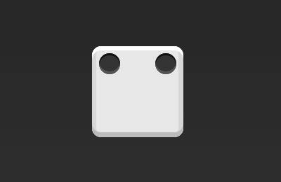
.box {
  display: flex;
  justify-content: space-between;
}
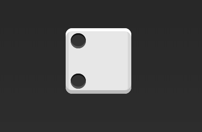
.box {
  display: flex;
  flex-direction: column;
  justify-content: space-between;
}
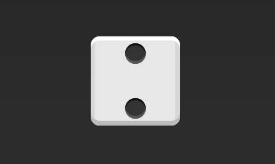
.box {
  display: flex;
  flex-direction: column;
  justify-content: space-between;
  align-items: center;
}
.box {
  display: flex;
  flex-direction: column;
  justify-content: space-between;
  align-items: flex-end;
}
.box {
  display: flex;
}

.item:nth-child(2) {
  align-self: center;
}
.box {
  display: flex;
  justify-content: space-between;
}

.item:nth-child(2) {
  align-self: flex-end;
}
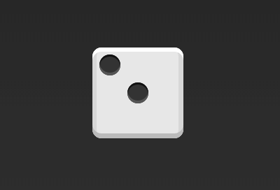
1.3 Three Projects
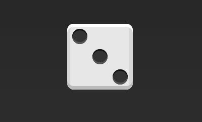
.box {
  display: flex;
}

.item:nth-child(2) {
  align-self: center;
}

.item:nth-child(3) {
  align-self: flex-end;
}
1.4 Four Projects
.box {
  display: flex;
  flex-wrap: wrap;
  justify-content: flex-end;
  align-content: space-between;
}
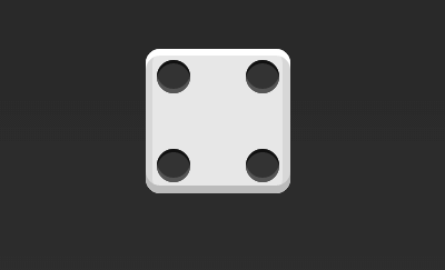
The HTML code is as follows.
<div class="box">
  <div class="column">
    <span class="item"></span>
    <span class="item"></span>
  </div>
  <div class="column">
    <span class="item"></span>
    <span class="item"></span>
  </div>
</div>
The CSS code is as follows.
.box {
  display: flex;
  flex-wrap: wrap;
  align-content: space-between;
}

.column {
  flex-basis: 100%;
  display: flex;
  justify-content: space-between;
}
1.56 Projects
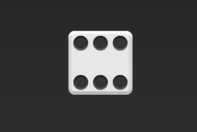
.box {
  display: flex;
  flex-wrap: wrap;
  align-content: space-between;
}
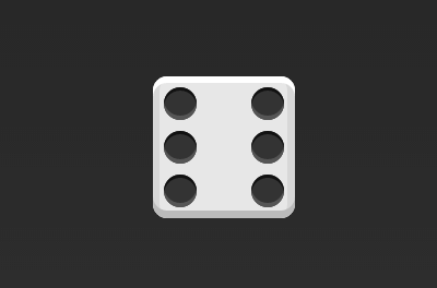
.box {
  display: flex;
  flex-direction: column;
  flex-wrap: wrap;
  align-content: space-between;
}
The HTML code is as follows.
<div class="box">
  <div class="row">
    <span class="item"></span>
    <span class="item"></span>
    <span class="item"></span>
  </div>
  <div class="row">
    <span class="item"></span>
  </div>
  <div class="row">
     <span class="item"></span>
     <span class="item"></span>
  </div>
</div>
The CSS code is as follows.
.box {
  display: flex;
  flex-wrap: wrap;
}

.row{
  flex-basis: 100%;
  display:flex;
}

.row:nth-child(2){
  justify-content: center;
}

.row:nth-child(3){
  justify-content: space-between;
}
Item 1.69
.box {
  display: flex;
  flex-wrap: wrap;
}
2. Grid Layout
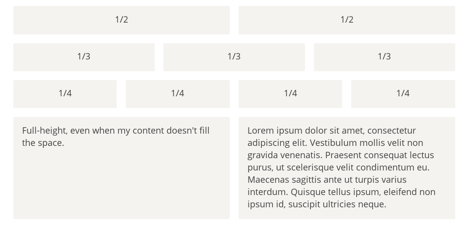
2.1 Basic Grid Layout
The simplest grid layout is the average distribution. Average allocation of space in the container is similar to the dice layout above, but automatic zooming of the project is required.
The HTML code is as follows.
<div class="Grid">
  <div class="Grid-cell">...</div>
  <div class="Grid-cell">...</div>
  <div class="Grid-cell">...</div>
</div>
The CSS code is as follows.
.Grid {
  display: flex;
}

.Grid-cell {
  flex: 1;
}
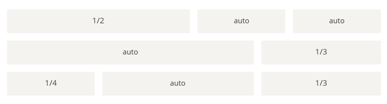
2.2 Percentage Layout
The width of one grid is a fixed percentage, and the remaining grids allocate the remaining space on average.
The HTML code is as follows.
<div class="Grid">
  <div class="Grid-cell u-1of4">...</div>
  <div class="Grid-cell">...</div>
  <div class="Grid-cell u-1of3">...</div>
</div>
.Grid {
  display: flex;
}

.Grid-cell {
  flex: 1;
}

.Grid-cell.u-full {
  flex: 0 0 100%;
}

.Grid-cell.u-1of2 {
  flex: 0 0 50%;
}

.Grid-cell.u-1of3 {
  flex: 0 0 33.3333%;
}

.Grid-cell.u-1of4 {
  flex: 0 0 25%;
}
III. Grail Layout
Grail Layout (Holy Grail Layout) refers to one of the most common site layouts. From top to bottom, the page is divided into three parts: header, body and footer. The trunk is divided into three columns horizontally, from left to right: navigation, main column and auxiliary column.
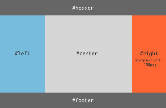
The HTML code is as follows.
<body class="HolyGrail">
  <header>...</header>
  <div class="HolyGrail-body">
    <main class="HolyGrail-content">...</main>
    <nav class="HolyGrail-nav">...</nav>
    <aside class="HolyGrail-ads">...</aside>
  </div>
  <footer>...</footer>
</body>
The CSS code is as follows.
.HolyGrail {
  display: flex;
  min-height: 100vh;
  flex-direction: column;
}

header,
footer {
  flex: 1;
}

.HolyGrail-body {
  display: flex;
  flex: 1;
}

.HolyGrail-content {
  flex: 1;
}

.HolyGrail-nav, .HolyGrail-ads {
  /* Set the width of the two sidebars to 12em */
  flex: 0 0 12em;
}

.HolyGrail-nav {
  /* Navigation on the leftmost side */
  order: -1;
}
If it is a small screen, the three columns of the trunk automatically become vertical overlay.
@media (max-width: 768px) {
  .HolyGrail-body {
    flex-direction: column;
    flex: 1;
  }
  .HolyGrail-nav,
  .HolyGrail-ads,
  .HolyGrail-content {
    flex: auto;
  }
}
IV. Layout of input boxes
We often need to add prompts in front of the input box and buttons in the back.
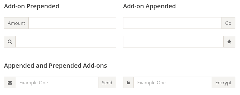
The HTML code is as follows.
<div class="InputAddOn">
  <span class="InputAddOn-item">...</span>
  <input class="InputAddOn-field">
  <button class="InputAddOn-item">...</button>
</div>
The CSS code is as follows.
.InputAddOn {
  display: flex;
}

.InputAddOn-field {
  flex: 1;
}
V. Suspension Layout
Sometimes, you need to add an image bar to the left or right side of the main bar.
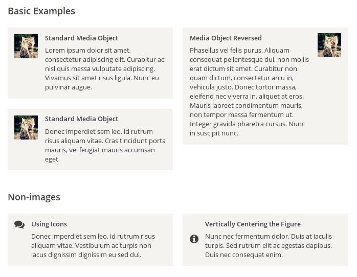
The HTML code is as follows.
<div class="Media">
  <img class="Media-figure" src="" alt="">
  <p class="Media-body">...</p>
</div>
The CSS code is as follows.
.Media {
  display: flex;
  align-items: flex-start;
}

.Media-figure {
  margin-right: 1em;
}

.Media-body {
  flex: 1;
}
6. Fixed Bottom Bar
Sometimes, when the content of the page is too small to cover the height of a screen, the bottom bar will be raised to the middle of the page. At this point, you can use Flex layout, so that the bottom bar always appears at the bottom of the page.
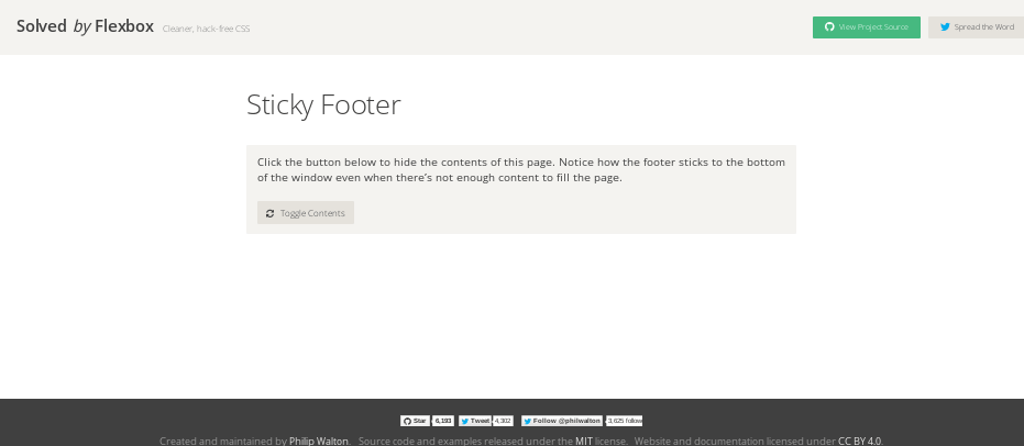
The HTML code is as follows.
<body class="Site">
  <header>...</header>
  <main class="Site-content">...</main>
  <footer>...</footer>
</body>
The CSS code is as follows.
.Site {
  display: flex;
  min-height: 100vh;
  flex-direction: column;
}

.Site-content {
  flex: 1;
}
(End)