Objectives of this section
- Master the use of flex shrink, similar to flex grow.
- Master the calculation formula of flex shrink reduction (difficulty).
Content summary
This chapter introduces the flex shrink attribute. If flow grow is used to zoom in, then flex shrink is shrunk, and its reduction rules are similar to flex grow.
The reading time is about 10 ~ 15 minutes. Although there are many words, they are mainly examples.
Flex shrink Foundation
The previous section learned flex growth. If you understand it, the flex shrink in this section is simple.
Simply put, flex grow is used to zoom in, and flex shrink is used to zoom out. The two attributes are reversed, and the calculation method is similar.
Zoom in is because there is space left. Zoom out is because the width of the item exceeds the container, and there is one that exceeds the space, so it is necessary to zoom out.
Out of space calculation method:
Total size of all items minus container size
Refer to the following examples:
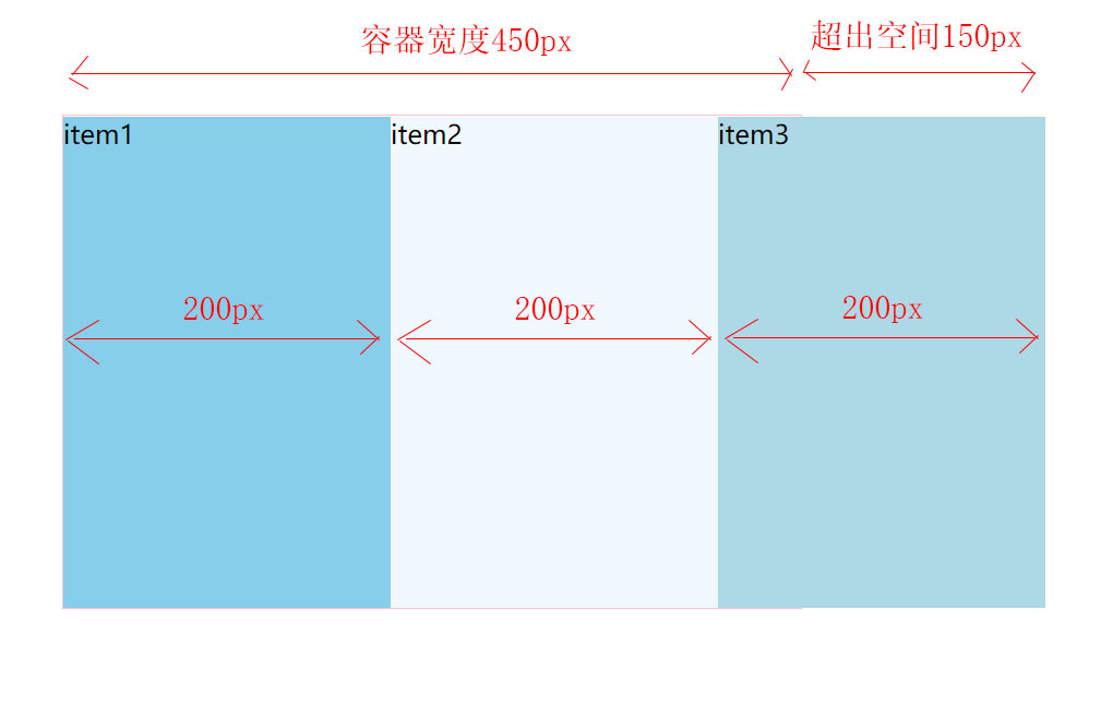
Remember the last example of the flex basis chapter?
The width of the container is 450px, and the three items are 200px respectively. If the total width exceeds the container, it will be automatically reduced. It's not difficult to calculate. The excess space here is 200px * 3 - 450px = 150px.
Syntax format:
.item {
	/* >=0 The default value is 1 */
	flex-shrink: <number>;
}
Of which:
1. The default value is 1, which means that all items are scaled down equally.
2. If it is 0, it means no reduction.
The reduced size calculation method is similar to that of fly grow, involving two formulas:
1) Calculate how much of the excess space is used for compression.
Formulas: out of space * ( Of all items flex-shrink Sum of >= 1 ? 1 : Of all items flex-shrink Sum of ) .
If the space is not exceeded, use compression; If the excess space is 150px and the sum of flex shrink of all items is 0.6, then 90px is used for compression.
2) Calculate how much space is reduced for each project.
Formulas: space to compress * ( Single item flex-shrink / Of all items flex-shrink Sum of )
In short, it is reduced according to the proportion of flex shrink.
Let's explain with examples to understand the calculation formula here.
Example 1: set the flex shrink of the project to 0:
Following the previous example, there is a div (container, 450px), which contains three div (project, flex base is 200px).
.item {
	/* flex-basis Property defines the size of the main size occupied by the item. */
	flex-basis: 200px;

	/* flex-shrink Property defines the reduction factor for the item */
	flex-shrink: 0;
}
Of which:
flex-shrink A value of 0 means that the project is not compressed.
Operation effect:
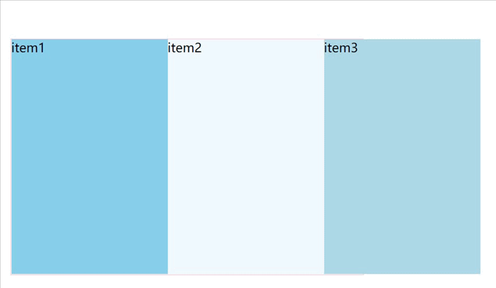
You can see that the item3 project exceeds the container.
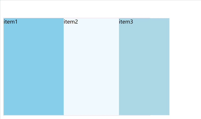
Example 2, followed by the previous example, set the flex shrink of items 1, 2 and 3 to 0, 1 and 2 respectively:
Set of formula calculation:
1) Calculate how much of the excess space is used for compression.
Space to compress
 = Total out of space * ( Of all items flex-shrink Sum of >= 1 ? 1 : Of all items flex-shrink Sum of ) .
 = 150px * ( 3 >= 1 ? 1 : 3)
 = 150px
2) Calculate how much space is reduced for each project.
Item 1 compressed space
 = 150px * ( 0 / 3 )
 = 0

Item 2 compressed space
 = 150px * ( 1 / 3 )
 = 50px

Item 3 compressed space
 = 150px * ( 2 / 3 )
 = 100px
So finally: the width of project 1 is 200px, the width of project 2 is 150px, and the width of project 3 is 100px.
Write the code to see the effect:
.item {
	/* flex-basis Property defines the size of the main size occupied by the item. */
	flex-basis: 200px;
}

.item1 {
	flex-shrink: 0;
}

.item2 {
	flex-shrink: 1;
}

.item3 {
	flex-shrink: 2;
}
Operation effect:
Observe the operation effect and meet the expectation.
Example 3: set the flex shrink of items 1, 2 and 3 to 0.1, 0.2 and 0.3 respectively:
This example is similar to the above example, except that the number becomes a decimal and the total is no more than 1.
First set of formulas to calculate:
1) Calculate how much of the excess space is used for compression.
Space to compress
 = Total out of space * ( Of all items flex-shrink Sum of >= 1 ? 1 : Of all items flex-shrink Sum of ) .
 = 150px * ( 0.6 >= 1 ? 1 : 0.6)
 = 90px
2) Calculate how much space is reduced for each project.
Item 1 compressed space
 = 90px * ( 0.1 / 0.6 )
 = 15px

Item 2 compressed space
 = 90px * ( 0.2 / 0.6 )
 = 30px

Item 3 compressed space
 = 90px * ( 0.3 / 0.6 )
 = 45px
So finally: the width of project 1 is 185x, the width of project 2 is 170px, and the width of project 3 is 155px.
The style code is as follows:
.item {
	/* flex-basis Property defines the size of the main size occupied by the item. */
	flex-basis: 200px;
}

.item1 {
	flex-shrink: .1;
}

.item2 {
	flex-shrink: .2;
}

.item3 {
	flex-shrink: .3;
}
The operation effect is as follows:
Meet the calculation expectation.
Summary of this section
-
The total size of the item that exceeds the container becomes out of space.
-
Flex shrink is used to set the reduction factor of the project.
-
The project downsizing calculation consists of two formulas:
1) Calculate how much of the excess space is used for compression.
Formula: total out of space * ( Of all items flex-shrink Sum of >= 1 ? 1 : Of all items flex-shrink Sum of ) .
2) Calculate how much space is reduced for each project.
Formulas: space to compress * ( Single item flex-shrink / Of all items flex-shrink Sum of )