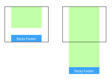
Sticky footer is to keep the footer part of the page at the bottom of the browser window.
When the page content is long enough to exceed the viewing height of the browser, the footer will be pushed to the bottom of the page with the content, but if the page content is not long enough, the footer will remain at the bottom of the browser window.
Implementation method
1. Set the bottom outer margin of the content part to a negative number
This is a more mainstream usage. Set the minimum height of the content part to 100%, and then use the negative bottom margin value of the content part to achieve the effect of keeping the footer at the bottom of the window when the height is unsatisfactory, and then launching when the height exceeds.
<body>
  <div class="wrapper">

      content

    <div class="push"></div>
  </div>
  <footer class="footer"></footer>
</body>
html, body {
  height: 100%;
  margin: 0;
}
.wrapper {
  min-height: 100%;

  /* The height equal to footer */
  margin-bottom: -50px;
}
.footer,
.push {
  height: 50px;
}
//This method requires additional placeholder elements in the container (e.g. push)

//It should be noted that the margin-bottom value of. wrapper needs to be consistent with the negative height value of. footer, which is not very friendly.

2. Set the top outer margin of the footer to a negative number

//Since negative margin bottom can be used on containers, can negative margin top be used? Certainly.

//Add a parent element outside the content and make the bottom margin of the content equal to the footer height.

<body>
  <div class="content">
    <div class="content-inside">
      content
    </div>
  </div>
  <footer class="footer"></footer>
</body>
html, body {
  height: 100%;
  margin: 0;
}
.content {
  min-height: 100%;
}
.content-inside {
  padding: 20px;
  padding-bottom: 50px;
}
.footer {
  height: 50px;
  margin-top: -50px;
}
But this method, like the previous one, requires additional unnecessary html elements.
3. Use calc() to set the content height
There's a way that you don't need any redundant elements -- using the new calc() function added to CSS3.
In this way, there will be no overlap between elements, and there is no need to control the internal and external margins.
<body>
  <div class="content">
    content
  </div>
  <footer class="footer"></footer>
</body>
.content {
  min-height: calc(100vh - 70px);
}
.footer {
  height: 50px;
}
You may wonder why 70 PX is subtracted from content height calc(), rather than footer's 50 px, because assuming that the two elements are 20 PX apart, 70 PX = 50 PX + 20 PX
But you don't have to care about that.~
4. Use flexbox layout
The footer heights of the above three methods are fixed, which is generally not conducive to the layout of web pages: content will change, they are flexible, once the content exceeds the fixed height, it will destroy the layout. So use flexbox for footer to make it bigger, smaller and more beautiful (> =)
<body>
  <div class="content">
    content
  </div>
  <footer class="footer"></footer>
</body>
html {
  height: 100%;
}
body {
  min-height: 100%;
  display: flex;
  flex-direction: column;
}
.content {
  flex: 1;
}
You can also add header s above or more elements below. Choose one of the following techniques:
- flex: 1 allows content (e.g., content) to be freely scalable
- margin-top: auto
5. Using Grid Grid Layout
grid is much newer than flexbox, and it's better and simpler
<body>
  <div class="content">
    content
  </div>
  <footer class="footer"></footer>
</body>
html {
  height: 100%;
}
body {
  min-height: 100%;
  display: grid;
  grid-template-rows: 1fr auto;
}
.footer {
  grid-row-start: 2;
  grid-row-end: 3;
}
Unfortunately, Grid layout currently only supports Chrome Canary and Firefox Developer Edition versions.