facet_wrap
facet_wrap uses a wavy character and then uses the data variables to be split. Give an example:
facet_wrap(~dob_month, ncol=3)
#Set the column number to 3
facet_wrap uses functions similar to those used
facet_wrap(formula)
facet_wrap(~variable)

facet_grid(formula)
facet_grid(vertical~horizontal)
Drawing Ordinary Graphics
# Loading data
pf <- read.csv("D:/R/pseudo_facebook.tsv", sep = '\t')

library(ggplot2)

qplot(x = friend_count, data = pf)

#Method 2: Draw the same figure
ggplot(aes(x = friend_count), data = pf) +
  geom_histogram()
Restriction axis
Using the x limb parameter in the graph can be used to limit the length of the axis. The parameter takes a vector to define the starting and ending positions of the axis.
qplot(x = friend_count, data = pf, xlim=c(0,1000))

#Method 2: Add a layer instead of xlim, and the effect is the same.
qplot(x = friend_count, data = pf)+
    scale_x_continous(limits=c(0,1000))
Adjustment of group spacing
# binwidth is the group distance parameter to determine the group distance of bar graph
qplot(x = friend_count, data = pf, binwidth=25)+
    scale_x_continuous(limits=c(0,1000),breaks=seq(0,1000,50))
# The function of breaks is to divide the x-axis and mark it every 50 positions.
Equivalent ggplot grammar
ggplot(aes(x = friend_count), data = pf) +
  geom_histogram(binwidth = 25) +
  scale_x_continuous(limits = c(0, 1000), breaks = seq(0, 1000, 50))
Layering charts by gender
Layering with facet
qplot(x = friend_count, data = pf) +
  facet_grid(~gender)
In this way, the chart will be divided into three layers. For non-males and non-females, facet will be represented by NA by default, as shown in the figure.
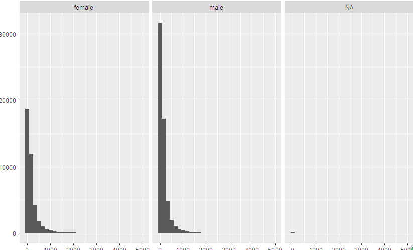
To ignore NA, you can use the subset subset and set conditions for the second parameter, the first parameter being the data set.
# The function of is.na(gender) is to ignore NA.
qplot(x = friend_count, data = subset(pf, !is.na(gender)),
      binwidth=10)+
  scale_x_continuous(limits = c(0, 1000), breaks = seq(0, 1000, 50)) +
  facet_wrap(~gender)

 #Equivalent ggplot grammar
 ggplot(aes(x = friend_count), data = subset(pf, !is.na(gender))) +
  geom_histogram() +
  scale_x_continuous(limits = c(0, 1000), breaks = seq(0, 1000, 50)) +
  facet_wrap(~gender)
Introduction to by command
Use this command to check the average number of friends by sex
The by command has three inputs: a variable, a category variable, or a list of indicators that divide subsets, and a function.
# summary is used to calculate the average, mode, and median of men and women.
by(pf$friend_count, pf$gender, summary)
Create a colored histogram
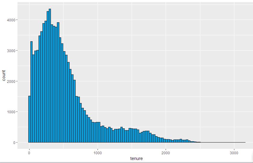
qplot(x=tenure, data=pf, binwidth=30,
      color=I('black'), fill=I('#099DD9'))


#Equivalent ggplot grammar
ggplot(aes(x = tenure), data = pf) +
   geom_histogram(binwidth = 30, color = 'black', fill = '#099DD9')
The parameter color determines the color outline of the object in the graph.
The parameter fill determines the area color of the object in the graph.
You may notice how the color black and the hexadecimal code color # 099D9 (a blue shadow) are encapsulated in I(). The I() function represents the "status quo" and tells qplot to use them as colors.
As shown in the figure:
Change the labels on the x and y axes
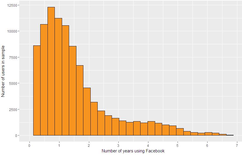
qplot(x=tenure/365, data = pf,
      xlab = 'Number of years using Facebook',
      ylab = 'Number of users in sample',
      color = I('black'), fill = I('#F79420'))+
  scale_x_continuous(limits = c(0,7), breaks = seq(0,7,1))


##Equivalent ggplot grammar
ggplot(aes(x = tenure / 365), data = pf) +
  geom_histogram(color = 'black', fill = '#F79420') +
  scale_x_continuous(breaks = seq(1, 7, 1), limits = c(0, 7)) +
  xlab('Number of years using Facebook') +
  ylab('Number of users in sample')
The results are shown as follows:
Display multiple graphs at the same time with the grid command
# define individual plots
p1 = ggplot(...)
p2 = ggplot(...)
p3 = ggplot(...)
p4 = ggplot(...)
# arrange plots in grid
grid.arrange(p1, p2, p3, p4, ncol=2)
A Method of Converting Ordinary Data into Logarithmic Data Base on 10
logScale <- qplot(x=log10(friend_count), data=pf)

# Gem_histogram() defines the form of a histogram
countScale<- ggplot(aes(x=friend_count), data=pf)+
  geom_histogram()+
  scale_x_log10()

#Display in two columns at the same time
grid.arrange(logScale, countScale, ncol=2)
The two pieces of code show the same graph, except that the x-axis is slightly different, as shown below.
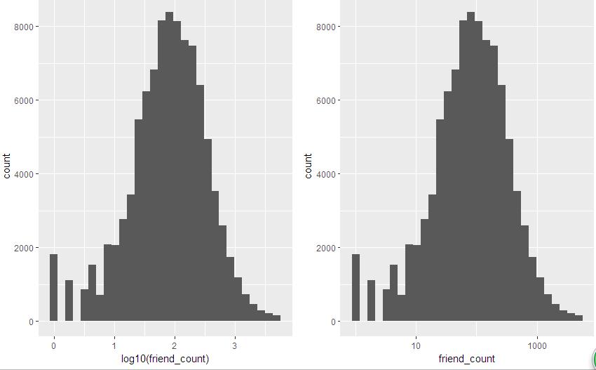
Or it can be written as follows:
# Add a layer to represent logarithms
qplot(x=friend_count, data=pf)+
    scale_x_log10()
Frequency polygon
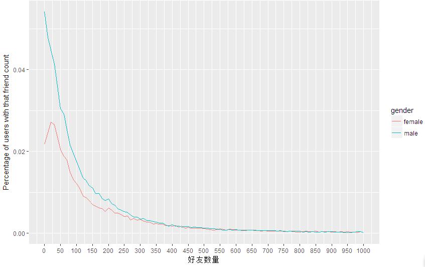
# The function of the phrase geom='freqpoly'is to generate a spectrum.
# The function of color=gender is to generate different spectrum curves according to gender.
# sum(..count..) will be aggregated across colors, so the percentage shown is the percentage of the total number of users. To draw percentages within each group, you can try
y = ..density...


qplot(x=friend_count, y = ..count../sum(..count..), data=subset(pf, !is.na(gender)),
      binwidth=10, geom='freqpoly', color=gender)+
  scale_x_continuous(limits = c(0, 1000), breaks = seq(0, 1000, 50)) +
  xlab('Number of Friends') +
  ylab('Percentage of users with that friend count')


 # Equivalent ggplot grammar
 ggplot(aes(x = friend_count, y = ..count../sum(..count..)), data = subset(pf, !is.na(gender))) +
  geom_freqpoly(aes(color = gender), binwidth=10) +
  scale_x_continuous(limits = c(0, 1000), breaks = seq(0, 1000, 50)) +
  xlab('Number of Friends') +
  ylab('Percentage of users with that friend count')
The result is shown in the figure.
Box plot
# Gem ='box plot'denotes drawing boxplots
qplot(x=gender, y=friend_count,
      data=subset(pf, !is.na(gender)),
      geom = 'boxplot')
The drawing results are as follows:
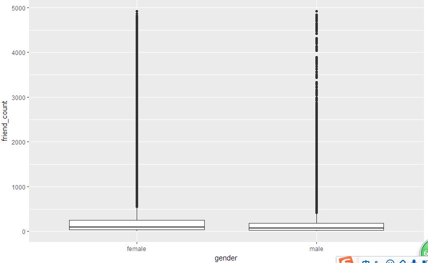
To limit the y-axis to (0,1000), it's better not to use scale_y_continuous layer, because this is equivalent to deleting more than 1,000 y elements. It's best to use the coord_cartesian layer with the following code:
qplot(x=gender, y=friend_count,
      data=subset(pf, !is.na(gender)),
      geom = 'boxplot')+
  coord_cartesian(ylim = c(0,1000))
Variable types converted to True or False
Determine whether a user is logged in using a mobile device
# PF $mobile_check_in<-NA. Its function is to create a new variable in the data box with NA value and assign NA value to it.
# Ifelse (pf $mobile_likes > 0, 1, 0) assigns a value of 1 if the user has used mobile login. If the login assignment is not 0. So use ifelse to judge, if mobile_likes is true, assign 1, if false, assign 0.
# Then we save our new variables by factor factor variables.
# Finally, summary is used to summarize the results.


mobile_check_in <- NA
pf$mobile_check_in <- ifelse(pf$mobile_likes>0 , 1, 0)
pf$mobile_check_in <- factor(pf$mobile_check_in)
summary(pf$mobile_check_in)
If you want to display it as a percentage
# Since mobile_check_in is a factor variable, the sum() function will not run. You can use the length() function to determine the number of values in the vector.

# We can also create mobile_check_in to save Boolean values. The sum() function can handle Boolean values (true 1, false 0).

summary(pf$mobile_check_in)
sum(pf$mobile_check_in==1)/length(pf$mobile_check_in)