WPF not only supports the user interface and user experience design of traditional Windows Forms programming, but also supports professional design with special Blend. At the same time, WPF also launched a new generation of design concept with template as the core. In WPF, the "content" and "form" of data and algorithm are decoupled by introducing templates. Templates are mainly divided into two categories: Data Template and Control Template. This article briefly describes the relevant contents of the Control Template with some simple small examples. It is only for learning and sharing. If there are deficiencies, please correct them.
Edit default template
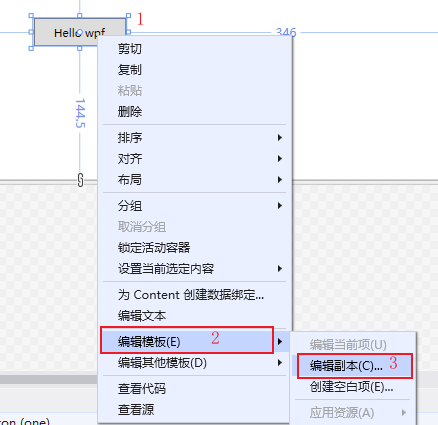
Select control - right click - edit template - edit copy to open the create Style resource dialog box, as shown below:
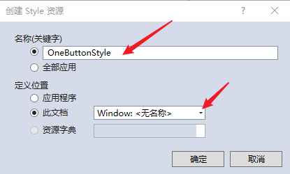
Create a Style resource, enter the resource name and define the location. The default is Window, and then click OK to create the resource. As follows:
Create a default resource for the control element, as follows:
 1 <Window x:Class="WpfApp2.TwoWindow"
 2         xmlns="http://schemas.microsoft.com/winfx/2006/xaml/presentation"
 3         xmlns:x="http://schemas.microsoft.com/winfx/2006/xaml"
 4         xmlns:d="http://schemas.microsoft.com/expression/blend/2008"
 5         xmlns:mc="http://schemas.openxmlformats.org/markup-compatibility/2006"
 6         xmlns:local="clr-namespace:WpfApp2"
 7         mc:Ignorable="d"
 8         Title="TwoWindow" Height="350" Width="800">
 9     <Window.Resources>
10         <Style x:Key="FocusVisual">
11             <Setter Property="Control.Template">
12                 <Setter.Value>
13                     <ControlTemplate>
14                         <Rectangle Margin="2" SnapsToDevicePixels="true" Stroke="{DynamicResource {x:Static SystemColors.ControlTextBrushKey}}" StrokeThickness="1" StrokeDashArray="1 2"/>
15                     </ControlTemplate>
16                 </Setter.Value>
17             </Setter>
18         </Style>
19         <SolidColorBrush x:Key="Button.Static.Background" Color="#FFDDDDDD"/>
20         <SolidColorBrush x:Key="Button.Static.Border" Color="#FF707070"/>
21         <SolidColorBrush x:Key="Button.MouseOver.Background" Color="#FFBEE6FD"/>
22         <SolidColorBrush x:Key="Button.MouseOver.Border" Color="#FF3C7FB1"/>
23         <SolidColorBrush x:Key="Button.Pressed.Background" Color="#FFC4E5F6"/>
24         <SolidColorBrush x:Key="Button.Pressed.Border" Color="#FF2C628B"/>
25         <SolidColorBrush x:Key="Button.Disabled.Background" Color="#FFF4F4F4"/>
26         <SolidColorBrush x:Key="Button.Disabled.Border" Color="#FFADB2B5"/>
27         <SolidColorBrush x:Key="Button.Disabled.Foreground" Color="#FF838383"/>
28         <Style x:Key="OneButtonStyle" TargetType="{x:Type Button}">
29             <Setter Property="FocusVisualStyle" Value="{StaticResource FocusVisual}"/>
30             <Setter Property="Background" Value="{StaticResource Button.Static.Background}"/>
31             <Setter Property="BorderBrush" Value="{StaticResource Button.Static.Border}"/>
32             <Setter Property="Foreground" Value="{DynamicResource {x:Static SystemColors.ControlTextBrushKey}}"/>
33             <Setter Property="BorderThickness" Value="1"/>
34             <Setter Property="HorizontalContentAlignment" Value="Center"/>
35             <Setter Property="VerticalContentAlignment" Value="Center"/>
36             <Setter Property="Padding" Value="1"/>
37             <Setter Property="Template">
38                 <Setter.Value>
39                     <ControlTemplate TargetType="{x:Type Button}">
40                         <Border x:Name="border" BorderBrush="{TemplateBinding BorderBrush}" BorderThickness="{TemplateBinding BorderThickness}" Background="{TemplateBinding Background}" SnapsToDevicePixels="true">
41                             <ContentPresenter x:Name="contentPresenter" Focusable="False" HorizontalAlignment="{TemplateBinding HorizontalContentAlignment}" Margin="{TemplateBinding Padding}" RecognizesAccessKey="True" SnapsToDevicePixels="{TemplateBinding SnapsToDevicePixels}" VerticalAlignment="{TemplateBinding VerticalContentAlignment}"/>
42                         </Border>
43                         <ControlTemplate.Triggers>
44                             <Trigger Property="IsDefaulted" Value="true">
45                                 <Setter Property="BorderBrush" TargetName="border" Value="{DynamicResource {x:Static SystemColors.HighlightBrushKey}}"/>
46                             </Trigger>
47                             <Trigger Property="IsMouseOver" Value="true">
48                                 <Setter Property="Background" TargetName="border" Value="{StaticResource Button.MouseOver.Background}"/>
49                                 <Setter Property="BorderBrush" TargetName="border" Value="{StaticResource Button.MouseOver.Border}"/>
50                             </Trigger>
51                             <Trigger Property="IsPressed" Value="true">
52                                 <Setter Property="Background" TargetName="border" Value="{StaticResource Button.Pressed.Background}"/>
53                                 <Setter Property="BorderBrush" TargetName="border" Value="{StaticResource Button.Pressed.Border}"/>
54                             </Trigger>
55                             <Trigger Property="IsEnabled" Value="false">
56                                 <Setter Property="Background" TargetName="border" Value="{StaticResource Button.Disabled.Background}"/>
57                                 <Setter Property="BorderBrush" TargetName="border" Value="{StaticResource Button.Disabled.Border}"/>
58                                 <Setter Property="TextElement.Foreground" TargetName="contentPresenter" Value="{StaticResource Button.Disabled.Foreground}"/>
59                             </Trigger>
60                         </ControlTemplate.Triggers>
61                     </ControlTemplate>
62                 </Setter.Value>
63             </Setter>
64         </Style>
65     </Window.Resources>
66     <Grid>
67         <Button x:Name="one" Content="Hello wpf" Margin="5" Width="100" Height="30" Style="{DynamicResource OneButtonStyle}"></Button>
68     </Grid>
69 </Window>
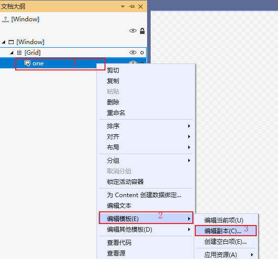
To edit the default template, you can also right-click document outline - edit template - edit copy, and then open the create resource dialog box, as shown below:
Modify default style
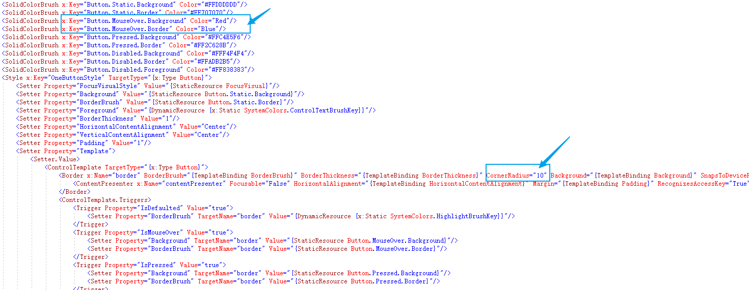
Through the control template Style created by default, you can modify and redefine the display content of the control, such as setting the button to display rounded corners and turning the mouse to red.
To realize the above functions, you only need to modify two places, as shown below:
Custom control template
By customizing the template, you can also modify the control style.
The control Template is also a kind of resource. Each control Template has a unique key, which is bound on the control through the Template, as shown below:
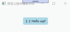
 1 <Window x:Class="WpfApp2.ThreeWindow"
 2         xmlns="http://schemas.microsoft.com/winfx/2006/xaml/presentation"
 3         xmlns:x="http://schemas.microsoft.com/winfx/2006/xaml"
 4         xmlns:d="http://schemas.microsoft.com/expression/blend/2008"
 5         xmlns:mc="http://schemas.openxmlformats.org/markup-compatibility/2006"
 6         xmlns:local="clr-namespace:WpfApp2"
 7         mc:Ignorable="d"
 8         Title="Custom control template example" Height="150" Width="300">
 9     <Window.Resources>
10         <ControlTemplate x:Key="oneStyle" TargetType="Button">
11             <Border Background="LightBlue" CornerRadius="5" x:Name="border">
12                 <StackPanel Orientation="Horizontal" HorizontalAlignment="{TemplateBinding HorizontalAlignment}">
13                     <TextBlock VerticalAlignment="{TemplateBinding VerticalAlignment}">>></TextBlock>
14                     <ContentPresenter HorizontalAlignment="{TemplateBinding HorizontalAlignment}" VerticalAlignment="{TemplateBinding VerticalAlignment}"></ContentPresenter>
15                 </StackPanel>
16             </Border>
17             <ControlTemplate.Triggers>
18                 <Trigger Property="IsMouseOver" Value="true">
19                     <Setter Property="Background" TargetName="border" Value="Red"/>
20                     <Setter Property="BorderBrush" TargetName="border" Value="Blue"/>
21                 </Trigger>
22             </ControlTemplate.Triggers>
23         </ControlTemplate>
24     </Window.Resources>
25     <Grid>
26         <Button x:Name="one" Content="Hello wpf" Margin="5" Width="100" Height="30" VerticalAlignment="Center"  HorizontalAlignment="Center" Template="{StaticResource oneStyle}"></Button>
27     </Grid>
28 </Window>
Custom control template, for example:
remarks
Control template determines the display form of data and user physical examination, which is very important in software UI design. This paper aims to throw a brick to attract jade, learn together and make progress together.
Untitled · stars last night, wind last night
The stars last night, the wind last night, the west of the painting building and the east of the Guitang. The body has no colorful Phoenix wings, and the heart has a touch of communication.
The spring wine is warm, and the Cao is covered with wax and the lamp is red. I listened to the drum and went to the official's office. I went to malantai to turn the tent.