Fluent is a cross platform application development framework that supports devices of various screen sizes. It can run on small devices such as smart watches or large devices such as TVs. Using the same code to adapt to different screen sizes and pixel densities is a challenge.
There are no rigid rules for the design of the responsive layout of the shuttle. In this article, I'll show you some methods you can follow when designing responsive layouts.
Before using fluent to build a responsive layout, I want to explain how Android and iOS handle layouts of different screen sizes.
1. Android method
In order to handle different screen sizes and pixel densities, the following concepts are used in Android:
1.1 ConstraintLayout
A revolutionary thing introduced in Android UI design is ConstraintLayout. It can be used to create flexible and responsive UI designs to adapt to different screen sizes and sizes. It allows you to specify the location and size of each view based on its spatial relationship with other views in the layout.
But this does not solve the problem of large devices. In large devices, stretching or just resizing UI components is not the most elegant way to use screen area. In a smart watch with a small screen area, adjusting components to fit the screen size may lead to strange UI.
1.2 Alternative layouts
To solve the above problems, you can use alternative layouts for devices of different sizes. For example, you can use split screen view on devices such as tablets to provide a good user experience and use large screens wisely.
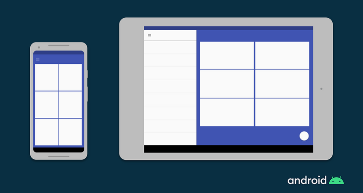
In Android, you can define different layout files for different screen sizes. The Android framework will automatically handle the switching between these layouts according to the screen size of the device.
1.3 Fragments
Using Fragment, you can extract your UI logic into separate components, so that when you design a multi pane layout for a large screen size, you don't have to define the logic separately. You can reuse the fragments defined for each Fragment.
1.4 Vector graphics
Vector graphics uses XML to create images to define paths and colors instead of pixel bitmaps. It can be scaled to any size. In Android, you can use VectorDrawable to draw any type of illustration, such as icons.
2. iOS approach
iOS defines responsive layouts as follows
2.1 Auto Layout
Auto Layout can be used to build an adaptive interface where you can define rules (called constraints) that control the content of your application. When some environmental changes (called features) are detected, Auto Layout automatically readjusts the layout according to the specified constraints.
2.2 Size classes
The feature of the size class is that it is automatically assigned to the content area according to its size. iOS will dynamically adjust the layout according to the size category of the content area. On the iPad, the size class also applies.
2.3 some UI components
There are other UI interfaces that you can use to build responsive UI on iOS, such as UIStackView, UIViewController, and UISplitViewController.
3. How is the shuttle adaptive
Even if you are not a developer of Android or iOS, by now, you should have understood how these platforms deal with responsive layout.
In Android, to display multiple UI views on a single screen, use Fragments, which are similar to reusable components that can run in an application's Activity.
You can run multiple fragments in one Activity, but you cannot run multiple activities in one application at the same time.
In iOS, in order to control multiple view controllers, UISplitViewController is used, which manages sub view controllers in a hierarchical interface.
Now we come to Flutter
Fluent introduces the concept of widget s. They are pieced together like building blocks to build the application screen.
Remember, in fluent, each screen and the entire application is also a widget!
Widgets are reusable in nature, so you don't need to learn any other concepts when building responsive layouts in fluent.
3.1 responsive concept of flutter
As I said earlier, I will discuss the important concepts needed to develop responsive layout, and then you can choose what way to implement responsive layout on your APP.
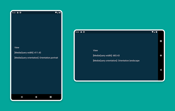
3.1.1 MediaQuery
You can use MediaQuery to retrieve the screen size (width / height) and orientation (vertical / horizontal).
Here is an example
class HomePage extends StatelessWidget {
  @override
  Widget build(BuildContext context) {
    Size screenSize = MediaQuery.of(context).size;
    Orientation orientation = MediaQuery.of(context).orientation;

    return Scaffold(
      body: Container(
        color: CustomColors.android,
        child: Center(
          child: Text(
            'View\n\n' +
                '[MediaQuery width]: ${screenSize.width.toStringAsFixed(2)}\n\n' +
                '[MediaQuery orientation]: $orientation',
            style: TextStyle(color: Colors.white, fontSize: 18),
          ),
        ),
      ),
    );
  }
}
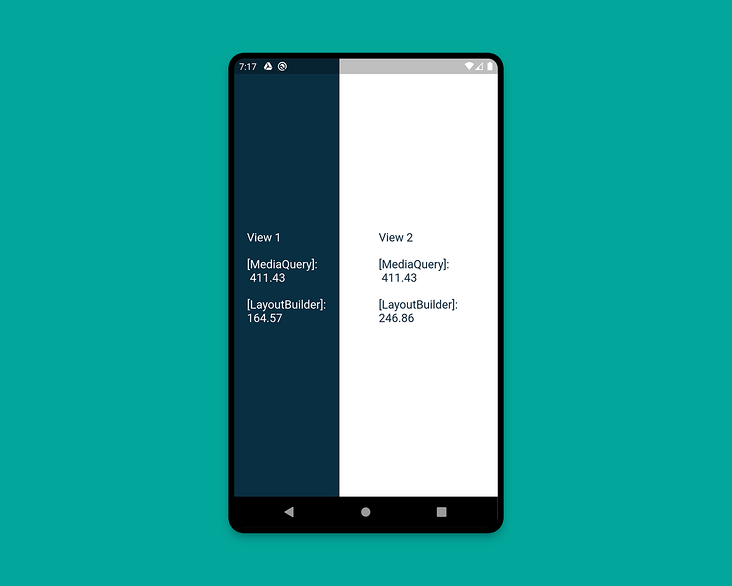
3.1.2 LayoutBuilder
Using the LayoutBuilder class, you can get the BoxConstraints object, which can be used to determine the maxWidth and maxHeight of the widget.
Remember: the main difference between MediaQuery and LayoutBuilder is that MediaQuery uses the full context of the screen, not just the size of a specific widget. LayoutBuilder can determine the maximum width and height of a particular widget.
Here is an example
class HomePage extends StatelessWidget {
  @override
  Widget build(BuildContext context) {
    Size screenSize = MediaQuery.of(context).size;

    return Scaffold(
      body: Row(
        children: [
          Expanded(
            flex: 2,
            child: LayoutBuilder(
              builder: (context, constraints) => Container(
                color: CustomColors.android,
                child: Center(
                  child: Text(
                    'View 1\n\n' +
                        '[MediaQuery]:\n ${screenSize.width.toStringAsFixed(2)}\n\n' +
                        '[LayoutBuilder]:\n${constraints.maxWidth.toStringAsFixed(2)}',
                    style: TextStyle(color: Colors.white, fontSize: 18),
                  ),
                ),
              ),
            ),
          ),
          Expanded(
            flex: 3,
            child: LayoutBuilder(
              builder: (context, constraints) => Container(
                color: Colors.white,
                child: Center(
                  child: Text(
                    'View 2\n\n' +
                        '[MediaQuery]:\n ${screenSize.width.toStringAsFixed(2)}\n\n' +
                        '[LayoutBuilder]:\n${constraints.maxWidth.toStringAsFixed(2)}',
                    style: TextStyle(color: CustomColors.android, fontSize: 18),
                  ),
                ),
              ),
            ),
          ),
        ],
      ),
    );
  }
}
PS: when you are building a widget and want to know its width, use this component. You can judge according to the available height / width of the sub component and build different layouts
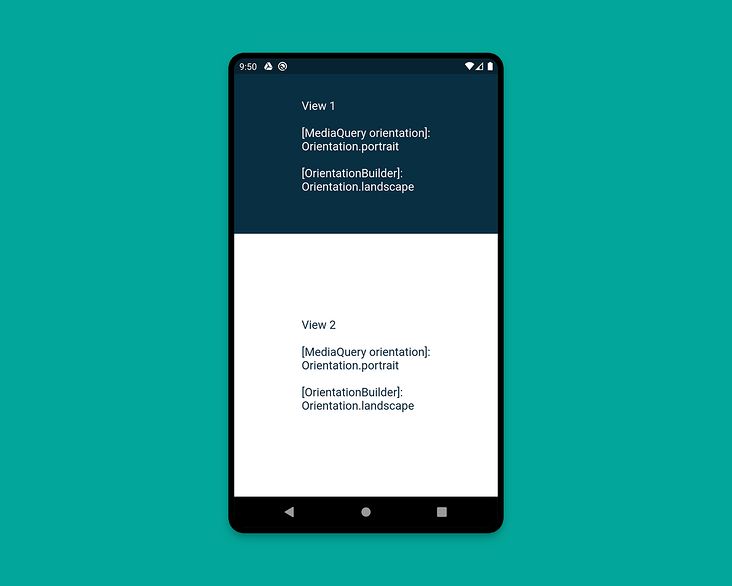
3.1.3 OrientationBuilder
To determine the current orientation of the widget, you can use the OrientationBuilder class.
Remember: This is different from the direction of the device you retrieve using MediaQuery.
Here is an example
class HomePage extends StatelessWidget {
  @override
  Widget build(BuildContext context) {
    Orientation deviceOrientation = MediaQuery.of(context).orientation;

    return Scaffold(
      body: Column(
        children: [
          Expanded(
            flex: 2,
            child: Container(
              color: CustomColors.android,
              child: OrientationBuilder(
                builder: (context, orientation) => Center(
                  child: Text(
                    'View 1\n\n' +
                        '[MediaQuery orientation]:\n$deviceOrientation\n\n' +
                        '[OrientationBuilder]:\n$orientation',
                    style: TextStyle(color: Colors.white, fontSize: 18),
                  ),
                ),
              ),
            ),
          ),
          Expanded(
            flex: 3,
            child: OrientationBuilder(
              builder: (context, orientation) => Container(
                color: Colors.white,
                child: Center(
                  child: Text(
                    'View 2\n\n' +
                        '[MediaQuery orientation]:\n$deviceOrientation\n\n' +
                        '[OrientationBuilder]:\n$orientation',
                    style: TextStyle(color: CustomColors.android, fontSize: 18),
                  ),
                ),
              ),
            ),
          ),
        ],
      ),
    );
  }
}
portrait landscape
PS: look at the source code comments of OrientationBuilder
The orientation of a widget is only a factor of its width relative to its height. If the width of a [Column] part exceeds its height, its direction is horizontal, even if it displays its child elements in a vertical form.
This is the translator's code
import 'package:flutter/cupertino.dart';
import 'package:flutter/material.dart';

/// Copyright (C), 2020-2020, flutter_demo
/// FileName: orientationBuilder_demo
/// Author: Jack
/// Date: 2020/12/6
/// Description:

class OrientationBuilderDemo extends StatelessWidget {
  @override
  Widget build(BuildContext context) {
    Orientation deviceOrientation = MediaQuery.of(context).orientation;

    return Scaffold(
      body: Column(
        children: [

          Expanded(
            flex: 1,
            child: Container(
              color: Colors.greenAccent,
              child: OrientationBuilder(
                builder: (context, orientation) => Center(
                  child: Text(
                    'View 1\n\n' +
                        '[MediaQuery orientation]:\n$deviceOrientation\n\n' +
                        '[OrientationBuilder]:\n$orientation',
                    style: TextStyle(color: Colors.white, fontSize: 18),
                  ),
                ),
              ),
            ),
          ),
          Expanded(
            flex: 2,
            child: OrientationBuilder(
              builder: (context, orientation) => Container(
                color: Colors.white,
                child: Center(
                  child: Text(
                    'View 2\n\n' +
                        '[MediaQuery orientation]:\n$deviceOrientation\n\n' +
                        '[OrientationBuilder]:\n$orientation',
                    style: TextStyle(color: Colors.greenAccent, fontSize: 18),
                  ),
                ),
              ),
            ),
          ),
        ],
      ),
    );
  }
}
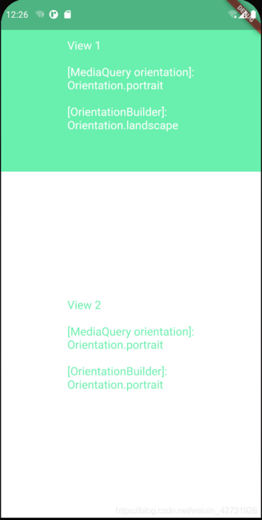
You must have understood the orientation builder's direction definition. If the width of a widget is greater than the height, it is horizontal. If the height is greater than the width, it is horizontal, that's all.
3.1.4 Expanded and Flexible
The widgets that are particularly useful in Row or Column are Expanded and Flexible. When Expanded is used in a Row, Column or Flex, Expanded can make its child widgets automatically fill the available space. On the contrary, Flexible child widgets will not fill the entire available space.
Examples are as follows.
class HomePage extends StatelessWidget {
  @override
  Widget build(BuildContext context) {
    return Scaffold(
      backgroundColor: Colors.white,
      body: SafeArea(
        child: Column(
          children: [
            Row(
              children: [
                ExpandedWidget(),
                FlexibleWidget(),
              ],
            ),
            Row(
              children: [
                ExpandedWidget(),
                ExpandedWidget(),
              ],
            ),
            Row(
              children: [
                FlexibleWidget(),
                FlexibleWidget(),
              ],
            ),
            Row(
              children: [
                FlexibleWidget(),
                ExpandedWidget(),
              ],
            ),
          ],
        ),
      ),
    );
  }
}

class ExpandedWidget extends StatelessWidget {
  @override
  Widget build(BuildContext context) {
    return Expanded(
      child: Container(
        decoration: BoxDecoration(
          color: CustomColors.android,
          border: Border.all(color: Colors.white),
        ),
        child: Padding(
          padding: const EdgeInsets.all(16.0),
          child: Text(
            'Expanded',
            style: TextStyle(color: Colors.white, fontSize: 24),
          ),
        ),
      ),
    );
  }
}

class FlexibleWidget extends StatelessWidget {
  @override
  Widget build(BuildContext context) {
    return Flexible(
      child: Container(
        decoration: BoxDecoration(
          color: CustomColors.androidAccent,
          border: Border.all(color: Colors.white),
        ),
        child: Padding(
          padding: const EdgeInsets.all(16.0),
          child: Text(
            'Flexible',
            style: TextStyle(color: CustomColors.android, fontSize: 24),
          ),
        ),
      ),
    );
  }
}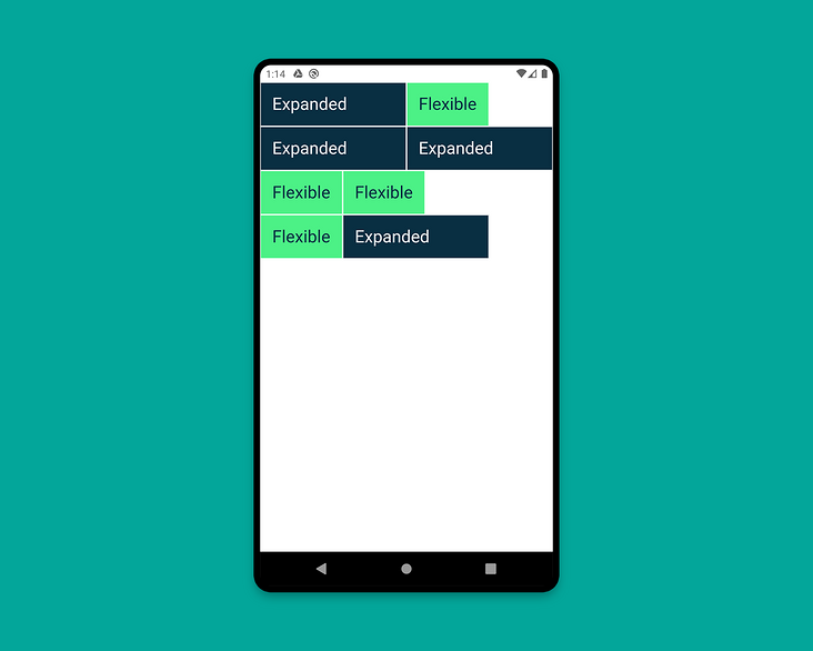
PS: unlike [expand], [flexible] does not need child widget s to fill the remaining space. In the first example, although expanded has the function of filling the empty space, the flex of both expanded and flexible components is 1, which is equivalent to dividing the vertical axis into two halves. All the space owned by expanded is half of the vertical axis. In fact, it has been filled.
3.1.5 FractionallySizedBox
The FractionallySizedBox widget resizes its child elements to a fraction of the available space. It is particularly useful in Expanded or flexible widgets.
class HomePage extends StatelessWidget {
  @override
  Widget build(BuildContext context) {
    return Scaffold(
      backgroundColor: Colors.white,
      body: SafeArea(
        child: Column(
          mainAxisAlignment: MainAxisAlignment.start,
          children: [
            Row(
              crossAxisAlignment: CrossAxisAlignment.start,
              children: [
                FractionallySizedWidget(widthFactor: 0.4),
              ],
            ),
            Row(
              crossAxisAlignment: CrossAxisAlignment.start,
              children: [
                FractionallySizedWidget(widthFactor: 0.6),
              ],
            ),
            Row(
              crossAxisAlignment: CrossAxisAlignment.start,
              children: [
                FractionallySizedWidget(widthFactor: 0.8),
              ],
            ),
            Row(
              crossAxisAlignment: CrossAxisAlignment.start,
              children: [
                FractionallySizedWidget(widthFactor: 1.0),
              ],
            ),
          ],
        ),
      ),
    );
  }
}

class FractionallySizedWidget extends StatelessWidget {
  final double widthFactor;
  FractionallySizedWidget({@required this.widthFactor});

  @override
  Widget build(BuildContext context) {
    return Expanded(
      child: FractionallySizedBox(
        alignment: Alignment.centerLeft,
        widthFactor: widthFactor,
        child: Container(
          decoration: BoxDecoration(
            color: CustomColors.android,
            border: Border.all(color: Colors.white),
          ),
          child: Padding(
            padding: const EdgeInsets.all(16.0),
            child: Text(
              '${widthFactor * 100}%',
              style: TextStyle(color: Colors.white, fontSize: 24),
            ),
          ),
        ),
      ),
    );
  }
}
PS: when you want your widget to occupy the percentage of the current screen width and height, use this component. When you want to use the percentage layout in the Row and Column components, you need to wrap an expanded or flexible outside the FractionallySizedBox
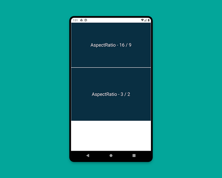
3.1.6 AspectRatio
You can use the AspectRatio widget to resize child elements to a specific aspect ratio. First, it tries to the maximum width allowed by the layout constraint and determines the height by applying the given aspect ratio to the width.
class HomePage extends StatelessWidget {
  @override
  Widget build(BuildContext context) {
    return Scaffold(
      backgroundColor: Colors.white,
      body: SafeArea(
        child: Column(
          children: [
            AspectRatioWidget(ratio: '16 / 9'),
            AspectRatioWidget(ratio: '3 / 2'),
          ],
        ),
      ),
    );
  }
}

class AspectRatioWidget extends StatelessWidget {
  final String ratio;

  AspectRatioWidget({@required this.ratio});

  @override
  Widget build(BuildContext context) {
    return AspectRatio(
      aspectRatio: Fraction.fromString(ratio).toDouble(),
      child: Container(
        decoration: BoxDecoration(
          color: CustomColors.android,
          border: Border.all(color: Colors.white),
        ),
        child: Padding(
          padding: const EdgeInsets.all(16.0),
          child: Center(
            child: Text(
              'AspectRatio - $ratio',
              style: TextStyle(color: Colors.white, fontSize: 24),
            ),
          ),
        ),
      ),
    );
  }
}
We have studied most important concepts for building a responsive layout of the shuttle app, except the last one.
Let's learn the last concept when building a sample responsive application.
3.2 create a responsive APP
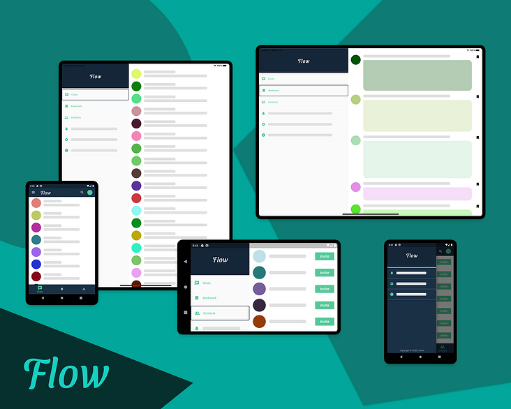
Now we will apply some of the concepts described in the previous section. At the same time, you will also learn another important concept of building a layout for a large screen, namely split screen view (multiple pages on one screen).
Responsive layout: use different layouts on screens of different sizes.
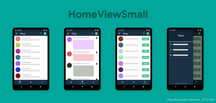
We will build a chat application called Flow.
app mainly consists of two parts:
- HomePage (PeopleView, BookmarkView, ContactView)
ChatPage (PeopleView, ChatView)
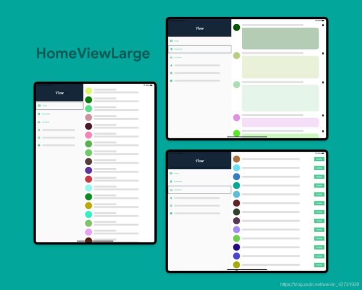
For the large screen, we will display a split screen view containing MenuWidget and DestinationView. As you can see, it is very easy to create split screen views in fluent. You only need to use a row to place them side by side, and then in order to fill the whole space, you only need to wrap the two views with expanded widgets. You can also define the flex property of the extension widget, which allows you to specify how much of the screen each widget should cover (the default flex setting is 1).
However, if you now move to a specific screen and switch between views, you will lose the context of the page, that is, you will always return to the first page, chat. To solve this problem, I used several callback functions to return the selected page to the home page. In fact, you should use state management techniques to handle this scenario. Since the sole purpose of this article is to teach you how to build responsive layouts, I won't discuss the complexity of any state management.