catalogue
1. Element UI introduction
Element UI, a Vue based desktop component library for developers, designers and product managers, uses the code encapsulated by the front-end framework to help engineers develop quickly
Features of element UI:
Rich components
The components of element UI are divided into six categories: basic components, form components, data components, prompt components, navigation components and other types of components. These rich basic components can well meet the needs of most PC to B business development
Mature ecology
Element UI is the earliest and most mature UI framework for Vue in China. There are many user groups, and problems can be basically solved
Excellent development documentation
The element UI document and demo are integrated. When we open the document, we can see that the document not only introduces the usage of each component, but also shows various examples of the component, but also clearly see the source code of each example, which is very friendly to users
Custom theme
A major feature of the Element UI is that it supports custom themes. You can use the online theme editor to modify the Design Tokens of all global and components of the Element, and easily preview the visual effects after the style changes in real time
2. Element UI start
It is officially recommended to use npm to use element UI. Next, we will demonstrate the use of element UI with the help of Vue cli project
2.1. The first element UI project
1. New vue-cli project:
Vue CLI details
I use the vuecli4 version
2. Add the element UI library to the project
Enter the project directory and execute the command to install element UI:
npm install element-ui --save
3. Configure element UI in main.js:
//Introducing element UI
import ElementUI from 'element-ui';
import 'element-ui/lib/theme-chalk/index.css';
//Using plug-ins
Vue.use(ElementUI);
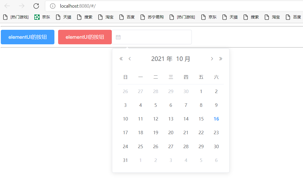
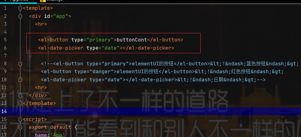
Initial experience of element UI style:
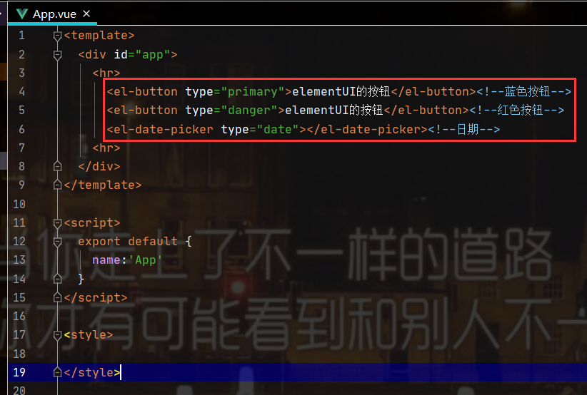
<template>
<div id="app">
<hr>
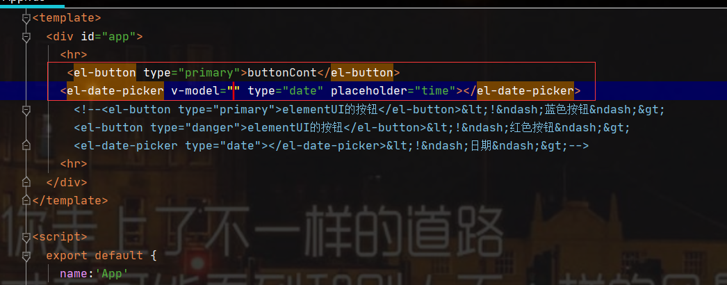
<el-button type="primary">elementUI Button for</el-button><!--Blue button-->
<el-button type="danger">elementUI Button for</el-button><!--Red button-->
<el-date-picker type="date"></el-date-picker><!--date-->
<hr>
</div>
</template>
<script>
export default {
name:'App'
}
</script>
<style>
</style>
Run test: npm run serve
3. Element plug-in and learning suggestions
Open the settings of WebStorm, search and download the element plug-in
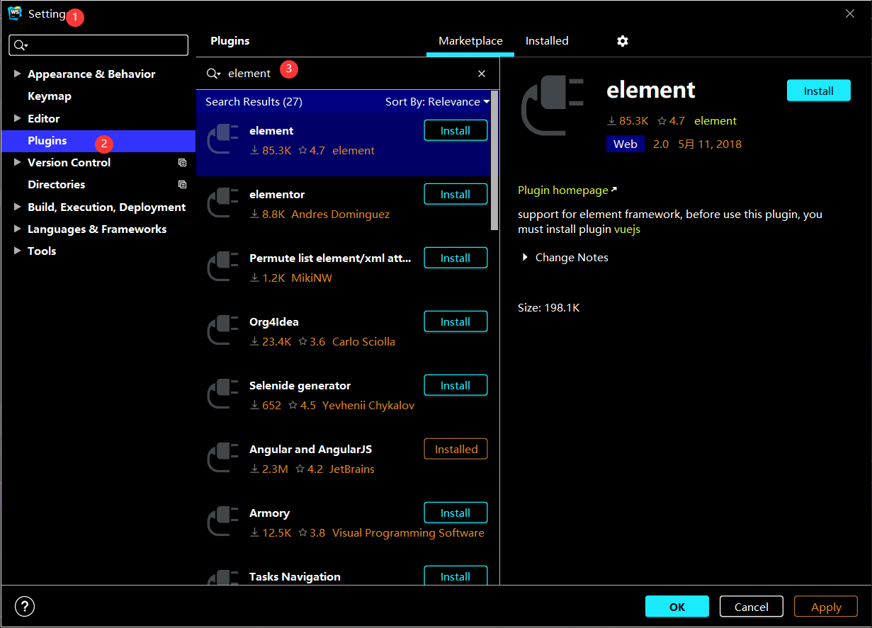
Click install to download the installation and restart
The plug-in provides us with the default completion function
Learning suggestions for element UI
Master core components
Different element UI components encapsulate different UI effects. Element UI has more than 60 components, and there are not many common components. Just grasp the key common components
Master typical grammar
The component functions of element UI are relatively powerful, so there are a large number of configuration attributes. Many attributes are not commonly used. When mastering components, you can master key attributes through typical usage
Try and error boldly and check more official documents
Don't be afraid of making mistakes when learning any new knowledge. Try more and learn from mistakes. The official examples are very comprehensive. When you encounter problems, you can read the official documents and check mistakes against the document examples
Practice makes perfect, and skill makes fine
There is nothing difficult in the world. I'm afraid that if you have a heart, you can knock more and practice more. You can practice whichever you are not familiar with. You don't need to memorize by rote. If you practice more, you will master it naturally
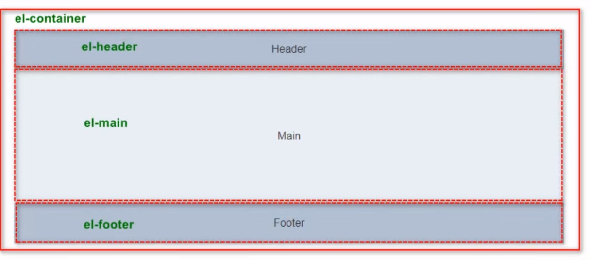
4. Container layout container
The container component used for layout is convenient to quickly build the basic structure of the page:
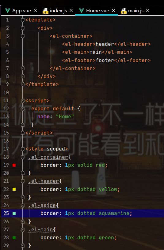
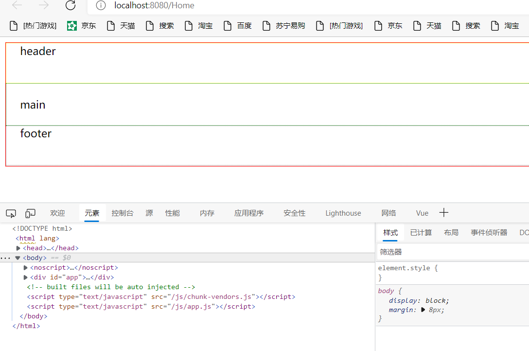
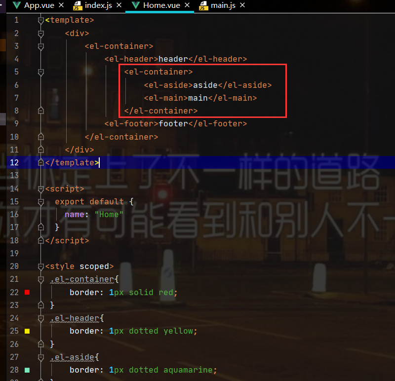
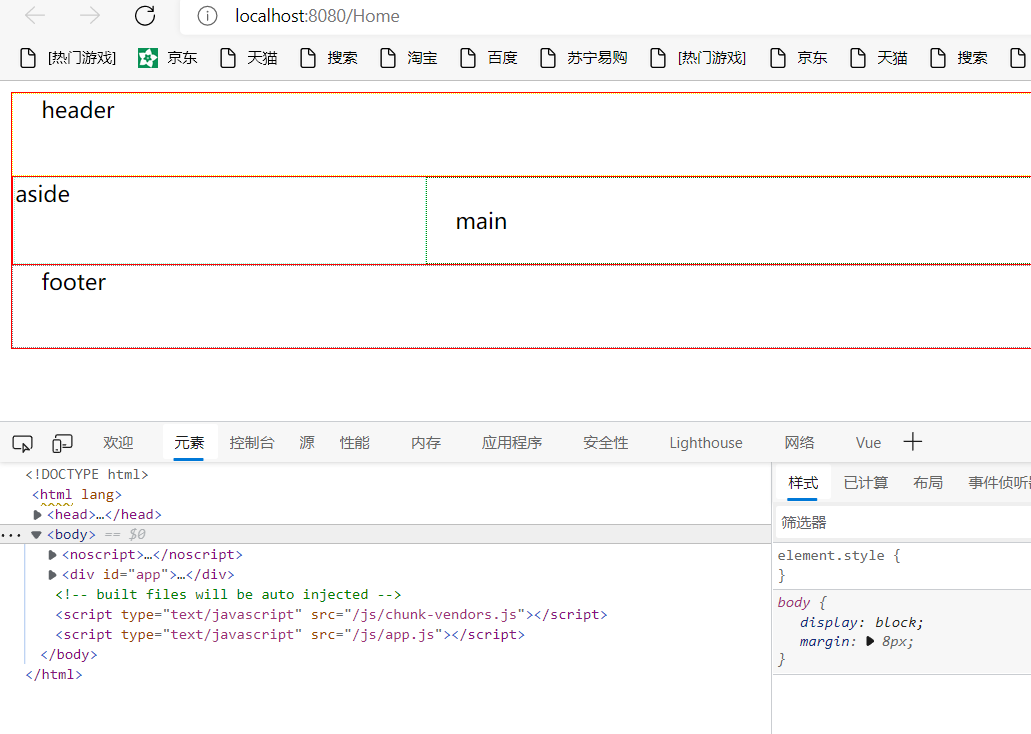
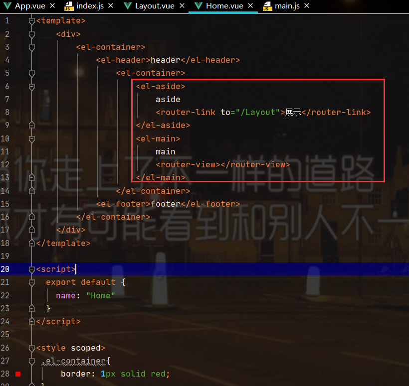
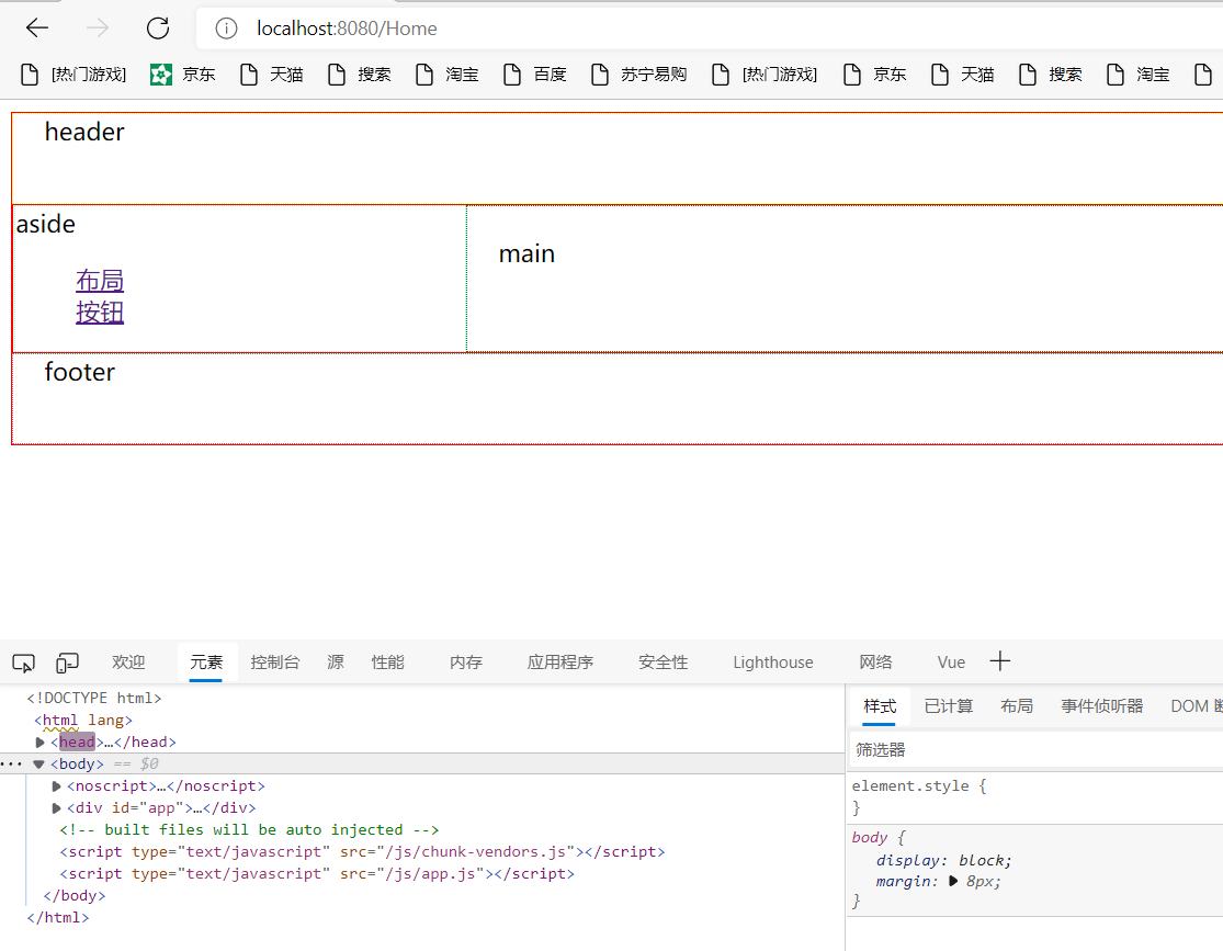
<el-container>:Outer container
<el-header>:Top rail container
<el-aside>:Sidebar container
<el-main>:Main area container
<el-footer>:Bottom bar container
Common page layouts
Code experience Display:
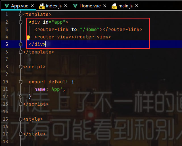
Create the Home.vue component under the view package:
<template>
  <div id="app">
    <router-link to="/Home">Button</router-link>
    <router-view></router-view>
  </div>
</template>

<script>

  export default {
    name:'App',
  }
</script>

<style>

</style>
Routing configuration:
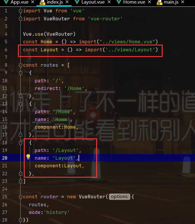
import Vue from 'vue'
import VueRouter from 'vue-router'
Vue.use(VueRouter)
const Home = () => import("../views/Home.vue")
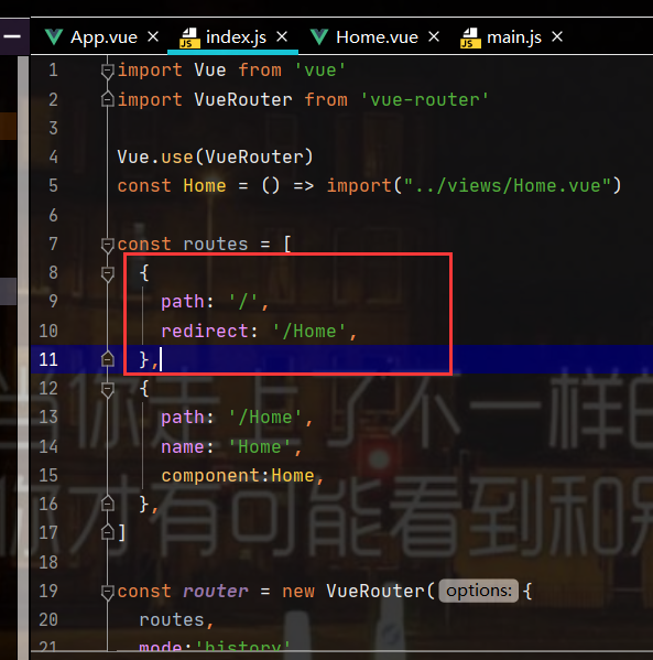
const routes = [
{
path: '/Home',
name: 'Home',
component:Home,
},
]
const router = new VueRouter({
routes,
mode:'history'
})
export default router
App.vue:
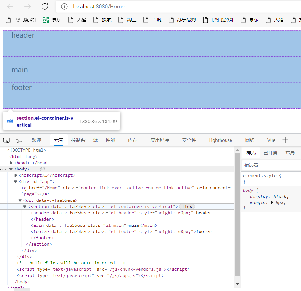
Run test:
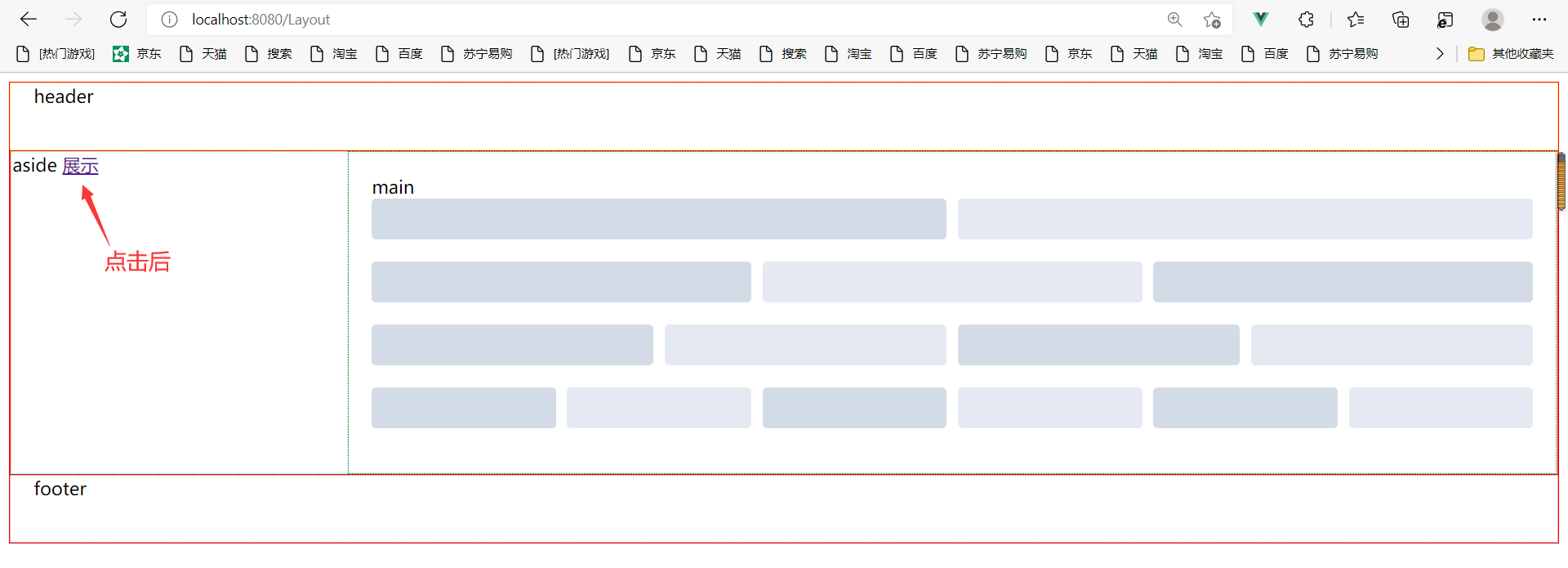
Adjust style: click the label name
function:
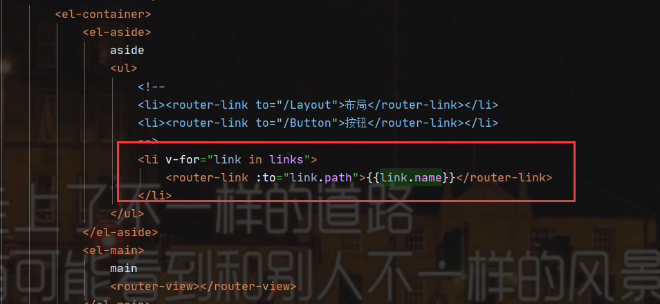
Add aside to sort them side by side: (because the containers are arranged in a single line, we need to use El container)
Summary:
- There are El header or El footer child elements in El container, and all child elements are arranged vertically
- When horizontal left-right arrangement is required, the El container needs to be redefined to contain child elements arranged horizontally left-right
To facilitate the demonstration, we add a default path to the route:
5. Layout layout
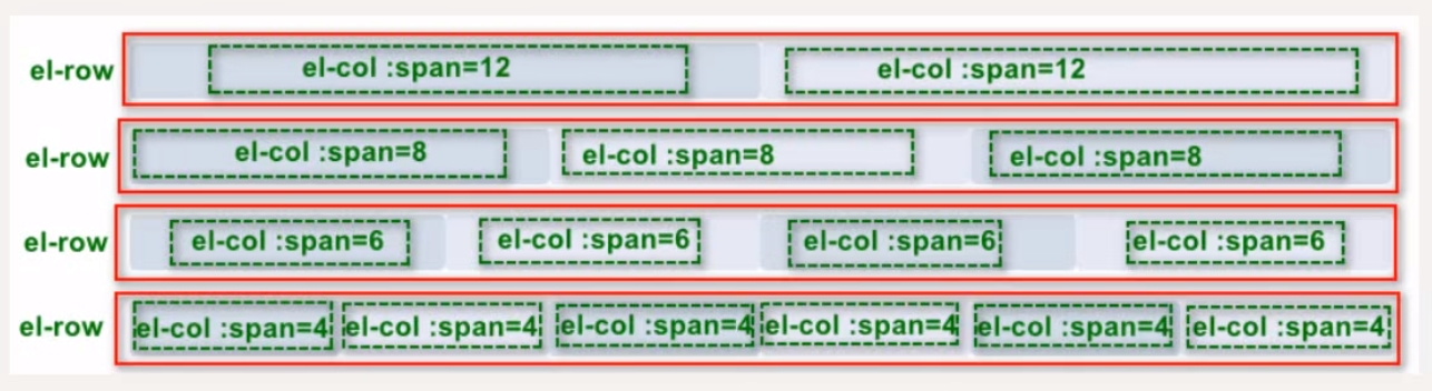
Layout can quickly divide an area into multiple columns, and each column can be divided into up to 24 basic columns to quickly and easily create a layout
5.1 foundation layout
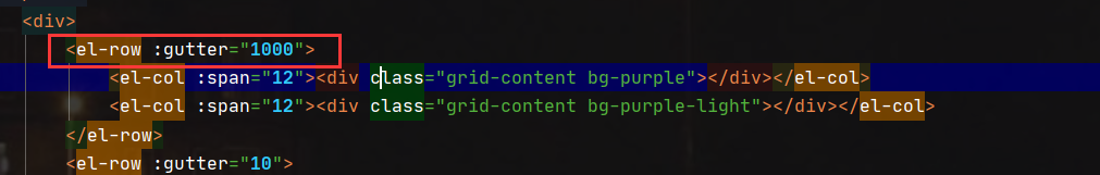
Through the row and col components and the span attribute of the col component, we can freely combine layouts
Layout.vue:
<template>
    <div>
        <el-row :gutter="10">
            <el-col :span="12"><div class="grid-content bg-purple"></div></el-col>
            <el-col :span="12"><div class="grid-content bg-purple-light"></div></el-col>
        </el-row>
        <el-row :gutter="10">
            <el-col :span="8"><div class="grid-content bg-purple"></div></el-col>
            <el-col :span="8"><div class="grid-content bg-purple-light"></div></el-col>
            <el-col :span="8"><div class="grid-content bg-purple"></div></el-col>
        </el-row>
        <el-row :gutter="10">
            <el-col :span="6"><div class="grid-content bg-purple"></div></el-col>
            <el-col :span="6"><div class="grid-content bg-purple-light"></div></el-col>
            <el-col :span="6"><div class="grid-content bg-purple"></div></el-col>
            <el-col :span="6"><div class="grid-content bg-purple-light"></div></el-col>
        </el-row>
        <el-row :gutter="10">
         <el-col :span="4"><div class="grid-content bg-purple"></div></el-col>
         <el-col :span="4"><div class="grid-content bg-purple-light"></div></el-col>
         <el-col :span="4"><div class="grid-content bg-purple"></div></el-col>
         <el-col :span="4"><div class="grid-content bg-purple-light"></div></el-col>
         <el-col :span="4"><div class="grid-content bg-purple"></div></el-col>
         <el-col :span="4"><div class="grid-content bg-purple-light"></div></el-col>
        </el-row>
    </div>
</template>

<script>
  export default {
    name: "Layout"
  }
</script>

<style scoped>
    .el-row{
        margin-bottom: 20px;
    &:last-child{
         margin-bottom: 0;
     }
    }
    .el-col{
        border-radius: 4px;
    }
    .bg-purple-dark{
        background-color: #99a9bf;
    }
    .bg-purple{
        background-color: #d3dce6;
    }
    .bg-purple-light{
        background-color: #e5e9f2;
    }
    .grid-content{
        border-radius: 4px;
        min-height: 36px;
    }
    .row-bg{
        padding: 10px 0;
        background-color: #f9fafc;
    }
</style>
Route registration:
The above can be accessed directly through the address:
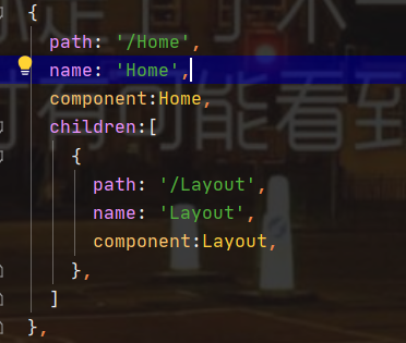
Set route access to this page: set / Layout as the sub path of / Home:
Set the display button and display position in Home.vue:
Run test:
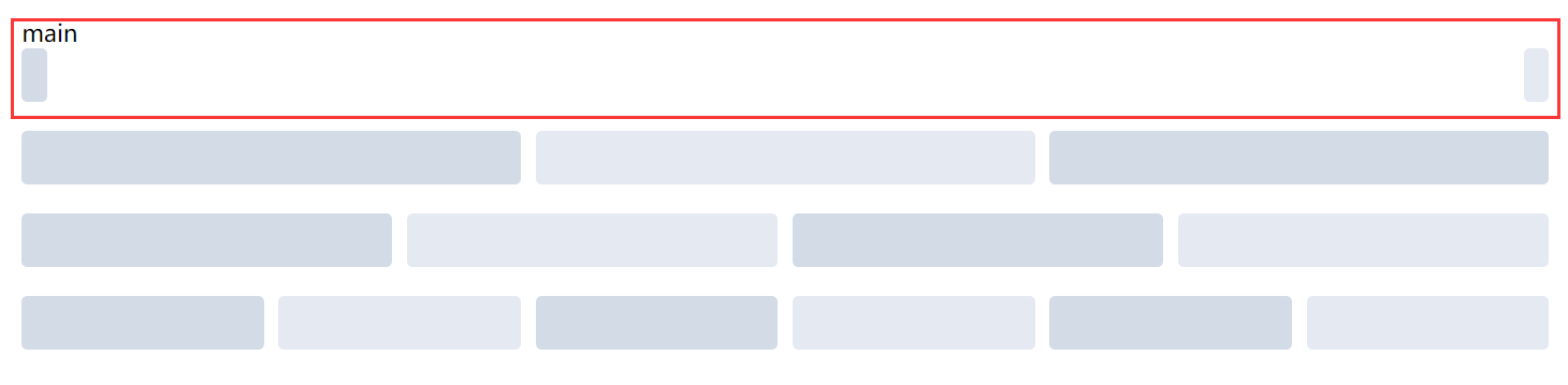
5.2 column spacing:
The row component provides the gutter attribute to specify the interval between each column:
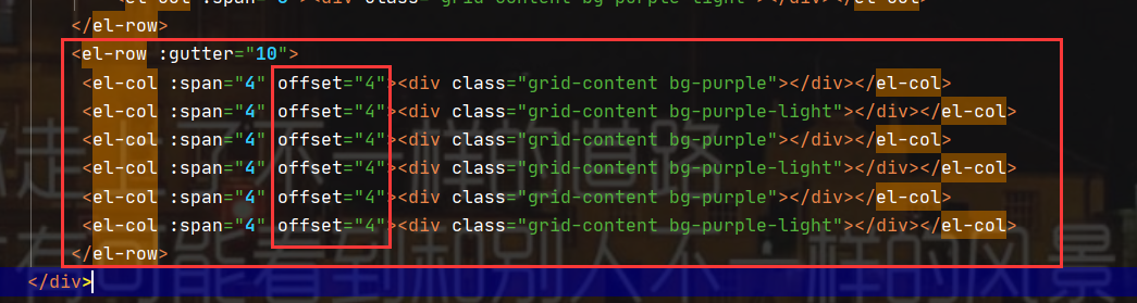
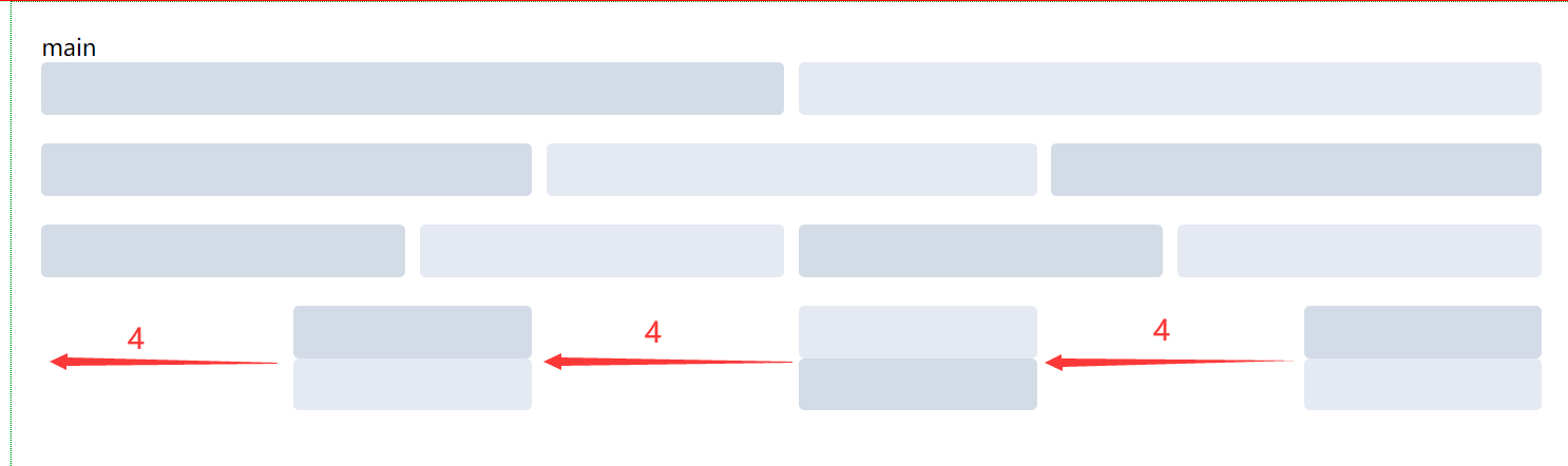
5.3 column offset:
By specifying the offset attribute of the col component, you can specify the number of columns whose column position is offset to the right
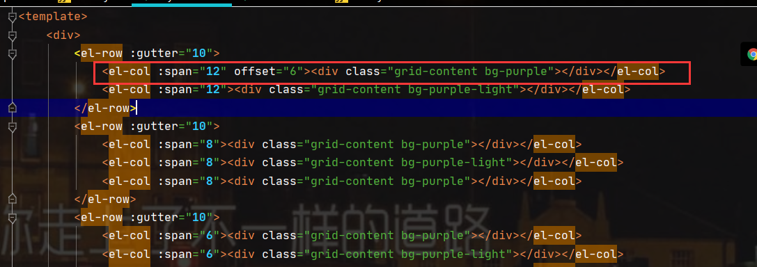
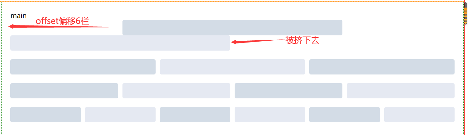
There will be no extrusion between components
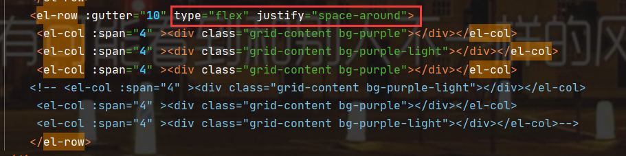
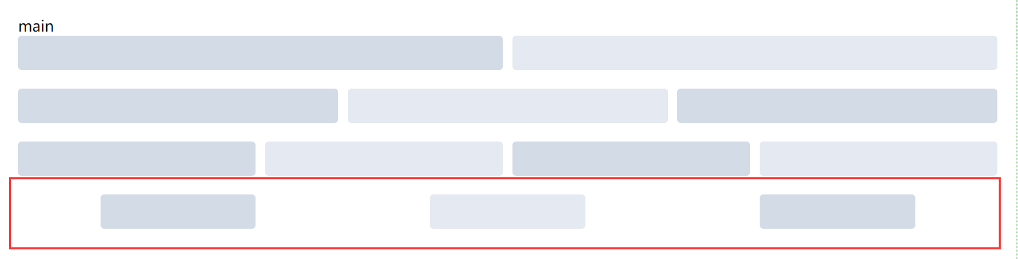
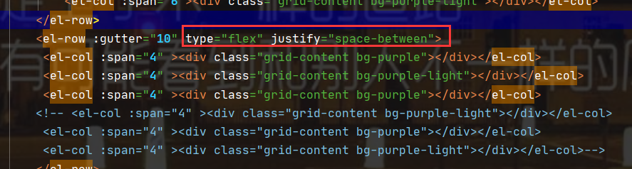
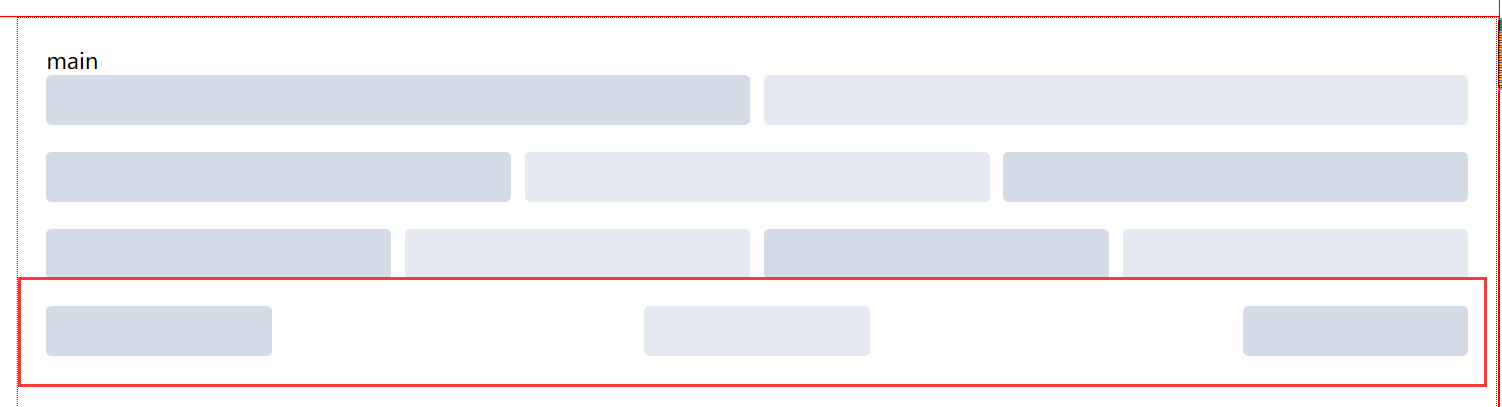
5.4 alignment:
Assign the type attribute of row component to flex to enable flex layout, and specify the values of start, center, end, space between and space around through the justify attribute to define the layout of child elements
6. Button button
Element UI provides a common operation button component: El button
6.1 basic usage
Define the style of the button through the type attribute
Button.vue:
<template>
<div>
<el-row :gutter="10">
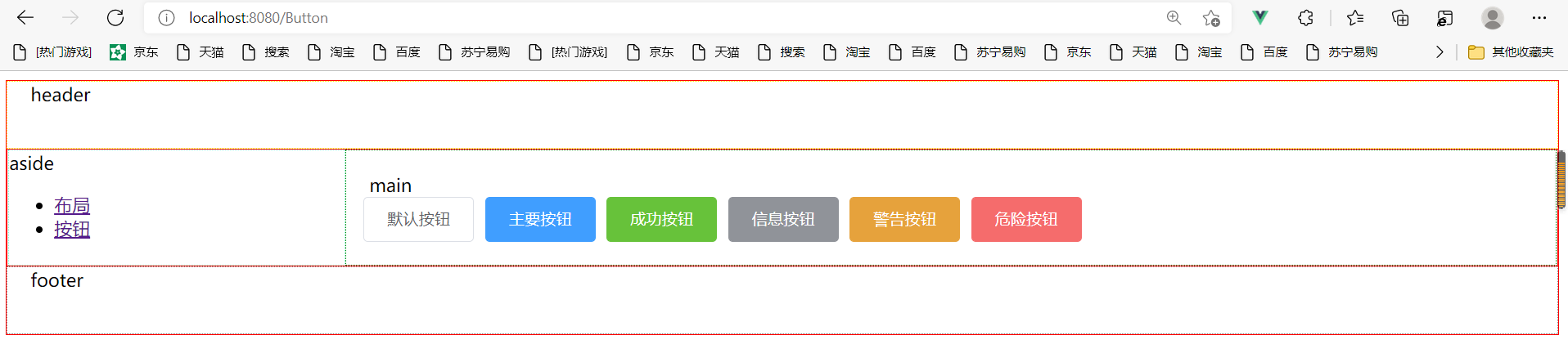
<el-button>Default button</el-button>
<el-button type="primary">Main button</el-button>
<el-button type="success">Success button</el-button>
<el-button type="info">Information button</el-button>
<el-button type="warning">Warning button</el-button>
<el-button type="danger">Danger button</el-button>
</el-row>
</div>
</template>
<script>
export default {
name: "Button"
}
</script>
<style scoped>
</style>
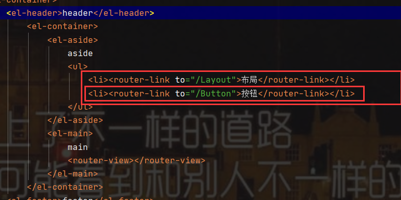
Routing configuration:
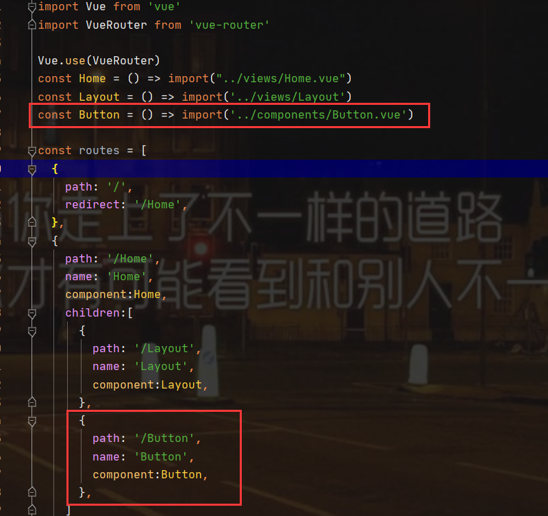
App.vue:
Run test:
The route display method will not be shown later (if you don't understand it, please subscribe to my Vue column or read it directly: Vuejs Part 5 (Vue router routing and tabbar))
Route display
Separate writing of data components:
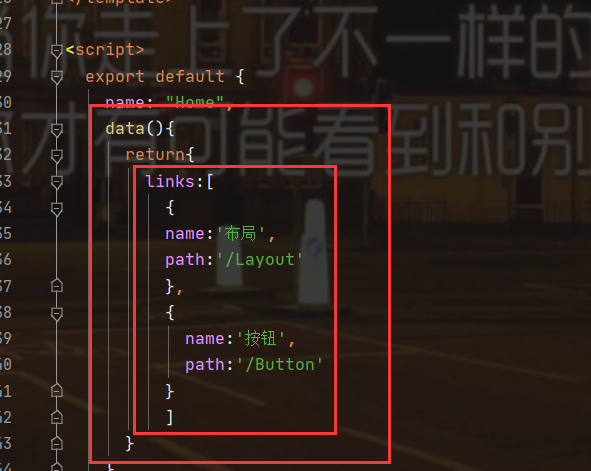
Remove the style code of li and write it yourself
function:
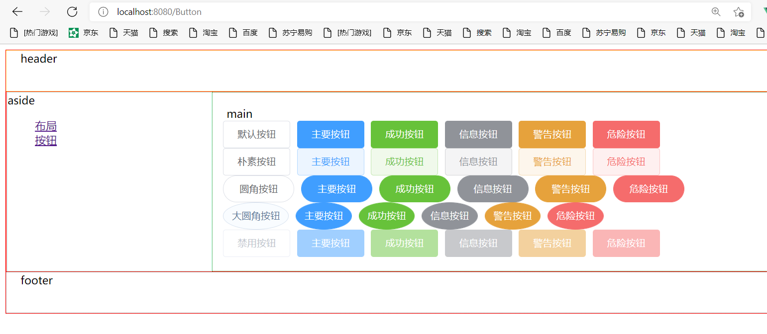
6.2. Button style:
Define the style of the Button through the plain, round, circle, and disabled attributes
<template>
<div>
<el-row :gutter="10">
<el-button>Default button</el-button>
<el-button type="primary">Main button</el-button>
<el-button type="success">Success button</el-button>
<el-button type="info">Information button</el-button>
<el-button type="warning">Warning button</el-button>
<el-button type="danger">Danger button</el-button>
</el-row>
<el-row :gutter="10">
<el-button plain>Plain button</el-button>
<el-button type="primary" plain>Main button</el-button>
<el-button type="success" plain>Success button</el-button>
<el-button type="info" plain>Information button</el-button>
<el-button type="warning" plain>Warning button</el-button>
<el-button type="danger" plain>Danger button</el-button>
</el-row>
<el-row :gutter="10">
<el-button round>Fillet button</el-button>
<el-button type="primary" round>Main button</el-button>
<el-button type="success" round>Success button</el-button>
<el-button type="info" round>Information button</el-button>
<el-button type="warning" round>Warning button</el-button>
<el-button type="danger" round>Danger button</el-button>
</el-row>
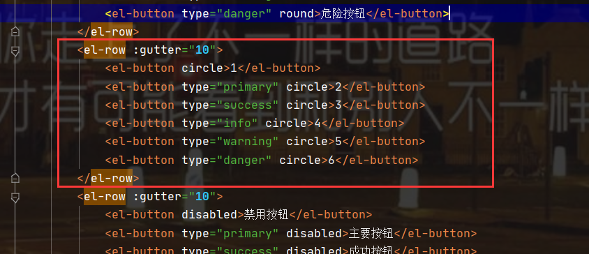
<el-row :gutter="10">
<el-button circle>Large fillet button</el-button>
<el-button type="primary" circle>Main button</el-button>
<el-button type="success" circle>Success button</el-button>
<el-button type="info" circle>Information button</el-button>
<el-button type="warning" circle>Warning button</el-button>
<el-button type="danger" circle>Danger button</el-button>
</el-row>
<el-row :gutter="10">
<el-button disabled>Disable button</el-button>
<el-button type="primary" disabled>Main button</el-button>
<el-button type="success" disabled>Success button</el-button>
<el-button type="info" disabled>Information button</el-button>
<el-button type="warning" disabled>Warning button</el-button>
<el-button type="danger" disabled>Danger button</el-button>
</el-row>
</div>
</template>
<script>
export default {
name: "Button"
}
</script>
<style scoped>
</style>
function:
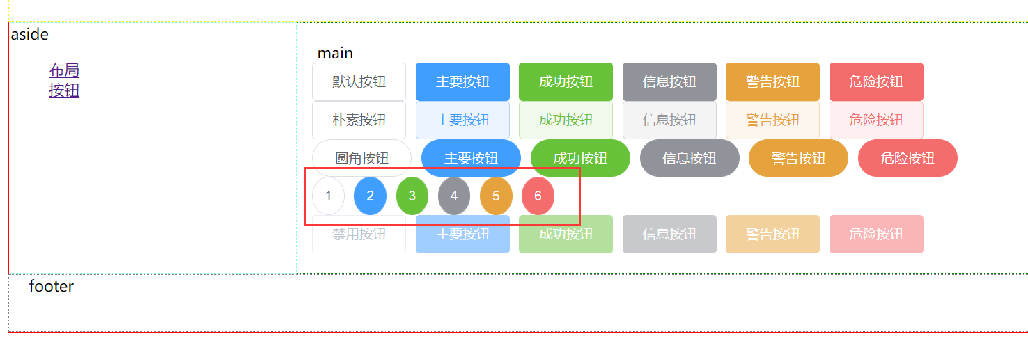
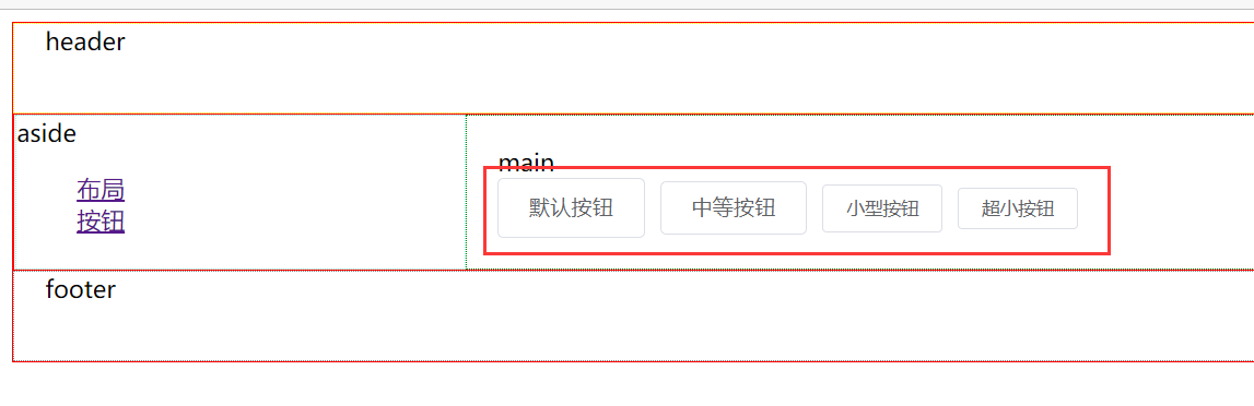
6.3 button size
In addition to the default values, the Button component provides three additional sizes: medium, small and mini. They can be configured by setting the size attribute, and the appropriate Button size can be selected in different scenarios
		<el-row>
            <el-button>Default button</el-button>
            <el-button size="medium">Medium button</el-button>
            <el-button size="small">Small button</el-button>
            <el-button size="mini">Ultra small button</el-button>
        </el-row>
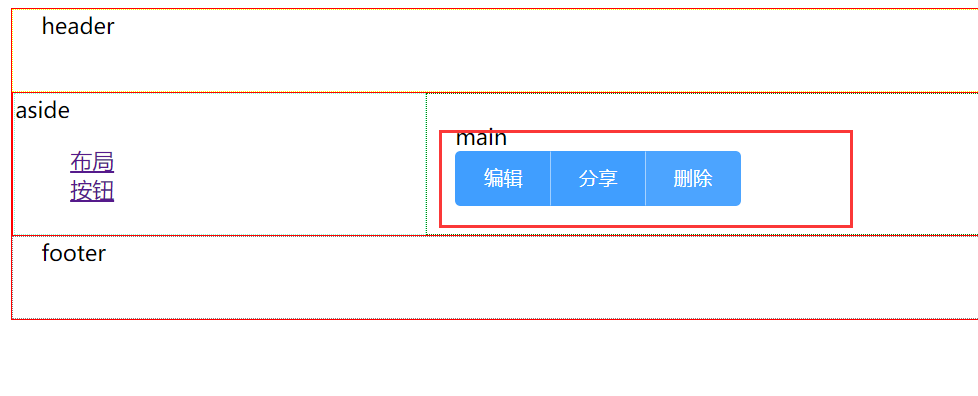
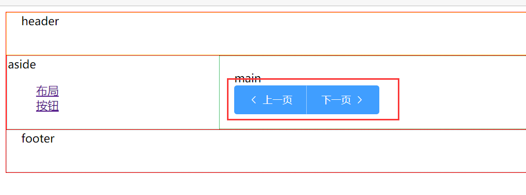
6.4 button group
Using the < El button group > tag to nest buttons, you can build a more closely related set of buttons
<el-button-group>
            <el-button type="primary">edit</el-button>
            <el-button type="primary">share</el-button>
            <el-button type="primary">delete</el-button>
        </el-button-group>
		<el-button-group>
          <el-button type="primary" icon="el-icon-arrow-left">previous page</el-button>
          <el-button type="primary">next page<i class="el-icon-arrow-right el-icon--right"></i></el-button>
        </el-button-group>
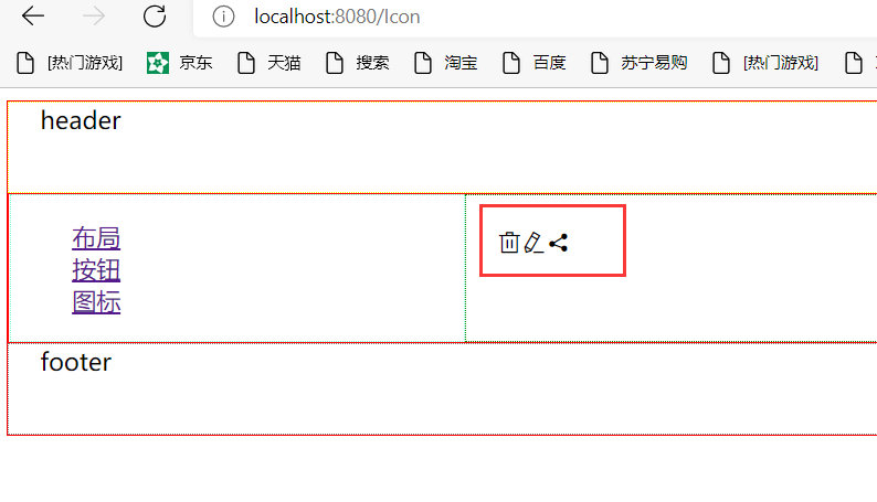
7. Icon icon
Element UI provides a set of commonly used icons
7.1. Application method
Set the class El icon iconname property directly for the i tag to use the icon. For example
Icon.vue
	<div>
        <i class="el-icon-delete"></i>
        <i class="el-icon-edit"></i>
        <i class="el-icon-share"></i>
    </div>
More icons can be viewed on the official website